
ソトアソビ – Outdoor Play
Japan is currently captivated by a fascinating shift in consumer culture, where practical, durable workwear has transcended its origins to become a mainstream fashion statement. This unexpected transformation isn’t just about utility; it’s a testament to the nation’s evolving embrace of accessible outdoor living and smart, functional style that doesn’t break the bank.
The Cultural Significance
The rise of what was once a humble workwear brand into a fashion and outdoor staple is a truly remarkable phenomenon in Japan. What started as robust gear for laborers has now become a go-to for everyone from weekend hikers to urban fashionistas. This surge in popularity stems from a perfect storm of factors: unparalleled durability, cutting-edge functionality (think UV-cut parkas and water-repellent jackets), and an incredibly appealing price point. It speaks to a growing Japanese demographic that values smart spending and genuine utility without sacrificing style. The buzz around new, low-cost, high-function items has generated significant excitement among outdoor enthusiasts and casual wearers alike, redefining what ‘fashionable’ can truly mean in an everyday context.
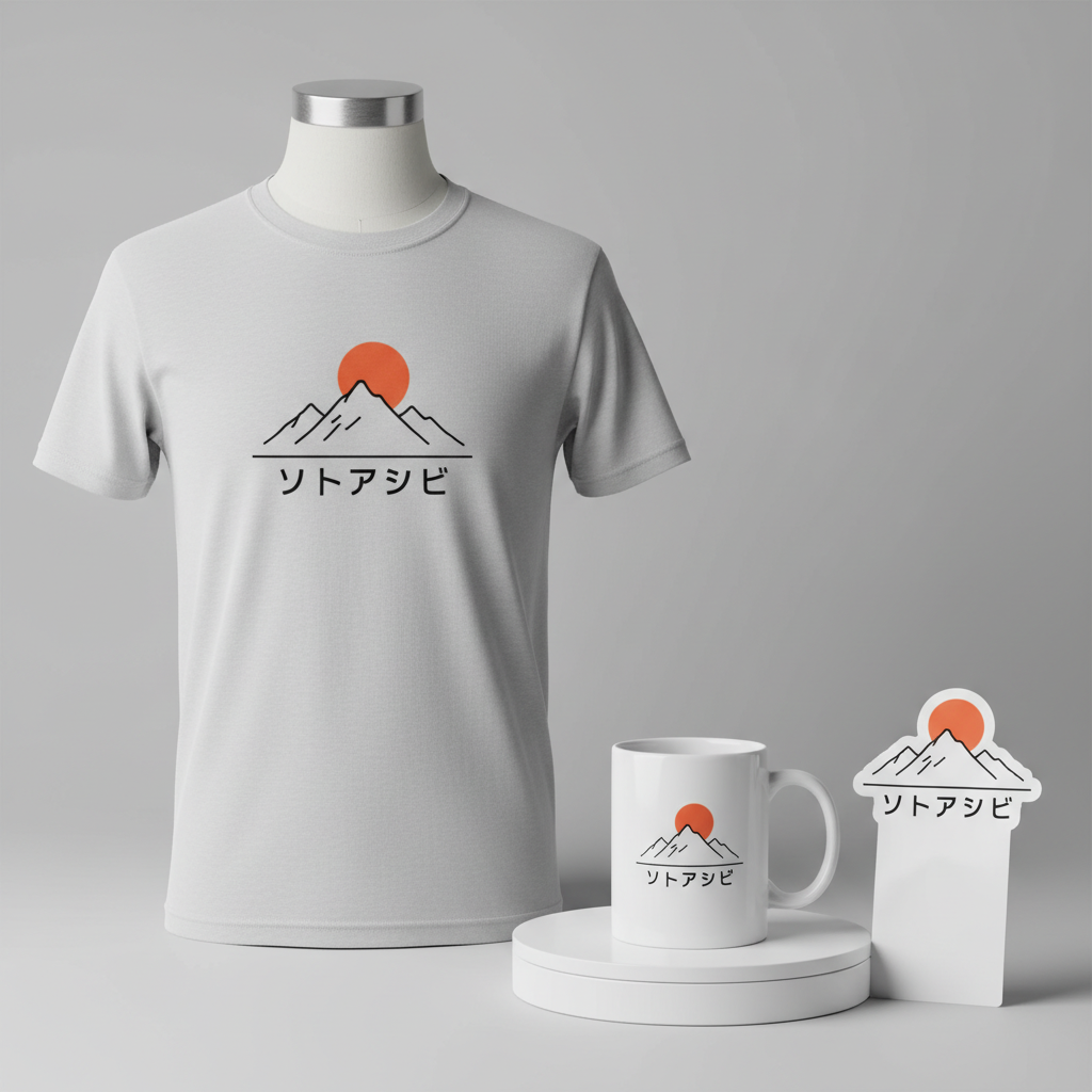
Design Brainstorm: Capturing the Aesthetic
Translating this cultural moment into merchandise requires a thoughtful approach that resonates with the core values of the trend while cleverly sidestepping intellectual property. One compelling design concept could focus on the *lifestyle* the trend embodies—accessible outdoor adventures and a connection to nature.
- 🎨 Visual Concept: An appealing direction might involve a clean, Japanese-style ‘line art’ illustration. This could feature a minimalist mountain range paired with a subtly rising sun. The overall aesthetic would be contemporary and refined, echoing the appreciation for natural beauty and understated elegance often found in Japanese design. This simple yet profound imagery evokes the spirit of exploration and tranquility, suitable for a broad audience.
- ✍️ Typography Ideas: The text “ソトアソビ” (Sotoasobi), meaning “Outdoor Play,” serves as the perfect centerpiece. Presenting this in a clean, modern Japanese sans-serif font would maintain a trendy and approachable feel. The clarity and simplicity of such typography would complement the line art, ensuring the message of enjoying the outdoors is both clear and aesthetically pleasing.
- 👕 Product Canvas: Considering the emphasis on lightweight and functional apparel within the trend, this design could translate exceptionally well onto light apparel. Think performance t-shirts, light hoodies perfect for layering during outdoor activities, or even versatile tote bags and caps. These items align with the practicality and comfort desired by the target demographic.
Strategic Market Insight
The genius of this approach lies in its strategic pivot. While the original brand name is off-limits due to trademark considerations, the *essence* of its appeal—the lifestyle it enables—is ripe for exploration. By focusing on “Sotoasobi,” a universally understood and beloved concept in Japan, the design taps into a broad, evergreen market segment. This demographic, sometimes playfully dubbed ‘Workman Joshi’ for its prominent female fanbase, deeply appreciates practicality, affordability, and a connection to nature. The psychological trigger here is aspirational: consumers are buying into a lifestyle of accessible adventure and smart, functional fashion, rather than just a brand. This design speaks to their desire for comfort, quality, and an active connection to the natural world, all while offering a culturally resonant phrase that feels inherently authentic.
⚖️ Estimated Copyright Risk: LOW
Our Findings: The design does not use the ‘Workman’ brand name or logo. It uses a generic term (‘Sotoasobi’) and common outdoor imagery (mountains, sun). This is a theme-based design, not a brand-based one, which is a safe approach to a brand-driven trend.
Always verify intellectual property rights before listing.
Check Japan Trademark Search for “ワークマン” ➔
AI Image Generation Prompts
The following prompts are optimized for leading generators to produce production-ready assets:
👕 Apparel / T-Shirt Prompt
A minimalist, trendy Japanese line art illustration for a t-shirt print. The design features a serene mountain range with crisp, flowing lines depicting peaks and valleys, and a perfectly circular rising sun positioned behind or above the mountains. The sun is rendered with simple, clean lines, emanating a subtle sense of calm. The overall style is a clean vector illustration, emphasizing precise, geometric simplicity and elegant curves. Utilize subtle variations in line weight to give a sense of depth without compromising the flat aesthetic. The composition is balanced and uses negative space effectively. The text 'ソトアソビ' is integrated seamlessly below the illustration, rendered in a modern, clean Japanese sans-serif font. The artwork is isolated on a solid Light background, appearing as if ready for a direct-to-garment print. The illustration should have a sharp, high-resolution finish, with no visible brush strokes or texture, perfectly smooth and scalable. The mood is tranquil, contemplative, and modern. --ar 3:4 --v 6.0 The ONLY text allowed in the image is exactly 'ソトアソビ'. Absolutely NO other names, words, or random letters.
🔍 Search this niche on:
☕ Drinkware / Mug Prompt
A duplicated side-by-side layout showing the exact same graphic on the left and right, designed perfectly for a panoramic mug wrap. The graphic is a clean, minimalist Japanese-style line art illustration featuring a tranquil mountain range and a perfectly round rising sun. The mountains are rendered with precise, varying line weights, creating depth and dimension within a flat, graphic style. The sun is a simple, bold circle, suggesting a serene dawn. The overall aesthetic is trendy and modern, with an emphasis on clarity and refined composition suitable for a seamless wrap. The text 'ソトアソビ' is incorporated into the design, rendered in a crisp, modern Japanese sans-serif font. The illustration is sharp, high-contrast, with defined edges, designed to wrap seamlessly around a cylindrical object. The mood is calm, natural, and inviting, perfect for a morning coffee ritual. --ar 3:1 --v 6.0 The ONLY text allowed in the image is exactly 'ソトアソビ'. Absolutely NO other names, words, or random letters.
🔍 Search this niche on:
✨ Die-Cut Sticker Prompt
A bold, minimalist Japanese-style line art illustration for a die-cut sticker, rendered in a vibrant 2D flat pop-art style. The design depicts a stylized mountain range with strong, graphic outlines and a bold, circular rising sun. The illustration utilizes flat, saturated color fields (e.g., deep indigo mountains against a warm orange sun, or monochromatic with a single accent color), emphasizing high contrast and graphic impact. The lines are thick and confident, reminiscent of screen printing, with clean, sharp edges. The text 'ソトアソビ' is integrated seamlessly, presented in a clean, modern Japanese sans-serif font, maintaining the overall pop-art aesthetic. A thick white outline border encircles the entire design, clearly defining the die-cut shape and making the sticker pop against any surface. The sticker has a glossy finish appearance. The mood is energetic, modern, and visually striking. --ar 1:1 --v 6.0 The ONLY text allowed in the image is exactly 'ソトアソビ'. Absolutely NO other names, words, or random letters.
🔍 Search this niche on:
Frequently Asked Questions
How does this design concept appeal to the “Workman Joshi” demographic without using the brand name?
The “Workman Joshi” demographic embodies a love for practicality, affordability, and the outdoors. This design speaks directly to those values by celebrating the “Sotoasobi” (Outdoor Play) lifestyle. The clean, minimalist aesthetic aligns with their preference for functional, understated style, while the focus on natural imagery and the act of outdoor enjoyment resonates with their active pursuits and appreciation for nature, effectively capturing the spirit of the trend without infringing on any specific brand.
What makes “Sotoasobi” such an effective keyword for this trend?
“Sotoasobi” is powerful because it’s a broad, universally positive, and culturally relevant term in Japan. It evokes a sense of accessible fun and adventure in the outdoors, immediately connecting with anyone interested in hiking, camping, or simply enjoying nature. It’s a safe keyword that bypasses brand-specific IP while directly addressing the lifestyle aspiration that drives the original trend’s popularity, making it both strategic and appealing.
Why is minimalist line art particularly suited for this Japanese outdoor theme?
Minimalist line art perfectly complements the Japanese aesthetic, which often values simplicity, balance, and natural motifs. For an outdoor theme, it suggests tranquility and connection to nature without being overly literal or cluttered. This style is also trendy and versatile, looking sophisticated on a range of apparel while maintaining a clean, modern feel that appeals to a demographic that appreciates thoughtful, understated design.
Final Thoughts
The phenomenon sweeping Japan demonstrates a powerful demand for merchandise that aligns with practical, nature-oriented lifestyles. By pivoting from a specific brand to the broader “Sotoasobi” ethos, designers can tap into a rich vein of consumer interest in functional fashion and accessible outdoor adventures. The potential for e-commerce in this space is significant, provided the designs are thoughtful, culturally resonant, and genuinely capture the spirit of what makes this trend so compelling. Ultimately, success lies in understanding the subtle nuances of consumer desire and bringing a personal, creative spin to these exciting market insights.
💬 What’s Your Take?
Art is subjective, and this is just one angle! How would you spin this “ワークマン (Workman)” trend? Did we miss the mark, or is there a better inside joke to use here? Drop your design ideas and let’s brainstorm in the comments below!
