
ペルシャ湾 (Persian Gulf) Merch Design
A recent flurry of news reports has cast a spotlight on the Strait of Hormuz, bringing the intricate world of global shipping and strategic waterways to the forefront of national conversations across Japan. This attention isn’t just about current events; it taps into Japan’s profound connection to the sea, a relationship that has shaped its culture, economy, and identity for centuries. The echoes of these maritime narratives, both ancient and modern, provide a compelling backdrop for creative exploration in merchandise design.
The Cultural Significance
Japan, an island nation, has always looked to the ocean as both a highway and a lifeline. Its economy relies heavily on maritime trade, making the security and freedom of shipping lanes a matter of intense national interest. When a region as vital as the Persian Gulf captures headlines, it resonates deeply within the public consciousness, touching upon themes of global interconnectedness, economic stability, and national pride in its seafaring industries. This inherent cultural significance provides a fertile ground for designs that acknowledge this focus, but pivot towards universal appreciation rather than specific incidents, fostering a broader appeal rooted in historical and aesthetic appreciation.
Design Brainstorm: Capturing the Aesthetic
When considering merchandise inspired by such a significant cultural moment, one powerful approach is to blend the contemporary subject with a timeless artistic tradition. Our concept here leans heavily into the rich heritage of Japanese Ukiyo-e art, offering a sophisticated and universally appealing take on maritime themes.
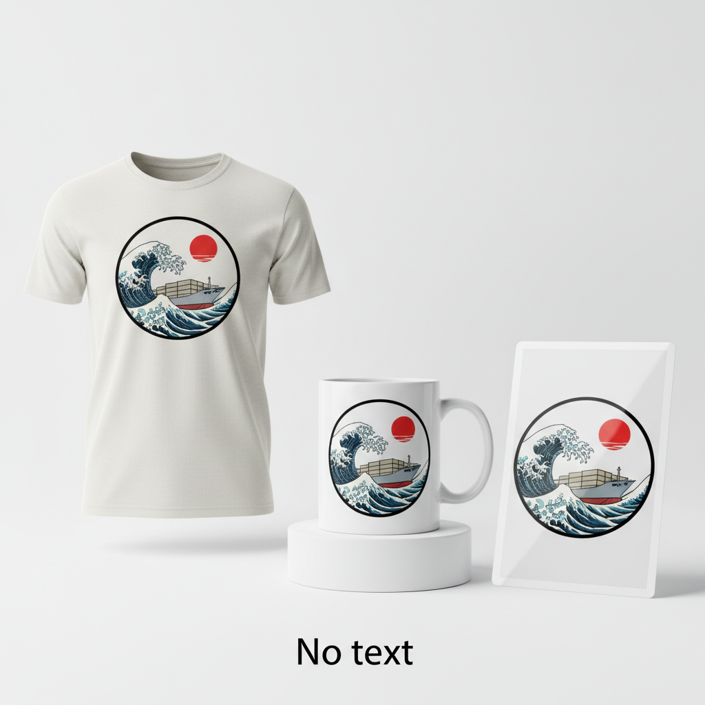
- 🎨 Visual Concept: This design proposes an image directly inspired by traditional Japanese Ukiyo-e woodblock prints, particularly the dramatic and stylized waves made famous by masters like Hokusai or Hiroshige. It would feature a contemporary, generic container ship sailing atop these swirling, ornate waves, creating a captivating juxtaposition of old and new. In the background, a simple, solid red disc represents the sun, a powerful and iconic symbol in Japanese art and culture. The entire composition is elegantly contained within a clean circular border, giving it a refined, emblem-like quality. This artistic fusion allows the design to evoke a sense of tradition and modern power without specific references to any particular event.
- ✍️ Typography Ideas: In a deliberate choice to allow the powerful visual to speak for itself, this concept suggests a complete absence of text. Eliminating linguistic barriers makes the design universally understandable and appreciative, reinforcing its art-centric approach and ensuring broad appeal to a global audience. The narrative is entirely carried by the visual storytelling.
- 👕 Product Canvas: Given the crisp lines, vibrant potential, and classic aesthetic of the Ukiyo-e style, light-colored apparel could serve as an ideal canvas. A white or natural-toned t-shirt, for instance, would allow the details of the stylized waves and the bold red sun to truly pop, creating a striking and sophisticated garment. This choice enhances the art print feel, making the apparel feel less like a novelty item and more like wearable art.
Strategic Market Insight
The brilliance of this design approach lies in its strategic pivot. While the initial news might spark interest in sensitive geopolitical topics, this merchandise concept wisely shifts focus to an evergreen and universally celebrated niche: “Japanese Maritime Pride” and “Ukiyo-e Art.” The target demographic is therefore expanded significantly. It includes individuals working within the global maritime industry, art enthusiasts who appreciate the intricate beauty of traditional Japanese woodblock prints, or anyone with a general fondness for Japanese aesthetics and cultural depth. This pivot ensures complete compliance with platform guidelines, as it sidesteps any mention of conflict or tragedy, instead offering a positive, artistic, and culturally rich product. The psychological triggers behind a purchase here would be an appreciation for fine art, a connection to maritime heritage, or simply a desire for a beautifully designed item that subtly hints at a deeper cultural narrative.
⚖️ Estimated Copyright Risk: LOW
Copyright Evaluation: The design is an original creation *in the style of* Ukiyo-e, not a copy of a specific famous artwork. Many works by artists like Hokusai and Hiroshige are in the public domain, and using their *style* as inspiration is not a copyright violation. The elements (ship, waves, sun) are generic and do not infringe on any intellectual property. This makes the design safe from copyright claims.
Always verify intellectual property rights before listing.
Check Japan Trademark Search for “ペルシャ湾” ➔
AI Image Generation Prompts
The following prompts are optimized for leading generators to produce production-ready assets:
👕 Apparel / T-Shirt Prompt
A traditional Japanese Ukiyo-e woodblock print inspired illustration, featuring a highly stylized, generic modern container ship. The ship is sailing on dramatic, swirling, ornate waves, rendered with intricate detail reminiscent of Hokusai's 'The Great Wave off Kanagawa' and Hiroshige's landscape compositions. The waves exhibit a dynamic sense of motion with frothy white crests and deep indigo-blue troughs. A simple, solid red disc sun is prominently positioned in the background, a minimalist symbol of Japan. The entire design is perfectly contained within a crisp, clean circular border, creating a harmonious and balanced composition. The art style is a clean vector illustration, characterized by bold, precise black outlines, flat, saturated color blocks with no gradients or textures, and smooth, geometric curves. The palette is limited to traditional Ukiyo-e hues, primarily deep blues, teal, stark white for foam, and a vibrant vermilion red for the sun. The rendering emphasizes graphic clarity, making it ideal for screen printing. The mood is serene yet powerful, capturing the majesty of both nature and human endeavor in a timeless Japanese aesthetic. Isolated on a solid Light background, ensuring maximum visibility and versatility for apparel printing. The ONLY text allowed in the image is exactly 'No text'. Absolutely NO other names, words, or random letters.--ar 3:4 --v 6.0
🔍 Search this niche on:
☕ Drinkware / Mug Prompt
A duplicated side-by-side layout showing the exact same graphic on the left and right, designed perfectly for a panoramic mug wrap. The graphic is a stunning, traditional Japanese Ukiyo-e woodblock print inspired illustration. It showcases a highly stylized, generic modern container ship, presented with a bold, graphic silhouette. The ship navigates across intensely dynamic, swirling, and ornate waves, rendered in the iconic style of Hokusai, particularly emulating the powerful, curling forms and intricate foam patterns of 'The Great Wave'. The aesthetic also incorporates the serene landscape qualities of Hiroshige. A simple, solid red disc sun sits gracefully in the background against a subtle, flat sky. The entire composition is perfectly encircled by a clean, thin border, defining its contained aesthetic. The art style is characterized by deep, rich colors in flat blocks, specifically vibrant indigo, cerulean blue, stark white for wave crests, and a striking vermilion red for the sun, all delineated by strong, precise black outlines. There are no gradients, complex textures, or superfluous details, focusing on a clear, high-contrast visual impact. The lighting is implied to be bright and even, highlighting the clean lines and distinct shapes. The mood is one of tranquil power, an iconic visual motif optimized for continuous wrapping around cylindrical drinkware. The ONLY text allowed in the image is exactly 'No text'. Absolutely NO other names, words, or random letters.--ar 3:1 --v 6.0
🔍 Search this niche on:
✨ Die-Cut Sticker Prompt
A vibrant, 2D flat pop-art style illustration, strongly influenced by traditional Japanese Ukiyo-e woodblock prints. The central focus is a highly stylized, generic container ship, presented with simplified, clean lines and a bold silhouette, reminiscent of modern graphic design. The ship is depicted sailing on spectacularly swirling, intricate, and highly decorative waves, directly inspired by the dramatic movement and stylized foam patterns seen in Hokusai's and Hiroshige's works, but with a contemporary pop-art flatness. A large, simple red disc sun is positioned in the background, a solid, iconic shape. The entire design is contained within a perfectly circular shape with a crisp, clean internal border. The color palette is bright, highly saturated, and limited, using solid blocks of contrasting hues like deep navy, bright teal, stark white, and vivid cherry red, without any shading, gradients, or textural effects. The illustration features strong, uniform black outlines that define every element, giving it a graphic novel or cartoon aesthetic. The mood is cheerful, iconic, and eye-catching. The design is presented as an isolated element, with a thick white outline border cleanly surrounding the entire circular design, making it ideal for a die-cut sticker application. The rendering is sharp, clean, and perfectly two-dimensional, ensuring visual impact. The ONLY text allowed in the image is exactly 'No text'. Absolutely NO other names, words, or random letters.--ar 1:1 --v 6.0
🔍 Search this niche on:
Frequently Asked Questions
Why choose an Ukiyo-e style for a modern container ship?
This design choice is a deliberate fusion of eras. Ukiyo-e, meaning “pictures of the floating world,” traditionally depicted the transient pleasures and everyday life of Edo Japan. By applying this timeless, iconic art style to a modern container ship, we create a powerful visual metaphor. It connects contemporary global trade with Japan’s deep maritime heritage and artistic legacy, transforming a functional vessel into a subject of traditional beauty and cultural pride. It’s about celebrating continuity and artistic interpretation.
Who is the ideal customer for this type of design?
The ideal customer is diverse, ranging from art enthusiasts who appreciate the blend of traditional Japanese aesthetics with modern themes, to individuals in the shipping and logistics industries who might wear it with a sense of professional pride. It also appeals to anyone with an appreciation for unique, thoughtful designs that carry a subtle cultural narrative, making it suitable for those who enjoy Japanese culture, history, or simply striking visual art on their apparel.
How does this design navigate sensitive current events?
This design masterfully sidesteps sensitive political or conflict-related topics by focusing entirely on aesthetic and cultural appreciation. It avoids any specific incident, location, or company. Instead, it leverages the broader interest in maritime affairs and channels it into a celebration of Japanese art and its long-standing connection to the sea. The universal appeal of art and maritime heritage provides a safe, positive, and enduring message.
Final Thoughts
The e-commerce potential for designs that blend contemporary interest with timeless cultural artistry is immense. This approach demonstrates how a news-driven topic can be intelligently reinterpreted into a commercially viable and ethically sound merchandise concept. By focusing on “Japanese Maritime Pride” and the universally admired “Ukiyo-e Art” style, designers can tap into a broad audience appreciative of both culture and compelling visuals. Ultimately, success in the print-on-demand space often hinges on such creative pivots and thoughtful execution, proving that even a complex narrative can inspire beautiful and marketable products.
💬 What’s Your Take?
Art is subjective, and this is just one angle! How would you spin this “ペルシャ湾 (Persian Gulf)” trend? Did we miss the mark, or is there a better inside joke to use here? Drop your design ideas and let’s brainstorm in the comments below!