不屈の精神 – Indomitable Spirit
Japan is currently gripped by football fever, and at the heart of the excitement is Kento Shiogai, a name that has quickly become synonymous with national aspiration. The 21-year-old striker’s electrifying debut for the Japanese national team has not only captivated sports headlines across the nation but also ignited a palpable sense of pride and anticipation among fans. His emergence on the international stage signals a fresh wave of talent and a promising future for Japanese football, drawing significant media and public attention to his journey and the team’s prospects.
The Cultural Significance
The debut of a young talent like Kento Shiogai on the national football team carries immense cultural weight in Japan. It’s more than just a sports event; it’s a moment of collective national pride, a testament to dedication, and a symbol of hope for future successes on the global stage. Football, or soccer as it’s often known, holds a special place in the hearts of many Japanese, embodying the spirit of teamwork, discipline, and relentless pursuit of excellence. A rising star like Shiogai represents the culmination of years of hard work and the dreams of countless aspiring athletes. His story resonates deeply, inspiring a passionate fan base eager to celebrate the triumphs and embody the unwavering spirit of their national heroes.
Design Brainstorm: Capturing the Aesthetic
Translating this profound national sentiment into merchandise requires a thoughtful approach that honors tradition while appealing to a modern audience. One angle to consider is a design that is both visually striking and culturally profound, sidestepping specific player names or team logos to offer a universally appealing message.
- 🎨 Visual Concept: A design that marries the ancient art of Japanese calligraphy (shodo) with a sleek, contemporary feel could work incredibly well. Imagine dynamic, expressive brushstrokes forming the text, arranged vertically to evoke traditional scrolls. Behind this powerful calligraphy, a minimalist red circle, reminiscent of the Japanese flag, could be subtly placed. This juxtaposition of traditional art and a modern, national symbol creates a clean yet powerful aesthetic.
- ✍️ Typography Ideas: The chosen phrase, “不屈の精神” (Fukutsu no Seishin), meaning “Indomitable Spirit,” is central to this concept. Rendered in a strong, authentic calligraphic style, it communicates resilience and determination – qualities admired in sports and life. The vertical arrangement of these characters adds to their visual impact and traditional appeal, making the text itself an art piece rather than just lettering.
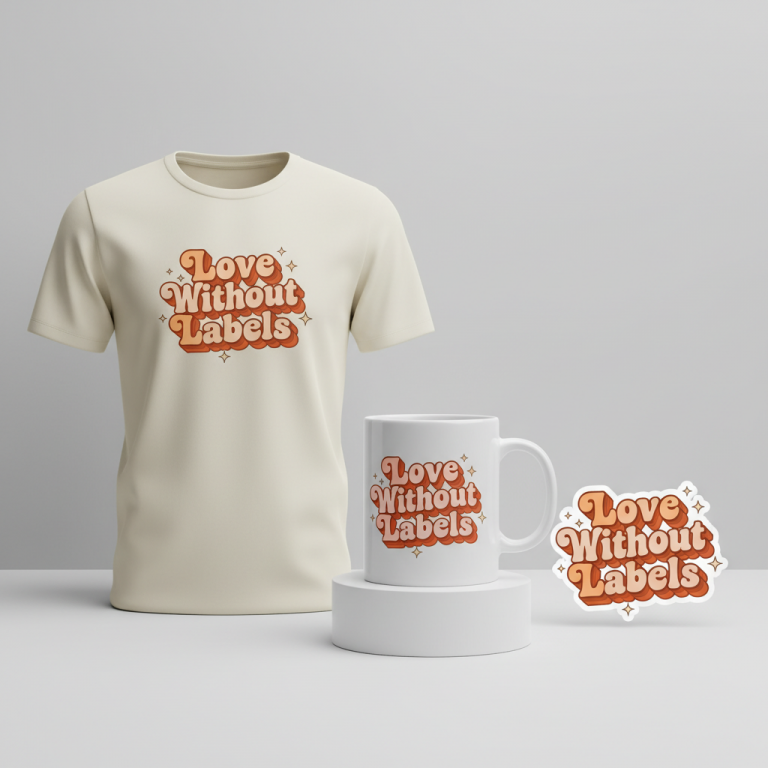
- 👕 Product Canvas: Light-colored apparel would serve as an ideal canvas for this design. The clean lines of the calligraphy and the vibrant red of the minimalist circle would pop beautifully against a white, natural, or light grey background. This choice enhances the design’s powerful simplicity, making it stand out without being overwhelming.
Strategic Market Insight
Targeting passionate supporters of the Japanese national football team with a design like this is a clever strategic move. The demographic is already engaged and looking for ways to express their loyalty and pride. By focusing on a universal, culturally resonant phrase like “不屈の精神,” this concept pivots away from specific intellectual property, such as player names or trademarked team nicknames like ‘Samurai Blue.’ This approach avoids potential IP pitfalls while still tapping into the core emotional triggers of national pride, perseverance, and admiration for athletic spirit. Fans are likely to be drawn to a message that embodies the collective soul of their team and nation, offering a timeless and profound connection that transcends individual players or temporary trends.
⚖️ Estimated Copyright Risk: LOW
Our Findings: Pivoted from the team’s official, trademarked nickname ‘サムライブルー’ (Samurai Blue) to ‘不屈の精神’ (Indomitable Spirit). This is a common and inspirational Japanese phrase (Yojijukugo) that is not the exclusive IP of the football association, making it safe to use.
Always verify intellectual property rights before listing.
Check Japan Trademark Search for “不屈の精神” ➔
AI Image Generation Prompts
The following prompts are optimized for leading generators to produce production-ready assets:
👕 Apparel / T-Shirt Prompt
A stunning, highly stylized vector illustration for a t-shirt print, depicting a modern interpretation of traditional Japanese calligraphy. The Japanese characters '不屈の精神' (Fukutsu no Seishin - Indomitable Spirit) are rendered in a dynamic, expressive shodo brushstroke style, vertically oriented with bold, sweeping lines and elegant, contained ink gestures. Each stroke possesses a meticulously clean, crisp vector edge, giving the appearance of perfectly rendered digital brushwork rather than a photo-realistic texture. Behind this powerful calligraphy is a minimalist, perfectly circular, solid red disc, reminiscent of the Japanese flag (Hinomaru red, vermilion), slightly offset to create subtle visual depth without sacrificing flatness. The red circle is a deep, rich, opaque matte vermilion, and the calligraphy is a stark, opaque matte black. The entire design is isolated on a solid Light background (off-white or very light grey), ensuring maximum printability and visual impact. The illustration features a clean, graphic design aesthetic with sharp contrasts, precise contours, and a sophisticated, simplified color palette. No gradients, no shadows, purely flat colors. The composition is balanced and powerful, embodying a blend of ancient artistry and contemporary graphic minimalism, suitable for high-quality screen printing. The aesthetic is flat, clean vector illustration style, with a strong graphic impact, print-ready quality, crisp edges, and a bold, elegant simplicity. The design is powerful, clean, and graphically strong, optimized for textile printing. The ONLY text allowed in the image is exactly '不屈の精神'. Absolutely NO other names, words, or random letters. --ar 3:4 --v 6.0
☕ Drinkware / Mug Prompt
A vibrant and clean graphic design perfectly suited for a panoramic coffee mug wrap, featuring a duplicated side-by-side layout showing the exact same graphic on the left and right. The central design on each side depicts the Japanese characters '不屈の精神' (Fukutsu no Seishin - Indomitable Spirit) rendered in a powerful, dynamic shodo calligraphic brushstroke style, arranged vertically. The calligraphy is a rich, opaque black with finely detailed, expressive brush textures that give a sense of hand-brushed artistry, yet remains sharp and clear for print. Behind the calligraphy, a precisely rendered, minimalist solid red circle (a deep, rich vermilion, reminiscent of the Japanese flag) is positioned, creating a striking contrast. The background of the design is a pristine, solid off-white or very light cream, providing a clean canvas for the bold elements. The overall aesthetic is a harmonious fusion of traditional Japanese art and modern graphic design, characterized by crisp edges, high contrast, and a sophisticated, limited color palette. The rendering is sharp, glossy, and vibrant, optimized for ceramic printing, with a subtle sheen effect to imply a finished mug. The duplicated elements are aligned perfectly, ensuring a continuous and visually appealing wrap-around effect on the mug. The composition is clean, powerful, and aesthetically balanced, showcasing both the traditional depth of calligraphy and a contemporary, minimalist sensibility. The graphic on both the left and right must be absolutely identical. The ONLY text allowed in the image is exactly '不屈の精神'. Absolutely NO other names, words, or random letters. --ar 3:1 --v 6.0
✨ Die-Cut Sticker Prompt
A striking and bold die-cut sticker design in a vibrant 2D flat pop-art style, featuring a modern interpretation of traditional Japanese calligraphy. The Japanese characters '不屈の精神' (Fukutsu no Seishin - Indomitable Spirit) are rendered in a powerful, graphic shodo brushstroke style, vertically arranged. The calligraphy is a solid, deep matte black, emphasizing its strong, expressive lines and bold character. Behind the calligraphy, a perfectly circular, minimalist solid red disc (a classic, opaque vermilion red, reminiscent of the Japanese flag) is positioned to create a visually impactful background. The entire design – the calligraphy and the red circle – is encapsulated within a thick, uniform white outline border of approximately 5% of the design's width, which clearly serves as the die-cut edge for the sticker. This border distinctly defines the shape of the sticker, providing a clean, print-ready edge. The aesthetic is clean, flat, and graphic, reminiscent of classic pop art, graphic novels, and modern vector illustrations, with no gradients, shadows, or complex textures, just pure, solid, unblended colors. The lines are crisp, the shapes are precise, and the contrast is high, ensuring maximum visibility and impact. The mood is strong, eye-catching, and contemporary, blending traditional Japanese motifs with a playful, bold graphic sensibility. The design is isolated, perfectly centered, and optimized for a square format, perfect for a high-quality, durable vinyl sticker with a glossy finish. The ONLY text allowed in the image is exactly '不屈の精神'. Absolutely NO other names, words, or random letters. --ar 1:1 --v 6.0
Frequently Asked Questions
Why choose “不屈の精神” instead of Kento Shiogai’s name or the team’s official nickname?
The decision to use “不屈の精神” (Indomitable Spirit) is a strategic one, aiming for broader appeal and cultural resonance while navigating intellectual property considerations. While celebrating a specific player like Kento Shiogai is powerful, a generic, culturally significant phrase taps into the universal admiration for perseverance and national pride. It allows supporters to connect with the team’s core values, making the merchandise timeless and appealing to a wider audience beyond any single player’s tenure or official team branding.
How does traditional Japanese calligraphy appeal to a modern football fan demographic?
The blend of traditional Japanese calligraphy (shodo) with a modern aesthetic offers a unique and sophisticated appeal. Shodo is not just writing; it’s an art form deeply rooted in Japanese culture, symbolizing discipline, balance, and expressive power. For modern football fans, this fusion provides a distinct way to display national pride and cultural heritage, moving beyond typical sports merchandise. It speaks to a sense of identity and appreciation for art, making the product both stylish and meaningful.
Why are light-colored apparel items recommended for this specific design concept?
Light-colored apparel, such as white, natural, or light grey t-shirts or hoodies, provides an optimal canvas for this particular design. The clean, dynamic black calligraphy and the minimalist red circle are intended to stand out with clarity and impact. On a lighter background, the contrast is stark and powerful, emphasizing the artistry of the brushstrokes and the iconic simplicity of the red circle. This choice ensures the design feels fresh, modern, and visually striking, allowing the “Indomitable Spirit” to truly shine.
Final Thoughts
The potential for e-commerce success within this niche, leveraging the excitement around figures like Kento Shiogai and the deep cultural meaning of “不屈の精神,” is significant. By understanding the pulse of pop culture and skillfully applying thoughtful design principles, print-on-demand creators can tap into passionate fan bases. The key lies in not just identifying trends but in interpreting them through a creative, culturally aware lens that offers unique and meaningful products. Remember, while these concepts provide a solid starting point, the ultimate success often comes down to individual execution, quality, and a personal artistic spin.
💬 What’s Your Take?
Art is subjective, and this is just one angle! How would you spin this “塩貝健人 (Kento Shiogai)” trend? Drop your design ideas and let’s brainstorm in the comments below!