
公安対魔特異課 – Public Safety Devil Extermination Special Division
Japan is currently buzzing with the announcement of ‘Chainsaw Man – The Movie: Reze Arc’ and its climactic final stage greeting event, sending ripples of excitement through the nation’s fervent fan base. This isn’t just another anime update; it’s a cultural moment for a series that has redefined dark fantasy and captured millions of imaginations with its raw, unapologetic storytelling and unforgettable characters. The anticipation around the movie has reignited discussions and passion for Tatsuki Fujimoto’s unique world, creating a prime window for merchandise that truly understands its audience.
The Cultural Significance
The world of Chainsaw Man, with its stark portrayal of devil hunters, complex moral ambiguities, and profoundly human characters, has become a cornerstone of modern pop culture, especially within Japan. Its gritty aesthetic and psychological depth resonate far beyond typical shonen narratives. The series, whether in manga or anime form, has consistently pushed boundaries, earning it a devoted following that values its originality and intensity. The ‘Reze Arc’ is particularly beloved, known for its emotional weight and thrilling action, making the film adaptation a highly anticipated event. This movie announcement isn’t just news; it’s a celebratory moment for fans, a chance to revisit one of the series’ most impactful storylines, and a powerful catalyst for a renewed wave of enthusiasm across social media and fan communities.
Design Brainstorm: Capturing the Aesthetic
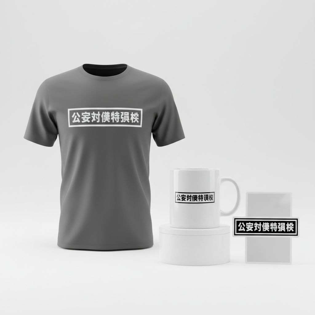
When approaching merchandise for a series with such a distinct identity, one angle to consider is a subtle, insider-baseball approach that speaks volumes to those in the know. Instead of overt character designs or logos, a sophisticated nod to the series’ lore can create a powerful connection. Here’s a look at how a minimalist concept could translate effectively:
- 🎨 Visual Concept: The core idea revolves around a minimalist, text-only design. Imagine the stark, authoritative aesthetic of an official government warning label or a public safety notice. This isn’t about flashy graphics; it’s about conveying a sense of officialdom, slight menace, and immediate recognition through pure typography. The lack of images or elaborate graphics makes it clean, bold, and intentionally understated, hinting at the bureaucratic yet deadly world of devil hunting.
- ✍️ Typography Ideas: The chosen text, “公安対魔特異課” (Kōan Tai Ma Tokuika), which translates to the “Public Safety Devil Hunters Special Division,” is key. This phrase is instantly recognizable to fans as the organization Denji works for. The font itself would ideally be a strong, sans-serif Japanese typeface – something clean, bold, and functional, mimicking official signage. This strategic choice avoids direct use of the series title or character names, cleverly sidestepping common copyright pitfalls while delivering a potent inside reference that only true fans will appreciate.
- 👕 Product Canvas: To truly enhance the authoritative and somewhat ominous feel of the design, dark apparel serves as the ideal canvas. Think black, charcoal grey, or deep navy t-shirts, hoodies, or long-sleeved tops. The bold, light-colored Japanese text (perhaps white or a subtle light grey) against a dark background would pop, creating a stark contrast that reinforces the “official notice” aesthetic and gives the item a premium, streetwear-inspired vibe.
Strategic Market Insight
This design targets a very specific, yet incredibly passionate, demographic: the dedicated fans of the ‘Chainsaw Man’ manga and anime. The psychological triggers at play here are multifaceted. Firstly, there’s the ‘if you know, you know’ exclusivity. Wearing a design like this is a subtle badge of honor, signaling membership in a discerning fan community without being overtly commercial. It appeals to those who appreciate understated references over blatant branding. Secondly, by referencing an in-universe organization rather than direct IP, the design offers an “evergreen” quality, remaining relevant long after specific arcs or seasons conclude. This approach also smartly navigates copyright concerns, making it a safe yet impactful option for creators. Buyers are not just purchasing a piece of clothing; they’re acquiring a piece of their fandom that feels authentic, clever, and securely outside the realm of generic fan merchandise.
⚖️ Estimated Copyright Risk: MEDIUM
Copyright Evaluation: The phrase is directly from the source material, which carries an inherent risk. However, it is not the main title of the series and is presented in a generic, text-only format that could be interpreted as a general statement rather than a direct reference to a specific copyrighted work. This ambiguity lowers the risk compared to using the main title or character art, but it’s not zero.
Always verify intellectual property rights before listing.
Check Japan Trademark Search for “チェンソーマン” ➔
AI Image Generation Prompts
The following prompts are optimized for leading generators to produce production-ready assets:
👕 Apparel / T-Shirt Prompt
A stark, high-contrast digital vector illustration optimized for a t-shirt print, isolated on a solid Dark background, specifically a deep matte charcoal or midnight blue. The design features the Japanese text '公安対魔特異課' rendered in an exceptionally bold, wide, sans-serif Japanese typeface, similar to a custom 'Impact' or 'Bebas Neue' equivalent, with uniform, thick white stroke weights for maximum visibility. The characters are perfectly kerned and aligned, forming a compact, immovable block of text that occupies the central visual space. The art style is a clean vector illustration, influenced by brutalist graphic design, mid-century Japanese public safety notices, and emergency broadcast system graphics, emphasizing absolute clarity and print readiness. The rendering is flat, 2D, and entirely devoid of any depth, shading, texture, gradients, or reflectivity. Edges are razor-sharp, pixel-perfect, and mathematically precise, giving the impression of an expertly silkscreened or vinyl-cut graphic. The overall mood is authoritative, serious, urgent, and official, conveying a powerful and unmistakable message. The composition is strictly centered and balanced, designed for immediate visual impact and universal recognition. The white text pops dramatically against the dark, uniform background, ensuring legibility and a striking aesthetic. The ONLY text allowed in the image is exactly '公安対魔特異課'. Absolutely NO other names, words, or random letters. --ar 3:4 --v 6.0
🔍 Search this niche on:
☕ Drinkware / Mug Prompt
A seamless, high-resolution digital vector graphic designed for a coffee mug wrap layout. The central design features the Japanese text '公安対魔特異課' rendered in an ultra-bold, condensed sans-serif Japanese typeface (reminiscent of a heavy-weight Helvetica or Futura, but in Japanese characters), in solid, opaque black, perfectly formed with sharp terminal edges. This core text graphic is duplicated side-by-side, showing the exact same graphic on the left and right, designed perfectly for a panoramic mug wrap. Each instance of the graphic is centered within its half of the horizontal frame. The background for the graphic itself is a pure, uniform, solid white, providing maximum contrast and legibility for the black text. The art style is clean, utilitarian, and uncompromising, inspired by standardized public safety signage and functional industrial labels, ensuring readability from any angle. The rendering is strictly flat, 2D, with no illusion of depth, shadows, textures, or gradients. Lines are razor-sharp and precise, appearing as a high-fidelity digital print ready for sublimation or decal application on ceramic. The duplicated layout creates a continuous, rhythmic visual, reinforcing the official 'notice' aspect, with no visible seams or interruptions in style between the two instances. The mood is one of official seriousness and functional efficiency, clear and impactful for daily use. The ONLY text allowed in the image is exactly '公安対魔特異課'. Absolutely NO other names, words, or random letters. --ar 3:1 --v 6.0
🔍 Search this niche on:
✨ Die-Cut Sticker Prompt
A vibrant, graphic, 2D flat pop-art style design optimized for a die-cut sticker. The central element is the Japanese text '公安対魔特異課', presented in an exceptionally thick, heavy, block-style sans-serif Japanese font (like a super-bold 'Impact' or 'Gotham Black' equivalent) with perfect geometric precision. The characters are solid black, uniform in weight, and perfectly kerned for maximum legibility and visual weight, forming an impactful and unmissable block. A meticulously rendered, uniform thick white outline border surrounds the entire black text design, precisely following its contours, creating a distinct, cut-ready appearance. This border is substantial, ensuring it stands out clearly as a die-cut edge. The art style draws influence from classic screen-printed posters, vintage Japanese comic book typography, and clean street art stencils, but with a modern, refined edge. The rendering is absolute flatness, with sharp vector edges, as if cut from colored vinyl or printed with perfectly opaque ink. There are no gradients, no shading, no textures – just pure, unadulterated color blocking. The design is completely isolated, with no background elements, allowing the sticker to pop. The mood is energetic, direct, and slightly rebellious, while still maintaining the official 'warning' aesthetic, making it highly eye-catching and collectible. The composition is centrally balanced within the square aspect ratio, maximizing the presence of the text and its distinctive border. The ONLY text allowed in the image is exactly '公安対魔特異課'. Absolutely NO other names, words, or random letters. --ar 1:1 --v 6.0
🔍 Search this niche on:
Frequently Asked Questions
Why choose “公安対魔特異課” over more obvious Chainsaw Man references?
The choice to feature “公安対魔特異課” (Public Safety Devil Hunters Special Division) is a strategic one, appealing to a more discerning fan. It functions as an “inside joke” or a subtle nod that only true enthusiasts will recognize, fostering a sense of shared identity and exclusivity. More practically, it’s a clever way to avoid direct copyright infringement on the series’ title or character names, offering a safe yet deeply resonant option for merchandise that still connects powerfully with the fan base.
What makes the “government warning label” aesthetic so effective for Chainsaw Man fans?
The “government warning label” aesthetic perfectly mirrors the bureaucratic, dangerous, and often grim world of Public Safety Devil Hunters within Chainsaw Man. It adds an authentic, in-universe feel that resonates with the series’ tone. This style also creates intrigue; it’s minimalist yet impactful, hinting at the underlying authority and peril without needing explicit imagery, allowing the design to stand out as sophisticated and true to the series’ unique atmosphere.
What kind of fan is this design primarily aimed at?
This design is ideal for the dedicated Chainsaw Man fan who appreciates subtlety, cleverness, and a unique take on their favorite series. It’s for those who prefer an understated style that speaks volumes to fellow fans, rather than loud, overt branding. It caters to individuals who enjoy showcasing their fandom in a more mature, conceptual way, and who appreciate designs that feel like a piece of the story world itself.
Final Thoughts
The renewed surge of interest in Chainsaw Man, particularly in Japan, presents a dynamic opportunity for merchandise creators. By understanding the cultural currents and employing smart design strategies like this “Public Safety Devil Hunters” concept, one can tap into a deeply passionate market. The key lies in creating items that resonate with authenticity, offer a sense of insider recognition, and cleverly navigate the complexities of intellectual property. Success in this exciting niche will ultimately come down to thoughtful execution and a keen appreciation for the unique spirit of the series itself.
💬 What’s Your Take?
Art is subjective, and this is just one angle! How would you spin this “チェンソーマン (Chainsaw Man)” trend? Did we miss the mark, or is there a better inside joke to use here? Drop your design ideas and let’s brainstorm in the comments below!