
刑事ドラマ中毒 – Detective Drama Addict
Japan is abuzz with excitement as veteran actress Yuki Saito prepares to grace screens once more, starring in the highly anticipated new television drama, ‘夫婦別姓刑事’ (Detective with a Different Last Name). This announcement has sent ripples through the entertainment world, reigniting discussions around enduring genre appeal and the enduring star power of Saito herself, making it a prime moment for pop culture merchandise that cleverly taps into this renewed public interest.
The Cultural Significance
The anticipation surrounding Yuki Saito’s role in ‘夫婦別姓刑事’ is multifaceted. As a seasoned actress, Saito brings a significant following and a sense of gravitas to any project. Her involvement alone is enough to capture headlines. Beyond the star power, the drama itself dives into the perennially popular ‘keiji dorama’ – Japanese detective drama – genre. This is a beloved staple in Japanese television, known for its gripping narratives, intricate mysteries, and often iconic characters. The specific title, ‘夫婦別姓刑事’, also hints at contemporary social themes, adding another layer of intrigue and potentially sparking conversations that extend beyond the screen. This blend of a beloved star, a classic genre, and a touch of modern relevance creates a powerful cultural moment ripe for creative expression.
Design Brainstorm: Capturing the Aesthetic
Translating this cultural moment into compelling merchandise involves a nuanced approach, blending nostalgia with a contemporary edge. The core concept here aims to evoke the thrilling atmosphere of a classic detective story while leaning into a popular aesthetic.
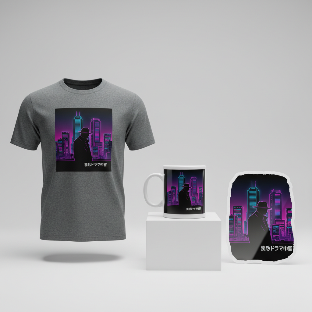
- 🎨 Visual Concept: One angle to consider is a striking retro 80s city pop aesthetic. This could translate well to a design featuring a dramatic silhouette of a trench-coat clad detective, perhaps caught mid-stride or standing vigil. This figure would be set against a stylized, neon-lit cityscape, strongly reminiscent of Tokyo at night. The color palette would be crucial here, focusing on vibrant purples, electric pinks, and cool blues, all popping against a dark background to enhance the neon glow effect. This visual not only captures the ‘mystery’ element but also appeals to the widespread appreciation for 80s Japanese aesthetics.
- ✍️ Typography Ideas: Complementing the visual, the Japanese text “刑事ドラマ中毒” (Keiji Dorama Chūdoku), which translates to “Detective Drama Addict,” offers a direct and relatable message to the target audience. For typography, a font that echoes the 80s digital or slightly futuristic vibe would pair perfectly with the city pop aesthetic, perhaps a clean sans-serif with subtle electronic hints, or even a bold, slightly condensed look that feels both retro and modern. The placement of the text could be integrated seamlessly into the neon lights of the city or positioned boldly above or below the silhouette.
- 👕 Product Canvas: Given the vibrant neon colors and dark background proposed for the design, dark apparel serves as the ideal canvas. This ensures the neon elements truly stand out and achieve their intended glow. Black t-shirts, hoodies, or even long-sleeve tees would provide a fantastic base, allowing the design to pop and create a strong visual statement.
Strategic Market Insight
Targeting fans of Japanese detective dramas is a highly strategic move. This demographic is passionate, dedicated, and often seeks ways to express their interests subtly and stylishly. The design’s brilliance lies in its ability to appeal directly to this group without infringing on any intellectual property. By focusing on the broader ‘keiji dorama’ genre rather than specific show titles or character names, it smartly navigates copyright concerns. The retro 80s city pop aesthetic taps into a powerful wave of nostalgia and a widely appreciated design trend, making the merchandise appealing even beyond the most ardent drama fans. The phrase “刑事ドラマ中毒” creates an instant connection, fostering a sense of shared identity and playful self-recognition among buyers. This isn’t just a design; it’s a badge of honor for those who live for the next thrilling case, offering a psychological trigger for purchase rooted in belonging and authentic self-expression.
⚖️ Estimated Copyright Risk: LOW
Risk Assessment: This design is low risk because it avoids all specific, copyrighted intellectual property. The actress’s name and the show’s title are not used. The phrase ‘刑事ドラマ中毒’ (Detective Drama Addict) is a common, generic fan expression, similar to saying ‘Sci-Fi Nerd’ and is not trademarked. The visual elements are common tropes of the detective genre and 80s aesthetic, not direct copies of any existing artwork.
Always verify intellectual property rights before listing.
Check Japan Trademark Search for “斉藤由貴” ➔
AI Image Generation Prompts
The following prompts are optimized for leading generators to produce production-ready assets:
👕 Apparel / T-Shirt Prompt
A clean, graphic vector illustration optimized for a t-shirt print. The design features a striking silhouette of a classic 80s trench coat detective (fedora hat, collar up, mysterious stance) set against a stylized, neon-lit city skyline. The cityscape is distinctly reminiscent of Tokyo at night, rendered with simplified geometric forms, sharp angles, and layered buildings, evoking an 80s retro anime or OVA aesthetic (e.g., Bubblegum Crisis or early Akira background art). The color palette is dominated by vibrant purples (magenta, violet, electric lavender), intense fuchsia pinks, and cool electric blues (cyan, synthwave blue), all set against a deep, solid dark background (black or very dark indigo). The neon lights within the city glow with a flat, illustrative effect, casting a strong, graphic backlight on the detective's silhouette. The overall rendering is ultra-crisp, with precise linework, smooth gradients for the neon elements, and perfectly flat color blocks. There is absolutely no grunge, noise, or distressed texture; the finish is polished and digital-perfect. The mood is sleek, mysterious, nostalgic, and undeniably cool, with an urban-futuristic energy. The design is isolated on a solid Dark background, clean vector illustration style, ensuring it pops on apparel. The text '刑事ドラマ中毒' is integrated seamlessly into the design, rendered in a bold, retro-futuristic font, glowing with a neon effect, perhaps as a stylized sign within the cityscape or a central graphic element. The ONLY text allowed in the image is exactly '刑事ドラマ中毒'. Absolutely NO other names, words, or random letters. --ar 3:4 --v 6.0
🔍 Search this niche on:
☕ Drinkware / Mug Prompt
A high-resolution digital painting designed as a panoramic wrap for a coffee mug. The composition features a duplicated side-by-side layout showing the exact same graphic on the left and right, designed perfectly for a panoramic mug wrap. The scene depicts a highly atmospheric, semi-realistic yet stylized 80s city pop aesthetic. A detailed silhouette of a mysterious detective (trench coat, fedora, perhaps a subtle hint of a cigarette smoke) stands on a wet, reflective street, looking out over a densely packed Tokyo skyline at night. The cityscape is intricate, with towering skyscrapers, visible windows, and a multitude of glowing, multi-colored neon signs in Japanese script (generic, not the specific required text), creating a deep sense of urban detail. The color palette is rich and saturated, featuring deep purples (ultraviolet, royal purple), vivid fuchsia pinks, electric blues (cerulean, neon blue), interspersed with contrasting warm oranges, yellows, and reds from the elaborate neon signage and streetlights. The lighting is dramatic and cinematic, with strong chiaroscuro effects, volumetric light rays cutting through a subtle atmospheric haze or mist, and brilliant reflections on the wet street surfaces. The detective silhouette is powerfully backlit by the city's glow. Textures include the slick wetness of the street, the metallic sheen of buildings, and a subtle film grain overlay to enhance the retro-cinematic mood. The overall mood is immersive, brooding, mysterious, and evokes a futuristic nostalgia, reminiscent of 80s album art. The text '刑事ドラマ中毒' is artfully integrated as a prominent, glowing neon sign within the cityscape itself, rendered in a stylized retro-futuristic Japanese font. The ONLY text allowed in the image is exactly '刑事ドラマ中毒'. Absolutely NO other names, words, or random letters. --ar 3:1 --v 6.0
🔍 Search this niche on:
✨ Die-Cut Sticker Prompt
A bold, graphic 2D flat pop-art illustration optimized for a die-cut sticker, featuring a thick white outline border around the entire design. The central motif is a highly stylized silhouette of a classic 80s detective in a trench coat and fedora, rendered with clean, sharp lines and minimal detail, emphasizing iconic form. Behind the detective, a geometrically simplified Tokyo cityscape at night is depicted, composed of abstract, stacked shapes and bold outlines representing skyscrapers, all glowing with illustrative neon effects. The color palette is high-contrast and impactful, utilizing saturated electric purples, hot pinks, and bright blues (cyan), set against a solid deep black background. The glow from the neon city is represented by bright color outlines or distinct color shifts within the flat design, rather than realistic volumetric lighting. There is no shading or complex gradients, only solid, vibrant color blocks. The finish is perfectly smooth, flat, and digital-glossy, ideal for a sticker. The mood is energetic, playful, iconic, and retro-cool, designed for immediate visual punch. The text '刑事ドラマ中毒' is prominently displayed within the design, rendered in a bold, angular, retro-futuristic font, possibly with a bright outline to simulate a neon glow, and is also encompassed by the thick white border of the sticker. The ONLY text allowed in the image is exactly '刑事ドラマ中毒'. Absolutely NO other names, words, or random letters. --ar 1:1 --v 6.0
🔍 Search this niche on:
Frequently Asked Questions
Why choose a retro 80s city pop aesthetic for merchandise inspired by a current drama?
The retro 80s city pop aesthetic offers a timeless, cool vibe that resonates strongly with current trends, particularly in Japan and globally. While the drama itself is new, this style evokes a sense of nostalgia for classic Japanese pop culture, detective stories, and urban landscapes. It provides a stylish, evergreen visual language that attracts a wide audience, blending current interest with nostalgic appeal, and elevates the design beyond just a single show.
How does “刑事ドラマ中毒” resonate with the target Japanese audience?
“刑事ドラマ中毒” directly translates to “Detective Drama Addict.” This phrase is instantly recognizable and deeply relatable to dedicated fans of the genre in Japan. It’s a playful, self-deprecating, yet proud way for enthusiasts to identify themselves. The authenticity of the Japanese text ensures it speaks directly to the intended market, fostering a strong sense of connection and making the merchandise feel incredibly personal and authentic to their passion.
What makes this design concept IP-safe, despite being inspired by a trending topic and a famous actress?
The design cleverly sidesteps intellectual property concerns by focusing on the generic elements of the ‘keiji dorama’ genre rather than specific copyrighted material. It avoids using Yuki Saito’s name, the drama’s title, or any direct visual representations of characters from the show. Instead, it utilizes widely recognized tropes—a detective silhouette, a neon cityscape—and a general, relatable phrase for fans (“Detective Drama Addict”). This strategy ensures the merchandise is inspired by the cultural moment but completely independent of any protected works, making it a legally sound approach.
Final Thoughts
The excitement surrounding Yuki Saito and ‘夫婦別姓刑事’ presents a fascinating opportunity within the print-on-demand landscape. By strategically pivoting from direct show-related content to a broader, IP-safe celebration of the detective drama genre and a beloved aesthetic, creative designers can tap into a highly engaged audience. This approach demonstrates how a keen eye for cultural trends, combined with smart design choices and an understanding of market psychology, can unlock significant e-commerce potential. Ultimately, success will hinge on the quality of execution and the unique spin each designer brings to these compelling ideas.
💬 What’s Your Take?
Art is subjective, and this is just one angle! How would you spin this “斉藤由貴 (Yuki Saito)” trend? Did we miss the mark, or is there a better inside joke to use here? Drop your design ideas and let’s brainstorm in the comments below!
