
声優しか勝たん – Only Seiyuu Can Win / Seiyuu Are The Best
Japan is currently buzzing with excitement surrounding one of its most beloved entertainment figures. The reason for the recent surge in chatter and trending topics can often be traced back to a fresh anime role, a highly anticipated music release, or even a prominent public appearance from a star whose talent resonates deeply across the nation. When such an event unfolds, it doesn’t just create headlines; it ignites the passionate fan bases that form the very backbone of Japan’s vibrant pop culture landscape, setting the stage for unique expressions of admiration.
The Cultural Significance
The individual at the heart of this particular trend is a titan in her field: a celebrated voice actress whose work has graced countless anime series and film projects, captivating audiences with her versatile vocal performances. Beyond the recording booth, her singing career has also garnered a dedicated following, adding another layer to her widespread appeal. In Japan, voice actors, or “seiyuu,” are stars in their own right, often achieving celebrity status comparable to mainstream actors or musicians. Their ability to bring animated characters to life creates a profound connection with fans, fostering a culture of deep appreciation and loyalty. When a figure of this caliber makes waves, it’s not just about her latest project; it’s a celebration of the entire seiyuu industry and the irreplaceable role it plays in Japanese entertainment, sparking conversations among fans eager to express their devotion.
Design Brainstorm: Capturing the Aesthetic
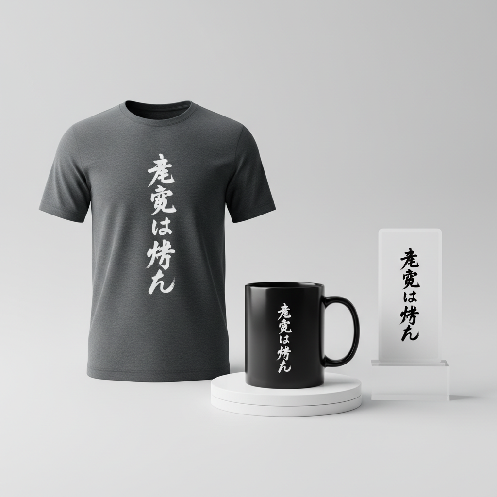
Translating this fervent admiration into a compelling merchandise design requires a thoughtful approach, one that respects the cultural context and speaks directly to the target audience. One promising avenue is a text-centric design that cleverly bypasses direct celebrity IP, focusing instead on the broader appreciation for the craft.
- 🎨 Visual Concept: The core of this visual concept revolves around the power and elegance of Japanese calligraphy. Imagine a design where the characters themselves become the art form, arranged vertically in a single, impactful line. This traditional orientation instantly evokes a sense of authentic Japanese aesthetic, while the clean, minimalist layout ensures a modern appeal.
- ✍️ Typography Ideas: The chosen text, “声優しか勝たん” (Seiyuu shika katan), is a brilliant pivot. “Seiyuu” is the generic term for voice actor, making the design universally applicable to the fan base. The phrase “…しか勝たん” is contemporary Japanese slang, a popular way for fans to express ultimate favoritism – essentially, “Only [X] is the best” or “[X] reigns supreme.” The typography itself could be a stylish, slightly brushy font. This choice would bridge traditional Japanese artistry with a fresh, youthful sensibility, making the message feel both authentic and current to those in the know.
- 👕 Product Canvas: For this particular design concept, the ideal product canvas would be dark apparel. Imagine the striking contrast of a lighter, perhaps subtly textured, Japanese text against the deep backdrop of a black, charcoal, or deep navy t-shirt, hoodie, or even a tote bag. This provides a strong, bold statement that allows the elegant typography to truly stand out.
Strategic Market Insight
The genius of this design concept lies in its strategic market targeting. While the initial trending event might be tied to a specific celebrity, directly using their name or likeness carries significant copyright risks. By shifting focus to “seiyuu” (voice actor) and pairing it with the popular fan slang “しか勝たん” (shika katan), the design transforms into a safe, evergreen expression of fandom. This isn’t just about avoiding legal pitfalls; it’s about tapping into a broader, yet incredibly passionate, demographic: anime fans who hold the entire voice acting profession in high esteem. The phrase “声優しか勝たん” acts as an insider nod, a badge of honor for those who truly understand and appreciate the art form. It triggers a psychological connection, allowing fans to proudly display their allegiance to the craft and culture of voice acting, rather than just a single individual. This specificity makes it highly attractive to a niche that values authenticity and shared cultural references, driving potential purchases from a deeply engaged audience.
⚖️ Estimated Copyright Risk: LOW
Our Findings: The design uses a generic term, ‘Seiyuu’ (声優), meaning voice actor, and a popular, non-trademarked slang phrase. It does not use Kana Hanazawa’s name or any specific character she has voiced. The risk is low because it targets the profession and the fan culture surrounding it, not a copyrighted individual.
Always verify intellectual property rights before listing.
Check Japan Trademark Search for “花澤香菜” ➔
AI Image Generation Prompts
The following prompts are optimized for leading generators to produce production-ready assets:
👕 Apparel / T-Shirt Prompt
A bold, modern Japanese typography design for a t-shirt print, isolated on a solid dark charcoal background. The core element is the Japanese phrase '声優しか勝たん' arranged vertically in a single, elegant line. The characters are rendered in a stylish, slightly brushy yet refined sans-serif font, possessing a dynamic flow that suggests both traditional calligraphy and contemporary graphic design. The strokes are sharp and clean, with subtle ink-brush textures simulated for an authentic, artisan feel without compromising vector crispness. Each character is perfectly formed, with precise negative space and an underlying grid structure ensuring perfect alignment and readability. The color palette is vibrant and striking: the characters glow with a luminescent electric blue fading into a subtle purple at the stroke edges, creating a neon-sign effect against the deep dark background. There's a subtle, soft inner shadow and a clean outer glow around the characters, adding depth and making them pop dramatically. This is a clean vector illustration style, characterized by smooth Bezier curves, sharp edges, and meticulous attention to typographic detail. The rendering is incredibly precise, showcasing a highly polished, professional graphic. The mood is cool, confident, and energetic, appealing to fans with a dedicated passion. High resolution, print-ready quality. The ONLY text allowed in the image is exactly '声優しか勝たん'. Absolutely NO other names, words, or random letters. --ar 3:4 --v 6.0
🔍 Search this niche on:
☕ Drinkware / Mug Prompt
A panoramic coffee mug wrap layout featuring a dynamic, text-focused Japanese design. A duplicated side-by-side layout showing the exact same graphic on the left and right, designed perfectly for a panoramic mug wrap. The central design element is the Japanese phrase '声優しか勝たん' rendered vertically in a single, expressive column. The typography adopts a stylish, moderately brushy, modern script font, balancing classic calligraphic grace with sharp, contemporary flair. The characters exhibit a rich, deep crimson red, outlined by a thin, glowing gold metallic border, reminiscent of traditional Japanese lacquerware but with a sleek, futuristic edge. Subtle gradients within the red strokes give a sense of polished ceramic or enamel. The background for the text is a subtle, mottled off-white parchment texture with very faint, almost invisible, Japanese wave patterns subtly embossed, giving it depth without distracting from the text. The overall aesthetic is elegant, artistic, and sophisticated, with a slightly understated intensity. The lighting is soft and even, highlighting the textural nuances and metallic sheen. This is a high-resolution, vibrant graphic designed for seamless wrap-around application. The ONLY text allowed in the image is exactly '声優しか勝たん'. Absolutely NO other names, words, or random letters. --ar 3:1 --v 6.0
🔍 Search this niche on:
✨ Die-Cut Sticker Prompt
A playful, vibrant die-cut sticker design featuring the Japanese text '声優しか勝たん'. The characters are arranged vertically in a single, bold line, rendered in a stylish, slightly brushy, chunky font that maintains excellent legibility while conveying a modern, artistic energy. The typography has a distinct 2D flat pop-art style, with crisp, clean lines and solid, unshaded colors. The characters are a bright, cheerful magenta, layered over a slightly larger, solid cyan shadow layer, creating a striking retro 3D effect. The entire design, including the characters and their cyan shadow, is encapsulated by a thick, clean white outline border, perfectly suited for die-cutting. The background within the sticker design (behind the text, but within the white border) is a subtle, halftone dot pattern in a very light grey, adding a classic pop-art texture without competing with the bold typography. The overall mood is energetic, fun, and eye-catching. The rendering is sharp, graphic, and perfectly flat, ensuring maximum visibility and impact as a sticker. The ONLY text allowed in the image is exactly '声優しか勝たん'. Absolutely NO other names, words, or random letters. --ar 1:1 --v 6.0
🔍 Search this niche on:
Frequently Asked Questions
Why focus on “seiyuu” generally instead of the trending celebrity specifically?
While a specific celebrity might trigger a trend, direct use of their name or image on merchandise often infringes on intellectual property rights. By pivoting to the generic, yet culturally significant, term “seiyuu” (voice actor), the design becomes legally safe and broadens its appeal to all fans who admire the profession, creating an evergreen product rather than one tied to a single moment or individual.
What makes “しか勝たん” such an effective phrase for this demographic?
“しか勝たん” is a popular, modern Japanese slang phrase used by fans to express fervent admiration, essentially meaning “only [X] is the best” or “[X] reigns supreme.” Its use demonstrates an understanding of contemporary Japanese fan culture, creating an immediate, strong connection with the target audience. It’s an insider phrase that speaks directly to shared passion and identity.
Are there other design elements that could complement this text-based approach?
While the strength of this concept is its minimalist, text-focused elegance, subtle complementary elements could be explored. Perhaps a very faint, abstract pattern in the background that evokes sound waves or traditional Japanese motifs, or even a small, discreet signature-style stamp. However, the core power of “声優しか勝たん” should remain the dominant visual, ensuring clarity and impact on a dark apparel canvas.
Final Thoughts
The world of e-commerce and pop culture is constantly evolving, but the enduring passion of fan bases remains a powerful constant. This design concept, born from a specific moment of cultural buzz in Japan, exemplifies how a deep understanding of audience, cultural nuances, and strategic design choices can unlock significant market potential. By transforming a fleeting trend into an evergreen celebration of “seiyuu” culture with an authentic, contemporary message, designers can create merchandise that resonates deeply. Ultimately, success in this niche will hinge on meticulous execution, quality production, and the unique personal spin each creator brings to these compelling cultural insights.
💬 What’s Your Take?
Art is subjective, and this is just one angle! How would you spin this “花澤香菜 (Kana Hanazawa)” trend? Did we miss the mark, or is there a better inside joke to use here? Drop your design ideas and let’s brainstorm in the comments below!