宇都宮餃子愛 – Utsunomiya Gyoza Love
Utsunomiya City, nestled in Japan’s Tochigi Prefecture, has recently found itself in the spotlight. While the city navigates a period of significant attention, it’s a perfect moment to celebrate one of its most universally beloved and delicious claims to fame: gyoza. This culinary icon offers a fantastic opportunity for print-on-demand designers to tap into strong local pride and a widespread love for Japanese cuisine, creating evergreen merchandise that resonates deeply with residents and food enthusiasts alike.
The Cultural Significance
Utsunomiya isn’t just a city; it’s a destination synonymous with culinary excellence, specifically its legendary gyoza. For decades, it has proudly held the title of Japan’s “Gyoza Capital,” drawing foodies from across the nation and beyond. This isn’t just about a dish; it’s about a cornerstone of local identity, a source of immense community pride, and a delicious tradition passed down through generations. When residents think of Utsunomiya, the aroma of sizzling gyoza often comes to mind. Tapping into this powerful sense of local pride and culinary heritage provides a positive, joyful, and highly resonant theme for merchandise, allowing people to wear their love for their city and its most famous delicacy.
Design Brainstorm: Capturing the Aesthetic
The goal is to evoke nostalgia, warmth, and culinary delight, transforming a simple dish into a vibrant emblem of Utsunomiya. One compelling approach could involve a design that feels both classic and charmingly modern.
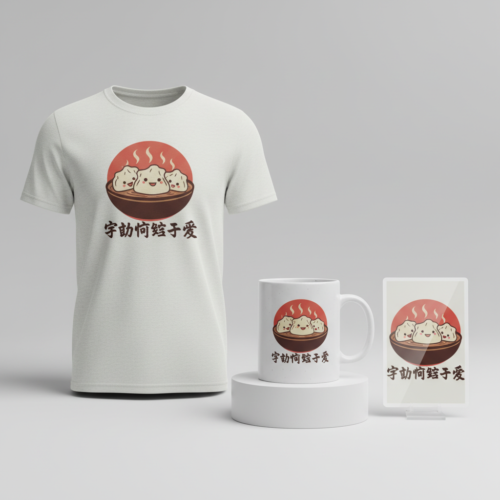
- 🎨 Visual Concept: Imagine a Japanese retro-style travel poster, rich with an inviting sense of bygone eras. At its heart, a stylized, almost cartoonish illustration of three plump gyoza dumplings sits steaming in a traditional bowl, hinting at their irresistible warmth. Behind this delectable scene, a vibrant red sun element, subtly reminiscent of the Japanese national flag, could rise, adding a touch of national identity and visual pop. The overall aesthetic aims for a blend of playful charm and respectful homage to Japanese art.
- ✍️ Typography Ideas: To complement the retro poster feel, a vintage Japanese-style font with a distinct, yet subtle, brush-stroke effect would be ideal. This could lend an authentic, hand-crafted feel to the text. The phrase “宇都宮餃子愛” (Utsunomiya Gyoza Love) rendered in such a font would not only be visually appealing but also a direct and heartfelt declaration of affection for the city’s signature dish, instantly recognizable and relatable to the target audience.
- 👕 Product Canvas: Given the vibrant yet muted color palette of reds, creams, and dark browns, light-colored apparel such as crisp white t-shirts, cream hoodies, or light grey long-sleeves would allow the design to truly pop. A lighter background ensures the retro details and warm colors stand out beautifully, making the gyoza the undeniable star of the show.
Strategic Market Insight
This design concept strategically leverages a deeply positive and evergreen aspect of Utsunomiya’s identity: its world-renowned gyoza. While current events may bring temporary attention to the city, focusing on its iconic culinary heritage provides a stable, joyful, and ethically sound foundation for merchandise. The target demographic is two-fold: proud residents of Utsunomiya who wish to display their local allegiance and Japanese food lovers globally who appreciate authentic regional cuisine. The psychological trigger here is powerful – it’s about expressing pride, sharing a passion, and connecting with a cultural touchstone. For locals, it’s a badge of honor; for food enthusiasts, it’s a celebration of delicious discovery. This pivot ensures the merchandise is not only highly relevant but also universally appealing and enduring, completely sidestepping any sensitive topics while still being intrinsically linked to the city’s profile.
⚖️ Estimated Copyright Risk: LOW
Our Findings: The design focuses on a city’s public identity and its most famous food, gyoza. The name of a city and a type of food are not copyrightable. The phrase ‘Utsunomiya Gyoza Love’ is a simple statement of affection and not a trademarked slogan. This is a classic ‘Local Pride’ design, which is a very low-risk category.
Always verify intellectual property rights before listing.
Check Japan Trademark Search for “宇都宮市” ➔
AI Image Generation Prompts
The following prompts are optimized for leading generators to produce production-ready assets:
👕 Apparel / T-Shirt Prompt
A highly detailed retro-style Japanese travel poster design, rendered as a clean vector illustration perfect for a t-shirt print. The central motif features three plump, smiling gyoza dumplings, depicted in a charmingly stylized, cartoonish manner, nestled snugly within a minimalist, steaming ceramic bowl. The gyoza are rendered with smooth, unbroken lines and flat, solid color fills, using muted cream and warm dark brown tones for their skins, with subtle, almost imperceptible texture overlays to hint at their cooked surface, resembling a screen-print aesthetic. Wisps of steam are depicted with elegant, simplified white or light cream brush strokes curling upwards from the bowl. Behind the gyoza and bowl, a bold, deep muted red sun element, reminiscent of the Japanese flag, rises with perfectly defined edges, offering a striking focal point without any gradients or complex shading. The overall composition is balanced and graphic, utilizing bold shapes and clear boundaries. The typography, "宇都宮餃子愛", is integrated seamlessly below the gyoza, rendered in a vintage Japanese-style font with a distinct yet refined brush-stroke effect, using a dark brown color that complements the gyoza. The illustration style is reminiscent of mid-century Japanese travel posters or traditional woodblock prints simplified for modern graphic design, characterized by its clean linework, limited color palette of muted reds, creams, and dark browns, and a timeless, artisanal quality. The entire design is isolated on a solid Light background, ensuring maximum clarity and versatility for apparel. It evokes a sense of nostalgic charm and culinary delight, with a clean, crisp, and vibrant yet understated aesthetic. The rendering is akin to high-quality vector art with precise paths and fills, free of pixelation or jagged edges, suitable for scalable print. The mood is cheerful, authentic, and inviting. The ONLY text allowed in the image is exactly '宇都宮餃子愛'. Absolutely NO other names, words, or random letters. --ar 3:4 --v 6.0
🔍 Search this niche on:
☕ Drinkware / Mug Prompt
A panoramic coffee mug wrap design featuring a duplicated side-by-side layout showing the exact same graphic on the left and right, designed perfectly for seamless repetition around the mug. The core graphic is a Japanese retro-style travel poster illustration. It centrally depicts three highly stylized, anthropomorphic gyoza dumplings, each with a cheerful expression, artfully arranged in a clean, steaming ceramic bowl. The gyoza are cartoonish, with smooth, rounded forms and distinct, solid color areas in muted creams and warm browns, suggesting a simple, graphic novel aesthetic. Subtle, elegant white brush-stroke steam emanates from the bowl, creating a sense of warmth and inviting aroma. In the background, a striking, deep muted red sun, characteristic of the Japanese flag but slightly softened in hue, anchors the composition with its perfectly circular form and flat color fill. The design incorporates vintage Japanese-style typography for the phrase "宇都宮餃子愛", rendered with a refined brush-stroke effect in a dark brown color, strategically placed within the lower portion of the design. The overall art style is a blend of mid-century modern graphic design and simplified Japanese aesthetics, characterized by bold, clean outlines, flat color washes, and a sophisticated, limited color palette dominated by muted reds, creams, and dark browns. There are no gradients or complex shading, maintaining a crisp, retro poster appeal. The mood is nostalgic, friendly, and culturally rich, inviting viewers to experience a taste of Japan. The rendering should be high-resolution vector art, ensuring sharp details and smooth edges suitable for a panoramic print. The duplicated graphic ensures continuous visual flow around the mug. The ONLY text allowed in the image is exactly '宇都宮餃子愛'. Absolutely NO other names, words, or random letters. --ar 3:1 --v 6.0
🔍 Search this niche on:
✨ Die-Cut Sticker Prompt
A vibrant and eye-catching die-cut sticker design in a 2D flat pop-art style, depicting a Japanese retro-style illustration. The central focus is a whimsical, cartoonish illustration of three plump gyoza dumplings, each with a distinct, cheerful personality, nestled within a stylized, steaming ceramic bowl. The gyoza are rendered with bold, thick outlines and solid, unshaded color fills in muted cream and a rich, dark brown, creating a graphic novel or comic book aesthetic. Subtle white, curling brush strokes represent steam rising from the bowl, adding dynamic movement. Behind the gyoza and bowl, a prominent, deep muted red sun element, reminiscent of the Japanese flag, provides a powerful background, rendered with crisp edges and a flat color. The typography, "宇都宮餃子愛", is integrated below or beside the gyoza, executed in a vintage Japanese-style font with a clear brush-stroke effect, in a contrasting dark brown color, ensuring high readability. The entire design is characterized by its high contrast, simplified forms, and a deliberate limited color palette of muted reds, creams, and dark browns, evoking a strong sense of retro charm and playful energy. The rendering style is clean vector art, ensuring sharp lines and smooth curves perfect for a sticker. Crucially, the entire finished design includes a thick white outline border around the design, preparing it for a perfect die-cut. The mood is fun, quirky, and collectible, with a nostalgic touch. The ONLY text allowed in the image is exactly '宇都宮餃子愛'. Absolutely NO other names, words, or random letters. --ar 1:1 --v 6.0
🔍 Search this niche on:
Frequently Asked Questions
How does this “Utsunomiya Gyoza Love” design connect to the city’s current prominence?
While Utsunomiya might be making headlines for various reasons, its status as Japan’s Gyoza Capital is an enduring, positive aspect of its identity. This design cleverly celebrates that iconic, beloved facet of the city. It offers residents and admirers a way to express pride and connection to Utsunomiya through a universally appreciated cultural symbol, providing a positive focal point amidst any other news.
What makes a retro-style travel poster effective for celebrating a food trend?
A retro-style travel poster evokes nostalgia and a timeless charm, perfectly capturing the enduring appeal of Utsunomiya’s gyoza. This aesthetic suggests that the dish is not just a passing trend but a classic, revered part of the city’s heritage. The artistic, slightly idealized depiction of the gyoza in this style elevates it beyond simple food illustration, turning it into an artistic homage to a beloved local treasure.
Beyond apparel, what other print-on-demand products could this Utsunomiya Gyoza design work well on?
This charming gyoza design, with its retro poster vibe, has versatile potential beyond apparel. It could look fantastic on durable tote bags for grocery runs, stylish ceramic mugs for a morning brew, framed art prints for kitchen decor, or even unique phone cases. Its strong visual identity and local appeal make it adaptable to a range of products where a touch of Japanese culinary pride would be appreciated.
Final Thoughts
The “Utsunomiya Gyoza Love” concept showcases the immense potential of Print-on-Demand to pivot creatively and ethically, transforming timely attention into an opportunity for positive, culturally rich merchandise. By focusing on Utsunomiya’s cherished gyoza heritage, designers can tap into a powerful current of local pride and global culinary appreciation. The key to success lies in thoughtful execution, ensuring the retro aesthetic and heartfelt message truly resonate with those who wear or display it, proving that the most delicious trends can also be the most enduring.
💬 What’s Your Take?
Art is subjective, and this is just one angle! How would you spin this “宇都宮市 (Utsunomiya City)” trend? Did we miss the mark, or is there a better inside joke to use here? Drop your design ideas and let’s brainstorm in the comments below!