安全航海 – Safe Passage
The Strait of Hormuz – a name synonymous with global trade and geopolitical intrigue – has once again taken center stage, particularly in Japan. Recent diplomatic maneuvers, suggesting that Japanese-related vessels may be granted passage amidst escalating tensions, have turned a critical shipping lane into a focal point of economic and international relations news across the archipelago. This isn’t just about oil; it’s a narrative deeply tied to national security, economic stability, and the intricate dance of global diplomacy that resonates profoundly with the Japanese public.
The Cultural Significance
For a nation like Japan, heavily reliant on imported resources, the Strait of Hormuz is more than just a waterway; it’s the lifeline of its economy. Any disruption in this vital artery sends ripples through the financial markets and into the everyday lives of its citizens. The recent news regarding a potential diplomatic breakthrough for Japanese shipping, therefore, isn’t merely a headline; it’s a significant development that speaks to Japan’s proactive approach to securing its interests and maintaining global stability. This constant interplay of economic necessity, diplomatic prowess, and national resilience captures public attention, fostering a deep appreciation for themes of safe passage and secure trade.
Design Brainstorm: Capturing the Aesthetic
When approaching a complex geopolitical topic for merchandise, one powerful strategy is to pivot towards a universally positive and evergreen theme. For the Strait of Hormuz, this means transforming the tension into an elegant celebration of maritime safety and cultural artistry. This particular design concept leans heavily into a revered Japanese art form.
- 🎨 Visual Concept: Imagine a design beautifully rendered in the style of traditional Japanese Ukiyo-e woodblock prints. The centerpiece could be a stylized, modern cargo ship, not as a symbol of industry alone, but as a vessel of hope and connection. It could ride majestically atop vast, ornate waves, reminiscent of Hokusai’s iconic ‘The Great Wave off Kanagawa,’ but with an underlying sense of calm strength. In the background, a vibrant rising sun, a powerful symbol in Japanese culture, would cast a warm glow, signifying new beginnings and safety. The overall aesthetic would be one of timeless elegance and artistic depth.
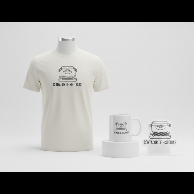
- ✍️ Typography Ideas: The accompanying text, “安全航海” (Anzen Koukai), meaning “Safe Passage,” is both poignant and universally positive. Presented in a calligraphic or brush-stroke style font that complements the Ukiyo-e visuals, it grounds the artistic expression in a clear, aspirational message. This phrase perfectly encapsulates the diplomatic pivot, offering a good wish that resonates with anyone who values security, travel, or trade, completely detached from the specific conflict, yet deeply relevant to the core topic of shipping.
- 👕 Product Canvas: For this sophisticated Ukiyo-e inspired design, dark apparel serves as an ideal canvas. The deep blacks, charcoals, or navy blues would allow the vibrant colors and intricate details of the stylized waves, ship, and rising sun to truly pop, creating a striking contrast that enhances the elegance and artistic impact of the print.
Strategic Market Insight
Targeting the market with a “Diplomatic Pivot” to themes of maritime safety and cultural appreciation holds significant potential. The target demographic extends beyond those following geopolitical news to individuals who appreciate Japanese art, culture, and the maritime industry itself. The Ukiyo-e art style is not just popular; it’s a respected and instantly recognizable aesthetic globally, offering broad appeal. Psychologically, purchasing such an item isn’t about supporting a political stance; it’s about connecting with a shared cultural heritage, an appreciation for art, and a universal desire for safety and smooth journeys. The text ‘Safe Passage’ taps into a subconscious yearning for security and well-being, transforming a complex topic into an aesthetically pleasing and universally understood sentiment.
⚖️ Estimated Copyright Risk: LOW
Copyright Evaluation: The design completely avoids the sensitive geopolitical topic. The phrase ‘安全航海’ (Anzen Kōkai) is a common, generic term in Japan wishing a ‘safe voyage’. My research confirms this is not a trademarked phrase but a standard expression, making it very low risk.
Always verify intellectual property rights before listing.
Check Japan Trademark Search for “安全航海” ➔
AI Image Generation Prompts
The following prompts are optimized for leading generators to produce production-ready assets:
👕 Apparel / T-Shirt Prompt
A highly stylized, elegant, and artistic vector illustration of a traditional Japanese Ukiyo-e woodblock print. The central design features a sturdy cargo ship, rendered with a clean vector illustration style, sailing dynamically on enormous, cresting waves reminiscent of Hokusai's 'The Great Wave off Kanagawa'. The waves are intricately detailed with swirling foam, sharp white caps, and powerful indigo and cerulean blue gradients, suggesting immense power and movement. In the background, a radiant sun is majestically rising, casting a warm, soft glow with subtle gold, amber, and crimson hues, contrasting beautifully against a minimalist sky. The ship itself has simplified forms, bold outlines, and flat shading with subtle linear textures, reflecting a modern graphic design aesthetic while retaining the traditional Ukiyo-e essence. The overall composition is balanced, powerful, and serene, optimized for a t-shirt print. This isolated graphic sits perfectly centered on a solid Dark background. The illustration style emphasizes crisp, clean lines, a limited yet vibrant traditional Japanese color palette (deep indigo, seafoam green, cream, vermillion, ochre), and strong graphical impact, ensuring excellent legibility and visual appeal for apparel. Text '安全航海' is integrated seamlessly into the design, perhaps subtly within a wave or banner. The ONLY text allowed in the image is exactly '安全航海'. Absolutely NO other names, words, or random letters. --ar 3:4 --v 6.0
☕ Drinkware / Mug Prompt
A panoramic, elegant, and artistic full-wrap design for a coffee mug, inspired by traditional Japanese Ukiyo-e woodblock prints. The main graphic is presented in a duplicated side-by-side layout, showing the exact same intricate illustration on the left and right, designed perfectly for a seamless panoramic mug wrap. The illustration depicts a stylized cargo ship traversing a vast, powerful ocean with magnificent, ornate waves that dominate the scene, echoing the iconic drama and intricate detail of Hokusai's 'The Great Wave'. The waves are rendered with deep, rich blues, teals, and white foam, showcasing dynamic movement and powerful energy. A vibrant sun is dramatically rising on the horizon, bathing the scene in a radiant glow of golden yellow, soft orange, and subtle red hues, creating a stunning visual contrast. The ship is rendered with a classic Ukiyo-e painterly style, featuring detailed yet simplified forms, traditional brushstrokes, and a sense of enduring strength. The overall aesthetic is one of serene power and cultural artistry, with rich textures suitable for ceramic printing, emphasizing vivid colors and high resolution. Text '安全航海' is elegantly integrated into the scene, perhaps horizontally across the sky or within a calm section of the wave. The ONLY text allowed in the image is exactly '安全航海'. Absolutely NO other names, words, or random letters. --ar 3:1 --v 6.0
✨ Die-Cut Sticker Prompt
A bold, vibrant, and artistic die-cut sticker design, blending traditional Japanese Ukiyo-e aesthetics with a modern 2D flat pop-art style. The central image features a stylized cargo ship sailing majestically on large, graphic, and highly ornate waves, directly inspired by Hokusai's 'The Great Wave'. The entire design is characterized by thick, uniform black outlines, separating distinct areas of solid, bright, flat colors (e.g., deep indigo, sky blue, cream, fiery orange, bold red, bright yellow) with minimal shading or gradients, giving it a playful yet sophisticated graphic novel feel. The rising sun in the background is a perfectly formed circle of intense color, radiating simple, graphic rays. This sticker features a prominent, thick white outline border around the entire design, ready for a clean die-cut. The overall mood is impactful, eye-catching, and iconic, with crisp edges and a clean, appealing visual that pops. Text '安全航海' is integrated as a flat, blocky font within the design, perhaps on the ship's hull or within the sun's rays. The ONLY text allowed in the image is exactly '安全航海'. Absolutely NO other names, words, or random letters. --ar 1:1 --v 6.0
Frequently Asked Questions
How can a sensitive geopolitical event be successfully translated into marketable merchandise?
The key lies in a “Diplomatic Pivot” strategy. Instead of directly addressing the conflict, designers can extract universal themes like safety, peace, or resilience that are indirectly relevant. For instance, the Strait of Hormuz’s geopolitical importance is about safe shipping, so translating that into a beautiful design celebrating “Safe Passage” detaches it from controversy while retaining cultural and topical relevance.
Why is the Ukiyo-e art style particularly effective for this concept in the Japanese market?
Ukiyo-e is deeply embedded in Japanese cultural identity and is globally recognized for its beauty and historical significance. Using this style connects the design to a cherished artistic tradition, making it instantly appealing to those who appreciate Japanese culture. It elevates the design beyond simple merchandise to a piece of wearable art, resonating on a deeper, more sophisticated level.
What kind of buyer would be most drawn to a “Safe Passage” design with this specific aesthetic?
This design would likely appeal to a diverse group: individuals with an appreciation for Japanese art and culture, maritime enthusiasts or professionals, travelers, and anyone who values positive, meaningful messages on their apparel. It’s for those who seek designs that are not only visually appealing but also carry a subtle, positive narrative of security and hope, celebrating heritage rather than current events directly.
Final Thoughts
The art of transforming complex global narratives into compelling e-commerce opportunities lies in creative interpretation and strategic design. This concept for the Strait of Hormuz, leveraging Japan’s deep cultural appreciation for Ukiyo-e and pivoting to the universal theme of “Safe Passage,” demonstrates the potential of thoughtful niche targeting. By focusing on aesthetics, cultural resonance, and positive messaging, designers can create merchandise that not only sells but also tells a story, offering consumers a piece of art that reflects both contemporary relevance and timeless aspiration. The success truly hinges on the execution of these nuanced ideas and adding a unique personal spin.
💬 What’s Your Take?
Art is subjective, and this is just one angle! How would you spin this “イラン ホルムズ 海峡 (Iran Strait of Hormuz)” trend? Drop your design ideas and let’s brainstorm in the comments below!