広島魂 – Hiroshima Spirit
The air in Hiroshima is thick with anticipation, humming with the kind of energy only a high-stakes football match can conjure. As the city prepares for a pivotal AFC Champions League showdown against Johor Darul Ta’zim, the collective spirit of its residents is palpable, translating into a unique cultural moment that extends far beyond the stadium walls. This isn’t just about a game; it’s about regional pride, resilience, and the unified roar of a community.
The Cultural Significance
In Japan, the love for local sports teams runs deep, weaving itself into the fabric of daily life and civic identity. This particular match carries an extra layer of drama: Sanfrecce Hiroshima faces the challenge of overcoming a deficit on their home turf, a narrative that fuels an already passionate fanbase. For the people of Hiroshima, supporting their team is a powerful expression of local allegiance, a shared experience that unites generations. It’s during such moments that symbols of local pride resonate most strongly, allowing residents to wear their hearts on their sleeves, literally.
Design Brainstorm: Capturing the Aesthetic
Translating this fervent local spirit into a compelling design requires a blend of cultural understanding and modern aesthetics. One approach could focus on universal symbols of strength and regional identity, carefully sidestepping direct team branding while still capturing the essence of the city’s connection to its beloved club.
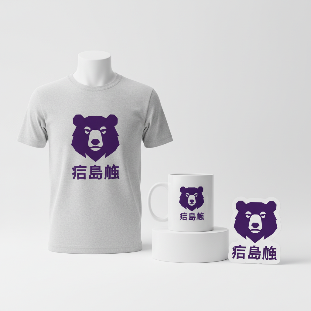
- 🎨 Visual Concept: A powerful, yet minimalist graphic of a bear’s head emerges as a strong contender. Inspired by the native Asiatic black bear—an animal renowned for its strength and resilience, and also the basis for the team’s mascot—this design could feature a modern, geometric rendering. The lines would be clean and sharp, giving the bear a contemporary and strong presence. The primary color could be a deep, regal violet, a hue instantly recognizable to supporters as it mirrors the team’s iconic colors, evoking a sense of loyalty and passion without explicitly using copyrighted logos.
- ✍️ Typography Ideas: Beneath the striking bear graphic, the text “広島魂” (Hiroshima Spirit/Soul) could be rendered in a clean, modern Japanese font. This phrase is a potent, non-trademarked expression of local pride and collective identity, resonating deeply with residents. The choice of typography would aim for clarity and impact, allowing the message to be absorbed instantly while maintaining an aesthetic that feels both traditional and contemporary.
- 👕 Product Canvas: This design could translate exceptionally well to light-colored apparel. The deep violet of the bear and text would pop dramatically against lighter fabrics like white, heather grey, or light beige t-shirts, hoodies, and perhaps even lightweight jackets. The contrast would ensure the graphic is highly visible and impactful, making it a proud statement piece for supporters.
Strategic Market Insight
The strategic brilliance of this design concept lies in its savvy navigation of intellectual property while still tapping into a highly passionate market. By avoiding direct “Location + Sport” terminology or copyrighted team names and logos, this merchandise pivots intelligently into a ‘Local Pride’ niche. It targets the fiercely loyal supporters of Hiroshima, offering them a way to express their civic and team allegiance that is both evergreen and compliant with various marketplace policies. The use of a generic bear, rooted in local wildlife and mascot symbolism, combined with the team’s color palette and the universally accepted phrase “広島魂,” creates a powerful psychological trigger. It allows individuals to proudly display their connection to Hiroshima and its fighting spirit, appealing to a sense of belonging, collective identity, and resilience—qualities that resonate deeply with fans and locals alike.
⚖️ Estimated Copyright Risk: LOW
Risk Assessment: The design avoids all trademarked assets of the Sanfrecce Hiroshima football club. It uses a generic animal symbol and a common, inspirational Japanese phrase that is not registered as a trademark for apparel. This ‘local pride’ angle is a safe way to target fans without infringing on intellectual property.
Always verify intellectual property rights before listing.
Check Japan Trademark Search for “広島 対 ジョホール” ➔
AI Image Generation Prompts
The following prompts are optimized for leading generators to produce production-ready assets:
👕 Apparel / T-Shirt Prompt
A highly detailed, isolated graphic design for a t-shirt print. The central motif is a powerful, minimalist, geometric rendering of an Asiatic black bear's head, designed with strong, sharp angles and crisp, clean lines, evoking a modern, abstract, low-poly aesthetic. The bear's silhouette is striking and bold, simplified to its essential forms, conveying strength and determination. The primary color for the bear graphic is a rich, deep violet (hex #4B0082, luxurious indigo-purple, royal purple), reflecting team colors. The rendering is in a clean, flat color vector illustration style, with no gradients, internal shadows, or textures within the bear itself, ensuring a pristine, scalable appearance suitable for apparel. Below the bear head, the text "広島魂" is precisely rendered in a modern, clean, sans-serif Japanese font, perfectly legible, crisp, and horizontally centered. The entire design is presented as a high-fidelity digital illustration, isolated on a perfectly solid, light, neutral background (pure white or very light gray). The overall mood is sophisticated, sleek, and contemporary, suitable for premium athletic apparel. The image should be hyper-focused on graphic clarity and vector precision, with no photographic elements or real-world lighting effects on the graphic itself, only a clean, digital output. --ar 3:4 --v 6.0 The ONLY text allowed in the image is exactly '広島魂'. Absolutely NO other names, words, or random letters.
🔍 Search this niche on:
☕ Drinkware / Mug Prompt
A perfectly duplicated, side-by-side panoramic graphic design, optimized for a coffee mug wrap. The layout features two identical instances of the core design: a powerful, minimalist, geometric rendering of an Asiatic black bear's head, created with strong, sharp angles and crisp, clean lines, evoking a modern, abstract, low-poly aesthetic. The bear's silhouette is bold and simplified, conveying strength and determination. The primary color for the bear graphic is a rich, deep violet (hex #4B0082, luxurious indigo-purple, royal purple). Below each bear head, the text "広島魂" is precisely rendered in a modern, clean, sans-serif Japanese font, perfectly legible, crisp, and horizontally centered beneath its respective bear graphic. The graphic on the left is an exact replica of the graphic on the right, placed side-by-side to create a continuous, seamless wrap pattern designed perfectly for a panoramic mug wrap. The rendering is in a clean, flat color vector illustration style, with no gradients, internal shadows, or textures within the graphics themselves, ensuring a pristine, scalable appearance suitable for high-quality printing on ceramic drinkware. The background is a solid, light, neutral color, allowing the deep violet graphics to stand out sharply and cleanly. The overall mood is sophisticated, sleek, and contemporary. The image should be hyper-focused on graphic clarity, vector precision, and the perfect replication of the design for a panoramic layout. --ar 3:1 --v 6.0 The ONLY text allowed in the image is exactly '広島魂'. Absolutely NO other names, words, or random letters.
🔍 Search this niche on:
✨ Die-Cut Sticker Prompt
A high-detail, perfectly rendered graphic design for a die-cut sticker. The central design features a powerful, minimalist, geometric rendering of an Asiatic black bear's head, crafted with strong, sharp angles and crisp, clean lines, embodying a modern, abstract, low-poly aesthetic. The bear's silhouette is bold and simplified, conveying strength. The primary color for the bear graphic is a rich, deep violet (hex #4B0082, luxurious indigo-purple, royal purple). Below the bear head, the text "広島魂" is precisely rendered in a modern, clean, sans-serif Japanese font, perfectly legible, crisp, and horizontally centered. The entire design is enclosed by a thick, clean, solid white outline border, mimicking a professional die-cut vinyl sticker edge. The rendering style is a vibrant, 2D flat pop-art aesthetic, emphasizing bold graphic shapes, high contrast, and a smooth, polished finish, reminiscent of classic comic book art or contemporary street art stickers. The surface appears smooth, glossy, and digitally perfect, with no texture, grunge, or artificial wear. The lighting is bright and even, highlighting the crispness of the lines, the deep saturation of the violet, and the stark white border. The overall mood is iconic, collectible, and visually striking, perfect for a high-quality vinyl sticker. The image should be presented against a very light, neutral background to emphasize the sticker's outline and design clarity. --ar 1:1 --v 6.0 The ONLY text allowed in the image is exactly '広島魂'. Absolutely NO other names, words, or random letters.
🔍 Search this niche on:
Frequently Asked Questions
Why choose a bear graphic for Hiroshima-themed apparel?
The bear graphic is a thoughtful choice because it draws inspiration from the Asiatic black bear, a local animal known for its strength and perseverance. Crucially, a bear is also the symbolic basis for Hiroshima’s beloved football team mascot. This allows the design to evoke a powerful, recognizable connection to the city’s identity and its team without using any trademarked logos or specific team names, making it a safe yet impactful symbol of local pride.
What does ‘広島魂’ mean and why is it effective for this design?
‘広島魂’ (Hiroshima Spirit/Soul) is a potent, non-trademarked phrase that encapsulates the enduring strength, resilience, and collective pride of the people of Hiroshima. It goes beyond a simple team cheer, resonating with the deeper civic identity and history of the city. Incorporating this text provides a direct, heartfelt message of local allegiance that is universally understood and cherished by residents, ensuring the design remains relevant and meaningful long after any single game.
How does this design avoid trademark issues and stay relevant beyond a single game?
This design is meticulously crafted to be compliant and evergreen. It strategically avoids using any copyrighted team names, logos, or direct “soccer/football” terminology. Instead, it leverages generic but culturally significant elements: a local animal (the bear), the team’s primary color (violet), and a non-trademarked phrase of local pride (‘広島魂’). This approach allows it to appeal to passionate supporters year-round, not just during game season, ensuring its longevity and wide applicability across various e-commerce platforms.
Final Thoughts
Tapping into local pride during moments of high cultural resonance, like a significant football match, offers immense potential for print-on-demand designers. The key lies in understanding the nuance of community sentiment and translating it into thoughtful, compliant, and aesthetically pleasing merchandise. This Hiroshima-inspired concept is a prime example of how creativity, combined with strategic market insight, can craft a design that is not only visually striking but also deeply meaningful to its target audience. Success in this arena often comes down to the clever spin and impeccable execution that makes a design truly stand out and resonate.
💬 What’s Your Take?
Art is subjective, and this is just one angle! How would you spin this “広島 対 ジョホール (Hiroshima vs. Johor)” trend? Did we miss the mark, or is there a better inside joke to use here? Drop your design ideas and let’s brainstorm in the comments below!