敵 (Enemy / Rival) Merch Design
The roar of the crowd, the crack of the bat, the unshakeable national pride – nowhere is the tension of a global sports showdown felt more acutely than in Japan during the World Baseball Classic. A term often on the lips of fans and commentators alike, “敵” (teki), or ‘opponent,’ becomes a charged word, encapsulating the competitive spirit and the desire for victory. This powerful atmosphere isn’t just about the game; it’s a cultural moment ripe for resonant expression.
The Cultural Significance
Japan’s fervent passion for baseball, often dubbed its “national sport,” reaches a fever pitch during international tournaments like the World Baseball Classic. When the national team takes the field, the entire nation rallies behind them. The concept of the ‘opponent’ or ‘rival’ isn’t merely tactical; it becomes a focal point for national identity and collective aspiration. This intense competitive spirit, paired with deep-seated respect for the game and its participants, creates a unique cultural backdrop where symbols of strength, resilience, and spirit truly resonate with a passionate fanbase.
Design Brainstorm: Capturing the Aesthetic
Translating the raw energy of national sports fandom into merchandise requires a thoughtful approach, balancing impactful imagery with cultural nuance. One compelling avenue explores the deeper meaning behind the competition, moving beyond the surface-level “opponent” to celebrate the internal strength required to overcome challenges.
- 🎨 Visual Concept: A powerful design choice could feature a single, commanding Japanese kanji character: ‘魂’ (tamashii), meaning ‘spirit,’ ‘soul,’ or ‘courage.’ Rendered in a dynamic, expressive Japanese calligraphy (Shodo) style, the visual impact is immediate and profound. The brushstrokes would convey movement and intensity, making the character feel alive and vibrant. This minimalist approach ensures the focus remains entirely on the artistic integrity and profound meaning of the kanji, creating an elegant yet potent statement.
- ✍️ Typography Ideas: For this concept, the “typography” is the art. The chosen kanji ‘魂’ is not merely text but a visual masterpiece, carefully crafted to evoke emotion and strength. The artistic rendering in Shodo ensures it stands alone as the primary design element, requiring no additional fonts or accompanying text. This simplicity is its strength, allowing the character’s intrinsic power and cultural resonance to speak volumes.
- 👕 Product Canvas: Given the bold, expressive nature of the calligraphy and its inherent cultural gravitas, this design concept could translate exceptionally well onto dark apparel. Think deep black, charcoal gray, or navy blue t-shirts, hoodies, or even caps. The stark contrast of the vibrant, perhaps subtly textured, calligraphic ‘魂’ against a dark background would enhance its visual pop, making the design stand out with gravitas and style.
Strategic Market Insight
Targeting passionate fans of Japanese national sports teams with a design like ‘魂’ is a savvy strategic move. It cleverly navigates potential pitfalls, such as the generic “Location + Sport” trap (e.g., “Japan Baseball”) or the complexities of trademarked team nicknames like “Samurai Japan.” By pivoting from the trending, potentially aggressive term ‘敵’ (Enemy) to the universally positive and powerful concept of ‘魂’ (Spirit), the design taps into a broader, more evergreen sentiment. The single kanji style is perennially popular in Japan, symbolizing not just sporting spirit but also national resilience and cultural identity. This approach resonates deeply with consumers seeking to express national pride and internal strength, creating a powerful emotional connection that transcends fleeting game results.
⚖️ Estimated Copyright Risk: LOW
Copyright Evaluation: A single, common-use kanji character like ‘魂’ is not subject to copyright or trademark. It represents a universal concept and is not tied to a specific brand. A Youth Apparel warning is not required as the word has no dual violent or explicit meaning.
Always verify intellectual property rights before listing.
Check Japan Trademark Search for “敵” ➔
AI Image Generation Prompts
The following prompts are optimized for leading generators to produce production-ready assets:
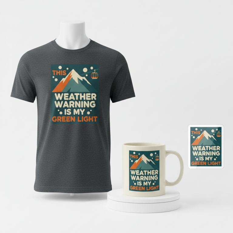
👕 Apparel / T-Shirt Prompt
A single, powerful Japanese kanji character '魂' (Soul/Spirit) rendered in an extremely dynamic, expressive, and authentic Shodo calligraphy style. The brushwork is bold, fluid, and energetic, showcasing thick, gestural ink strokes with subtle dry brush texture at the ends and controlled ink bleed simulation. This is a clean vector illustration, isolated on a solid dark charcoal grey background. The lines are crisp, sharp, and digitally perfected, but meticulously mimic traditional sumi-e techniques, including variations in ink density and pressure, and a sense of swift, purposeful movement. High contrast, minimalist graphic design, ready for t-shirt print. The design should feel both ancient and modern, powerful and serene. Ultra-high resolution, sharp focus, graphic design aesthetic. The ONLY text allowed in the image is exactly '魂'. Absolutely NO other names, words, or random letters. --ar 3:4 --v 6.0
☕ Drinkware / Mug Prompt
A duplicated side-by-side layout showing the exact same graphic on the left and right, designed perfectly for a panoramic mug wrap. The graphic is a single, large Japanese kanji character '魂' (Soul/Spirit) in a highly expressive and traditional Shodo calligraphy style. The brushstrokes are vibrant, dynamic, and full of raw energy, featuring visible ink texture, simulated natural brush hairs, subtle organic edges, and variations in ink pooling, capturing the essence of authentic sumi-e art. The character is rendered in deep, rich black ink against a clean, brilliant white background, optimized for print clarity and vibrant display on a coffee mug. The composition is minimalist, with the focus solely on the artistic integrity of the character. High resolution, sharp focus, digitally painted with meticulous detail to simulate a handcrafted feel. The ONLY text allowed in the image is exactly '魂'. Absolutely NO other names, words, or random letters. --ar 3:1 --v 6.0
✨ Die-Cut Sticker Prompt
A single, large Japanese kanji character '魂' (Soul/Spirit) rendered in a bold, stylized, and dynamic Shodo calligraphy style, specifically optimized for a die-cut sticker. The design features a thick white outline border around the entire graphic, creating a strong visual pop. The kanji character itself is rendered with clean, simplified, hard-edged brushstrokes in solid, deep black ink, giving it a modern 2D flat pop-art aesthetic. It's a high-contrast graphic with clear, sharp lines and no intricate textures, emphasizing bold form and iconic impact. The style is crisp, clean, and digitally precise, perfect for a glossy vinyl sticker. Isolated on a neutral background to highlight the sticker's design and white border. The ONLY text allowed in the image is exactly '魂'. Absolutely NO other names, words, or random letters. --ar 1:1 --v 6.0
Frequently Asked Questions
Why pivot from “敵” (Enemy) to “魂” (Spirit)?
While “敵” captures the trending competitive energy, pivoting to “魂” offers a more universally appealing and positive message. “魂” represents the enduring spirit, courage, and determination of both the team and its supporters. This approach broadens the design’s appeal beyond a specific rival, making it relevant for any occasion where national pride and inner strength are celebrated. It’s a way to embrace the intensity of competition through a lens of positive cultural values.
What makes this single kanji design culturally significant and appealing in Japan?
Single kanji designs hold a special place in Japanese aesthetics and culture. They are minimalist yet profound, often embodying deep philosophical or emotional concepts in a single character. ‘魂’ itself is a powerful word, evoking themes of samurai spirit, resilience, and deep-seated passion—values highly esteemed in Japan. This style is not only visually striking but also carries a timeless cultural weight, making it a popular and evergreen choice for expressing national pride or personal conviction.
How does this design avoid potential trademark or ‘bot trap’ issues often found in sports merchandise?
By focusing on a broad cultural value (‘魂’) rather than specific team names, logos, or direct references to “Japan Baseball,” this design effectively sidesteps potential trademark infringements and the risk of being categorized as generic, ‘bot-like’ merchandise. The strategic shift allows for creative expression rooted in Japanese culture and national pride without infringing on intellectual property associated with official teams or leagues, opening up a unique and viable lane in the print-on-demand market.
Final Thoughts
The convergence of national sports fervor and deep cultural symbolism presents an exciting opportunity for e-commerce. Designs that tap into the core emotions of fans, like the unyielding ‘魂’ (spirit), offer a potent way to connect with a passionate audience. While this exploration suggests a powerful direction, remember that individual execution – the precise brushstroke, the chosen apparel quality, the nuanced marketing – remains paramount. Success in this vibrant niche will ultimately come down to the unique spin and creative passion poured into each design.
💬 What’s Your Take?
Art is subjective, and this is just one angle! How would you spin this “敵 (Enemy / Rival)” trend? Drop your design ideas and let’s brainstorm in the comments below!