日本の未来は明るい – The future of Japan is bright
A fresh current of national optimism is coursing through Japan, capturing the attention of citizens across generations. At the heart of this evolving political narrative is a prominent figure whose vision for a “stronger Japan” is resonating deeply, particularly among a younger, politically engaged demographic. This surge in interest highlights a palpable shift in public sentiment, signaling an invigorated national discourse around leadership, economy, and Japan’s place on the global stage.
The Cultural Significance
The rise in prominence of figures like Sanae Takaichi isn’t just about individual popularity; it reflects a broader cultural moment in Japan. Voters, including a significant segment of the youth, appear to be gravitating towards a message centered on national pride, economic revitalization, and a confident assertion of Japan’s future direction. This isn’t merely a political trend; it’s an expression of a renewed desire for stability, clear leadership, and a sense of collective purpose. The conservative stance, particularly when coupled with forward-looking economic proposals, seems to strike a chord with those yearning for a brighter, more assertive national identity in a rapidly changing world.
Design Brainstorm: Capturing the Aesthetic
Translating such a potent cultural moment into merchandise requires a thoughtful and nuanced approach. The goal is to capture the essence of optimism and national pride without being overtly partisan, allowing the message to resonate with a wider audience long after specific news cycles fade.
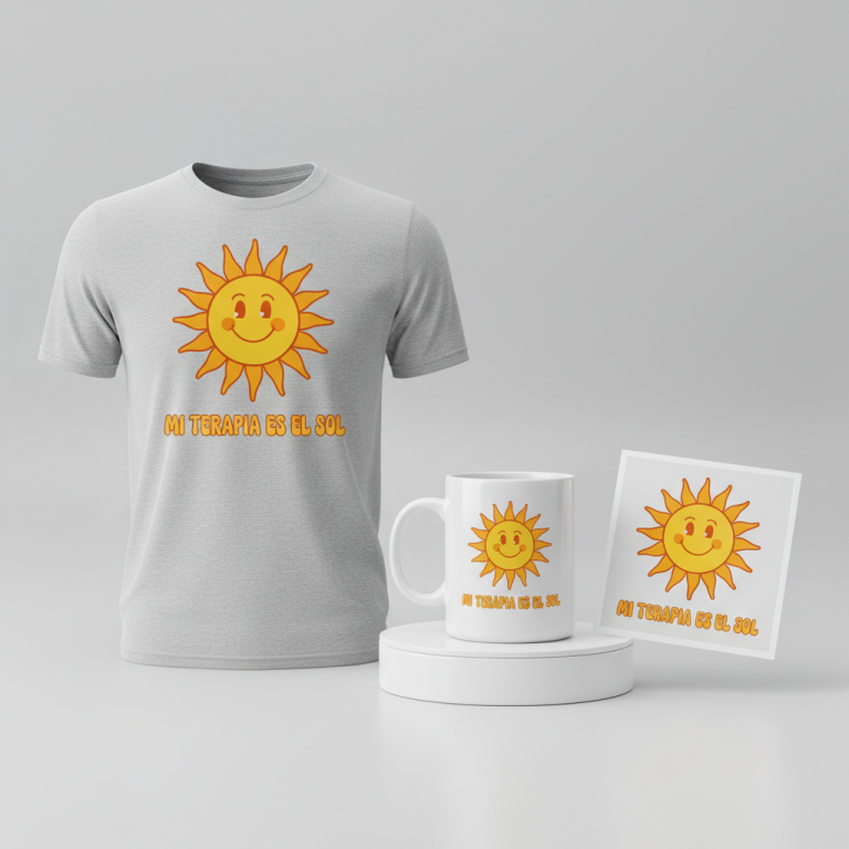
- 🎨 Visual Concept: One compelling angle is to envision a clean, optimistic design anchored by a stylized rising sun icon. Instead of a traditional depiction, this concept could embrace a modern, abstract interpretation. The sun’s rays, for instance, could be cleverly represented by upward-trending arrows, subtly symbolizing growth, progress, and a positive trajectory for Japan. This visual metaphor speaks to the core message of a hopeful future.
- ✍️ Typography Ideas: For the textual element, “日本の未来は明るい” (Japan’s future is bright), a strong and elegant Japanese Mincho (serif) font could be highly effective. Mincho fonts inherently convey a sense of tradition, stability, and gravitas. However, by applying modern spacing and perhaps a slightly contemporary weight, the design can bridge classic elegance with a forward-thinking aesthetic, appealing to both traditionalists and younger voters.
- 👕 Product Canvas: Given the optimistic and bright nature of the message, light-colored apparel would serve as an ideal canvas. Think crisp whites, soft creams, or pale grays. These lighter tones naturally enhance the sense of clarity, hope, and new beginnings that the design aims to convey, making the stylized sun and positive message pop.
Strategic Market Insight
Targeting this demographic of politically aware and patriotic Japanese citizens, particularly younger voters brimming with optimism for their country, presents a unique e-commerce opportunity. The appeal isn’t tied to a specific politician’s name but rather to the enduring, evergreen message of national hope and a bright future. This strategy transforms a potentially fleeting political trend into a broader, patriotic statement. Psychologically, purchasing such merchandise taps into a desire for belonging, collective pride, and an affirmation of belief in Japan’s positive direction. By offering a design that is non-partisan yet deeply patriotic, the merchandise can achieve broader resonance and sustained relevance, extending its appeal beyond a single election cycle or political event.
⚖️ Estimated Copyright Risk: LOW
Our Findings: The design does not use any politician’s name, face, or party logo. The quote ‘日本の未来は明るい’ is a generic, optimistic phrase. It is not trademarked and represents a common sentiment, making it safe for commercial use.
Always verify intellectual property rights before listing.
Check Japan Trademark Search for “日本の未来は明るい” ➔
AI Image Generation Prompts
The following prompts are optimized for leading generators to produce production-ready assets:
👕 Apparel / T-Shirt Prompt
A high-resolution, clean vector illustration of a stylized, modern abstract rising sun icon, optimized for a t-shirt print. The design is isolated on a pristine, solid light background (e.g., pure white or very light grey). The central element is a minimalist, perfectly circular sun disc, rendered in a vibrant gradient from warm golden yellow at the bottom to a soft, bright orange at the top, symbolizing optimism and energy. Radiating gracefully upwards from the sun's upper curve are three distinct, sleek, upward-trending arrow shapes, geometrically precise and streamlined. These arrows represent the sun's rays and progress, filled with a subtle gradient from bright yellow to a lighter, almost ethereal yellow-white at their sharp tips. The entire icon exudes a sense of forward momentum and aspiration. Below this dynamic sun graphic, the Japanese text '日本の未来は明るい' is rendered in a strong, elegant, and perfectly proportioned Japanese Mincho (serif) font. The typography features classic, stable character forms with modern, generous spacing, conveying both tradition and contemporary clarity, presented in a deep, sophisticated charcoal black or indigo hue. The overall art style is flat, 2D graphic design with crisp, hard-edged lines, smooth digital fills, and no visible texture. The rendering is impeccably clean, sharp, and precise, resembling high-quality screen printing. The composition is balanced and centered, embodying a hopeful, modern, and respectful aesthetic. The ONLY text allowed in the image is exactly '日本の未来は明るい'. Absolutely NO other names, words, or random letters. --ar 3:4 --v 6.0
☕ Drinkware / Mug Prompt
A meticulously crafted, high-resolution panoramic graphic design, engineered specifically for a coffee mug wrap layout. The composition features a duplicated side-by-side display, showing the exact identical graphic on both the left and right sides of the canvas, designed to create a perfectly seamless wraparound effect. The core design is a clean, optimistic, stylized modern abstract rising sun icon. This icon consists of a minimalist, smoothly rendered sun disc, featuring a bright, hopeful gradient from sunbeam yellow to soft optimistic orange. Three slender, geometrically perfect upward-trending arrow shapes extend from the top of the sun, acting as dynamic rays, filled with a luminous gradient of bright yellow transitioning to a lighter, almost reflective white-yellow at their tips. Beneath this aspirational sun motif, the powerful Japanese text '日本の未来は明るい' is rendered in a strong, elegant Japanese Mincho (serif) font. The typography maintains its traditional stability with modern, clear spacing, presented in a rich, deep indigo blue or profound charcoal black, ensuring maximum legibility and sophistication. The entire graphic, from the sun to the text, is executed in a clean vector illustration style with impeccable precision, featuring flat, smooth color fills, crisp, hard-edged lines, and no visible texture, mimicking a high-quality ceramic print. The background is a clean, solid pure white, emphasizing the vibrancy of the graphic. The duplication is precise, making the design appear continuous when wrapped. The mood is uplifting, sophisticated, and forward-looking. The ONLY text allowed in the image is exactly '日本の未来は明るい'. Absolutely NO other names, words, or random letters. --ar 3:1 --v 6.0
✨ Die-Cut Sticker Prompt
A striking, vibrant die-cut sticker design presented in a bold 2D flat pop-art style. The central motif is a stylized, modern abstract rising sun icon, rendered with impactful solid color blocks and minimal shading, embodying a sense of dynamic optimism. The sun disc is a strong, saturated yellow, transitioning abruptly to a punchy orange at its upper curve. Its rays are represented by three distinct, upward-trending arrow shapes, geometrically precise and robust, filled with a brilliant, luminous yellow. The entire sun icon radiates energy and forward motion, reminiscent of classic pop-art graphics. Beneath this compelling symbol, the Japanese text '日本の未来は明るい' is rendered in a strong, elegant Japanese Mincho (serif) font. The typography is clean, stable, and commanding, with modern spacing, presented in a deep, contrasting black or intense indigo, ensuring high visibility. Crucially, the entire combined design (sun icon and text) is encircled by a perfectly uniform, thick white outline border, creating a clean, crisp edge for the die-cut sticker. The art style emphasizes hard-edged lines, flat color fills, high contrast, and a graphic, illustrative quality. The implied finish is glossy and smooth, characteristic of a high-quality vinyl sticker. The composition is square and perfectly centered for optimal sticker appeal. The mood is energetic, modern, bold, and uplifting. The ONLY text allowed in the image is exactly '日本の未来は明るい'. Absolutely NO other names, words, or random letters. --ar 1:1 --v 6.0
Frequently Asked Questions
How does this design concept transcend a specific political figure to appeal broadly?
The design pivots away from individual likeness or specific political slogans, focusing instead on universal themes like national pride, hope, and a bright future for Japan. The stylized rising sun and the message “日本の未来は明るい” (Japan’s future is bright) are patriotic sentiments that resonate across the political spectrum, allowing buyers to express their optimism for the nation rather than endorsing a single personality.
What’s the rationale behind the modern, abstract rising sun motif with upward arrows?
The abstract rising sun serves as a powerful, recognizable symbol of Japan, while its modern interpretation speaks to a forward-looking vision. The upward-trending arrows embedded in the rays are a subtle yet potent visual metaphor for progress, economic growth, and an optimistic trajectory, aligning perfectly with the core message of national renewal and a positive future.
Why is a strong, elegant Japanese Mincho font recommended for this merchandise?
Mincho fonts strike an ideal balance between tradition and elegance, conveying a sense of stability and historical depth. This choice reinforces the deep-rooted cultural pride inherent in the message. Modern spacing can infuse a contemporary feel, ensuring the design appeals to both those who appreciate classical aesthetics and younger audiences seeking a refined, current look.
Final Thoughts
The current wave of national optimism in Japan offers a compelling backdrop for print-on-demand designers. By focusing on evergreen themes of national pride, progress, and a bright future, and by executing designs with thoughtful visual and typographic choices, there’s significant potential to connect with a broad and engaged audience. Remember, while the trend provides the inspiration, it’s the creative execution and personal spin on these core ideas that ultimately define success in the dynamic world of e-commerce.
💬 What’s Your Take?
Art is subjective, and this is just one angle! How would you spin this “高市早苗 (Sanae Takaichi)” trend? Drop your design ideas and let’s brainstorm in the comments below!