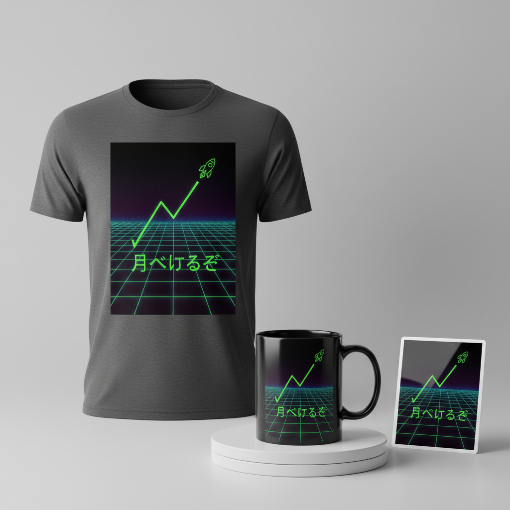
月へ行くぞ – Let’s go to the moon
In the vibrant, fast-paced world of Japanese finance, one ticker has recently exploded onto screens and conversations, sending ripples far beyond traditional trading floors. The buzz around Japan Display Inc. (JDI) isn’t just about quarterly reports; it’s a cultural phenomenon, a lightning rod for the new generation of retail investors and day traders seeking their own “to the moon” moment. As news of potential new investment and a factory build-out in the US propels JDI’s stock price dramatically upwards, it’s clear this isn’t just an economic story – it’s a narrative ripe for creative expression.
The Cultural Significance
The surge of JDI’s stock price in Japan resonates deeply with a growing global trend: the rise of the empowered retail investor. This isn’t just institutional trading; it’s about individual traders, often connected through online communities, pooling their collective energy and enthusiasm behind specific stocks. For many Japanese investors and day traders, JDI’s dramatic ascent isn’t merely a financial opportunity; it symbolizes hope, a chance to participate in a shared, exhilarating journey, and a testament to the power of collective market sentiment. It taps into the same ‘meme stock’ culture seen elsewhere, creating an “insider” excitement that builds community and a unique shared experience among those deeply invested – both financially and emotionally – in the ride.
Design Brainstorm: Capturing the Aesthetic
Translating this high-octane energy into merchandise requires a visual language that speaks directly to this specific audience, embracing both the thrill of the market and a captivating aesthetic. One compelling direction could merge the futuristic aspirations of high-tech investment with a nostalgic, yet fresh, visual style.
- 🎨 Visual Concept: Imagine a design steeped in a Japanese 80s retro-futuristic or vaporwave aesthetic. This could translate well to a scene featuring a glowing, neon green grid receding dramatically into perspective, evoking digital landscapes and virtual realities. Overlaying this, a simple, stylized stock market line chart would trend sharply upwards, culminating not just in a peak, but visually morphing into a rocket ship emoji graphic, blasting off into the digital cosmos. This composition powerfully symbolizes the “to the moon” aspiration, blending the past’s vision of the future with today’s online investment culture.
- ✍️ Typography Ideas: For text elements, a clean, modern sans-serif font could provide a strong contrast and legibility against the vibrant background. The inclusion of Japanese characters for the core message, “月へ行くぞ” (Tsuki e Iku zo), is crucial. This phrase, directly translating to “To the moon,” is instantly recognizable to the target audience, acting as a powerful, shared rallying cry within the meme stock community. The combination of a sleek modern font with the classic impact of Japanese characters grounds the design in its cultural context while projecting a universal sentiment.
- 👕 Product Canvas: Given the vivid neon green and the retro-futuristic concept, ideal apparel would undoubtedly be dark. A black t-shirt, hoodie, or even a deep navy could serve as the perfect canvas. The dark background would allow the glowing neon green grid, the ascending stock chart, and the rocket ship graphic to truly pop, enhancing the vaporwave aesthetic and creating a striking, visually appealing piece of merchandise.
Strategic Market Insight
Targeting Japanese retail stock market investors and day traders with this specific design concept offers significant strategic advantages. This demographic isn’t just buying a t-shirt; they’re buying into an identity, a shared experience, and an aspiration. The design cleverly pivots from the specificity of JDI to the universal, evergreen theme of a soaring stock, making it appealing beyond just JDI enthusiasts. By incorporating “月へ行くぞ,” it utilizes insider language, a psychological trigger that fosters a sense of belonging and community. The retro-futuristic aesthetic is currently very trendy and visually engaging, appealing to a younger, digitally native audience. This merchandise taps into the excitement of the market, offering a tangible way for individuals to display their participation in and optimism for their investment journeys, creating a highly relatable and desirable product for a passionate niche.
⚖️ Estimated Copyright Risk: LOW
Our Findings: The design is completely free of intellectual property. It does not use the company name ‘JDI’ or its logo. The concept of a rising stock chart and the phrase ‘To the moon’ are generic memes within the public domain of internet culture and cannot be copyrighted.
Always verify intellectual property rights before listing.
Check Japan Trademark Search for “Jdi” ➔
AI Image Generation Prompts
The following prompts are optimized for leading generators to produce production-ready assets:
👕 Apparel / T-Shirt Prompt
A clean vector illustration in a Japanese 80s retro-futuristic vaporwave aesthetic, isolated on a solid Dark background. The central graphic features a bold, stylized stock market line chart trending sharply upwards from the bottom left to the upper right. The chart line is a vibrant, glowing neon green, rendered with smooth Bezier curves and sharp angles, reminiscent of a digital interface. At the peak of the upward trend, a simplified, iconic rocket ship emoji graphic, also glowing neon green, is depicted, indicating ascent. Behind this chart, a subtle, receding neon green grid provides depth and a classic vaporwave perspective effect, fading into the dark background, but keeping the overall design clean and uncluttered for apparel. The grid lines are thin, precise, and geometrically perfect. The typography '月へ行くぞ' (Tsuki e iku zo) is rendered in a sleek, clean, modern sans-serif font, glowing with the same intense neon green, positioned strategically above or below the chart, integrated seamlessly into the graphic's composition. The entire design uses a limited color palette focused on luminous neon greens, deep blacks for contrast, and possibly very subtle touches of electric blue or magenta for accent lighting effects around the glow. The style is crisp, with sharp edges, smooth gradients where appropriate for glow, and a high-fidelity graphic design aesthetic suitable for screen printing. Minimalist yet impactful, with a strong emphasis on composition and immediate visual recognition, embodying a synthwave mood. --ar 3:4 --v 6.0 The ONLY text allowed in the image is exactly '月へ行くぞ'. Absolutely NO other names, words, or random letters.
🔍 Search this niche on:
☕ Drinkware / Mug Prompt
A duplicated side-by-side layout showing the exact same graphic on the left and right, designed perfectly for a panoramic mug wrap. The graphic itself features a vibrant Japanese 80s retro-futuristic vaporwave aesthetic, full of energetic glow and sleek lines. Each instance of the graphic showcases a dynamic, sharply ascending stock market line chart rendered in brilliant, emissive neon green, appearing as if drawn by light. This line chart begins from the lower left and sweeps powerfully upwards, culminating in a stylized, glowing neon green rocket ship graphic, signifying rapid growth and ambition. Behind this ascending trajectory, a complex yet visually clean neon green grid recedes dramatically into deep perspective, creating an immersive, infinite digital space. The grid lines are sharp, perfectly uniform, and cast a subtle glow on the dark, inky background. Incorporated into the design is the Japanese text '月へ行くぞ' (Tsuki e iku zo), rendered in a bold, clean, glowing neon green sans-serif font, positioned to complement the chart's upward motion. The entire composition utilizes a striking color palette of luminous neon green, deep dark purples and blacks for the background, with hints of electric blue or fuchsia in the volumetric lighting and reflections, creating a high-contrast, high-energy visual experience. The rendering is highly detailed, with crisp edges, powerful light reflections, and atmospheric depth, designed to wrap seamlessly around a mug, maintaining visual interest from every angle. The overall mood is optimistic, high-tech, and aspirational, with a strong synthwave and new retro wave influence. --ar 3:1 --v 6.0 The ONLY text allowed in the image is exactly '月へ行くぞ'. Absolutely NO other names, words, or random letters.
🔍 Search this niche on:
✨ Die-Cut Sticker Prompt
A vibrant, 2D flat pop-art style graphic with a thick white outline border around the entire design, perfect for a die-cut sticker. The central image is a striking Japanese 80s retro-futuristic vaporwave inspired design. It features a bold, simplified stock market 'line chart' moving sharply upwards from the lower left, ending definitively in a highly stylized, iconic rocket ship emoji graphic. Both the chart line and the rocket ship are rendered in a powerful, uniform flat neon green color, with crisp, vector-like edges and a minimalist aesthetic. Behind this, a prominent, geometrically perfect neon green grid recedes into perspective, creating a strong sense of depth despite the flat art style. The grid lines are solid, unwavering, and also in flat neon green. The background within the design is a deep, uniform dark purple or black, providing maximum contrast for the neon elements. The Japanese text '月へ行くぞ' (Tsuki e iku zo) is integrated cleanly, rendered in a bold, sans-serif font, also in flat neon green, maintaining the cohesive color scheme. The overall art style is graphic, with a strong emphasis on clean lines, solid color blocks, and minimal gradients, giving it a playful yet sophisticated pop-art feel, reminiscent of vintage arcade graphics. The edges are razor-sharp, and the entire design is self-contained within its thick white border, making it stand out with a bold, retro-futuristic mood. --ar 1:1 --v 6.0 The ONLY text allowed in the image is exactly '月へ行くぞ'. Absolutely NO other names, words, or random letters.
🔍 Search this niche on:
Frequently Asked Questions
How does this design specifically cater to the Japanese retail investor market?
The design is deeply rooted in the cultural zeitgeist of Japanese online investing. By translating the popular “to the moon” meme into the Japanese phrase “月へ行くぞ” and incorporating a trendy Japanese 80s retro-futuristic aesthetic, it directly speaks to the insider language and visual preferences of this audience, creating immediate recognition and a strong sense of community belonging.
Why choose a retro-futuristic aesthetic for a modern stock market trend?
The retro-futuristic/vaporwave aesthetic is incredibly popular right now, particularly with younger, digitally savvy demographics. It evokes a sense of both nostalgia for a past vision of the future and optimism for what’s to come, which perfectly mirrors the excitement and forward-looking nature of investing in a surging stock. The glowing neon colors also visually represent the dynamic, often screen-based, experience of day trading.
Is this design only relevant to JDI investors, or can it appeal more broadly?
While inspired by the JDI trend, the design smartly pivots to the universal theme of a “soaring stock” and the aspiration to go “to the moon.” This makes it highly versatile, appealing not just to those specifically invested in JDI, but to any Japanese retail investor or day trader who has experienced the thrill of a rapidly appreciating asset, or who identifies with the ‘meme stock’ culture.
Final Thoughts
The confluence of a surging stock, a passionate online community, and a visually arresting aesthetic presents a compelling opportunity for print-on-demand entrepreneurs. By tapping into the cultural significance of the “JDI to the moon” phenomenon in Japan, and expressing it through a carefully crafted retro-futuristic design, creators can connect deeply with a highly engaged target audience. Remember, while the concept is strong, success in this niche will ultimately hinge on quality execution, thoughtful marketing, and the unique personal spin each designer brings to these potent themes.
💬 What’s Your Take?
Art is subjective, and this is just one angle! How would you spin this “Jdi” trend? Did we miss the mark, or is there a better inside joke to use here? Drop your design ideas and let’s brainstorm in the comments below!