犯人は誰だ? – Who is the culprit?
Japan’s cultural landscape is currently buzzing with intense discussion, all thanks to the dramatic conclusion of ‘Reboot’, the hit television series starring the acclaimed actor Ryohei Suzuki. As the final credits rolled, social media platforms and online forums across the nation erupted, reflecting the show’s profound impact and Suzuki’s compelling performance. This widespread conversation opens up intriguing avenues for capturing the energy of a trending moment with smart, culturally resonant merchandise.
The Cultural Significance
The recent finale of ‘Reboot’ isn’t merely the end of a television season; it’s a genuine cultural event. Ryohei Suzuki, a powerhouse in Japanese entertainment known for his versatile roles, has once again captivated audiences, driving a nationwide dialogue about the series’ intricate plotlines and his stellar portrayal. In Japan, television dramas often become integral parts of daily life, sparking water cooler discussions and online discourse for weeks, if not months. The conclusion of a beloved series, especially one featuring such a prominent actor, naturally creates a shared experience of anticipation and reflection among fans. This communal feeling often translates into a desire to own a piece of that experience, subtly commemorating their connection to the show and its themes.
Design Brainstorm: Capturing the Aesthetic
When considering merchandise for a moment like this, the goal is often to create something clever and understated that speaks to an appreciative audience without infringing on specific intellectual property. One compelling approach involves tapping into the broader genre appeal that a hit show often highlights.
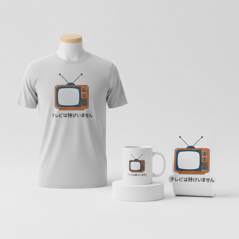
- 🎨 Visual Concept: The core idea here is to mimic the unmistakable look of a Japanese TV show subtitle. Imagine a clean, crisp line of text positioned perfectly at the bottom center of the apparel, just as it would appear on screen. To enhance authenticity and ensure readability, a classic, bold Japanese font—perhaps a sturdy Gothic or an elegant Mincho typeface—in white with a subtle black drop shadow could be used. This visual choice instantly communicates “television drama” to the initiated without needing overt branding.
- ✍️ Typography Ideas: The chosen phrase, “犯人は誰だ?” (Han’nin wa dare da?), which translates to “Who is the culprit?”, is a masterstroke of strategic design. This question is a staple in virtually every Japanese mystery and police drama. It’s an evergreen phrase, making it an instant “if you know, you know” inside joke for fans of the genre. Pairing this universally recognized query with an authentic Japanese subtitle aesthetic creates a powerful, yet subtle, nod to the viewing experience, resonating deeply with those who love suspenseful storytelling.
- 👕 Product Canvas: For maximum visual impact and to truly make the white subtitle pop, the ideal apparel choice would be dark-colored items. Think classic black t-shirts, deep navy hoodies, charcoal grey sweatshirts, or even dark mugs. The contrast allows the design to stand out boldly, reinforcing the sharp, clean look of on-screen text.
Strategic Market Insight
This design concept strategically pivots away from the high-risk intellectual property of a specific actor or show, instead targeting the vast and evergreen niche of Japanese mystery and police drama fans. The brilliance lies in its universality within the genre. The phrase “Who is the culprit?” is not tied to ‘Reboot’ or Ryohei Suzuki alone; it’s a foundational element of countless beloved detective stories. This approach taps into a psychological trigger for buyers: the desire for an “inside joke” that signifies belonging to a specific fan community. Purchasing such an item becomes a subtle declaration of their appreciation for the genre, a way to connect with fellow enthusiasts without overt branding. This broadens the market significantly, ensuring the design’s relevance extends far beyond the immediate buzz of any single show’s finale.
⚖️ Estimated Copyright Risk: LOW
Risk Assessment: The quote ‘犯人は誰だ?’ is a generic phrase equivalent to ‘Whodunnit?’. It is not a trademarked slogan. The design avoids the actor’s name/likeness and the show’s title, making it a safe and effective pivot.
Always verify intellectual property rights before listing.
Check Japan Trademark Search for “犯人は誰だ?” ➔
AI Image Generation Prompts
The following prompts are optimized for leading generators to produce production-ready assets:
👕 Apparel / T-Shirt Prompt
A print-on-demand graphic design for a t-shirt, rendered in a crisp, clean vector illustration style. The design features the Japanese text '犯人は誰だ?' prominently placed at the bottom, mimicking a classic TV show subtitle. The typography is a bold, traditional Japanese Mincho or Gothic typeface, rendered in pure, stark white. A subtle yet distinct black drop shadow is applied to the text, offset slightly to the bottom-right, giving it a sense of depth and making it pop, just like an on-screen graphic. The overall aesthetic is minimalist, modern, and impactful, with sharp edges and perfectly smooth curves typical of high-quality vector art. The illustration is entirely isolated on a solid, deep dark background, such as a rich charcoal grey or deep navy, ensuring maximum contrast and readability. The rendering should be pristine, with no artifacts, jagged edges, or texture outside of the perfectly smooth text and shadow. This is a bold, high-contrast, graphic design piece, optimized for direct-to-garment printing, emphasizing clarity and graphic impact. The lighting is even and flat, enhancing the vector nature. The ONLY text allowed in the image is exactly '犯人は誰だ?'. Absolutely NO other names, words, or random letters. --ar 3:4 --v 6.0
☕ Drinkware / Mug Prompt
A panoramic graphic design for a coffee mug wrap, featuring a duplicated side-by-side layout showing the exact same graphic on the left and right, designed perfectly for a seamless mug wrap. The core graphic displays the Japanese text '犯人は誰だ?' in a classic, bold, white Japanese Mincho or Gothic typeface, positioned as if it's a TV show subtitle. A subtle black drop shadow is applied to the text, offset slightly to the bottom-right, creating depth and a cinematic on-screen appearance. The typography is precise, with perfect kerning and smooth outlines. The style is clean, sharp, and print-ready, with a high-contrast graphic appeal. Both instances of the graphic are identical in size, placement, and visual characteristics, flawlessly mirrored or duplicated across the panoramic canvas. The rendering is akin to a high-resolution vector graphic, ensuring crisp lines and vibrant, unblemished white text against a neutral or implicitly dark background (as would be the color of the mug). The mood is intriguing and stylish, reminiscent of Japanese television aesthetics. The design is presented as flat graphic elements, ready for application. The ONLY text allowed in the image is exactly '犯人は誰だ?'. Absolutely NO other names, words, or random letters. --ar 3:1 --v 6.0
✨ Die-Cut Sticker Prompt
A die-cut sticker design featuring the Japanese text '犯人は誰だ?' rendered in a vibrant 2D flat pop-art style. The text is presented in a classic, bold, white Japanese Mincho or Gothic typeface, capturing the essence of a TV show subtitle. A pronounced black drop shadow is applied to the text, offset to the bottom-right, creating a strong graphic punch and dimensionality typical of pop art. Around the entire design (the white text and its black shadow), there is a thick, clean white outline border, clearly defining the sticker's edge and enhancing its die-cut appearance. The lines are sharp and crisp, with a bold graphic impact, making the design stand out. The colors are flat and saturated, with no gradients or complex textures, adhering strictly to a pop-art aesthetic. The overall mood is bold, eye-catching, and iconic, suitable for a collectible sticker. The design is centered within a square canvas, showcasing its readiness for production. The ONLY text allowed in the image is exactly '犯人は誰だ?'. Absolutely NO other names, words, or random letters. --ar 1:1 --v 6.0
Frequently Asked Questions
How does this design avoid direct intellectual property infringement?
By utilizing a generic phrase (“Who is the culprit?”) that is common across the entire mystery drama genre, coupled with a universally recognized TV show subtitle format, the design cleverly references the *feel* and *experience* of a Japanese drama without naming specific actors, shows, or copyrighted logos. It’s a respectful nod to the culture rather than a direct copy of a specific brand.
Why target “mystery drama fans” instead of focusing solely on Ryohei Suzuki’s specific fanbase?
While Ryohei Suzuki’s fans would undoubtedly appreciate this design, targeting the broader demographic of Japanese mystery and police drama enthusiasts provides a much larger and more enduring market. This approach transforms a timely trend into a timeless appreciation for a beloved genre, ensuring the design’s appeal and sales potential extend far beyond the immediate hype of one show’s finale. It’s about building a connection with a dedicated, long-term audience.
What makes the “subtitle” aesthetic so effective for this concept?
The subtitle aesthetic is instantly recognizable to anyone familiar with watching Japanese television dramas, creating an immediate and intuitive visual association with the genre. It’s a subtle yet powerful visual cue that reinforces the “inside joke” nature of the design and evokes the immersive viewing experience. This visual language is universally understood by the target audience, making the design incredibly effective at communicating its message at a glance.
Final Thoughts
The intersection of timely cultural moments and evergreen genre appeal offers fertile ground for creative e-commerce. Designs like this, which blend a nuanced understanding of pop culture with clever, risk-averse execution, hold significant potential. Success in this space often hinges on not just the idea, but the quality of the print, the choice of product, and the ability to articulate the subtle charm of the design to the target audience. It’s about translating a fleeting trend into a lasting statement, offering fans a unique and understated way to celebrate their passions.
💬 What’s Your Take?
Art is subjective, and this is just one angle! How would you spin this “鈴木亮平 (Ryohei Suzuki)” trend? Drop your design ideas and let’s brainstorm in the comments below!