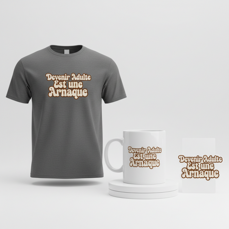
王鵬 (Ōhō) Merch Design
The electric buzz of the spring sumo tournament, Haru Basho, has once again captivated Japan, drawing eyes to the hallowed dohyo where legends are forged. This year, much of the conversation swirls around rising stars like Ōhō, whose scheduled bouts are sparking fervent discussions among fans nationwide. It’s a moment where ancient tradition meets modern anticipation, creating a unique cultural groundswell that astute designers and e-commerce entrepreneurs might recognize as a fertile space for creative exploration.
The Cultural Significance
Sumo wrestling is far more than just a sport in Japan; it is a profound cultural institution, steeped in Shinto rituals and centuries of history. The Haru Basho, one of the six annual Grand Sumo Tournaments, is a particularly significant event, drawing massive viewership and igniting passionate discourse. When a promising rikishi like Ōhō is in the spotlight, his performance becomes a focal point for national pride and collective excitement. This isn’t merely about wins and losses; it’s about the embodiment of strength, discipline, and the indomitable spirit that defines these incredible athletes, resonating deeply within the Japanese psyche and among martial arts enthusiasts globally.
Design Brainstorm: Capturing the Aesthetic
Translating the raw power and cultural reverence of sumo into a compelling design requires a thoughtful touch. The aim here is to distill the essence of the sport and its athletes into a visual that is both powerful and timeless, moving beyond specific event hype to an evergreen appeal.
- 🎨 Visual Concept: One compelling angle is to center the design around a single, potent Japanese kanji character. Imagine it rendered in a dynamic, expressive calligraphy (shodo) style. This would involve visible, sweeping brush strokes and perhaps a few artistic ink splatters, conveying energy and authenticity. The beauty of this approach lies in its minimalism – a singular focus on the strength and artistic elegance of the character itself, allowing it to speak volumes.
- ✍️ Typography Ideas: The chosen text, “剛力” (Gōriki), is exceptionally fitting. It translates to “mighty strength” or “Herculean power,” perfectly encapsulating the physical and mental prowess of a sumo wrestler. When rendered in an authentic shodo style, the character itself becomes a work of art, conveying its meaning visually. This isn’t just text; it’s an icon of power, a tribute to the unyielding force that sumo wrestlers represent.
- 👕 Product Canvas: To maximize the impact of such a bold, dark kanji design, an ideal product canvas would be light-colored apparel. Think crisp white, soft cream, or light grey t-shirts, hoodies, or even long-sleeve tees. The contrast allows the intricate brushwork and the strength of the character to truly pop, making for a striking and elegant statement piece.
Strategic Market Insight
The true genius of this design strategy lies in its clever pivot. While the initial trending interest might be sparked by a specific athlete like Ōhō and the Haru Basho, the merchandise concept deftly transcends these ephemeral events. By utilizing the term ‘Gōriki,’ which embodies the universal concept of a sumo wrestler’s power, the design appeals to a much broader and perennial target audience: devoted fans of sumo wrestling, practitioners and admirers of Japanese martial arts culture, and anyone who appreciates the aesthetics of Japanese calligraphy and the spirit of strength. This approach is not only culturally respectful but also strategically robust, safeguarding against reliance on potentially protected names while tapping into an enduring passion for sumo, ensuring year-round relevance and appeal.
⚖️ Estimated Copyright Risk: LOW
Copyright Evaluation: The design uses a common Japanese word that represents a concept of strength. It is not a brand name or a registered trademark. The calligraphy style is an artistic expression. The design avoids using any specific wrestler’s name, likeness, or official tournament logos, targeting the broad cultural trope of sumo wrestling.
Always verify intellectual property rights before listing.
Check Japan Trademark Search for “王鵬” ➔
AI Image Generation Prompts
The following prompts are optimized for leading generators to produce production-ready assets:
👕 Apparel / T-Shirt Prompt
A powerful, single Japanese kanji character '剛力' rendered in a dynamic, highly expressive shodo (calligraphy) style. The character features bold, energetic brush strokes with varying line weight, showcasing authentic sumi ink techniques, dry brush effects, and spontaneous, artistic ink splatters and drips radiating from the main character. The aesthetic is clean, minimalist, and focused entirely on the raw beauty and strength of the calligraphy. This is a crisp, clean vector illustration style, with precise, sharp edges and smooth curves, optimized for a t-shirt print. The artwork is digitally created, highly detailed, and appears as a flawless graphic, perfectly isolated on a solid light grey background, ensuring maximum contrast and clarity. There are no fuzzy anti-aliasing artifacts; instead, it's a perfect cut-out suitable for print. The ink appears rich, deep black with subtle simulated texture within the strokes, giving it a tactile feel while maintaining vector crispness. High-resolution digital art, print-ready quality. The overall mood is powerful, ancient, and elegantly modern. The ONLY text allowed in the image is exactly '剛力'. Absolutely NO other names, words, or random letters. --ar 3:4 --v 6.0
☕ Drinkware / Mug Prompt
A duplicated side-by-side layout showing the exact same graphic on the left and right, designed perfectly for a panoramic mug wrap. Each instance features a single, impactful Japanese kanji character '剛力' meticulously rendered in an authentic, dynamic, and highly expressive shodo (calligraphy) style. The brushwork is bold, commanding, with visible, varied stroke thickness, nuanced dry brush textures, and spontaneous, artistic ink splatters and fine drips that convey raw energy and motion. The sumi ink appears rich, deep black, with hyper-realistic texture simulating actual wet ink on paper, showing subtle sheens and depths. The design maintains a strong minimalist aesthetic, allowing the power of the character to dominate. The rendering is ultra-high-definition digital art, showcasing photographic realism for the ink textures while preserving the calligraphic artistry. The background is a clean, bright white studio setting, ensuring the dual graphics stand out. Lighting is even, soft studio illumination, highlighting the faux ink's texture and simulated dimensionality. The graphic is perfectly replicated on both sides, ensuring a seamless wrap. The ONLY text allowed in the image is exactly '剛力'. Absolutely NO other names, words, or random letters. --ar 3:1 --v 6.0
✨ Die-Cut Sticker Prompt
A vibrant, die-cut sticker graphic featuring a single, powerful Japanese kanji character '剛力' in a stylized, dynamic, and expressive shodo (calligraphy) style. The character is rendered with bold, sweeping brush strokes and graphic, artistic ink splatters that are integrated into a 2D flat pop-art aesthetic. The design includes a thick, clean white outline border around the entire graphic (character + splatters), making it perfectly suitable for a die-cut sticker. The style is a crisp, clean vector illustration, digital art with ultra-sharp edges and smooth, anti-aliased lines. Colors are stark: pure black for the character and splatters, and pure white for the background and border. There is no gradient or complex shading; it's flat, impactful, and graphic. The rendering is high-resolution, super crisp, and designed for maximum visual punch on a sticker. The overall mood is dynamic, cool, and modern. Isolated on a plain white background, emphasizing the die-cut nature. The ONLY text allowed in the image is exactly '剛力'. Absolutely NO other names, words, or random letters. --ar 1:1 --v 6.0
Frequently Asked Questions
How does this design remain relevant beyond a specific sumo tournament or wrestler?
The design’s focus on “剛力” (Gōriki) allows it to transcend the ebb and flow of specific events or individual athletes. “Gōriki” means “mighty strength,” a timeless attribute central to the essence of sumo wrestling and martial arts in general. It speaks to the core values of the sport and its practitioners, making it universally appealing to fans regardless of who is currently in the spotlight or what tournament is active.
Why is traditional calligraphy (shodo) a powerful design choice for this niche?
Shodo is deeply intertwined with Japanese culture and spiritual practice, making it an authentic and highly respected artistic medium. For sumo, it lends an air of tradition, power, and meditative focus. The visible brush strokes and artistic ink splatters inherent in shodo convey dynamism and raw energy, perfectly mirroring the intense moments and physical prowess seen on the dohyo. It’s an art form that speaks to both visual aesthetics and cultural depth.
What other products could effectively showcase this minimalist kanji design?
Beyond light-colored apparel, this powerful and minimalist kanji design would translate beautifully to a variety of products. Consider accessories like durable tote bags, ceramic mugs, phone cases, or even wall art prints. The high contrast of the dark kanji on a light background ensures versatility, allowing the design to make a strong statement across different merchandise categories, appealing to collectors and fans looking for subtle ways to display their passion.
Final Thoughts
Harnessing the current cultural moment around sumo, while strategically broadening its appeal, presents a fantastic opportunity for those in the e-commerce space. This design concept, leveraging the timeless power of Japanese calligraphy and a universally understood concept like “Gōriki,” offers a respectful and engaging way to connect with a passionate global audience. The potential for strong sales in a niche that values tradition, strength, and authentic cultural representation is significant. Ultimately, success will hinge on the careful execution of the design and the ability to convey its deep meaning to the right buyers.
💬 What’s Your Take?
Art is subjective, and this is just one angle! How would you spin this “王鵬 (Ōhō)” trend? Drop your design ideas and let’s brainstorm in the comments below!