立直! – Riichi!
Japan’s vibrant media landscape is currently captivated by a unique blend of strategic genius and dazzling charisma, epitomized by figures like professional Mahjong player and model, Okada Sayaka. This isn’t just about celebrity; it’s a testament to the surging popularity of Mahjong, a game where every move is a calculated dance between skill and chance, drawing significant public attention.
The Cultural Significance
This surge isn’t just a fleeting trend. Okada Sayaka’s multi-faceted career, spanning high-fashion modeling, formidable professional Mahjong play, and a beloved media personality role, has propelled the ancient tile game into the mainstream consciousness of Japan. Her ability to bridge these seemingly disparate worlds has created a powerful focal point, drawing new eyes to the intricate beauty of Mahjong. This heightened visibility ignites a renewed passion among existing players and sparks curiosity in newcomers, cementing Mahjong’s place not just as a game, but as a cultural touchstone. The game, with its rich history and complex strategies, has always held a special place in Japanese culture, and individuals like Okada Sayaka are now amplifying that resonance to a wider, more diverse audience.
Design Brainstorm: Capturing the Aesthetic
To truly resonate with this specific cultural moment and the Mahjong community, a design concept could lean into a clean, modern aesthetic. This approach not only captures the essence of the game but also provides an insider wink to those in the know.
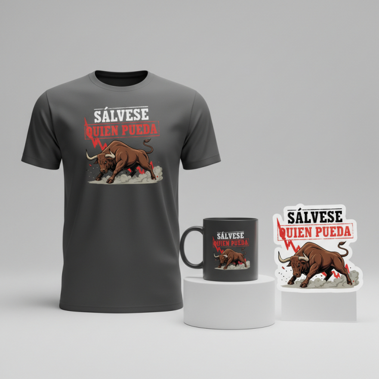
- 🎨 Visual Concept: The central element might be a striking visual of the Japanese text “立直!” (Riichi!), crafted to evoke the tactile experience of the game. One could imagine these characters boldly displayed, perhaps stylized to appear as if individual Mahjong tiles are precisely stacked or aligned, mimicking the moment of declaring ‘Riichi’. Below this powerful Japanese statement, a subtle, smaller English translation could provide context without diluting the authentic Japanese feel. A clever touch would be to render the exclamation point in a vibrant red, artfully nodding to the coveted ‘dora’ tile – a visual cue instantly recognized and appreciated by any seasoned Mahjong player, symbolizing a moment of high stakes and potential victory.
- ✍️ Typography Ideas: The choice of typeface for “立直!” is paramount. One could explore a robust, traditional Japanese calligraphy style, but rendered with sharp, contemporary lines to maintain the “clean, modern” brief. Alternatively, a sans-serif font with strong, block-like characters could be selected, then individually manipulated to create that stacked tile illusion. The aim is for legibility combined with a powerful visual impact, ensuring the Japanese characters are distinct and aesthetically pleasing. For the smaller English translation, a clean, readable sans-serif font would offer contrast and clarity without competing with the primary Japanese text.
- 👕 Product Canvas: Given the intent to create a bold, impactful design, apparel in a dark hue would serve as the ideal canvas. Think deep charcoal, midnight blue, or classic black t-shirts, hoodies, or even long-sleeve athletic wear. The contrast of the vibrant red exclamation point and the stylized white or light-colored Japanese text against a dark background would make the design pop, embodying the sharp, focused energy of a Mahjong game. Dark apparel inherently projects a sophisticated and versatile vibe, suitable for both casual wear and more dedicated gaming sessions, aligning well with the demographic.
Strategic Market Insight
Targeting Mahjong players, both within Japan and globally, with a design like this taps into a highly dedicated and passionate demographic. The term “Riichi” is more than just a word; it’s a pivotal moment in Japanese Mahjong, a declaration that signifies a player is one tile away from completing their hand, often accompanied by heightened tension and strategic calculation. For a Mahjong enthusiast, seeing “立直!” on apparel is an immediate, powerful insider reference – a badge of belonging, a subtle nod to their shared passion and knowledge. This avoids any IP entanglements related to a specific celebrity by pivoting to the universal language of the game itself. The psychological trigger here is identity and affiliation. Wearing such a design isn’t just about fashion; it’s about expressing one’s identity as a Mahjong player, connecting with a subculture, and appreciating the intricate beauty of the game. It creates an authentic, targeted product that resonates deeply with its intended audience, fostering a sense of community and shared passion.
⚖️ Estimated Copyright Risk: LOW
Risk Assessment: As noted in the IP log, Okada Sayaka is a celebrity whose name and likeness are protected. The design pivots to the safe, generic Mahjong theme. The term ‘Riichi!’ is a common gameplay word, not a brand, and my research found no evidence of it being trademarked for apparel, making it safe to use.
Always verify intellectual property rights before listing.
Check Japan Trademark Search for “立直!” ➔
AI Image Generation Prompts
The following prompts are optimized for leading generators to produce production-ready assets:
👕 Apparel / T-Shirt Prompt
Isolated on a solid Dark background, clean vector illustration style. The central design features the Japanese text '立直!', rendered in a bold, highly stylized typeface meticulously designed to resemble Mahjong tiles stacked tightly together. Each character '立', '直' is crafted with crisp, sharp outlines, subtle internal bevels, and solid, muted color fills (e.g., ivory, light grey, bamboo green, or charcoal), evoking the precise texture and aesthetic of polished Mahjong tiles. The font features strong geometric forms, perfect symmetry, and a sense of depth, giving the impression of carved blocks. The exclamation point '!' within the '立直!' text string is rendered in a vibrant, eye-catching 'dora' red (a rich, saturated crimson), providing a strong visual pop and mimicking the iconic Mahjong tile color. The overall composition is perfectly balanced, with precise, clean lines, smooth curves where appropriate, and a high-definition graphic finish suitable for screen printing. The artwork is presented with stark clarity, no blur, and a focused, graphic-novel like mood. Lighting is even and soft, emphasizing the clean edges without harsh shadows. The solid dark background enhances the vibrancy and contrast of the design elements, making them stand out prominently. The rendering style is flat yet dimensional, prioritizing readability and visual impact. The ONLY text allowed in the image is exactly '立直!'. Absolutely NO other names, words, or random letters. --ar 3:4 --v 6.0
☕ Drinkware / Mug Prompt
A duplicated side-by-side layout showing the exact same graphic on the left and right, designed perfectly for a panoramic mug wrap. The central graphic is a clean, modern design featuring the Japanese text '立直!'. This text is presented in a bold, highly stylized Japanese typeface, meticulously crafted to resemble Mahjong tiles stacked tightly together. Each character '立', '直' has crisp, sharp edges, with subtle internal shading and a slight bevel to give the impression of polished ivory or jade tiles. The overall font style is geometric, strong, and impactful, rendered in solid, clean colors (e.g., off-white, subtle grey, or light bamboo green) with a smooth, polished texture effect. The exclamation point '!' within the '立直!' text string is rendered in a vibrant, attention-grabbing 'dora' red (a bright, clear crimson), providing a striking focal point against the otherwise muted tones. The design elements are arranged with perfect symmetry and balance, ensuring visual harmony for repeated display across the mug. The entire graphic maintains a high level of detail and clarity, rendered in a crisp, vector-like digital art style suitable for print. The mood is minimalist, sophisticated, and focused, with strong visual presence. The colors are well-saturated for print, and the lines are razor-sharp. No extraneous elements or background distractions, designed to float perfectly on a mug surface. The ONLY text allowed in the image is exactly '立直!'. Absolutely NO other names, words, or random letters. --ar 3:1 --v 6.0
✨ Die-Cut Sticker Prompt
A vibrant, 2D flat pop-art style illustration, optimized for a die-cut sticker, featuring a thick white outline border around the entire design. The central graphic showcases the Japanese text '立直!' presented in a bold, highly stylized typeface, specifically designed to evoke the appearance of Mahjong tiles stacked together. Each character '立', '直' is rendered with distinct, clean lines and solid, flat color blocks, mimicking the crisp edges and robust, simplified form of polished Mahjong tiles. The 'tiles' themselves are in a modern, bold color palette such as bright off-white, light grey, or subtle jade green, with strong black outlines defining their shapes for maximum graphic impact. The exclamation point '!' within the '立直!' text string is rendered in a brilliant, attention-grabbing 'dora' red (a true, punchy crimson), making it pop vividly against the other characters and the white border. The design is characterized by its sharp graphic quality, high contrast, and simplified forms, devoid of complex gradients or textures, favoring clean color separation. The thick white outline border cleanly separates the design from any background, ensuring it stands out as a distinct, peelable sticker. The overall mood is modern, energetic, and highly graphic, with strong visual impact and playful simplicity. The rendering is absolutely flat, with no depth cues beyond strong outlines. The ONLY text allowed in the image is exactly '立直!'. Absolutely NO other names, words, or random letters. --ar 1:1 --v 6.0
Frequently Asked Questions
Why focus on “Riichi” specifically instead of broader Mahjong themes?
“Riichi” is a cornerstone declaration in Japanese Mahjong, instantly recognizable and deeply significant to players of that specific variant. It’s an “if you know, you know” phrase, creating an exclusive feel that resonates strongly with dedicated enthusiasts. This specificity helps differentiate the design and target a passionate niche effectively, appealing directly to those immersed in the game.
How does this design appeal to international Mahjong players, not just those in Japan?
Japanese Mahjong has a significant global following, with online platforms and communities thriving worldwide. Players outside Japan are often well-versed in Japanese terminology like “Riichi” because it’s integral to the game’s rules and strategy. The inclusion of a smaller English translation provides accessibility, while the authentic Japanese text and Mahjong-inspired visuals offer an appealing cultural connection for international fans who appreciate the game’s origins and depth.
What kind of aesthetic complements this design for a full product line?
To complement this “Riichi” concept, one could explore a minimalist aesthetic with clean lines and subtle nods to Mahjong elements. Think abstract tile patterns, geometric representations of game pieces, or even designs featuring the four directional winds. The key is to maintain a sophisticated, contemporary feel that mirrors the strategic depth of Mahjong, perhaps utilizing a limited color palette that works well with dark apparel to create a cohesive and stylish collection.
Final Thoughts
The current spotlight on figures like Okada Sayaka offers a brilliant gateway into the enduring appeal of Mahjong. By creatively leveraging key phrases and iconic imagery from the game, designers can craft merchandise that resonates deeply with a dedicated global audience. The potential for e-commerce in this niche lies in understanding the cultural nuances and delivering authentic designs that speak directly to the player’s experience. Ultimately, success hinges on thoughtful execution and injecting a unique artistic spin that captures the strategic spirit and cultural richness of Japanese Mahjong.
💬 What’s Your Take?
Art is subjective, and this is just one angle! How would you spin this “岡田紗佳 (Okada Sayaka)” trend? Drop your design ideas and let’s brainstorm in the comments below!