薔薇 ばら – Bara (Rose)
In the vibrant tapestry of Japanese culture, few things capture the collective imagination quite like the enigmatic beauty of its written language. Beyond the everyday characters, there exists a cherished realm of ‘Nandoku Kanji’ – those notoriously complex or obscure Chinese characters that present a delightful intellectual challenge. This recurring fascination isn’t just a fleeting trend; it’s a deep-seated appreciation for linguistic artistry and a national pastime that regularly bubbles up in online quizzes, educational magazines, and social media feeds, sparking conversations and friendly competitions among enthusiasts.
The Cultural Significance
The enduring appeal of Nandoku Kanji in Japan stems from a unique blend of intellectual curiosity and aesthetic admiration. It’s a testament to the intricate layers of the Japanese language itself, where a single character can hold centuries of history and multiple readings. The act of deciphering a difficult Kanji isn’t just about memorization; it’s a mental puzzle, a test of knowledge, and for many, a beautiful connection to the classical roots of their lexicon. When a particularly challenging character is mastered, it provides a sense of accomplishment, an “aha!” moment that resonates deeply. This cultural phenomenon makes it an evergreen topic, continually refreshed by new discoveries and shared challenges, fostering a community of language lovers and character connoisseurs.
Design Brainstorm: Capturing the Aesthetic
Translating this cultural fascination into a compelling merchandise design requires a thoughtful approach that respects both the intellectual challenge and the visual artistry inherent in Kanji. One powerful angle to consider focuses on elegance and directness, letting the character itself be the star.
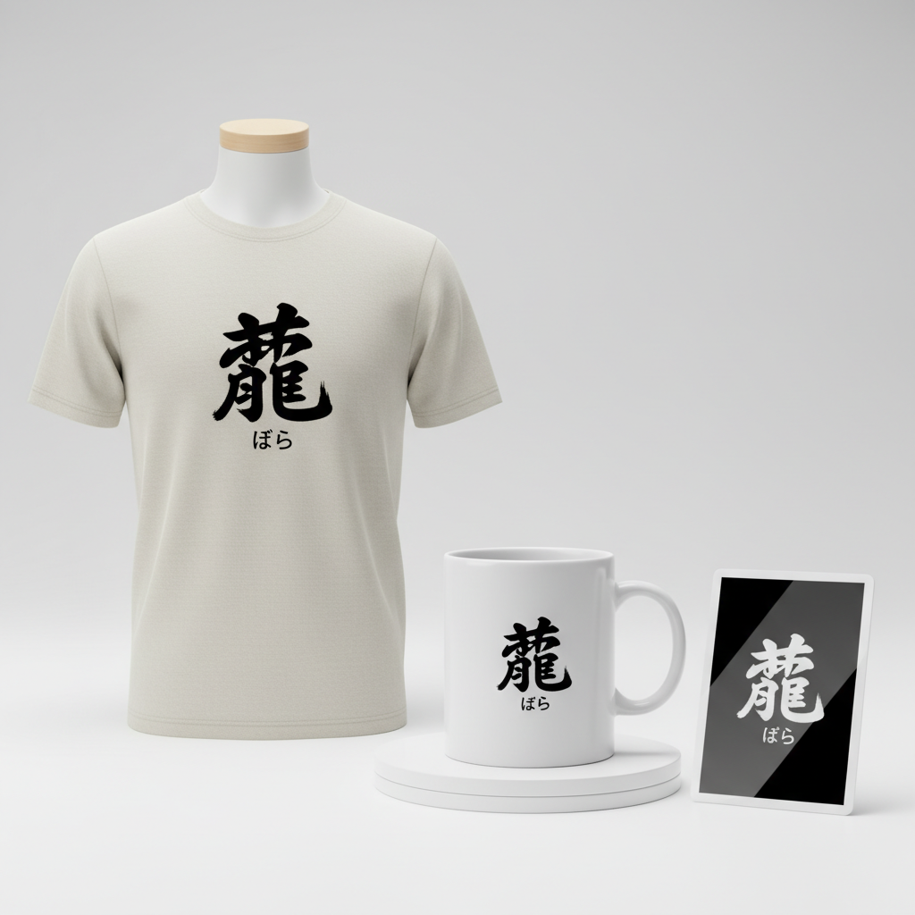
- 🎨 Visual Concept: The core of this design concept centers around a single, striking Kanji character. Imagine a large, bold rendition of 薔薇 (bara, meaning rose) dominating the space, rendered with the fluid, expressive strokes of traditional Japanese calligraphy, known as Shodo. The dynamic brushwork, with its subtle variations in ink saturation and line thickness, would convey both power and grace, giving the design an authentic and artistic feel. This approach ensures the character is not just text, but a piece of art in itself.
- ✍️ Typography Ideas: Complementing the artistic Kanji, the phonetic reading “ばら” could be placed subtly below. This secondary text would appear in a much smaller, clean, and modern sans-serif font. The contrast between the elaborate, traditional Kanji and the minimalist, contemporary hiragana reading creates an intriguing visual tension, offering clarity without detracting from the main artwork. It’s an insider’s nod for those who recognize the Kanji, and a helpful guide for those learning.
- 👕 Product Canvas: For this type of design, a light-colored apparel base would work beautifully. White, light grey, or even soft pastel garments would allow the rich black or deep color of the calligraphic Kanji to truly pop. The contrast would enhance the visual impact of the brush strokes, ensuring the intricate details are clearly visible and appreciated, creating a sophisticated and eye-catching piece.
Strategic Market Insight
Targeting the market for Nandoku Kanji merchandise offers a unique opportunity to connect with a passionate and discerning demographic. The ideal audience includes enthusiasts of the Japanese language – from students delving into its complexities to seasoned speakers who appreciate its nuances. Calligraphy lovers will be drawn to the artistic quality, while those who enjoy intellectual challenges will find a kinship with the concept. The psychological trigger here is multifaceted: it’s about signaling an insider’s knowledge, an appreciation for intellectual beauty, and a connection to a specific cultural phenomenon. Wearing such a design is a subtle yet powerful conversation starter, allowing individuals to express their passions and perhaps even share a moment of shared understanding over a notoriously difficult character. This niche is not only culturally resonant but also incredibly stable, appealing to an evergreen interest in Japanese aesthetics and education.
⚖️ Estimated Copyright Risk: LOW
Our Findings: Kanji characters themselves are part of the public domain writing system and cannot be copyrighted. The design simply presents a word and its pronunciation. No protected intellectual property is used.
Always verify intellectual property rights before listing.
Check Japan Trademark Search for “難読 漢字” ➔
AI Image Generation Prompts
The following prompts are optimized for leading generators to produce production-ready assets:
👕 Apparel / T-Shirt Prompt
A single, dominant, beautifully rendered Japanese Kanji character '薔薇' (Bara, meaning Rose) as the central focus of a t-shirt print design. The character is executed in a highly dynamic, expressive, and authentic Shodo (Japanese calligraphy) brush-stroke style. Imagine broad, confident ink strokes with varying pressure and speed, exhibiting a sophisticated sense of flow and movement, reminiscent of traditional sumi-e but translated into a crisp, clean vector illustration style. The ink is a deep, rich, velvety black, with subtle nuances of simulated brush texture rendered with sharp, clean vector edges, giving depth without losing its graphic impact. Below the large Kanji, in a much smaller, extremely clean, modern, and highly legible sans-serif font (e.g., Helvetica Neue or Montserrat), is the phonetic reading 'ばら'. This smaller text is perfectly centered beneath the Kanji, creating a balanced composition. The entire design is isolated on a solid, pristine light background, making the black calligraphy pop with maximum contrast and clarity, optimized for direct-to-garment or screen printing applications. The overall mood is elegant, minimalist, and powerful, with a strong aesthetic appeal. --ar 3:4 --v 6.0 The ONLY text allowed in the image is exactly '薔薇 ばら'. Absolutely NO other names, words, or random letters.
🔍 Search this niche on:
☕ Drinkware / Mug Prompt
A duplicated side-by-side layout showing the exact same graphic on the left and right, designed perfectly for a panoramic mug wrap. The graphic features a single, prominent, exquisitely rendered Japanese Kanji character '薔薇' (Bara, meaning Rose) as the core element. This Kanji is presented in a bold, energetic, and artistic Shodo (Japanese calligraphy) brush-stroke style, characterized by strong, fluid ink lines, varying thickness, and an intentional, artful imperfection that conveys authenticity and handmade charm. The ink color is a vibrant, deep crimson red, evoking the essence of a rose, with subtle, organic texture suggesting traditional ink on a ceramic-like surface. Directly below the large Kanji, in a significantly smaller, meticulously clean, contemporary sans-serif typeface, is the phonetic reading 'ばら'. This smaller text maintains excellent readability and offers a precise, understated contrast to the organic Kanji above. The composition is balanced and self-contained, with a transparent background that allows the mug's color to show through. The aesthetic is sophisticated, timeless, and culturally rich, designed for high-resolution ceramic printing. --ar 3:1 --v 6.0 The ONLY text allowed in the image is exactly '薔薇 ばら'. Absolutely NO other names, words, or random letters.
🔍 Search this niche on:
✨ Die-Cut Sticker Prompt
A single, impactful, beautifully stylized Japanese Kanji character '薔薇' (Bara, meaning Rose) as the central focus for a die-cut sticker design. The character is rendered in a highly graphic, 2D flat pop-art style, with bold, clean, and distinct brush strokes that retain the dynamic spirit of Shodo calligraphy but are simplified for maximum visual punch. The lines are sharp and precise, resembling a stencil or screen-printed aesthetic, with no gradient or shading, utilizing pure, unadulterated deep black. Directly beneath the large Kanji, in a much smaller, blocky, modern, and highly legible sans-serif font, is the phonetic reading 'ばら'. This smaller text is crisp and perfectly aligned, complementing the bold Kanji. The entire design is encircled by a thick, uniform, and very clean white outline border, creating a striking separation from any background it might be placed against, enhancing its die-cut appeal. The overall mood is energetic, contemporary, and iconic, with a strong graphic presence, ideal for vinyl sticker production. --ar 1:1 --v 6.0 The ONLY text allowed in the image is exactly '薔薇 ばら'. Absolutely NO other names, words, or random letters.
🔍 Search this niche on:
Frequently Asked Questions
Why choose ‘薔薇’ (bara/rose) as a Nandoku Kanji for merchandise?
The character 薔薇 (bara) is a fantastic choice because it perfectly embodies the Nandoku Kanji appeal. It’s famously difficult to write and recognize for many, yet its meaning – “rose” – is universally understood and beautiful. This creates a delightful ‘insider joke’ for those familiar with its complexity, while still offering an aesthetically pleasing and easily graspable concept for a broader audience. It’s a blend of intellectual challenge and visual charm.
What other kinds of Nandoku Kanji or themes might resonate well with this target audience?
Beyond specific famous characters like 薔薇, other themes could include rare animal names (like 麒麟 ‘kirin’ for giraffe or mythical beast), obscure place names, or unique plant species. The key is to find Kanji that are visually interesting, challenging to read, and ideally carry a positive or intriguing meaning. Exploring characters with multiple complex radicals or those that are rarely encountered in daily writing often yields excellent results for this niche.
How can designers make their Nandoku Kanji merchandise stand out in a competitive market?
Differentiation can come from several angles. First, focus on the *authenticity and quality* of the calligraphy – a truly skilled Shodo rendering will elevate the design significantly. Second, explore unique combinations: perhaps a slightly abstract background, a minimalist modern frame, or even a subtle color gradient within the character itself, while maintaining its readability. Lastly, consider the character selection: finding lesser-known but equally beautiful Nandoku Kanji could attract collectors or those seeking truly unique expressions of their interest.
Final Thoughts
The enduring fascination with Nandoku Kanji presents a rich vein for print-on-demand creators. By tapping into this blend of intellectual challenge and aesthetic appreciation, designers can craft merchandise that resonates deeply with language enthusiasts, cultural connoisseurs, and anyone who appreciates the subtle beauty of complex design. The potential for e-commerce success in this niche lies in understanding the cultural context, executing designs with precision and artistic flair, and recognizing the powerful psychological draw of wearing one’s passions. With thoughtful character selection and high-quality artistic rendition, these designs aren’t just clothes; they’re conversation starters, expressions of identity, and wearable pieces of Japanese linguistic art.
💬 What’s Your Take?
Art is subjective, and this is just one angle! How would you spin this “難読 漢字 (Difficult to read Kanji)” trend? Did we miss the mark, or is there a better inside joke to use here? Drop your design ideas and let’s brainstorm in the comments below!