選手を信じる – Believe in the players
📅 Published: May 13, 2026
📍 Target Market: Japan
🔥 Trend: 山瀬 慎之 助 (Yamase Shinnosuke) ↗
Japan’s national obsession, baseball, is currently buzzing with more than just home run cheers. A recent controversy has ignited the passion of fans across the archipelago, sparking debate and offering a unique opportunity for print-on-demand creators to tap into a powerful cultural sentiment.
The Cultural Significance
The heart of Japanese baseball, known as Yakyū, beats with a fervent devotion that permeates all aspects of society. When a star player, Yamase Shinnosuke, faced a demotion by the Yomiuri Giants’ manager, it wasn’t just a team decision; it became a national talking point. This wasn’t merely about wins and losses; it touched upon deeper cultural chords, including the relationship between players and management, the traditional respect for authority, and the passionate, almost familial, bond fans feel with their athletes. The public criticism from former professional players further fueled the debate, turning a locker room decision into a nationwide discussion, demonstrating the profound emotional investment Japanese fans have in their sport.
Design Brainstorm: Capturing the Aesthetic
Translating such a potent cultural moment into merchandise requires a thoughtful approach that respects tradition while resonating with current sentiment. One exciting angle to explore involves drawing directly from the rich visual heritage of Japanese baseball, infused with a message that speaks to the heart of the current debate.
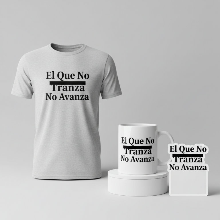
- 🎨 Visual Concept: The design could beautifully mimic classic Japanese baseball apparel. Think about the timeless aesthetic of team uniforms and fan gear, often characterized by bold, clean lines and a sense of athletic tradition. The arrangement of the text would be key, often presented vertically, which is a hallmark of Japanese graphic design and adds an immediate sense of authenticity and historical reverence.
- ✍️ Typography Ideas: For the textual element, a thick, slightly brush-stroked font would be ideal. Styles akin to Kanteiryu, traditionally used for sumo banners but adaptable for its powerful, dynamic character, would lend an authoritative yet artistic feel. The chosen phrase, “選手を信じる” (Senshu wo Shinjiru), meaning “Believe in the players” or “Trust the players,” is brilliant. It cleverly sidesteps specific names or teams, making it universally applicable to the sentiment of supporting athletes, while perfectly capturing the essence of the current fan debate.
- 👕 Product Canvas: Given the nature of sports fan apparel, light-colored products would serve as an excellent canvas. This ensures the bold Japanese typography stands out clearly and feels comfortable for fans wearing it in various settings, from casual outings to game day.
Strategic Market Insight
Targeting passionate Japanese baseball fans with this design concept is a strategic move, tapping into potent psychological triggers. The trend pivots from a specific, potentially trademarked news event involving named individuals to an evergreen, emotional stance of ‘supporting the athletes.’ Fans who feel empathy for the player and frustration with management now have a safe, yet powerful, way to express their solidarity. The phrase “選手を信じる” is generic enough to avoid infringement concerns but deeply resonant with the core sentiment of the trend. It allows individuals to wear their convictions without directly affiliating with a specific team’s internal politics, making it a powerful statement of fan loyalty and belief in the spirit of the game itself.
AI Image Generation Prompts
The following prompts are optimized for leading generators to produce production-ready assets:
👕 Apparel / T-Shirt Prompt
An intricate, highly detailed, clean vector illustration optimized for a t-shirt print, depicting a classic Japanese baseball (Yakyū) aesthetic. The central focus is the impactful, vertically arranged Japanese text '選手を信じる'. The characters are meticulously crafted in an extremely bold, thick, brush-stroked Kanteiryu-style font, conveying traditional calligraphic power with modern vector precision. Each stroke features razor-sharp, defined edges, consistent line weight, and a flawless, flat fill, devoid of any gradients, textures, or faux brush distress. The entire design employs a strictly limited, high-contrast color palette, such as deep, rich black for the prominent text against a subtle, dark red stylized baseball silhouette discreetly placed behind, all rendered with absolute flatness. The illustration style emphasizes crispness, graphic simplicity, and bold shapes, ensuring maximum clarity and impact when printed. There is no subtle shading or depth; every element is a pure, unadulterated color block. The design is presented in a traditional and respectful mood, yet distinctly modern in its execution. Isolated on a solid Light background, clean vector illustration style. The ONLY text allowed in the image is exactly '選手を信じる'. Absolutely NO other names, words, or random letters. --ar 3:4 --v 6.0
☕ Drinkware / Mug Prompt
A breathtaking, highly detailed artistic illustration meticulously crafted for a panoramic coffee mug wrap layout, exuding a profound Japanese baseball (Yakyū) aesthetic. The core of the design is the vertical Japanese text '選手を信じる', exquisitely rendered in an authentic, thick, brush-stroked calligraphy style that captures the dynamic fluidity and raw power of traditional Sumi-e ink painting, infused with the bold presence of Kanteiryu. Each character exhibits organic ink bleed, subtle variations in opacity, and visible brush hair textures, imparting a handcrafted, artisanal feel. The text is masterfully integrated into a rich, atmospheric background featuring soft, gradient ink washes in shades of deep indigo, misty gray, and a touch of earth brown, evoking a serene, vintage Japanese landscape. Abstract, swirling currents or subtle, stylized gusts of wind are depicted with fine brush lines, suggesting movement and energy. Delicate, muted vermilion accents appear as faint, traditional Japanese baseball stitching patterns subtly woven into the background texture, or as a single, ethereal red sun disc peeking through the mist. The art style is a harmonious blend of traditional Japanese painting techniques and modern graphic design, rendered with soft, natural lighting that highlights the textural qualities of the ink and paper-like surface. The mood is powerful, contemplative, and deeply respectful of tradition. A duplicated side-by-side layout showing the exact same graphic on the left and right, designed perfectly for a panoramic mug wrap. The ONLY text allowed in the image is exactly '選手を信じる'. Absolutely NO other names, words, or random letters. --ar 3:1 --v 6.0
✨ Die-Cut Sticker Prompt
A highly impactful, dynamically composed 2D flat pop-art illustration, meticulously designed for a premium die-cut sticker. The concept embodies a modern take on classic Japanese baseball (Yakyū). The centerpiece is the vertically oriented Japanese text '選手を信じる', presented in an extraordinarily bold, chunky, brush-stroke font with an almost block-print graphic quality. Each character is delineated by a heavy, precise black outline and filled with vibrant, unadulterated flat color, such as an intense cherry red or a deep, powerful indigo. The brush strokes are exaggerated for visual punch, maintaining a perfectly clean, vector-like finish without any artificial distress or ink bleed. The text is anchored by a high-energy background element, like a stylized, minimalist baseball graphic radiating bold speed lines, or an iconic, simplified silhouette of a baseball bat and ball, all rendered in contrasting, highly saturated flat colors (e.g., brilliant yellow, pure white, stark black). The art style emphasizes strong graphic shapes, clear visual hierarchy, and an absence of any gradients, shadows, or photo-realistic textures, true to the pop-art aesthetic. The overall mood is energetic, playful, and unequivocally bold. A thick white outline border around the design, ensuring a crisp, clean die-cut edge. The ONLY text allowed in the image is exactly '選手を信じる'. Absolutely NO other names, words, or random letters. --ar 1:1 --v 6.0
Frequently Asked Questions
How does this design navigate potential trademark or specific event limitations?
The strength of this concept lies in its intelligent abstraction. By focusing on the universal sentiment “選手を信じる” (Believe in the players) and utilizing a classic Japanese baseball aesthetic, the design intentionally avoids direct mentions of specific players, teams, or managers involved in the initial controversy. This approach allows it to capture the emotional essence of the trend safely and broadly, appealing to any fan who believes in supporting athletes, regardless of specific team allegiances.
Why are Japanese baseball fans so deeply invested in management decisions and player controversies?
Japanese baseball is more than just a sport; it’s a cultural institution deeply woven into the national identity, evoking strong passions and a sense of community. Fans often form profound emotional bonds with their favorite players, viewing them almost as family members or local heroes. Therefore, decisions impacting these beloved figures, especially those perceived as unjust or against the player’s best interest, are felt personally and can ignite widespread public debate, reflecting the deep respect and high expectations placed on all figures within the Yakyū world.
Beyond apparel, what other print-on-demand products could this design concept be applied to effectively?
Given its strong visual and emotional appeal, this design would translate wonderfully to a variety of products popular with sports fans. Consider accessories such as caps, phone cases, and tote bags, where the vertical text and classic aesthetic would stand out. Mugs, posters, and even Japanese-style hand towels could also be excellent canvases, allowing fans to integrate their support for players into various aspects of their daily lives, extending beyond game day wear.
Final Thoughts
The passion of Japanese baseball fans presents a vibrant market for print-on-demand, especially when tapping into culturally significant moments like the recent controversy. A design concept rooted in tradition, yet speaking to contemporary sentiment with a powerful, universally appealing message like “選手を信じる,” holds significant e-commerce potential. Success in this niche will undoubtedly hinge on meticulous execution, a keen eye for cultural nuance, and a commitment to high-quality print production that honors the aesthetic it seeks to emulate.
💬 What’s Your Take?
Art is subjective, and this is just one angle! How would you spin this “山瀬 慎之 助 (Yamase Shinnosuke)” trend? Drop your design ideas and let’s brainstorm in the comments below!
⚖️ Disclaimer, Copyright & Earnings Notice
This article provides insights, design concepts, and strategies for educational and informational purposes only. By utilizing this information, you acknowledge and agree to the following:
- No Legal Advice: The content provided does not constitute legal counsel. Intellectual property laws are complex and constantly evolving.
- Independent Verification Required: There is no guarantee that the suggested niches, keywords, or AI-generated design concepts are free from trademarks, copyrights, or IP claims. You are solely responsible for conducting independent due diligence using official databases (e.g., USPTO, Trademarkia) before listing any product.
- Platform Compliance: You are entirely responsible for ensuring your final designs, keywords, and descriptions comply with the Terms of Service of your chosen Print-on-Demand platforms.
- No Earnings Guarantee: Mentions of “trending” topics or “buyer intent” do not guarantee sales, profits, or financial success. Your results depend on your individual execution and market conditions.
By acting on any information in this article, you accept full responsibility for your business operations and any resulting commercial or legal consequences.