音楽は私の生き甲斐 – Music is my reason for living
📍 Target Market: Japan
🔥 Trend: M ステ Dream Live (M Ste (Music Station) Dream Live) ↗
Japan’s music scene is currently a vibrant kaleidoscope of excitement! The air is thick with anticipation as fans across the nation gear up for a truly monumental event: ‘Music Station’s’ much-awaited ‘DREAM LIVE’ special. With a star-studded lineup of 26 artists and their chosen anthems now fully revealed, the buzz has hit a fever pitch, lighting up social feeds and igniting passionate discussions among J-Pop and J-Rock enthusiasts alike. This cultural moment offers a unique pulse point for creative expression.
The Cultural Significance
‘Music Station’ (Mステ) isn’t just another TV show in Japan; it’s a venerable institution that has shaped the country’s music landscape for decades. A ‘DREAM LIVE’ special, especially one stretching 3.5 hours and featuring a diverse lineup of 26 artists, becomes a significant cultural event. It’s a celebration, a communal gathering point for fans to share in their love for music, discover new favorites, and revel in the performances of established icons. The announcement of the full roster acts as a trigger, creating a wave of discussions, predictions, and nostalgia. This isn’t just about a show; it’s about the collective heartbeat of Japanese music culture resonating widely, capturing public attention and creating a powerful sense of shared experience.
Design Brainstorm: Capturing the Aesthetic
Translating such a powerful cultural moment into merchandise requires a thoughtful approach, balancing artistic flair with a deep understanding of the target audience’s passion. One compelling design concept pivots from direct event branding to the underlying emotion, ensuring timeless appeal and broad resonance among Japanese music lovers.
- 🎨 Visual Concept: The core visual could center around a vibrant, flowing, brush-stroke style of Japanese calligraphy, known as shodo. This isn’t just text; it’s an art form that conveys energy and elegance. Behind this striking calligraphy, a subtle, abstract pattern could emerge – perhaps reminiscent of undulating soundwaves, the rhythmic pulse of a concert crowd, or even the shimmering light display of a live performance. This background element, rendered in a contrasting but complementary color, would add depth and dynamism without overwhelming the central calligraphic art.
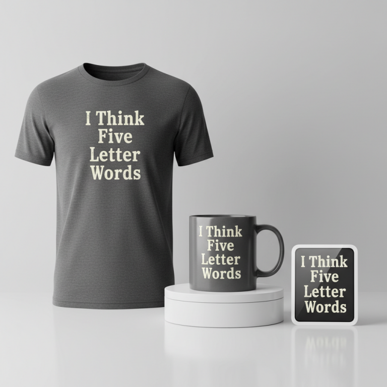
- ✍️ Typography Ideas: The chosen design text, “音楽は私の生き甲斐” (Ongaku wa watashi no ikigai – “Music is my reason for living” or “Music is my purpose in life”), is incredibly profound and universally relatable for any true music lover. Rendering this deeply emotional phrase through beautiful, authentic Japanese calligraphy elevates it beyond mere words. The artistic nuances of each stroke would imbue the design with authenticity and a sense of handmade craft, making it a statement piece rather than just a logo.
- 👕 Product Canvas: For a design concept featuring vibrant calligraphy and subtle background patterns, dark apparel provides an ideal canvas. The depth of a charcoal grey, a deep navy, or classic black allows the colors of the calligraphy and the abstract patterns to truly pop. This contrast ensures maximum visual impact and elegance, making the design stand out in a sophisticated way that appeals to a diverse range of J-Pop and J-Rock fans.
Strategic Market Insight
The genius of this design approach lies in its strategic pivot. While the initial trending topic, ‘m ステ dream live,’ acts as the catalyst, the design cleverly shifts focus from the trademarked TV show to the broader, passionate niche of Japanese music lovers. By using the emotionally charged phrase “音楽は私の生き甲斐,” the design taps into a universal sentiment that transcends specific events. This appeals directly to the deep emotional connection J-Pop and J-Rock fans have with music. Purchasing such an item becomes an act of self-expression, a quiet declaration of identity. It’s not just buying merch; it’s acquiring a piece that articulates an intrinsic part of who they are, creating a powerful psychological trigger for purchase, all while gracefully navigating intellectual property considerations.
⚖️ Estimated Copyright Risk: LOW
Risk Assessment: The phrase ‘音楽は私の生き甲斐’ is a common Japanese expression and not a brand, slogan, or trademarked term. My research confirmed it’s a generic and popular saying for music lovers. The art style is a traditional form.
Always verify intellectual property rights before listing.
Check Japan Trademark Search for “音楽は私の生き甲斐” ➔
AI Image Generation Prompts
The following prompts are optimized for leading generators to produce production-ready assets:
👕 Apparel / T-Shirt Prompt
A clean vector illustration style digital artwork, isolated on a solid dark charcoal grey background. The central design features the Japanese text '音楽は私の生き甲斐' rendered in a vibrant, dynamic, flowing brush-stroke Japanese calligraphy (shodo) style. The characters are artistically rendered with energetic, calligraphic curves and sharp flicks, utilizing a rich, deep crimson red for the primary strokes, with subtle gradients towards a brighter scarlet at the brush tips and pressure points, conveying fluidity and motion. Behind the text, a subtle, abstract pattern reminiscent of soundwaves or the energy of a concert crowd emerges. This background pattern is composed of translucent, ethereal, curvilinear shapes and subtle energy pulses in a complementary yet contrasting deep sapphire blue and soft lavender, creating a delicate, almost holographic shimmer. The pattern flows organically, suggesting movement and sonic vibrations without being distracting, rendered with smooth vector curves and soft transparency effects. The overall aesthetic is graphic, modern, and high-impact, with crisp lines, precise contours, and a polished finish suitable for high-quality t-shirt printing. The lighting is flat and even, emphasizing the graphic nature of the design with no heavy shadows or texture on the isolated elements. The mood is powerful, artistic, and sophisticated. The ONLY text allowed in the image is exactly '音楽は私の生き甲斐'. Absolutely NO other names, words, or random letters. --ar 3:4 --v 6.0
☕ Drinkware / Mug Prompt
A duplicated side-by-side layout showing the exact same graphic on the left and right, designed perfectly for a panoramic mug wrap. The design features the Japanese text '音楽は私の生き甲斐' rendered in an expressive, painterly brush-stroke Japanese calligraphy (shodo) style. The characters are dynamically rendered with visible brush textures and varying opacities, as if painted with thick, vibrant indigo ink, exhibiting the characteristic spirit and spontaneity of authentic shodo. Subtle textural nuances, akin to dry brush effects and ink bleeds at the stroke edges, enhance the artistic integrity. Behind the text, a continuous, abstract pattern reminiscent of musical energy and sound waves flows seamlessly. This pattern consists of interwoven organic lines, ethereal wisps, and soft, undulating gradient washes in harmonious complementary colors of misty grey, pale sky blue, and a hint of soft lavender, creating a sense of atmospheric depth and movement. The abstract elements subtly suggest sonic vibrations and concert energy, designed to wrap continuously around a cylindrical surface. The entire graphic maintains a high-resolution digital painting aesthetic, with rich color saturation and exquisite detail. The lighting is soft and even, highlighting the textural quality of the brushwork and the subtle interplay of colors in the background. The mood is contemplative, artistic, and immersive. The ONLY text allowed in the image is exactly '音楽は私の生き甲斐'. Absolutely NO other names, words, or random letters. --ar 3:1 --v 6.0
✨ Die-Cut Sticker Prompt
A bold, 2D flat pop-art style design, optimized for a die-cut sticker, featuring a thick, pure white outline border around the entire design. The central element is the Japanese text '音楽は私の生き甲斐' rendered in a stylized, high-contrast brush-stroke Japanese calligraphy (shodo) style. The characters are simplified yet dynamic, utilizing a vibrant, flat electric blue for the strokes, with no internal gradients, giving a clean, graphic punch. The brush strokes maintain their energetic flow but are rendered with crisp, hard edges characteristic of pop art. Behind the text, a clean, abstract pattern reminiscent of soundwaves or energetic bursts is incorporated. This background pattern is composed of bold, flat geometric shapes, radiating lines, and stylized concentric circles in a contrasting neon green and bright magenta, creating a visually striking and energetic effect. The shapes are solid, opaque, and clearly defined, without any blurring or complex textures, adhering strictly to a flat graphic aesthetic. The entire design, including the background pattern, is encircled by a prominent, uniform thick white outline border, clearly separating it from any implied external background, enhancing its die-cut sticker appearance. The lighting is perfectly flat, emphasizing the graphic shapes and bold color blocking. The mood is playful, modern, eye-catching, and distinctly graphic. The ONLY text allowed in the image is exactly '音楽は私の生き甲斐'. Absolutely NO other names, words, or random letters. --ar 1:1 --v 6.0
Frequently Asked Questions
Why choose “音楽は私の生き甲斐” instead of directly referencing ‘Mステ’ or ‘DREAM LIVE’?
The phrase “音楽は私の生き甲斐” (Music is my reason for living) allows the design to connect with the underlying passion that drives fans to events like ‘Mステ DREAM LIVE,’ rather than relying on specific, potentially trademarked event names. This approach broadens the appeal to all Japanese music lovers, creating a timeless and evergreen statement that resonates deeply, ensuring the merchandise remains relevant and desirable long after the specific event concludes, and smartly avoids any intellectual property conflicts.
Could this design concept work on apparel colors other than dark?
While dark apparel is recommended for optimal contrast, a talented designer could adapt the concept for lighter backgrounds. This would likely involve adjusting the color palette, perhaps using darker tones for the calligraphy and subtle, muted colors for the background pattern to maintain visibility and sophistication. However, for the vibrant brush strokes and the ethereal background effect to truly ‘pop’ and achieve maximum impact, dark garments generally provide the most dramatic and appealing canvas.
Is this design primarily for fans in Japan, or could it resonate internationally?
While the immediate trigger is a trending topic in Japan, the design’s core appeal – the universal love for music expressed through authentic Japanese calligraphy – has strong international resonance. J-Pop and J-Rock have significant global followings, and fans worldwide appreciate authentic cultural aesthetics and meaningful phrases. Therefore, this concept has excellent potential to resonate with a global audience of Japanese music enthusiasts who value deep, artistic expression.
Final Thoughts
The current buzz around ‘Music Station’s’ ‘DREAM LIVE’ special offers a brilliant strategic entry point for Print-on-Demand creators. By understanding the cultural momentum and pivoting intelligently to a design that speaks to the deeper, evergreen passion for music, there’s significant e-commerce potential. The key lies in artful execution of the calligraphy, a nuanced use of color, and a keen eye for what truly moves the hearts of J-Pop and J-Rock fans. Success in this niche, as in all others, will hinge on creativity and a genuine connection with the audience’s profound love for their chosen tunes.
💬 What’s Your Take?
Art is subjective, and this is just one angle! How would you spin this “M ステ Dream Live (M Ste (Music Station) Dream Live)” trend? Drop your design ideas and let’s brainstorm in the comments below!