DRAGON OF THE SEAS
The United Kingdom’s maritime presence has once again captured the public imagination, as the Royal Navy’s formidable Type 45 destroyer, HMS Dragon, embarks on a critical deployment to the Eastern Mediterranean. This high-profile move has not only dominated headlines across the nation but has also ignited a renewed spark of national and naval pride, resonating deeply with those who follow the nation’s armed forces.
The Cultural Significance
At the heart of HMS Dragon’s widespread attention lies a fascinating blend of modern naval power and ancient Welsh mythology. The ship itself is famously adorned with a striking Welsh Dragon emblem – ‘Y Ddraig Goch’ – a powerful symbol of Wales. This connection isn’t merely decorative; HMS Dragon holds affiliations with Wrexham, Wales, cementing a bond between the cutting-edge destroyer and a proud, historic region. Consequently, its deployment transcends a purely military event to become a moment of collective national and regional pride. For many, particularly within Wales and among Royal Navy families, the ‘Dragon’ represents resilience, strength, and a deep-seated heritage. This unique cultural intertwining allows for merchandise that celebrates this spirit without delving into the sensitive specifics of military operations, creating a broad, evergreen appeal centered on heritage and support.
Design Brainstorm: Capturing the Aesthetic
Translating such a rich narrative into a compelling design requires thoughtful consideration of symbolism, aesthetic, and audience. One creative avenue could focus on a clean, impactful visual that hints at the ship’s identity while remaining broadly appealing.
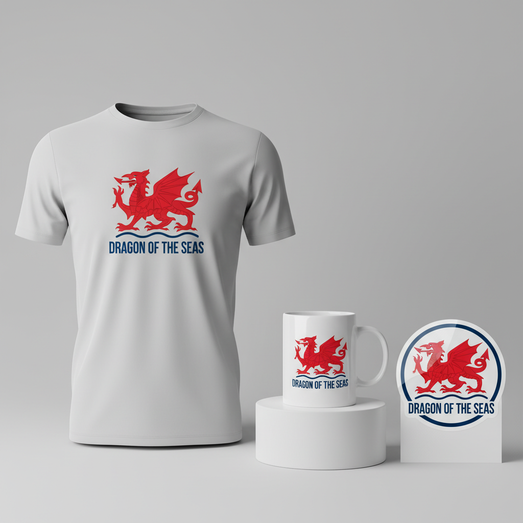
- 🎨 Visual Concept: Imagine a stylized, minimalist interpretation of the Welsh Dragon, rendered in a bold, solid red. This iteration moves away from traditional heraldic complexity towards a modern, graphic sensibility. The dragon could be poised gracefully above a simple yet elegant wave pattern, depicted in classic navy blue and crisp white, subtly evoking the sea. This aesthetic decision ensures a contemporary feel that appeals to a wider demographic, celebrating the spirit of the ‘Dragon’ without being overtly militaristic.
- ✍️ Typography Ideas: Complementing the modern visual, a strong, sans-serif font would provide the ideal typographic foundation. This choice projects confidence and clarity, perfectly framing the phrase “DRAGON OF THE SEAS.” This descriptive text acts as a powerful, generic identifier, universally understood as referring to a formidable naval entity while artfully sidestepping the use of the ship’s official name or crest, thus broadening its market appeal and ensuring evergreen relevance.
- 👕 Product Canvas: This vibrant and clean design would undoubtedly flourish on light-colored apparel. Think crisp white t-shirts, soft grey hoodies, or light blue crewnecks. The bold red of the dragon and the defined navy/white waves would pop beautifully against a pale backdrop, maximizing visibility and impact. This choice of canvas also helps reinforce the modern, fresh aesthetic, making the apparel desirable for everyday wear.
Strategic Market Insight
Targeting the market for a concept like “DRAGON OF THE SEAS” is a nuanced exercise in leveraging national identity and familial pride. The primary audience naturally includes proud Welsh citizens who resonate deeply with the symbolism of ‘Y Ddraig Goch,’ seeing it as an extension of their heritage. Simultaneously, supporters of the Royal Navy and their families form another crucial demographic. For these individuals, the design offers a way to express solidarity and appreciation for naval service, distinct from specific deployments. The psychological trigger behind a purchase here is multi-faceted: it’s about expressing identity, showing support, and celebrating a potent symbol that represents strength and home. By focusing on a generic, powerful phrase and a stylized, iconic image, the design taps into an enduring sense of pride that is both national and deeply personal, ensuring a broader appeal beyond current events and making it a timeless piece of cultural merchandise.
⚖️ Estimated Copyright Risk: LOW
Our Findings: The risk is low because the Welsh Dragon is a national symbol and its use in a patriotic context is common. The design uses a unique artistic interpretation and avoids the official, protected Royal Navy ship’s crest and insignia. The text is a generic, descriptive phrase, not a trademarked slogan.
Always verify intellectual property rights before listing.
Check UK Trademark Search for “Hms Dragon” ➔
AI Image Generation Prompts
The following prompts are optimized for leading generators to produce production-ready assets:
👕 Apparel / T-Shirt Prompt
A highly stylized, minimalist vector illustration of a Welsh Dragon ('Y Ddraig Goch') designed for a t-shirt print. The dragon is rendered in a single, bold, solid vibrant red color, with absolutely no gradients, shading, or textural effects, emphasizing a flat, graphic quality. Its form is abstract and angular, composed of smooth, precise geometric shapes and sharp, clean lines, avoiding any traditional heraldic complexity. The dragon's silhouette is sleek and modern, conveying power and dynamism through simplified forms. Positioned directly beneath the dragon is a simple, elegant wave pattern, rendered in two distinct layers: a darker navy blue and a pure stark white. These waves are also minimalist, with smooth, flowing curves and flat, solid colors, suggesting the sea without excessive detail. The entire composition is meticulously balanced, creating a high-contrast visual. Below the main graphic, the text "DRAGON OF THE SEAS" is displayed in a strong, contemporary sans-serif font, using solid white or a complementary navy blue color, integrated seamlessly into the lower part of the design without overlapping the dragon or waves. The overall aesthetic is clean, sharp, and impactful, reminiscent of modern graphic design and corporate branding. The rendering style is hyper-crisp, with pixel-perfect edges and smooth Bezier curves, appearing as if directly exported from professional vector software. The design is isolated on a solid light grey or white background, ensuring maximum print clarity and visibility on apparel. The mood is strong, confident, and sophisticated. The ONLY text allowed in the image is exactly 'DRAGON OF THE SEAS'. Absolutely NO other names, words, or random letters. --ar 3:4 --v 6.0
🔍 Search this niche on:
☕ Drinkware / Mug Prompt
A panoramic coffee mug wrap design featuring a perfectly duplicated side-by-side layout of a stylized, minimalist Welsh Dragon graphic. The graphic itself consists of a bold, solid red Welsh Dragon ('Y Ddraig Goch') rendered in a clean, contemporary illustration style, free of gradients or complex textures. Its simplified, abstract form is characterized by fluid yet sharp lines and geometric precision, representing a modern interpretation rather than a traditional emblem. Beneath the striking red dragon is an elegant, two-layered wave pattern, using flat, solid blocks of navy blue and pure white to suggest the ocean. This entire dragon-and-wave motif is presented with sharp, crisp edges and a clean, high-contrast aesthetic. This exact, identical graphic, including the text "DRAGON OF THE SEAS" positioned beneath the waves in a strong, legible sans-serif font (either white or navy blue), is flawlessly duplicated and placed on both the left and right halves of the panoramic canvas. Each instance of the graphic is centered within its half, creating a symmetrical and impactful visual continuity designed to seamlessly wrap around a mug. The background is a clean, solid light grey or white, allowing the vibrant red, navy, and white design to pop. The rendering is akin to a high-quality print-ready graphic, with smooth vector-like curves and impeccable color separation. The mood is consistent: modern, powerful, and aesthetically cohesive across the wrap. The ONLY text allowed in the image is exactly 'DRAGON OF THE SEAS'. Absolutely NO other names, words, or random letters. --ar 3:1 --v 6.0
🔍 Search this niche on:
✨ Die-Cut Sticker Prompt
A vibrant, 2D flat pop-art style die-cut sticker design featuring a stylized, minimalist Welsh Dragon ('Y Ddraig Goch'). The dragon is depicted in a singular, bold, solid red, executed with thick, clean linework and entirely flat color fills, embodying a playful yet powerful pop-art aesthetic. Its form is highly simplified, almost cartoonish in its abstraction, with smooth, rounded edges and simplified shapes that give it an iconic, graphic novel feel. Below the red dragon, a simplified wave pattern in flat navy blue and stark white, with distinct, clear separations between the colors, provides a strong base. The entire combined design, including the dragon, waves, and the text "DRAGON OF THE SEAS" rendered in a robust, clear sans-serif font (in solid white or navy blue) positioned cleanly beneath the waves, is encased by a prominent, uniform, thick white outline border. This border completely encircles the entire composition, creating a distinct edge for a die-cut sticker, enhancing its visibility and impact. The rendering is extremely crisp, with no shadows, gradients, or textural nuances, emphasizing pure, unadulterated color blocks and strong graphic shapes. The background outside the white border is a plain, solid color, allowing the sticker to stand out. The mood is energetic, bold, and instantly recognizable, perfect for a collectible sticker. The ONLY text allowed in the image is exactly 'DRAGON OF THE SEAS'. Absolutely NO other names, words, or random letters. --ar 1:1 --v 6.0
🔍 Search this niche on:
Frequently Asked Questions
How does this design concept appeal to a broad audience while still honoring its origins?
The design cleverly pivots from a specific military vessel to a broader celebration of national heritage and naval spirit. By utilizing a stylized Welsh Dragon and the generic phrase “DRAGON OF THE SEAS,” it evokes the ship’s unique identity and its Welsh ties without being exclusive or specific to current events. This approach ensures it resonates with proud Welsh citizens, Royal Navy supporters, and anyone appreciating strong, symbolic naval imagery.
What makes the minimalist Welsh Dragon a strong design choice over a traditional heraldic crest?
Opting for a minimalist, stylized Welsh Dragon brings several advantages. It gives the design a modern, fashion-forward appeal that can easily integrate into contemporary apparel and lifestyle products. This approach avoids the formality and potentially copyrighted elements of official crests, broadening its commercial viability and allowing for greater creative freedom while still retaining the powerful cultural significance of ‘Y Ddraig Goch’.
Why is light-colored apparel recommended for this specific design?
Light-colored apparel, such as white, grey, or pale blue, serves as an ideal canvas for this “DRAGON OF THE SEAS” concept. The bold, solid red of the stylized dragon and the crisp navy/white wave pattern create a striking contrast against lighter backgrounds. This enhances visual impact, makes the design pop, and aligns with the clean, modern aesthetic, ensuring maximum appeal and visibility.
Final Thoughts
The “DRAGON OF THE SEAS” concept presents a compelling opportunity for designers to tap into a rich vein of national pride and cultural symbolism. By focusing on a timeless representation of strength and heritage, rather than fleeting current events, this approach offers a design that is both relevant and evergreen. The key to success in the e-commerce landscape lies in thoughtful execution, a keen eye for quality, and a commitment to understanding the subtle nuances of cultural appreciation. With the right touch, a simple idea can truly become a beacon of inspiration for consumers, celebrating a legacy that sails on.
💬 What’s Your Take?
Art is subjective, and this is just one angle! How would you spin this “Hms Dragon” trend? Did we miss the mark, or is there a better inside joke to use here? Drop your design ideas and let’s brainstorm in the comments below!