BERGAMO COMBATTE – BERGAMO FIGHTS
A buzz is sweeping through Italy, from the cobbled streets of Bergamo to the bustling piazzas nationwide. The anticipation for a colossal European football clash has reached a fever pitch, igniting an electrifying sense of local pride and national fervor. When an Italian underdog prepares to face a continental giant, it’s more than just a game; it’s a cultural event that galvanizes communities and inspires a unique brand of patriotism.
The Cultural Significance
In Italy, football is deeply woven into the fabric of daily life, a passion passed down through generations. The upcoming European encounter featuring Atalanta from Bergamo against German powerhouse FC Bayern Munich is no exception. This isn’t just about sporting rivalry; it taps into a deeper collective identity, particularly for the people of Bergamo. It’s a moment where local pride surges, where the city, its history, and its spirit come to the forefront. When an Italian team steps onto such a grand stage, especially one with an underdog narrative, the entire nation often rallies behind them, transforming a club match into a symbol of collective Italian resilience and heart. The sheer interest translates into a powerful opportunity for merchandise that captures this underlying sentiment without falling into common intellectual property traps.
Design Brainstorm: Capturing the Aesthetic
To truly resonate with this passionate audience, a design concept could pivot away from specific team branding and instead embrace the enduring spirit of the city itself. One angle to consider is a clean, powerful visual that evokes history and local pride.
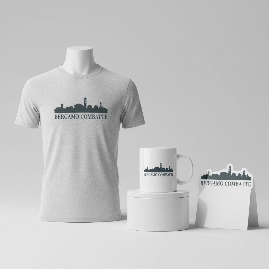
- 🎨 Visual Concept: Imagine a striking, one-color stylized illustration of Bergamo’s iconic Città Alta (Upper City) skyline. This isn’t a complex, photo-realistic image, but rather a minimalist, powerful silhouette that immediately identifies the location. The single color choice ensures versatility across various apparel colors and gives the design a classic, timeless feel, suggesting strength and heritage.
- ✍️ Typography Ideas: Below this distinctive skyline, the text “BERGAMO COMBATTE” could be rendered in a strong, classic serif font. This choice of typeface isn’t just aesthetic; it’s symbolic. Serif fonts often convey tradition, authority, and gravitas, perfectly aligning with a sense of historical pride and unwavering spirit. “COMBATTE” translates to “FIGHTS” or “COMBATS,” a powerful, patriotic Italian phrase that taps directly into the underdog spirit and resilience of the local fanbase without mentioning any specific sporting teams or events.
- 👕 Product Canvas: This clean and powerful aesthetic would translate exceptionally well onto light-colored apparel. Think crisp white, soft grey, or natural beige t-shirts and hoodies. The single-color design on a light background ensures maximum impact and readability, allowing the iconic skyline and the impactful text to truly pop.
Strategic Market Insight
The brilliance of this design concept lies in its strategic targeting and inherent safety. Instead of directly referencing the high-IP-risk football match or team names, it intelligently pivots to an evergreen ‘Local Pride’ theme. This approach directly appeals to the passionate, local fanbase of the Italian team. The psychological triggers behind a purchase here are profound: it’s about community identity, shared history, and the deep-seated pride one feels for their home city, especially when it’s under the international spotlight. By focusing on ‘Bergamo’ and the patriotic ‘COMBATTE,’ the merchandise connects with the fans’ underdog spirit and emotional investment in their city, regardless of the match’s outcome. This carefully avoids the ‘Location + Sport’ bot trap by omitting any mention of football (‘calcio’) or specific team names, ensuring compliance while maximizing appeal.
⚖️ Estimated Copyright Risk: LOW
Copyright Evaluation: The design uses a city name, which is public domain, and a generic, patriotic phrase in Italian. The graphic is a representation of a public landmark, not a copyrighted logo. This approach completely avoids protected team branding.
Always verify intellectual property rights before listing.
Check EU Trademark Search for “Bayern” ➔
AI Image Generation Prompts
The following prompts are optimized for leading generators to produce production-ready assets:
👕 Apparel / T-Shirt Prompt
A powerful, one-color stylized vector illustration of the iconic Bergamo Città Alta skyline, isolated on a solid Light background. The illustration features a clean, highly graphic, and precise vector art style, emphasizing strong, confident lines and simplified geometric forms. Architectural elements like the Campanone (Civic Tower), the Rocca, and the domes and spires of historic churches are rendered with a minimalist approach, focusing on their distinct silhouettes and characteristic shapes rather than intricate details. The overall style is reminiscent of classic WPA poster art and mid-century graphic design, using bold, uniform line weights and solid, flat color fills to create a striking, iconic representation. Negative space is expertly utilized to define structures and depth, giving a sense of the city's unique topography without relying on complex shading. Below the skyline, the text 'BERGAMO COMBATTE' is prominently displayed in a robust, classic serif font, exuding a sense of history, strength, and unwavering pride. The typography is clean, crisp, and perfectly aligned, complementing the architectural lines above. The entire design communicates resilience and historical significance through its elegant simplicity and powerful composition. The rendering is sharp, anti-aliased, and optimized for screen printing, ensuring no gradients or complex textures. The chosen single color is a deep, rich dark tone (e.g., charcoal grey or dark navy) providing maximum contrast against the light background. The mood is dignified, defiant, and timeless. The ONLY text allowed in the image is exactly 'BERGAMO COMBATTE'. Absolutely NO other names, words, or random letters. --ar 3:4 --v 6.0
🔍 Search this niche on:
☕ Drinkware / Mug Prompt
A panoramic, one-color stylized illustration for a coffee mug wrap, featuring the iconic Bergamo Città Alta skyline. The design consists of a duplicated side-by-side layout, showing the exact same graphic on the left and right, crafted perfectly for a seamless panoramic mug wrap. The illustration employs a bold, clean, and graphically strong aesthetic, presenting the skyline with simplified, iconic silhouettes and crisp, uniform line art. Key landmarks such as the Campanone, the Venetian walls, and various bell towers are rendered with a powerful, one-color flat graphic style, suggesting depth and form through expert use of positive and negative space, without any complex shading or photorealistic elements. The style is reminiscent of classic city map illustrations or travel posters, but with a modern, minimalist edge, emphasizing clear visual communication. Below the skyline, the text 'BERGAMO COMBATTE' is integrated flawlessly into the composition using a strong, classic serif font that conveys historical weight and local pride. The text is sharp, legible, and proportionate to the skyline, ensuring maximum impact when wrapped around a mug. The entire design is monochromatic, utilizing a single dark, rich color (e.g., a deep terracotta or a strong espresso brown) against a pristine light background, creating a high-contrast and visually striking effect. The mood is dignified, resolute, and enduring, perfect for a daily use item. The rendering is vector-smooth, highly defined, and without any photographic elements or complex textures, ensuring perfect print quality on ceramic. The ONLY text allowed in the image is exactly 'BERGAMO COMBATTE'. Absolutely NO other names, words, or random letters. --ar 3:1 --v 6.0
🔍 Search this niche on:
✨ Die-Cut Sticker Prompt
A dynamic, one-color stylized illustration of the Bergamo Città Alta skyline, designed as a 2D flat pop-art style die-cut sticker. The entire design is encased within a thick, clean white outline border, clearly defining the edge for die-cutting with precision. The illustration style is bold, highly graphic, and reminiscent of classic pop art and comic book aesthetics, featuring strong, uniform outlines and flat, saturated color fills (a single dark, vibrant color like a deep crimson or royal blue against a pristine light background for the design itself, before the white border). Iconic structures of Bergamo, like the Duomo, the Campanone, and the historical wall sections, are simplified into their most recognizable, striking silhouettes, rendered with a clean, almost abstract precision. The forms are geometric and powerful, ensuring legibility and impact even at a small size. Below the skyline, the text 'BERGAMO COMBATTE' is integrated into the composition using a robust, classic serif font, providing a strong sense of heritage and defiance. The typography is crisp, easily readable, and perfectly complements the graphic nature of the skyline illustration, mirroring its bold, clean lines. The overall aesthetic is vibrant, impactful, and iconic, with a focus on high contrast and graphic clarity. The lighting is perfectly flat, with no shadows or dimensionality, emphasizing the pure graphic quality. The texture is smooth, simulated vector, ideal for print on a glossy vinyl sticker. The mood is proud, energetic, and visually arresting. The ONLY text allowed in the image is exactly 'BERGAMO COMBATTE'. Absolutely NO other names, words, or random letters. --ar 1:1 --v 6.0
🔍 Search this niche on:
Frequently Asked Questions
Why focus on Bergamo’s skyline instead of team logos or specific match details?
Shifting the focus to Bergamo’s iconic Città Alta skyline is a clever strategic move. It allows designers to tap into the immense local pride and passion surrounding the event without directly infringing on intellectual property rights associated with specific teams or leagues. It creates an evergreen piece of merchandise that celebrates the city’s enduring spirit and history, appealing to fans long after the match concludes.
What does “BERGAMO COMBATTE” signify for the fans?
“BERGAMO COMBATTE” translates to “Bergamo Fights” or “Bergamo Combats.” This phrase powerfully encapsulates the resilient and tenacious spirit often associated with underdogs. For the local fanbase, it’s a rallying cry, signifying their city’s strength, determination, and refusal to back down, especially when facing formidable challenges. It’s a statement of civic pride and unwavering support.
What types of apparel colors would best complement this clean, powerful design?
Given the one-color, stylized nature of the Bergamo skyline illustration and the classic serif font, this design truly shines on light-colored apparel. Crisp whites, subtle greys, or natural off-white and beige tones would provide a perfect canvas. These lighter backgrounds ensure the design remains clean, powerful, and highly visible, enhancing its elegant and historical appeal.
Final Thoughts
The fervor surrounding a major European match in Italy presents a golden opportunity for print-on-demand entrepreneurs. By skillfully navigating IP complexities and tapping into the timeless emotion of local pride, a design like the one explored can create highly desirable merchandise. It’s a reminder that truly effective e-commerce often lies in understanding the cultural undercurrents and crafting designs that resonate on a deeper, more personal level with the target audience. Execution, as always, is key to transforming a trending moment into lasting success.
💬 What’s Your Take?
Art is subjective, and this is just one angle! How would you spin this “Bayern” trend? Did we miss the mark, or is there a better inside joke to use here? Drop your design ideas and let’s brainstorm in the comments below!