Devenir Adulte Est une Arnaque – Becoming an Adult is a Scam
In France, the typically serious world of financial planning is sparking unexpected conversations across the country. While institutions are rolling out compelling promotional offers for life insurance products, the buzz extends far beyond balance sheets, inadvertently highlighting the very real and often humorous challenges young people face as they navigate the complexities of adult life.
The Cultural Significance
The recent surge in discussion around “assurance vie” (life insurance) isn’t just about fiscal responsibility; it’s a cultural touchpoint. With multiple financial heavyweights actively campaigning, the topic has been thrust into the public consciousness, prompting individuals to consider their long-term financial futures. For many French Millennials and Gen Z, this conversation, while important, often intersects with a broader sentiment: the overwhelming and sometimes absurd pressures of “adulting.” It’s a moment of reflection that, for some, brings a wry smile and a familiar feeling of existential overwhelm, making the idea of long-term planning seem like another checkbox in a never-ending list of grown-up duties.
Design Brainstorm: Capturing the Aesthetic
Translating a nuanced cultural sentiment into a compelling merchandise design requires a thoughtful approach. This concept aims to pivot from the dry financial topic to the shared emotional experience, making it relatable and stylish.
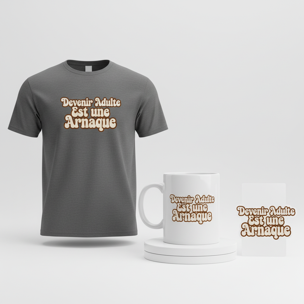
- 🎨 Visual Concept: The core of this design concept is its pure text-based nature. Imagine a sleek, minimalist aesthetic where the message takes center stage. The text is carefully arranged, each line centered and scaled to create a visually appealing, balanced shape. This simple yet impactful layout ensures versatility and broad appeal, aligning with modern streetwear trends that favor understated statements.
- ✍️ Typography Ideas: The chosen phrase, “Devenir Adulte Est une Arnaque” (Adulting is a Scam), is rendered in a trendy, slightly wavy, stacked retro font. This font choice adds a touch of vintage cool while remaining effortlessly modern. The wave subtly introduces dynamic energy without sacrificing readability or minimalist integrity. The French phrasing itself lends an authentic, relatable voice to the sentiment, making it instantly recognizable and shareable within the target demographic.
- 👕 Product Canvas: This design truly shines on a dark apparel canvas. Think deep charcoals, midnight blues, or classic black t-shirts and hoodies. The dark background provides a perfect contrast for the text, making the minimalist design pop and ensuring the witty message is clearly visible. This choice also aligns with a chic, understated style preferred by many in the younger demographics.
Strategic Market Insight
While “assurance vie” might not be a passionate niche in itself, the genius of this approach lies in its strategic pivot. The true target isn’t those actively seeking life insurance; it’s French Millennials and Gen Z who deeply connect with the humor and stress of “adulting.” This demographic frequently seeks ways to express their shared experiences, especially through fashion. The psychological trigger here is profound: relatability. Wearing this design isn’t just about putting on a shirt; it’s about making a statement, finding solidarity, and sharing a collective chuckle at the absurdities of growing up. It bypasses any compliance or copyright issues by focusing on a universal sentiment, making it a highly shareable and evergreen piece of apparel.
⚖️ Estimated Copyright Risk: LOW
Risk Assessment: The design is based on a common, humorous sentiment about adulthood. The quote is a popular trope and not a specific, registered trademark or copyrighted phrase. It avoids mentioning any financial products or brands, making it completely original and safe.
Always verify intellectual property rights before listing.
Check EU Trademark Search for “Assurance Vie” ➔
AI Image Generation Prompts
The following prompts are optimized for leading generators to produce production-ready assets:
👕 Apparel / T-Shirt Prompt
A purely text-based design featuring the phrase 'Devenir Adulte Est une Arnaque'. The text is rendered in a trendy, slightly wavy, stacked retro font, with each line meticulously centered and scaled to create a visually balanced and harmonious overall shape. The aesthetic is clean, minimalist, and modern, with a playful, ironic mood. Isolated on a solid Dark background, presented in a clean vector illustration style. The rendering is characterized by exceptionally crisp, razor-sharp edges and smooth, perfect bezier curves, devoid of any anti-aliasing artifacts or pixelation. Colors are solid, flat fills with strong contrast against the dark apparel, showcasing no gradients, distress effects, or complex textures within the graphic itself. The font's retro character is subtly enhanced by a gentle, organic wave or warp applied to each line of text, adding dynamic movement while maintaining perfect legibility. The stacking creates intentional and pleasing negative space, forming a cohesive design block. Lighting is entirely flat and illustrative, implying no external light source or internal shadows on the graphic, as if digitally rendered. The texture implied is purely smooth, digital, and perfectly print-ready. The final output is optimized for high-quality screen printing or DTG on fabric, emphasizing clarity and bold visual impact. The ONLY text allowed in the image is exactly 'Devenir Adulte Est une Arnaque'. Absolutely NO other names, words, or random letters. --ar 3:4 --v 6.0
🔍 Search this niche on:
☕ Drinkware / Mug Prompt
A duplicated side-by-side layout showing the exact same graphic on the left and right, designed perfectly for a panoramic mug wrap. The central graphic is a purely text-based design featuring the phrase 'Devenir Adulte Est une une Arnaque'. The text is styled with a trendy, slightly wavy, stacked retro font, where each line is centered and carefully scaled to form a balanced, eye-catching shape. The overall design embodies a minimalist, modern, and subtly humorous aesthetic, perfect for coffee drinkware. Rendering emphasizes crisp, precise lines and solid, vibrant color fills optimized for ceramic printing. There are no gradients, blurs, or halftone dots, ensuring a sharp and clean appearance. The retro font's gentle wavy distortion adds character and dynamism without compromising readability. The stacked layout forms a cohesive visual unit that flows seamlessly across the mug's surface. Lighting on the graphic is flat and even, characteristic of a high-quality digital print. The implied texture is smooth, glossy, and perfectly integrated onto a ceramic surface. The mood is relaxed, stylish, and a touch cheeky. The ONLY text allowed in the image is exactly 'Devenir Adulte Est une Arnaque'. Absolutely NO other names, words, or random letters. --ar 3:1 --v 6.0
🔍 Search this niche on:
✨ Die-Cut Sticker Prompt
A die-cut sticker design featuring the phrase 'Devenir Adulte Est une Arnaque' as the core element. The text is rendered in a trendy, slightly wavy, stacked retro font, with each line precisely centered and scaled to create a visually balanced and impactful shape. The style is a bold, 2D flat pop-art aesthetic, highly graphic, minimalist, and modern. A thick white outline border uniformly encapsulates the entire design, creating a distinct 'die-cut' effect. The rendering showcases strong, clean outlines and vibrant, opaque solid color fills. There is no subtle shading, complex textures, or gradients; the design relies purely on high-contrast color blocking and graphic impact, reminiscent of classic comic book lettering with a contemporary twist. The wavy distortion in the retro font adds a playful, eye-catching quality. Lighting is purely illustrative and flat, as expected in a 2D pop-art piece, with no realistic light source or shadows. The implied texture is smooth, glossy, and durable, typical of a high-quality vinyl sticker. The mood is playful, eye-catching, and youthfully rebellious. The ONLY text allowed in the image is exactly 'Devenir Adulte Est une Arnaque'. Absolutely NO other names, words, or random letters. --ar 1:1 --v 6.0
🔍 Search this niche on:
Frequently Asked Questions
How does this design concept connect to the “assurance vie” trend without being too literal?
The connection is thematic and emotional rather than direct. While the initial trend might be about financial products, for younger generations, discussions around long-term planning often trigger the underlying sentiment of “adulting is tough.” This design cleverly taps into that shared emotional resonance, offering a humorous outlet for the stress that conversations about “assurance vie” can inadvertently highlight.
Why opt for a purely text-based, minimalist design for such a culturally rich concept?
A minimalist, text-based design maximizes impact and versatility. It ensures the powerful, relatable phrase “Devenir Adulte Est une Arnaque” remains the focal point, allowing the humor and sentiment to shine without distraction. This aesthetic also aligns perfectly with contemporary streetwear and pop culture trends that favor clean lines and strong, statement-driven typography, making it broadly appealing and easy to style.
What makes “Devenir Adulte Est une Arnaque” particularly resonate with the French Gen Z/Millennial audience?
The phrase “Devenir Adulte Est une Arnaque” strikes a chord due to its universal relatability regarding the challenges of adulting, phrased with a distinct French colloquial charm. It’s a sentiment commonly expressed in social circles and online, making it an insider joke that fosters a sense of community and shared understanding. Its directness and humor make it instantly recognizable and memorable.
Final Thoughts
Tapping into cultural currents, even those seemingly dry like financial news, can unlock incredible e-commerce potential when approached with creativity and insight. This particular strategy demonstrates how to pivot from a trending topic to an evergreen, highly relatable human emotion. Success in the print-on-demand space often hinges on understanding these deeper connections and translating them into designs that resonate on a personal level. The execution, from the choice of font to the overall aesthetic, gives these ideas life, reminding us that a well-placed phrase can truly speak volumes.
💬 What’s Your Take?
Art is subjective, and this is just one angle! How would you spin this “Assurance Vie (life insurance)” trend? Did we miss the mark, or is there a better inside joke to use here? Drop your design ideas and let’s brainstorm in the comments below!