Mon plan de retraite est de ne jamais arrêter de travailler – My retirement plan is to never stop working

In the bustling urban centers and vibrant startup scenes across France, a subtle shift in perspective regarding financial futures is taking hold. While headlines might buzz with aggressive promotions for “assurance vie” – life insurance products – offering enticing cash bonuses, a deeper, more relatable sentiment is quietly brewing among the nation’s young professionals. It’s a blend of pragmatism, wit, and perhaps a touch of resignation, encapsulated in a phrase that perfectly captures the modern work-life juggle: the idea that retirement isn’t an end-goal, but an ongoing journey, or perhaps, a myth.
The Cultural Significance
The current flurry of “assurance vie” campaigns, though seemingly about financial products, inadvertently taps into a broader cultural conversation in France. For many young professionals, entrepreneurs, and freelancers, the traditional vision of a comfortable, early retirement feels increasingly unattainable or even undesirable. The aggressive push for financial planning vehicles can, ironically, highlight the very anxieties it aims to alleviate. This demographic often embraces a ‘hustle culture’ mindset, valuing continuous engagement, personal projects, and a fluid career path over a definitive end date. The humor in proclaiming “Mon plan de retraite est de ne jamais arrêter de travailler” isn’t a sign of genuine despair, but rather a sardonic nod to a complex economic reality and a rejection of outdated societal expectations, all while acknowledging the importance of financial foresight.
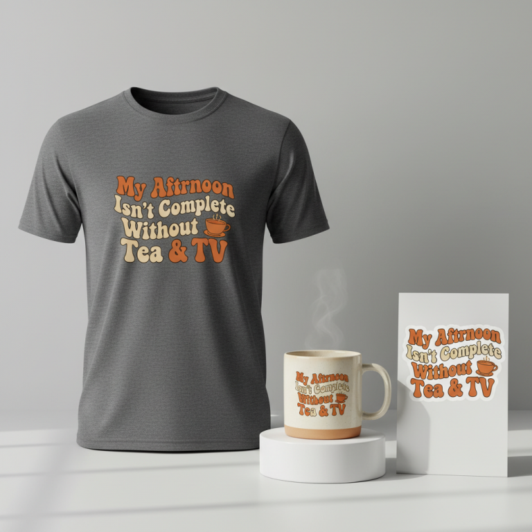
Design Brainstorm: Capturing the Aesthetic
Translating this nuanced sentiment into merchandise requires a thoughtful artistic approach. One angle to consider is a ‘Quiet Luxury’ or ‘Smart Minimalism’ aesthetic, allowing the powerful, witty text to speak for itself with understated elegance.
- 🎨 Visual Concept: The core idea is simplicity and balance. Imagine a design where the text is the sole focal point, centrally placed or thoughtfully off-center, allowing for significant negative space around it. This creates a high-end, intentional feel, elevating a humorous phrase into a statement piece. The visual weight should be light and airy, avoiding any clutter or heavy graphic elements that might detract from the message.
- ✍️ Typography Ideas: For the text “Mon plan de retraite est de ne jamais arrêter de travailler,” a clean, elegant serif typeface would be an excellent choice. Think classic, refined fonts that evoke trust and sophistication, subtly contrasting with the playful sarcasm of the message. The font choice should convey a sense of timelessness and quality, aligning with the ‘Quiet Luxury’ theme and ensuring readability.
- 👕 Product Canvas: This design concept lends itself beautifully to light-colored apparel. Crisp white, muted cream, soft grey, or even a pale sky blue could serve as the ideal canvas. The light background allows the minimalist text design to stand out without being harsh, reinforcing the understated elegance and quiet confidence of the aesthetic.
Strategic Market Insight
Targeting young professionals, entrepreneurs, and freelancers in France with this concept could be highly effective because it directly resonates with their worldview. These individuals often navigate economic uncertainties, fluctuating work demands, and a desire for personal autonomy that makes the traditional retirement narrative less appealing. Purchasing such an item isn’t just about owning a piece of clothing; it’s about buying into a shared inside joke, a declaration of a unique work ethic, and a humorous acknowledgment of modern financial realities. It speaks to their intelligence, their cynicism, and their ambition, triggering a sense of belonging and a subtle rebellion against conventional norms. It’s a purchase that validates their perspective and allows them to express it with style and wit.
⚖️ Estimated Copyright Risk: LOW
Risk Assessment: This is a sarcastic, humorous phrase that is not trademarked. Financial planning and retirement are general topics. The humor comes from subverting expectations, which is a common and uncopyrightable comedic device.
Always verify intellectual property rights before listing.
Check EU Trademark Search for “Assurance Vie” ➔
AI Image Generation Prompts
The following prompts are optimized for leading generators to produce production-ready assets:
👕 Apparel / T-Shirt Prompt
A sophisticated and minimalist t-shirt graphic design in a 'Quiet Luxury' and 'Smart Minimalism' style. The design features the text "Mon plan de retraite est de ne jamais arrêter de travailler" rendered in a clean, elegant, premium serif typeface. The typography is meticulously balanced, showcasing perfect kerning, generous letter spacing, and a refined visual hierarchy, with ample negative space around the text to convey a high-end, intentional aesthetic. The overall impression is one of subtle sophistication and timeless elegance. The graphic is presented as a crisp, highly detailed vector illustration, isolated on a solid, uniform light background (e.g., pure white or off-white). The rendering style is flat graphic with precise, sharp edges and smooth fills, devoid of any grunge, distressing, or complex textures. Lighting is even and studio-like, ensuring maximum clarity and readability of the text without any shadows or gradients within the design itself. The mood is inspiring, calm, thoughtful, and aspirational. The color palette for the text is a rich, deep charcoal grey or matte black, contrasting elegantly with the light background. This is a clean, print-ready digital artwork. The ONLY text allowed in the image is exactly 'Mon plan de retraite est de ne jamais arrêter de travailler'. Absolutely NO other names, words, or random letters. --ar 3:4 --v 6.0
🔍 Search this niche on:
☕ Drinkware / Mug Prompt
A high-fidelity panoramic coffee mug wrap graphic, designed in a 'Quiet Luxury' and 'Smart Minimalism' aesthetic. The central design element is the French text: "Mon plan de retraite est de ne jamais arrêter de travailler". This text is presented in a clean, exceptionally elegant, and subtly luxurious serif typeface, with a balanced composition and generous negative space that exudes intentionality and sophistication. The overall layout is precise, reflecting a high-end typographic treatment suitable for premium branding. This design is explicitly presented in a duplicated side-by-side layout, showing the exact same graphic on the left half and the right half of the canvas, perfectly optimized for a panoramic mug wrap. Each instance of the graphic is centered within its respective half, ensuring seamless continuity when wrapped around a mug. The rendering is a pristine, high-resolution digital illustration with crisp, vector-like lines and solid, elegant fills. The background for the graphic is a clean, uniform light color (e.g., a very light grey or off-white) to maintain the minimalist and luxurious feel. The lighting for this digital artwork is flat and even, ensuring optimal print quality and legibility. The mood is sophisticated, motivational, and serene. The text color is a refined, deep tone like a dark slate grey or a rich sepia, enhancing its understated elegance. The ONLY text allowed in the image is exactly 'Mon plan de retraite est de ne jamais arrêter de travailler'. Absolutely NO other names, words, or random letters. --ar 3:1 --v 6.0
🔍 Search this niche on:
✨ Die-Cut Sticker Prompt
A minimalist and elegant die-cut sticker design, embodying 'Quiet Luxury' and 'Smart Minimalism' principles, while incorporating a 2D flat pop-art inspired graphic style. The design exclusively features the text "Mon plan de retraite est de ne jamais arrêter de travailler" rendered in a clean, classic, elegant serif typeface. The typography is bold yet refined, with clean lines and balanced proportions, ensuring strong visual impact without sacrificing sophistication. The layout is centered, with significant negative space around the text, giving it a premium and intentional appearance. A distinct, thick white outline border meticulously surrounds the entire design (the text block), providing a clean die-cut edge. The rendering is a sharp, flat graphic illustration, characteristic of a contemporary pop-art aesthetic – solid, vibrant (though understated) color fills for the text against a crisp, transparent or solid light background within the sticker's boundary, and absolutely no gradients or intricate textures within the text itself. The pop-art influence here refers to its bold, graphic flatness and strong contours, rather than bright, kitschy colors. The text color is a sophisticated, solid dark navy or deep forest green, offering a subtle contrast and elegant presence. The overall mood is confident, direct, and stylishly understated. The sticker itself is envisioned with a glossy, smooth finish. The ONLY text allowed in the image is exactly 'Mon plan de retraite est de ne jamais arrêter de travailler'. Absolutely NO other names, words, or random letters. --ar 1:1 --v 6.0
🔍 Search this niche on:
Frequently Asked Questions
Why choose a seemingly cynical phrase for a print-on-demand design?
The phrase “Mon plan de retraite est de ne jamais arrêter de travailler” isn’t meant to be genuinely cynical or negative. Instead, it leverages a common coping mechanism: humor and sarcasm. For young professionals, it’s a relatable, witty commentary on modern economic realities and evolving career aspirations, allowing them to express their outlook in a lighthearted, yet profound way. It connects with a shared sentiment, fostering community and a sense of understanding among like-minded individuals.
How does a ‘Quiet Luxury’ aesthetic complement a humorous, text-based design?
The juxtaposition of a ‘Quiet Luxury’ aesthetic with a humorous, text-based design creates a sophisticated and intriguing product. By presenting a sarcastic statement in a refined, minimalist style with an elegant serif font and ample negative space, the design elevates the humor beyond mere novelty. It suggests an intelligent wit and an appreciation for understated quality, appealing to those who prefer subtle statements over overt declarations, making the humor more impactful and refined.
Is this design concept too niche or specific to the French market?
While the phrase is in French and resonates strongly with the specific cultural nuances of France, the underlying sentiment—the evolving view of retirement and work-life balance—is increasingly global. The French language version offers an exclusive appeal, making it particularly resonant for the target demographic within France. However, the core idea of continuous work and a redefinition of retirement is highly relatable across many developed economies, giving this concept potential for broader appreciation, especially among those who appreciate international cultural expressions.
Final Thoughts
The convergence of financial trends and evolving cultural attitudes in France presents a compelling opportunity for print-on-demand designers. By tapping into the underlying emotional current beneath the headlines – the witty cynicism of a generation redefining its relationship with work and retirement – a simple text-based design can achieve significant resonance. The elegance of ‘Quiet Luxury’ combined with a sharp, relatable message offers a unique appeal. As with any trend, successful execution and a personal spin on the core concept will be key to capturing the attention and loyalty of this discerning demographic, turning a fleeting moment into an evergreen statement piece.
💬 What’s Your Take?
Art is subjective, and this is just one angle! How would you spin this “Assurance Vie (life insurance)” trend? Did we miss the mark, or is there a better inside joke to use here? Drop your design ideas and let’s brainstorm in the comments below!