月まで! – To the moon!
The financial world in Japan is buzzing, not just with corporate reports, but with the electrifying energy of a potential stock market rocket launch. A relatively dry business story about Japan Display Inc. (JDI) suddenly found itself at the epicenter of a retail investor frenzy, as news of a potential massive U.S. factory sent its stock soaring. This isn’t just about a company; it’s about the thrill of the market, the chase for the next big win, and the palpable excitement that can grip a community of passionate traders.
The Cultural Significance
What makes a company like JDI, traditionally a behind-the-scenes display manufacturer, capture the public’s imagination? Beyond the immediate financial headlines of a stock surge, this phenomenon taps directly into the vibrant and increasingly global culture of retail investing. In Japan, much like elsewhere, a strong community of individual investors is always on the lookout for the next big opportunity. When a news item suggests significant upward momentum, especially for a company with a history that might make a turnaround feel like a triumphant underdog story, it resonates deeply. It’s not just about portfolio gains; it’s about being part of a movement, riding the wave, and experiencing the collective hope and excitement that defines ‘meme stock’ culture, even when the catalyst is a legitimate business development.
Design Brainstorm: Capturing the Aesthetic
Translating this financial fervor into a compelling design concept requires a blend of cultural reverence and modern market iconography. One angle to consider focuses on a powerful visual narrative that celebrates the aspiration of market gains without being tied to any specific brand name, making it broadly appealing and safe for merchandise.
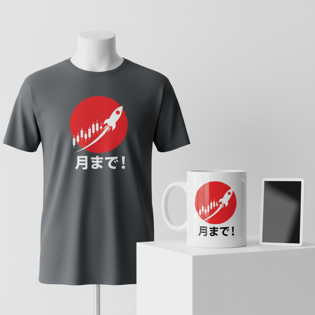
- 🎨 Visual Concept: Imagine a design where traditional Japanese aesthetics meet the raw energy of the stock market. A striking red Japanese sun, a timeless symbol of Japan, could form a powerful background, evoking heritage and strength. In the foreground, a crisp, white silhouette of a traditional candlestick stock chart could depict a dramatic, undeniable upward trend. The final candlestick, the peak of this surge, could playfully morph into a sleek rocket ship, symbolizing the beloved “To the Moon” meme. This fusion creates a dynamic visual that is both culturally relevant and universally understood by stock enthusiasts.
- ✍️ Typography Ideas: The accompanying text, “月まで!” (Tsuki made!), is a direct and powerful localization of the “To the Moon” sentiment. This phrase is instantly recognizable to Japanese retail investors and meme stock traders. The typography chosen could be bold and assertive, perhaps a clean, modern sans-serif that contrasts effectively with the traditional sun, or a more stylized brushstroke font that leans into the Japanese aesthetic for the text itself. The goal is clarity and impact, ensuring the message resonates strongly.
- 👕 Product Canvas: For apparel, dark colors like charcoal, navy, or classic black would provide the ideal canvas. These shades offer a dramatic contrast for the red sun and white graphic elements, making the design truly pop. Furthermore, dark apparel often lends itself to a sleek, sophisticated feel that appeals to a demographic that appreciates sharp, statement-making graphics.
Strategic Market Insight
Targeting Japanese retail investors, stock market enthusiasts, and ‘meme stock’ traders with this type of merchandise taps into a highly engaged and passionate demographic. The appeal isn’t just about owning a shirt; it’s about expressing an identity, a shared experience, and a belief in the potential for significant gains. The design cleverly uses the universal “To the Moon” meme, a cultural touchstone in global investing communities, and localizes it with “月まで!” and traditional Japanese visuals. This approach is powerful because it sidesteps any direct association with a specific company (like JDI itself), which can be legally tricky or quickly outdated. Instead, it celebrates the broader thrill of market movements, the hope for prosperity, and the camaraderie among those who share this unique passion. It’s a design that says, “I’m part of this journey,” without needing to name the destination.
⚖️ Estimated Copyright Risk: LOW
Our Findings: The phrase ‘To the moon’ is a widespread meme and is not trademarked for apparel in a way that would conflict with this usage. The design uses generic, universally understood symbols (sun, candlestick chart, rocket) and does not use the JDI company name or logo. It targets the broad trope of stock market speculation.
Always verify intellectual property rights before listing.
Check Japan Trademark Search for “Jdi” ➔
AI Image Generation Prompts
The following prompts are optimized for leading generators to produce production-ready assets:
👕 Apparel / T-Shirt Prompt
A bold graphic design for a t-shirt print, isolated on a solid dark charcoal background. The design features a stylized Japanese red sun, a perfect circle rendered in a vibrant, solid crimson red with exceptionally sharp, clean vector edges. Overlaid on the lower half of the sun is a crisp, pure white silhouette of a traditional Japanese candlestick stock chart, depicting a dramatic, steep upward trend. The candlesticks are simple, geometric rectangular shapes, uniformly proportioned and rendered in flat white, clearly indicating strong bullish momentum. The final, uppermost candlestick smoothly transitions and morphs into a sleek, minimalist rocket ship silhouette, also in pure white, pointed directly upwards, with a subtle, simplified white exhaust plume emanating from its base. Below the chart and rocket, the Japanese text '月まで!' is rendered in a modern, bold white sans-serif font, perfectly aligned and integrated into the overall design. The entire graphic is executed in a clean vector illustration style, characterized by precise, unbroken linework, flat color fills, no gradients or textures within the graphic elements themselves, and extremely high resolution, optimized for screen printing. The aesthetic is a fusion of traditional Ukiyo-e simplification and modern graphic design, creating an iconic, high-impact, and minimalist visual. The rendering is perfectly smooth and anti-aliased, ensuring sharp edges and clear definition suitable for apparel. The ONLY text allowed in the image is exactly '月まで!'. Absolutely NO other names, words, or random letters. --ar 3:4 --v 6.0
🔍 Search this niche on:
☕ Drinkware / Mug Prompt
A duplicated side-by-side layout showing the exact same graphic on the left and right, designed perfectly for a panoramic mug wrap. The central graphic features a stylized Japanese red sun, a perfect circle with a solid, vibrant crimson red fill and a razor-sharp, clean vector edge. Superimposed on the lower half of the sun is a minimalist, pure white silhouette of a traditional Japanese candlestick stock chart, depicting a powerful, dramatic upward trend. Each candlestick is a simple, geometric rectangle, uniformly rendered in stark white, conveying strong bullish momentum. The final, highest candlestick seamlessly transforms into a sleek, futuristic rocket ship silhouette, also in pure white, pointing straight up, with a subtle, stylized white exhaust plume. Below the chart and rocket, the Japanese text '月まで!' is rendered in a clean, modern white sans-serif font, perfectly integrated into the design. This entire graphic is rendered in a clean, high-contrast flat graphic style, similar to a digital vector illustration, optimized for high-quality print on ceramic. The colors are bold, saturated, and designed to pop distinctly. The rendering is perfectly smooth with no pixelation, artifacts, or unnecessary textures, ensuring a crisp reproduction. The background behind the graphic for the mug is a neutral, seamless light gray, allowing the red and white design to stand out distinctly, as if viewed on an actual ceramic product. This dual display ensures a continuous, high-resolution design ready for panoramic application. The ONLY text allowed in the image is exactly '月まで!'. Absolutely NO other names, words, or random letters. --ar 3:1 --v 6.0
🔍 Search this niche on:
✨ Die-Cut Sticker Prompt
A die-cut sticker design in a vibrant, 2D flat pop-art style. The core graphic features a bold, stylized Japanese red sun, a perfect circle rendered in solid, vivid crimson red with crisp, clean vector edges. Serving as a striking foreground element, a pure white silhouette of a traditional candlestick stock chart shows a steep, dramatic upward trend. The individual candlesticks are simplified geometric shapes, sharply defined in white. The final, topmost candlestick dynamically transforms into a sleek, upward-pointing rocket ship silhouette, also in pure white, complete with a stylized, graphic exhaust plume. Below this, the Japanese text '月まで!' is rendered in a clean, bold white sans-serif font, perfectly integrated into the overall composition. The entire composite design, combining the red sun, white chart/rocket, and white text, is encased by a prominent, uniform, thick white outline border, clearly defining the intended die-cut edge of the sticker. The design embodies a vibrant pop-art aesthetic, characterized by extremely sharp lines, unshaded, solid color blocks, high contrast, and a graphic novel influence. The rendering is perfectly smooth, digital illustration quality, with no textures, gradients, or shadows within the design elements. The overall look is punchy, iconic, and immediately recognizable, designed for a glossy, durable vinyl sticker. The image itself is isolated on a simple, neutral light grey background to clearly showcase the sticker's outline and design. The ONLY text allowed in the image is exactly '月まで!'. Absolutely NO other names, words, or random letters. --ar 1:1 --v 6.0
🔍 Search this niche on:
Frequently Asked Questions
Is this design solely for JDI investors, or can it appeal more broadly?
While the initial trend around JDI stock provided the spark, this design is intentionally crafted to transcend a single company. By focusing on the “To the Moon” meme and universal stock chart imagery, localized with “月まで!” and a Japanese sun, it appeals to any Japanese retail investor or stock enthusiast who understands the excitement of a soaring stock and the shared culture of the market. It’s about the journey and the aspiration, not the specific ticker symbol.
What kind of emotional connection does this design aim to foster with its wearer?
This design aims to evoke feelings of optimism, shared community, and the thrill of financial possibility. Wearing it is a subtle nod to being “in the know” about market culture, a badge of honor for those who ride the waves of stock surges. It connects individuals to a broader narrative of hope for prosperity and the exciting, often unpredictable, world of retail investing.
Why is targeting Japan a particularly strong strategy for this concept, beyond the immediate news?
Japan has a sophisticated and active retail investor community, deeply engaged with both domestic and international markets. Localizing a globally recognized meme like “To the Moon” with Japanese text (“月まで!”) and traditional aesthetics (the red sun) creates a powerful, culturally resonant product. It respects the local context while tapping into a universal passion, offering a unique product that speaks directly to this specific demographic’s financial aspirations and cultural pride.
Final Thoughts
The world of e-commerce thrives on capturing the zeitgeist, and sometimes, that means looking beyond the obvious headline to find the passionate subculture beneath. The JDI stock surge in Japan is a fantastic example of how a business story can ignite the imagination of retail investors. By distilling that energy into a culturally relevant, visually striking design that speaks to a shared aspiration – the “To the Moon” dream – there’s significant potential. Remember, success in this space is about thoughtful execution and a willingness to put your unique spin on a trending moment, connecting with audiences on a level deeper than just a transaction.
💬 What’s Your Take?
Art is subjective, and this is just one angle! How would you spin this “Jdi” trend? Did we miss the mark, or is there a better inside joke to use here? Drop your design ideas and let’s brainstorm in the comments below!