
Diagnose: Süchtig nach Arztserien – Diagnosis: Addicted to Doctor Shows
The screens across Germany are abuzz with the dramatic twists and turns surrounding Dr. Maria Weber, a central figure in the beloved, long-running medical drama ‘In aller Freundschaft.’ A recent wedding storyline, quickly followed by a nail-biting cliffhanger, has sent ripples through the show’s dedicated fanbase, sparking fervent discussions and solidifying her place at the heart of German television culture. It’s moments like these that unite viewers, transforming fictional narratives into shared cultural touchstones, and offering a unique pulse point for creative expression.
The Cultural Significance
For over two decades, ‘In aller Freundschaft’ has been a staple in German households, captivating audiences with its blend of intricate medical cases and compelling personal dramas at the fictional Sachsenklinik. Dr. Maria Weber, as a character deeply embedded in this universe, embodies the emotional investment viewers place in these long-running sagas. Her wedding and the subsequent dramatic events aren’t just plot points; they’re communal experiences. Fans have grown up with these characters, celebrated their triumphs, and mourned their losses. This deep connection fosters a passionate community, eager to celebrate their fandom and connect with fellow enthusiasts, creating a fertile ground for resonant, well-conceived merchandise that speaks directly to their shared passion.
Design Brainstorm: Capturing the Aesthetic
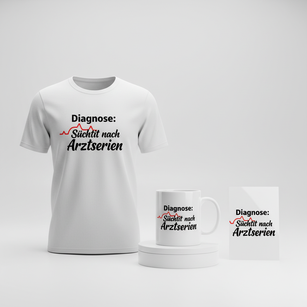
Translating such a specific, yet widely relatable, fan sentiment into merchandise requires a clever touch that sidesteps specific intellectual property while still hitting all the right notes for the target audience. One promising avenue is a minimalist, text-based design that offers a knowing wink to those in the know.
- 🎨 Visual Concept: A simple, yet instantly recognizable graphic element could really elevate the message. Imagine a clean, understated heartbeat (EKG) line. This universal symbol of medicine and life could be gracefully integrated between two lines of text. Its subtle presence immediately grounds the design in the medical drama genre without being overly literal, allowing the text to truly shine while providing a relevant visual anchor.
- ✍️ Typography Ideas: The chosen text, “Diagnose: Süchtig nach Arztserien,” translates to “Diagnosis: Addicted to Medical Dramas.” This is a brilliant, humorous, and highly relatable statement for any dedicated fan. For the top line, a modern, simple sans-serif font could be employed, offering clarity and a direct, almost clinical, feel – fitting for a ‘diagnosis.’ Below it, the bottom line could transition to a flowing, casual script font. This contrast between the crisp, direct top line and the more personal, expressive script below adds personality and a touch of human warmth, perfectly encapsulating the blend of drama and personal connection fans feel for these shows.
- 👕 Product Canvas: Given the clean and minimalist nature of this design concept, targeting light-colored apparel would be a natural fit. Think crisp white t-shirts, light grey hoodies, or even pastel-colored sweatshirts. A light background allows the simple graphic and text to stand out clearly, maintaining a fresh and modern aesthetic. This also enhances versatility, making it a piece that can be worn casually and comfortably.
Strategic Market Insight
The true genius behind this merchandise concept lies in its strategic pivot. While the initial spark comes from the specific ‘Dr. Maria Weber’ storyline, the design wisely broadens its scope to the universal experience of being a fan of medical dramas. This approach significantly de-risks potential IP infringement while simultaneously expanding the target audience to *all* German fans who find themselves “addicted” to the genre, whether their allegiance lies with ‘In aller Freundschaft,’ ‘Die Bergretter,’ or another beloved hospital series. Psychologically, purchasing such an item is an act of self-identification and community signaling. It’s a humorous declaration of a shared passion, a conversation starter, and a comfortable piece of apparel that resonates with an internal truth. This evergreen appeal ensures that even as specific storylines evolve, the core sentiment remains relevant and purchasable.
⚖️ Estimated Copyright Risk: LOW
Risk Assessment: The design uses a generic phrase and a common symbol (EKG line). It does not contain any copyrighted or trademarked names, characters, or show titles. The quote is a common sentiment expressed in a unique way and is not a registered trademark, making it safe for POD.
Always verify intellectual property rights before listing.
Check EU Trademark Search for “Dr Maria Weber” ➔
AI Image Generation Prompts
The following prompts are optimized for leading generators to produce production-ready assets:
👕 Apparel / T-Shirt Prompt
A clean, minimalist text-based design, isolated on a solid Light background, rendered in a crisp, clean vector illustration style, optimized for a t-shirt print. The design features two lines of text separated by a graphic. The top line reads 'Diagnose:' in a simple, modern, geometric sans-serif font, characterized by bold, clean lines, perfect kerning, and absolute legibility, evoking a contemporary and impactful feel akin to Helvetica or Montserrat. Beneath this, a simple yet dynamic heartbeat (EKG) line graphic is meticulously rendered: a single, continuous, sharp, and precise line with clear peaks and valleys, presented in a vibrant medical red hue. Below the EKG line, the phrase 'Süchtig nach Arztserien' is displayed in a flowing, casual script font, exhibiting elegant curves, an organic handwritten aesthetic, and a balanced, expressive flow, suggesting a personalized and relatable touch. The overall illustration technique emphasizes flat colors, perfectly smooth curves, sharp vector edges, and high contrast for maximum print clarity. The text is in a deep, rich charcoal black. The background is pure white or an extremely light off-white, ensuring the design pops with professional graphic design precision. The composition is balanced and centrally aligned, embodying a modern, witty, and sophisticated mood, suitable for high-quality screen printing or direct-to-garment application. Every element is rendered with meticulous attention to detail, ensuring perfect scalability without pixelation. The ONLY text allowed in the image is exactly 'Diagnose: Süchtig nach Arztserien'. Absolutely NO other names, words, or random letters. --ar 3:4 --v 6.0
🔍 Search this niche on:
☕ Drinkware / Mug Prompt
A duplicated side-by-side layout showing the exact same graphic on the left and right, designed perfectly for a panoramic mug wrap. The core graphic is a clean, minimalist, text-based design, optimized for print on a coffee mug. The design features 'Diagnose:' in a simple, modern, bold sans-serif font, with stark, impactful letterforms and precise spacing, conveying clarity and directness. Below this, a crisp and dynamic heartbeat (EKG) line graphic is rendered in a vibrant, slightly desaturated medical red, maintaining its sharp peaks and valleys for a realistic yet graphic representation. Finally, 'Süchtig nach Arztserien' is presented in an elegant, flowing, casual script font, exuding a warm, inviting, and personalized touch with smooth, calligraphic curves. The entire design, with text in deep jet black and the EKG line in vivid red, is rendered with impeccable precision, showcasing high-resolution graphic design suitable for ceramic sublimation. The style is sleek, professional, and ensures perfect legibility and sharp anti-aliased edges when wrapped around a curved surface. The implied background is the pristine white ceramic of the mug, allowing the vibrant design to stand out. The lighting is even and indirect, emphasizing the clarity and color saturation of the print. The composition is horizontally stretched to seamlessly wrap around the mug, creating a consistent visual experience from any angle. The mood is playful, witty, and designed for daily enjoyment. The ONLY text allowed in the image is exactly 'Diagnose: Süchtig nach Arztserien'. Absolutely NO other names, words, or random letters. --ar 3:1 --v 6.0
🔍 Search this niche on:
✨ Die-Cut Sticker Prompt
A bold, eye-catching, die-cut sticker design featuring a clean, minimalist text-based concept, rendered in a 2D flat pop-art style with a thick white outline border around the entire design. The top line reads 'Diagnose:' in an extremely bold, blocky, modern sans-serif font, with strong visual weight and crisp, defined edges, evoking a comic book aesthetic. Directly beneath, a dynamic heartbeat (EKG) line graphic is presented, thick and sharply defined, in a brilliant, almost neon vermilion red, with clear, energetic peaks and valleys that stand out. Below the EKG, the phrase 'Süchtig nach Arztserien' is in a stylized, flowing, casual script font, maintaining its organic feel but with exaggerated, clean strokes and a distinct outline for graphic impact, typical of pop art. The text is in a vivid, saturated jet black. The entire design is characterized by solid blocks of intense color, high contrast, and a distinct lack of gradients or complex shading, emphasizing its graphic nature. The thick white contour border perfectly encapsulates the complete composition, giving it a 'peeled-off-the-sheet' look, ready to be die-cut. The rendering is digitally precise, with perfect vector curves and sharp corners, suggesting a glossy, durable finish. The mood is playful, retro-modern, rebellious, and highly collectible, designed to immediately grab attention. The ONLY text allowed in the image is exactly 'Diagnose: Süchtig nach Arztserien'. Absolutely NO other names, words, or random letters. --ar 1:1 --v 6.0
🔍 Search this niche on:
Frequently Asked Questions
How does this design appeal to fans without directly naming ‘In aller Freundschaft’ or Dr. Weber?
The power of this design lies in its clever use of universal fan sentiment and genre recognition. The phrase “Diagnose: Süchtig nach Arztserien” (“Diagnosis: Addicted to Medical Dramas”) is a highly relatable, humorous statement that any fan of the genre, regardless of their specific favorite show, can identify with. Combined with the subtle EKG graphic, it immediately speaks the language of medical dramas, creating an inside joke that fosters a sense of belonging without needing to mention specific copyrighted names.
Why is a minimalist text-based design effective for such a passionate niche?
A minimalist text-based design, especially one with a clever phrase, often carries a sophisticated and timeless appeal. It allows the message itself to be the hero, rather than relying on complex, potentially quickly outdated, imagery. For a passionate niche, it feels authentic and direct, serving as a subtle nod rather than an overt fan banner. This approach ensures versatility, making the apparel suitable for a wider range of occasions and preferences, and less likely to feel like a costume.
What makes “Diagnose: Süchtig nach Arztserien” particularly impactful for a German audience?
The phrase hits home for a German audience due to the significant cultural presence and enduring popularity of medical dramas in Germany. The format “Diagnose: [Condition]” is also a commonly understood, almost clinical, structure that lends itself well to humorous self-diagnosis. It taps into a shared cultural experience and a form of self-deprecating humor that resonates deeply, making the statement both funny and highly relatable to anyone immersed in German TV culture.
Final Thoughts
The fervent fan culture surrounding shows like ‘In aller Freundschaft’ presents a dynamic opportunity for print-on-demand creators. By understanding the underlying emotional drivers and cultural touchstones, and skillfully pivoting from specific IP to broader, relatable sentiments, designs can achieve both commercial success and genuine resonance with the target audience. The “Diagnose: Süchtig nach Arztserien” concept is a prime example of such a strategy – clever, compliant, and culturally astute. Ultimately, success in this niche, as in all creative ventures, hinges on thoughtful execution and the unique spin each designer brings to these compelling cultural narratives.
💬 What’s Your Take?
Art is subjective, and this is just one angle! How would you spin this “Dr Maria Weber (Dr. Maria Weber)” trend? Did we miss the mark, or is there a better inside joke to use here? Drop your design ideas and let’s brainstorm in the comments below!