
I’m not saying I won the lottery but I am retiring tomorrow
📍 Target Market: United Kingdom
🔥 Trend: National Lottery Euromillions Jackpot ↗
Across the United Kingdom, a ripple of collective fantasy recently swept through daily life, sparked by the news of a single ticket-holder claiming a staggering £181 million EuroMillions jackpot. This monumental win wasn’t just a headline; it ignited water cooler conversations, fueled lunch break daydreams, and reminded everyone of the universal allure of sudden wealth and the life-altering possibilities it represents.
The Cultural Significance
The sheer scale of a £181 million win transcends mere financial news; it becomes a cultural phenomenon. In a world where economic pressures are a constant, the idea of such an immense windfall offers a potent escape, a collective ‘what if’ scenario that captivates the public imagination. It’s not just about the money; it’s about the freedom, the dreams unfulfilled, and the audacious possibilities that spark widespread discussion. From humble office workers to everyday dreamers, the story resonates deeply, tapping into an age-old human desire for financial independence and the ultimate ability to dictate one’s own future.
Design Brainstorm: Capturing the Aesthetic
Translating such a culturally resonant moment into marketable merchandise requires a clever blend of style and strategic messaging. One exciting avenue involves a retro, nostalgic approach that sidesteps direct references while still evoking the feeling of a momentous win.
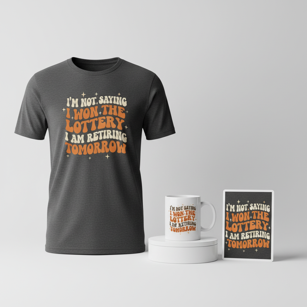
- 🎨 Visual Concept: Imagine a design infused with a distinct 1970s vibe. Think groovy, flowing lines and an inviting, warm color palette dominated by rich oranges, earthy browns, and soft creams. This retro aesthetic offers a unique visual appeal that stands out. To subtly hint at fortune without being explicit, small, understated starburst or sparkle icons could be artfully scattered around the central text, adding a touch of celebratory glimmer.
- ✍️ Typography Ideas: The core of this concept lies in its witty, original text: “I’m not saying I won the lottery but I am retiring tomorrow.” This phrase, rendered in a funky, wavy 70s-inspired font, perfectly encapsulates the dry humor and aspirational fantasy of the target audience. It’s relatable, universally understood, and most importantly, it skillfully navigates content policy restrictions by focusing on the consequence of winning rather than the act itself.
- 👕 Product Canvas: To truly make the vibrant 70s-inspired colors pop, this design could translate exceptionally well onto dark apparel. The contrast between the bright, warm color scheme and a dark background would enhance readability and the overall visual impact, making the design truly stand out in any crowd.
Strategic Market Insight
Targeting this trend with a design like “I’m not saying I won the lottery but I am retiring tomorrow” shrewdly aims at a broad, relatable demographic: office workers, dreamers, and anyone with a dry, self-aware sense of humor about their daily grind. The psychological trigger here is universal aspiration combined with a chuckle. People buy this not just for the lottery connection, but for the shared fantasy of quitting their job and embracing financial freedom. It offers a subtle, year-round wearable statement piece that’s both humorous and aspirational, resonating far beyond the immediate news cycle of a jackpot win. Its clever wording also ensures it remains evergreen and policy-compliant, focusing on a safe, relatable human dream.
⚖️ Estimated Copyright Risk: LOW
Copyright Evaluation: This design is based on a generic, humorous concept and uses an original quote. It avoids all brand names like ‘EuroMillions’ or ‘National Lottery’. The risk is low because the idea of suddenly quitting a job is a common trope and not protectable IP.
Always verify intellectual property rights before listing.
Check UK Trademark Search for “National Lottery Euromillions Jackpot” ➔
AI Image Generation Prompts
The following prompts are optimized for leading generators to produce production-ready assets:
👕 Apparel / T-Shirt Prompt
A retro 1970s-inspired graphic design for a t-shirt, rendered in a pristine, clean vector illustration style. The central focus is the text 'I'm not saying I won the lottery but I am retiring tomorrow' presented in bold, groovy, wavy typography. The lettering features a psychedelic, melted effect, with chunky, rounded characters that flow organically, reminiscent of vintage disco-era poster art and mid-century modern graphic design. The text is expertly stacked and custom lettered for maximum visual impact, ensuring clarity despite its playful curves. The primary color palette is warm and inviting, dominated by burnt orange, rich chocolate brown, and creamy off-white, with subtle gradient transitions within the vector shapes to add depth without losing the flat graphic appeal. Surrounding the prominent text are small, subtle starburst and sparkle icons, rendered with crisp, hard-edged vector lines, implying good luck and fortune. These delicate accents are strategically placed to enhance the celebratory mood without overwhelming the typography. The entire design is isolated cleanly on a solid, dark charcoal gray background, providing stark contrast that makes the retro colors pop. The rendering is extremely precise, showcasing sharp edges, smooth color fills, and a high-fidelity print aesthetic suitable for screen printing. The overall mood is optimistic, playful, and distinctly nostalgic. The ONLY text allowed in the image is exactly 'I'm not saying I won the lottery but I am retiring tomorrow'. Absolutely NO other names, words, or random letters. --ar 3:4 --v 6.0
🔍 Search this niche on:
☕ Drinkware / Mug Prompt
A panoramic coffee mug wrap design featuring a duplicated side-by-side layout, showing the exact same groovy 1970s-inspired graphic on both the left and right sides, engineered perfectly for a continuous, seamless mug wrap. The design's main focus is the phrase 'I'm not saying I won the lottery but I am retiring tomorrow', rendered in vibrant, wavy, psychedelic typography. The letters are chunky, flowing, and elongated, creating a dynamic visual rhythm that evokes a retro, celebratory feeling. The color scheme is a rich blend of warm tangerine orange, deep chocolate brown, and creamy vanilla white, with distinct, bold outlines separating the color fields, giving it a playful, illustrative quality akin to vintage pop art or graphic novel panels. Small, scattered starbursts and subtle sparkle icons are strategically integrated around and within the typography, suggesting themes of luck and good fortune, adding a cheerful twinkle to the design. The rendering style is clean vector art with a glossy finish impression, ensuring the colors are bright, clear, and high-contrast, making the text highly legible and eye-catching from any angle. The overall aesthetic is cheerful, energetic, and highly engaging, designed to wrap around a standard coffee mug. The ONLY text allowed in the image is exactly 'I'm not saying I won the lottery but I am retiring tomorrow'. Absolutely NO other names, words, or random letters. --ar 3:1 --v 6.0
🔍 Search this niche on:
✨ Die-Cut Sticker Prompt
A vibrant, die-cut sticker design in a bold, 2D flat pop-art style, heavily inspired by the groovy aesthetics of the 1970s. The central element is the text 'I'm not saying I won the lottery but I am retiring tomorrow', rendered in chunky, wavy, and rounded typography that exudes a playful, retro charm. The letterforms are distinct and impactful, designed for immediate readability and visual punch. The color palette is high-saturation and striking, featuring bright orange, rich chocolate brown, and creamy beige, with solid color fills and crisp, hard-edged separations that define the iconic pop-art look. Small, exaggerated starbursts and simple geometric sparkle icons are carefully placed around the text, emphasizing the theme of luck and celebration, rendered with the same flat, clean vector precision. The entire design is encircled by a prominent, uniform thick white outline border, perfectly defining its die-cut shape and making it stand out as a collectible, graphic element. The rendering is extremely flat with no gradients or textures, ensuring maximum clarity and a sharp, clean finish typical of high-quality vinyl stickers. The mood is fun, direct, and optimistically playful. The ONLY text allowed in the image is exactly 'I'm not saying I won the lottery but I am retiring tomorrow'. Absolutely NO other names, words, or random letters. --ar 1:1 --v 6.0
🔍 Search this niche on:
Frequently Asked Questions
How does this design navigate content policies often associated with gambling themes?
The design cleverly sidesteps direct mentions of lotteries or gambling by focusing entirely on the aspirational outcome: “retiring tomorrow.” This phrase taps into a universal desire for freedom and financial independence, making the design about personal dreams rather than specific gambling activities, thus ensuring it’s a safe and evergreen concept for various marketplaces.
What makes a retro 70s aesthetic a compelling choice for a contemporary EuroMillions trend?
The 1970s aesthetic brings a sense of playful nostalgia and timeless cool to the design. It allows for vibrant, distinctive typography and color palettes that stand out. This retro approach subtly hints at classic ‘good times’ and big dreams without being literal, making the merchandise feel unique and stylish rather than overtly tied to a single news event.
Beyond EuroMillions fans, what wider appeal does the specific phrase “I’m not saying I won the lottery but I am retiring tomorrow” have?
This witty phrase possesses broad appeal for anyone experiencing the daily grind, dreaming of financial freedom, or simply possessing a dry sense of humor. It resonates with office workers, students, and anyone who fantasizes about a life free from obligations. It’s a humorous declaration of independence, making it a relatable and year-round wearable statement piece for a diverse audience.
Final Thoughts
The excitement surrounding a massive EuroMillions jackpot offers a vibrant, albeit fleeting, window for creative merchandise. By tapping into the underlying aspirations and cultural conversations, rather than just the news headline itself, and by applying a unique visual and textual spin, there’s significant e-commerce potential. Success in this niche, as with any, ultimately hinges on thoughtful design execution, understanding your audience, and putting your own clever spin on widely felt sentiments.
💬 What’s Your Take?
Art is subjective, and this is just one angle! How would you spin this “National Lottery Euromillions Jackpot” trend? Did we miss the mark, or is there a better inside joke to use here? Drop your design ideas and let’s brainstorm in the comments below!