
UK NBA SLEEP SCHEDULE
Across the Atlantic, UK basketball enthusiasts often find themselves in a unique temporal dilemma. While the recent Lakers vs. Timberwolves clash captivated fans globally, its recap sparked a particular buzz in the United Kingdom, not just for the game’s outcome, but for a widely shared sentiment: “No One Was Even Awake.” This single headline perfectly encapsulates the dedication—and the exhaustion—of a passionate UK NBA fanbase consistently battling the clock.
The Cultural Significance
The “No One Was Even Awake” comment resonates deeply because it taps into a shared, almost ritualistic experience for British NBA followers. Watching live games from across the pond often means sacrificing precious sleep, tuning in during the wee hours of the morning, long after the rest of the country has settled down. This isn’t just about catching a highlight reel later; it’s about being part of the live action, sharing in the immediate highs and lows. It’s a badge of honour, a testament to true fandom, and a silent nod of understanding between those who brave the late-night hours. This cultural touchpoint creates a tight-knit community, where the struggle of the sleep schedule is as much a part of the NBA experience as the slam dunks and buzzer-beaters themselves.
Design Brainstorm: Capturing the Aesthetic
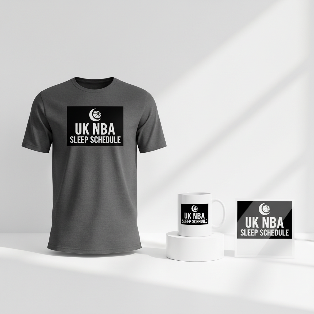
To capture this unique fan experience, a design concept could lean into subtlety and shared understanding, moving away from explicit team branding to embrace a lifestyle statement. One angle to consider is a minimalist, text-focused approach that speaks directly to this insider community.
- 🎨 Visual Concept: The core visual concept could feature a clean, high-contrast white design set against a dark background, evoking the dim light of early morning hours. Subtly integrated elements might include a small, stylized crescent moon—symbolizing late-night viewing—paired with a basketball, perhaps slightly faded or silhouetted, to maintain the minimalist feel. The overall impression would be understated yet instantly recognizable to those in the know.
- ✍️ Typography Ideas: For the primary text, “UK NBA SLEEP SCHEDULE,” a modern, clean sans-serif font like Helvetica, Arial, or a similar contemporary typeface could work well. This choice would ensure readability and a sleek aesthetic, preventing the design from feeling cluttered. The text itself is the hero here, acting as a clear, relatable punchline that needs no further explanation for the target audience.
- 👕 Product Canvas: Given the white-on-dark design concept and the theme of late-night viewing, dark apparel serves as the ideal canvas. Think black hoodies, navy t-shirts, or charcoal long-sleeves. Not only do these colours enhance the high contrast of the design, but they also subtly align with the nocturnal theme, making the message pop effectively.
Strategic Market Insight
Targeting the specific demographic of UK-based NBA fans who consistently sacrifice sleep offers a powerful strategic advantage. This isn’t just a broad sports audience; it’s a dedicated, passionate niche that experiences a very specific, shared challenge. Purchasing a product with this design isn’t merely buying a shirt; it’s acquiring a piece of identity, a statement that says, “I’m one of you.” The psychological triggers behind such a purchase are strong: a sense of belonging, an insider joke, and a badge of honour for their dedication. Crucially, this concept cleverly sidesteps potential intellectual property issues by focusing on the universal fan lifestyle rather than specific team names or league logos, providing an evergreen, safe, and highly relatable product concept.
⚖️ Estimated Copyright Risk: LOW
Our Findings: The design avoids all trademarked team and league names. The phrase ‘UK NBA SLEEP SCHEDULE’ is a descriptive, factual statement about a fan’s lifestyle and carries no copyright risk. It is a unique concept targeting a behavior, not a brand.
Always verify intellectual property rights before listing.
Check UK Trademark Search for “Lakers Vs Timberwolves” ➔
AI Image Generation Prompts
The following prompts are optimized for leading generators to produce production-ready assets:
👕 Apparel / T-Shirt Prompt
A minimalist, text-focused graphic design optimized for a t-shirt print. The design is isolated on a solid, deep black background, creating a high-contrast visual. The central element is the text 'UK NBA SLEEP SCHEDULE', rendered in pure white using a modern, bold, clean sans-serif typeface, reminiscent of Helvetica Neue Bold or Gotham Black. The typography features precise kerning and uniform stroke weight, exuding a sleek, professional aesthetic. Subtly integrated above the main text is a small, highly stylized, abstract graphic combining a crescent moon and a basketball. The crescent moon is depicted as a slender, pure white, perfectly smooth arc, while the basketball is a simple, minimalist white circle with two clean, abstract white lines representing seams, elegantly nested within the inner curve of the crescent. The entire design – text and graphic – is executed in a pristine, sharp, flat vector illustration style. This digital illustration emphasizes absolute geometric precision, flawless Bezier curves, and ultra-crisp, razor-sharp edges without any aliasing. It's a pure 2D graphic, devoid of gradients, bevels, drop shadows, or any simulated textures, maintaining a perfectly smooth, polished appearance. The aesthetic is iconic, infographic-like, and highly effective for screen printing, ensuring vibrant white ink on a dark substrate. The composition is balanced and proportional, radiating a contemporary, sophisticated, and athletic mood. The ONLY text allowed in the image is exactly 'UK NBA SLEEP SCHEDULE'. Absolutely NO other names, words, or random letters.
🔍 Search this niche on:
☕ Drinkware / Mug Prompt
A highly detailed, panoramic coffee mug wrap layout, designed explicitly with a duplicated side-by-side display: the exact same graphic is featured prominently on both the left and right halves of the horizontal canvas, ensuring a perfect wrap. The foundational element is a seamless, solid, deep black background that extends across the entire width. The primary design (repeated twice) is minimalist and text-focused, featuring the phrase 'UK NBA SLEEP SCHEDULE' rendered in a vibrant, pure white. The typography is a clean, robust, modern sans-serif font, such as Gotham Bold or Lato Black, with meticulous kerning and sharp, defined edges. Positioned elegantly above the text is a small, stylized graphic element: a pure white, slender crescent moon arc subtly cradling a minimalist white basketball icon, which has two delicate, abstract white lines indicating seams. This entire white-on-black graphic is executed in an immaculate, ultra-crisp vector art style, characterized by absolute geometric precision, flawless curves, and razor-sharp outlines. It is a flat, 2D illustration, entirely devoid of gradients, drop shadows, bevels, or any textural effects, optimized for the highest quality print on ceramic. The high contrast and precise digital rendering ensure maximum visual impact and readability when applied to a mug. The two identical designs are spaced appropriately to allow for visual continuity around the mug. The ONLY text allowed in the image is exactly 'UK NBA SLEEP SCHEDULE'. Absolutely NO other names, words, or random letters.
🔍 Search this niche on:
✨ Die-Cut Sticker Prompt
A vibrant, die-cut sticker design presented in a striking 2D flat pop-art style. The design features a prominent, uniformly thick white outline border that precisely contours the entire composition. Inside this white border, the core design is rendered in a high-contrast white-on-solid-black scheme. The central element is the phrase 'UK NBA SLEEP SCHEDULE', meticulously set in a clean, bold, modern sans-serif typeface such as Bebas Neue Bold or Impact, in crisp white. Above this text, a small, powerfully stylized graphic subtly integrates a crescent moon and a basketball. The crescent moon is depicted as a distinct, solid white arc, while the basketball is a simple, bold white circle with minimalist, abstract white seam lines, elegantly positioned within the moon's curve. These white text and graphic elements are placed directly on a solid, deep black background shape that defines the immediate boundary of the design. The entire illustration adheres to a pure pop-art aesthetic: simplified forms, strong graphic impact, razor-sharp edges, and absolutely no gradients, textures, or shadows. It's a flat, high-contrast, iconic visual, with perfect digital rendering ensuring precise cut lines for manufacturing. The sticker appears as a bold, collectible emblem, radiating a modern and impactful visual identity. The ONLY text allowed in the image is exactly 'UK NBA SLEEP SCHEDULE'. Absolutely NO other names, words, or random letters.
🔍 Search this niche on:
Frequently Asked Questions
How does this design concept avoid potential trademark or IP conflicts with the NBA or its teams?
The design concept intelligently pivots away from using specific team names, logos, or official NBA branding. Instead, it focuses on the universal, shared experience of being an international fan and the common struggle of time differences. By highlighting a relatable “lifestyle” element—the “UK NBA SLEEP SCHEDULE”—rather than directly referencing teams or the league, it taps into fan culture without infringing on existing intellectual property.
What makes the “UK NBA SLEEP SCHEDULE” phrase so impactful for this particular audience?
This phrase is potent because it’s an insider joke and a statement of shared dedication. It speaks directly to the specific grind of UK fans who adjust their lives to catch live games. It’s a shorthand for their sacrifice, passion, and the unique community they’ve formed around these late-night viewings, creating an immediate sense of camaraderie and understanding.
Beyond apparel, what other merchandise types could effectively carry this “sleep schedule” design?
This concept could translate beautifully to a range of products beyond dark apparel. Consider travel mugs or insulated tumblers for those early morning brews, cozy throw blankets or pillows for nap recovery, or even minimalist wall art and posters for a subtle nod to their dedication. The versatility of the simple text and graphic allows it to fit seamlessly onto items used during those late nights or for recovery afterward.
Final Thoughts
The potential for e-commerce success within such a well-defined and passionate niche like the UK NBA fan base is significant. By tapping into a shared experience rather than specific team allegiance, a concept like “UK NBA SLEEP SCHEDULE” offers a unique and enduring appeal. The key to unlocking this potential lies in thoughtful execution, a keen understanding of the audience’s lived experience, and an appreciation for the subtle cultural touchpoints that bind them. A design that speaks to their unique journey transforms a simple product into a statement of identity, fostering connection and community amongst dedicated fans.
💬 What’s Your Take?
Art is subjective, and this is just one angle! How would you spin this “Lakers Vs Timberwolves” trend? Did we miss the mark, or is there a better inside joke to use here? Drop your design ideas and let’s brainstorm in the comments below!