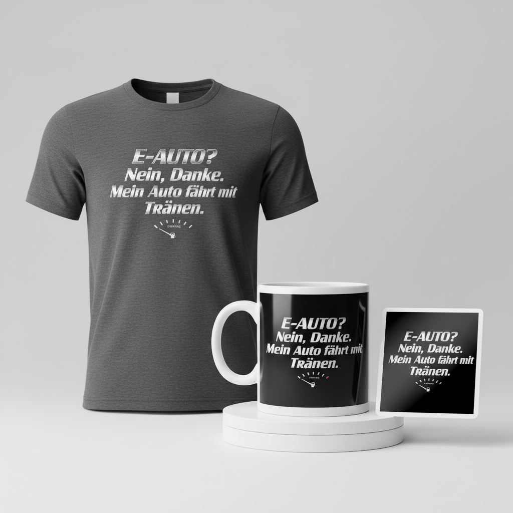
E-Auto? Nein, danke. Mein Auto fährt mit Tränen. – E-Car? No, thanks. My car runs on tears.
Across Germany, the daily topic of “Spritpreise” – fuel prices – isn’t just small talk; it’s a recurring national conversation, often tinged with a collective sigh. As news outlets consistently highlight impending price hikes at the pump, a palpable frustration sweeps across the nation’s drivers. This isn’t merely an economic issue; it’s a cultural touchstone, shaping commutes, weekend plans, and household budgets, making it a powerful current for relatable merchandise.
The Cultural Significance
The continuous climb of gas prices in Germany has transformed a simple cost into a significant point of public discourse. From morning radio shows to evening news broadcasts, the fluctuating cost of fuel is a constant headline, fueling a shared sense of exasperation among a vast segment of the population. This isn’t about partisan politics; it’s about the everyday impact on citizens who rely on their vehicles. The universal nature of this frustration creates a fertile ground for humor and shared understanding, tapping into a common experience that transcends regional or demographic boundaries. It’s a moment where a simple, witty observation can resonate deeply, offering a lighthearted outlet for a weighty concern.
Design Brainstorm: Capturing the Aesthetic
Translating this widespread sentiment into a compelling design requires a blend of visual appeal and clever messaging. One intriguing angle could lean into nostalgia, offering a visual escape from present-day woes, while delivering a very current message.
- 🎨 Visual Concept: Imagine a design that immediately transports you back to the vibrant, often over-the-top aesthetics of the 1980s. This retro inspiration could manifest through bold graphic elements and a generally dynamic layout. Complementing this, a stylized, minimalist depiction of a car’s fuel gauge, starkly pointing to ‘E’ for empty, could serve as a powerful, universally understood visual shorthand for the core issue. The contrast between a lively retro style and the stark reality of an empty tank can create a unique, engaging piece.
- ✍️ Typography Ideas: For the textual component, a bold, slightly italic sans-serif font would fit perfectly within that ’80s retro theme. To give it an extra pop, a subtle chrome effect on the lettering could evoke the polished, futuristic feel often associated with that era, even when discussing a modern-day problem. The phrase “E-Auto? Nein, danke. Mein Auto fährt mit Tränen.” (“EV? No thanks. My car runs on tears.”) offers a brilliant, humorous twist on a common environmental discussion, delivering a relatable punchline that drivers of internal combustion engines will immediately understand and appreciate.
- 👕 Product Canvas: For apparel, dark bases like charcoal, navy, or classic black would provide the perfect backdrop. These colors allow the retro graphics and chrome-effect typography to truly stand out, enhancing the overall impact and ensuring the design looks sleek and intentional.
Strategic Market Insight
The strategic power of this design lies in its direct appeal to a massive, identifiable demographic: German drivers of internal combustion engine vehicles experiencing the pinch of high fuel costs. By employing humor, the design sidesteps confrontational or overtly political statements, instead focusing on a shared, relatable feeling of economic pain. This allows individuals to express their frustration in a lighthearted, almost self-deprecating way. The phrase itself is a clever, non-copyrighted spin on everyday concerns, ensuring broad appeal without legal entanglements. Furthermore, the issue of fuel prices is perennially relevant, making this an evergreen concept that can resonate with consumers across different economic cycles. It’s a design that offers both catharsis and community, turning a common grievance into a badge of shared experience.
⚖️ Estimated Copyright Risk: LOW
Risk Assessment: The phrase is a humorous, original creation based on common sentiments found online. A search of the German Patent and Trade Mark Office (DPMA) database reveals no active trademarks for this specific slogan in the relevant apparel classes. Slogans and common phrases are generally difficult to trademark in Germany unless they have acquired significant distinctiveness.
Always verify intellectual property rights before listing.
Check EU Trademark Search for “Spritpreise” ➔
AI Image Generation Prompts
The following prompts are optimized for leading generators to produce production-ready assets:
👕 Apparel / T-Shirt Prompt
A stunning retro-futuristic 1980s-inspired t-shirt graphic design. The central element is the text 'E-Auto? Nein, danke. Mein Auto fährt mit Tränen.' rendered in a bold, assertive, slightly italicized sans-serif typeface, reminiscent of classic 80s action movie titles or video game logos. This text features a subtle, highly refined chrome effect: a polished metallic surface with soft, reflective gradients and a subdued sheen, indicating depth without being overly glossy. Below the text, a stylized, minimalist graphic of a car's empty fuel gauge is depicted. The gauge is iconic, simplified, with a sleek, digital-analog hybrid look – a clean black dial with white markings, and a prominent red or orange needle pointing precisely to 'E'. The overall art style is a pristine, clean vector illustration, characterized by sharp, crisp lines, perfect geometric shapes, and a smooth, unblemished finish. The rendering is flat yet sophisticated, with subtle highlights and shadows used judiciously to convey the metallic texture of the chrome and the clean contours of the gauge. The color palette is vibrant but cohesive, utilizing electric blues, deep purples, and radiant pinks for subtle background glow elements (if any, kept minimal for print), contrasted with the metallic silver-chrome text and the stark white/black of the gauge. The mood is nostalgic, cool, and a touch ironic, embodying quintessential 80s synthwave aesthetics. The design is isolated on a solid Dark background, making it perfect for direct-to-garment printing on a black or dark navy t-shirt. The illustration techniques are digital, precise, and optimized for scalability and print clarity, with no fuzzy edges or raster artifacts. The lighting is even and graphic, emphasizing the design's clean contours rather than realistic depth. The texture is implied as smooth and polished. The ONLY text allowed in the image is exactly 'E-Auto? Nein, danke. Mein Auto fährt mit Tränen.'. Absolutely NO other names, words, or random letters.
🔍 Search this niche on:
☕ Drinkware / Mug Prompt
A duplicated side-by-side layout showing the exact same graphic on the left and right, designed perfectly for a panoramic mug wrap. The graphic is a highly detailed, immersive retro 1980s synthwave design. The central text 'E-Auto? Nein, danke. Mein Auto fährt mit Tränen.' dominates the upper section, presented in a bold, slightly italicized sans-serif font, possessing a striking, highly polished chrome effect. This chrome is intensely reflective, gleaming with precise specular highlights, ambient reflections of an imagined neon cityscape, and subtle metallic texture, giving it a tangible, solid appearance. Below the text, a hyper-stylized, minimalist car fuel gauge is rendered. The gauge features a sleek, futuristic design, possibly with a subtle digital display integrated into its analog face, and a vibrant neon-red needle firmly resting on 'E'. The gauge itself is perhaps subtly backlit with a soft neon glow, or embedded in a minimalist geometric console. The background behind the text and gauge elements features a dynamic 80s grid pattern receding into a vaporwave sunset gradient (pinks, purples, oranges), with faint neon light streaks or abstract geometric shapes emanating from the sides, creating a sense of depth and motion that seamlessly repeats across the wrap. The art style is a blend of sharp vector graphics and atmospheric digital painting, with smooth gradients and precise line work. The rendering is sophisticated, emphasizing the reflective qualities of the chrome and the subtle atmospheric effects. Lighting is dramatic and high-contrast, featuring strong backlighting, neon glows, and sharp shadows to enhance the retro-futuristic mood. The texture is slick, glossy, and highly polished, mimicking polished metal and vibrant digital displays. The mood is nostalgic, energetic, and visually captivating, perfect for a coffee mug. The ONLY text allowed in the image is exactly 'E-Auto? Nein, danke. Mein Auto fährt mit Tränen.'. Absolutely NO other names, words, or random letters.
🔍 Search this niche on:
✨ Die-Cut Sticker Prompt
A vibrant and bold retro 1980s pop-art inspired die-cut sticker design. The text 'E-Auto? Nein, danke. Mein Auto fährt mit Tränen.' is rendered in a punchy, bold, slightly italicized sans-serif typeface, designed with a stylized, flat chrome effect. This chrome effect is achieved through high-contrast two-tone gradients (e.g., bright silver to dark grey) and sharp, geometric highlights that suggest reflectivity without being photorealistic. The overall style is reminiscent of classic comic book lettering or vintage arcade machine graphics. Below the text, a highly simplified, iconic car fuel gauge is depicted. The gauge is rendered in a stark, minimalist 2D flat pop-art style, perhaps with a thick black outline, segmented lines, and a solid block color for the needle pointing unequivocally to 'E'. The art style is defined by clean, heavy black outlines, simplified color blocking, and a graphic, illustrative quality, characteristic of 2D flat pop-art. There are no subtle shadows or complex textures; everything is rendered with a graphic flatness. The color palette is bright and impactful, utilizing primary and secondary colors typical of the 80s aesthetic, such as electric blue, magenta, yellow, and stark white. The rendering is sharp, clean, and extremely graphic, designed for immediate visual impact. Lighting is entirely flat and shadowless, as expected in pop-art. The texture is smooth, clean, and vibrant, like a perfectly printed vinyl sticker. A thick white outline border surrounds the entire design, ensuring it stands out when die-cut. The mood is playful, direct, and assertively retro. The ONLY text allowed in the image is exactly 'E-Auto? Nein, danke. Mein Auto fährt mit Tränen.'. Absolutely NO other names, words, or random letters.
🔍 Search this niche on:
Frequently Asked Questions
How does this design manage to be humorous without being overtly political or negative?
The design cleverly uses hyperbole and a common shared experience – the pain of high gas prices – to create humor. By stating “My car runs on tears,” it personalizes the frustration in a relatable, almost theatrical way, rather than assigning blame or making a political statement. The retro aesthetic also contributes by creating a playful, less serious tone, allowing wearers to commiserate with a smile rather than a complaint.
Why choose a 1980s retro aesthetic for such a current and ongoing issue like fuel prices?
The retro 1980s aesthetic offers a compelling contrast and a sense of timelessness. It can evoke nostalgia for a simpler, perhaps more affordable, past while addressing a very modern concern. This visual style allows the design to stand out, offering an artistic, almost iconic interpretation of a recurring problem. It suggests that while the issue persists, one can approach it with a certain style and a sense of playful detachment, giving the design broader appeal beyond just the immediate frustration.
What makes the German phrase “E-Auto? Nein, danke. Mein Auto fährt mit Tränen.” so effective for this target audience?
This phrase is highly effective because it taps directly into a contemporary German discussion (the push for electric vehicles vs. traditional cars) and delivers a humorous, self-aware punchline. It’s a common, identifiable sentiment for many drivers of conventional cars who might feel pressured or unable to switch to an EV. The humor in “My car runs on tears” is universally understood as an exaggeration of economic struggle, creating instant camaraderie and a knowing chuckle among those who share the experience.
Final Thoughts
The “Spritpreise” trend in Germany represents a significant opportunity for e-commerce, offering a unique blend of cultural relevance and evergreen appeal. By focusing on shared frustration, humor, and a distinctive aesthetic, creators can develop merchandise that truly resonates. The key, as always, lies in thoughtful execution, understanding the nuances of the target audience, and allowing for creative interpretation within the established framework. This concept offers a robust starting point for designs that are not just visually appealing but deeply connected to the everyday lives and sentiments of a wide market.
💬 What’s Your Take?
Art is subjective, and this is just one angle! How would you spin this “Spritpreise (gas prices)” trend? Did we miss the mark, or is there a better inside joke to use here? Drop your design ideas and let’s brainstorm in the comments below!