野球魂 – Baseball Soul
Japan is currently riding a powerful wave of baseball euphoria, a fervor reignited by the incredible performance of its national team, Samurai Japan, in the recent international tournament. This success has not only crowned new heroes but also shone a renewed spotlight on revered figures from the sport’s rich history, like former player Yoshinobu Takahashi. The nation’s collective pride is palpable, creating a vibrant landscape for merchandise that resonates with this deep cultural connection to the game.
The Cultural Significance
Baseball, or “yakyu,” holds a unique and revered place in the heart of Japanese culture, transcending mere sport to become a significant part of national identity. The recent undefeated streak of Samurai Japan in the WBC captivated the entire archipelago, prompting a resurgence of commentary and news around pivotal moments and key figures. Yoshinobu Takahashi, a name synonymous with excellence and leadership in Japanese baseball, naturally surfaces in these conversations, embodying the legacy and spirit that current players carry forward. This shared national triumph fosters a powerful sense of community and pride, making any merchandise that taps into this emotional wellspring incredibly appealing. It’s not just about celebrating a win; it’s about honoring a tradition, acknowledging a collective effort, and carrying a piece of that national spirit.
Design Brainstorm: Capturing the Aesthetic
Translating this profound cultural moment into a wearable design requires a nuanced approach, blending historical appreciation with contemporary appeal. One creative direction could lean into a vintage, almost rebellious aesthetic, offering a fresh take on fan apparel.
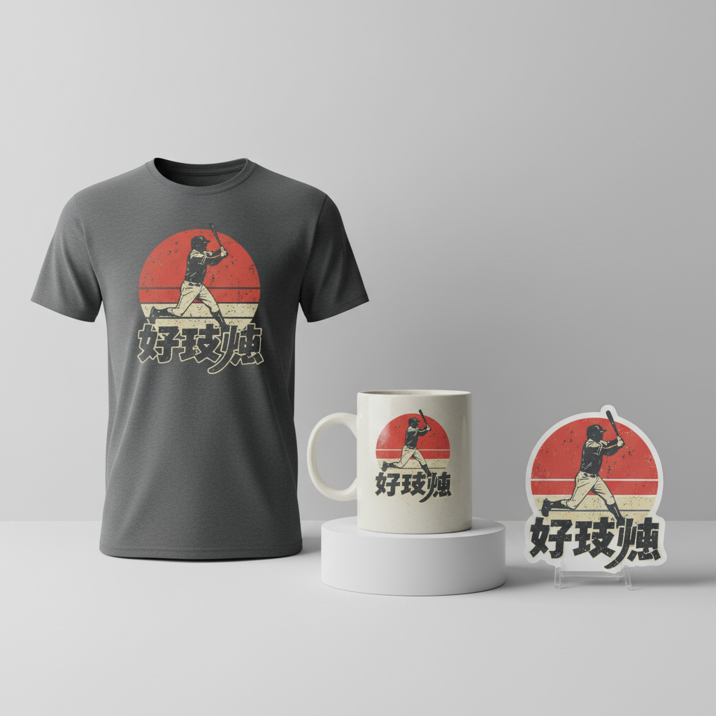
- 🎨 Visual Concept: Imagine a design that harks back to the raw, unfiltered energy of 90s bootleg concert shirts. This could feature a generic baseball player captured in a dynamic batting pose, devoid of any discernible face, team logos, or specific identifiers. The anonymity allows the wearer to project their own team or player loyalty onto the image. Behind this powerful silhouette, a stylized red sun, evoking the iconic Japanese flag, serves as a backdrop, subtly reinforcing the national pride without explicit flag imagery. The overall look would be distressed, with a faded, well-worn feel, giving it an authentic, lived-in character.
- ✍️ Typography Ideas: The text elements could further amplify this retro vibe. A mix of a bold, blocky font for the primary statement, perhaps “野球魂” (Baseball Soul), combined with a more fluid script font for secondary details, could create visual interest. Both fonts would ideally carry a faded texture, appearing as if screen-printed years ago and lovingly worn, enhancing the bootleg aesthetic and historical feel.
- 👕 Product Canvas: This kind of impactful, vintage-inspired graphic would undoubtedly shine brightest on dark apparel. Black, charcoal, or deep navy garments would provide the perfect contrast for the distressed red and off-white textures of the design, allowing the visuals to truly pop and embrace the desired gritty, retro feel.
Strategic Market Insight
The target demographic for such a design is undeniably the passionate Japanese baseball fan. This strategy intelligently sidesteps the common pitfalls of IP infringement by deliberately avoiding all specific, trademarked entities associated with the current trending topic – no ‘WBC’, no ‘Samurai Japan’, and no direct player names like ‘Yoshinobu Takahashi’. Instead, it shrewdly targets the broader, evergreen trope of ‘Japanese Baseball Pride’. The phrase ‘野球魂’ (Baseball Soul) is a particularly potent choice. It’s a common, spirited term used by fans to express their deep connection to the sport, and crucially, it is not trademarked. This approach ensures safety from IP claims and Amazon bot rejections, while still resonating profoundly with the emotional core of the fan base. Buyers are motivated by a desire to show their national pride and love for baseball in an authentic, yet safe, manner, seeking a design that feels unique and personal without being explicitly tied to official, commercialized merchandise.
⚖️ Estimated Copyright Risk: LOW
Copyright Evaluation: Research confirms ‘Samurai Japan’ and ‘WBC’ are trademarked. This design completely avoids these by using a generic player silhouette and a common, non-trademarked phrase that captures the spirit of the trend without infringing on any intellectual property. This is a classic ‘broad trope’ workaround.
Always verify intellectual property rights before listing.
Check Japan Trademark Search for “高橋由伸” ➔
AI Image Generation Prompts
The following prompts are optimized for leading generators to produce production-ready assets:
👕 Apparel / T-Shirt Prompt
A vintage, distressed design for a 90s bootleg concert t-shirt. Isolated on a solid Dark background, a clean vector illustration style featuring a generic baseball player in a dynamic, powerful batting pose, mid-swing. The player's face is completely obscured or featureless, with no discernible team logos, numbers, or branding on their uniform. The uniform itself is rendered in a simplified, retro athletic style with subtle creases and folds that suggest movement. Behind the player, a large, prominent stylized red sun, reminiscent of the Japanese flag, with a slightly irregular, hand-drawn outline, radiating subtle, distressed energy lines. The entire design has a heavy vintage, faded, and distressed texture overlay, simulating authentic screen print wear and tear, crackle effects, ink irregularities, and subtle grunge elements. The color palette is limited to a few muted, desaturated tones, primarily deep reds, warm creams, and dark grays, with the bright yet faded red sun as a focal point, all softened by the grunge effect. The typography incorporates the text '野球魂' prominently. '野球' is in a bold, blocky, condensed collegiate-style font, evoking classic sports aesthetics, while '魂' is in a contrasting, elegant yet slightly rugged script font. Both text elements have the same distressed, faded, and cracked texture, seamlessly integrated with the overall design's aged aesthetic. The composition is punchy, energetic, and slightly off-kilter, capturing a rebellious, underground concert vibe. The illustration technique utilizes crisp, bold outlines and minimal, flat shading, characteristic of vintage graphic tees, yet presented with precise vector clarity against the dark background. The mood is cool, nostalgic, and subtly aggressive. The ONLY text allowed in the image is exactly '野球魂'. Absolutely NO other names, words, or random letters. --ar 3:4 --v 6.0
🔍 Search this niche on:
☕ Drinkware / Mug Prompt
A duplicated side-by-side layout showing the exact same graphic on the left and right, designed perfectly for a panoramic mug wrap. The graphic is a vintage, distressed design in the style of a 90s bootleg concert shirt. It features a generic baseball player captured in a dramatic, powerful batting pose, mid-swing, dynamically positioned to wrap around a mug. The player is silhouetted or has an intentionally vague, featureless face. There are absolutely no discernible team logos, numbers, or identifiable branding on the player's uniform, which is depicted in a classic, simplified athletic cut with bold lines. Behind the player, a large, prominent stylized red sun, evoking the Japanese flag, with a slightly imperfect, hand-drawn feel, its rays subtly integrated into the background and extending outward to create visual flow. The entire design is imbued with a heavy vintage, faded, and distressed texture overlay, giving the impression of an old, worn screen print with visible crackle, ink variations, halftone dots, and subtle grunge grit, optimized for a wrap format. The color scheme is a limited, muted palette of desaturated reds, creams, off-whites, and dark grays or blacks, with the vibrant, yet distressed, red sun providing contrast and visual anchor. The typography integrates '野球魂' prominently. '野球' is rendered in a robust, blocky, collegiate-style font, reminiscent of old sports jerseys and concert posters, while '魂' is presented in a flowing, yet slightly worn script font. Both text elements share the same faded, cracked, and vintage texture, consistent with the overall design's aged aesthetic. The composition is dynamic and balanced across the panoramic canvas, ensuring the central elements are clear and impactful from all viewing angles. The rendering is flat with intentional imperfections, capturing the raw, indie spirit of 90s graphic art. The mood is nostalgic, powerful, and slightly rebellious, with a strong visual presence. The ONLY text allowed in the image is exactly '野球魂'. Absolutely NO other names, words, or random letters. --ar 3:1 --v 6.0
🔍 Search this niche on:
✨ Die-Cut Sticker Prompt
A die-cut sticker design featuring a vintage, distressed aesthetic inspired by 90s bootleg concert shirts, with a thick white outline border around the entire design. The central image is a generic baseball player in a highly dynamic batting pose, mid-swing, rendered with a flat, bold 2D pop-art style. The player's face is completely featureless or obscured, and their uniform is devoid of any team logos, numbers, or specific branding, depicted in a simplified, classic baseball uniform style with clean, hard-edged lines. Behind the player, a large, impactful stylized red sun, reminiscent of the Japanese flag, with crisp, yet slightly irregular edges, radiating a sense of raw energy. The entire graphic maintains a strong vintage, faded, and distressed texture, giving it the worn-out look of an old screen print, including subtle crackle effects, halftone patterns, subtle grain, and grunge overlays. The color palette is bold but desaturated, using a limited range of vintage reds, creams, off-whites, and dark earth tones, with the distressed red sun as a key accent point, ensuring high visibility and graphic punch. The typography prominently displays '野球魂'. '野球' is set in a chunky, blocky, collegiate-style font, typical of retro sports graphics and band merch, while '魂' is in a contrasting, fluid, yet slightly weathered script font. Both textual elements exhibit the same faded, cracked, and textured appearance as the rest of the design, contributing to the authentic bootleg feel. The illustration is sharp and impactful, optimized for a sticker with clear lines, strong visual appeal, and a distinct silhouette due to the thick white border. The 2D flat pop-art style emphasizes graphic impact, boldness, and iconic readability over realism. The mood is cool, retro, and iconic, designed to stand out. The ONLY text allowed in the image is exactly '野球魂'. Absolutely NO other names, words, or random letters. --ar 1:1 --v 6.0
🔍 Search this niche on:
Frequently Asked Questions
Why opt for a “90s bootleg concert shirt” aesthetic for baseball merchandise?
This aesthetic taps into a powerful vein of nostalgia and counter-culture appeal. The distressed, faded look of 90s bootlegs implies a sense of history, authenticity, and a connection to a specific, beloved era. For passionate fans, it offers a design that feels less like generic team merchandise and more like a unique, collectible item that tells a story, subtly signaling a deeper, more enduring connection to the sport and its culture beyond just the current headlines.
How can a generic baseball player and the phrase “野球魂” resonate with fans who are following specific players like Takahashi and the Samurai Japan team?
While fans might be following specific players and teams, the underlying emotion is often a broader love for Japanese baseball itself and national pride. By featuring a generic player in a dynamic pose and using “野球魂” (Baseball Soul), the design transcends individual affiliations. It becomes a universal emblem of that collective passion and spirit, allowing fans to celebrate the essence of the game and their national identity without infringing on specific team or player intellectual property. It’s about celebrating the “soul” of Japanese baseball.
What is the cultural significance of “野球魂” and why is it a strategic choice for design text?
“野球魂” translates to “Baseball Soul” or “Baseball Spirit,” and it’s a deeply ingrained cultural expression among Japanese baseball fans. It represents the dedication, resilience, passion, and fighting spirit inherent in the sport and its players. As a common, spirited phrase, it powerfully encapsulates the emotional connection fans have. Strategically, it’s brilliant because it’s a widely understood and emotionally resonant term that is not trademarked, making it an IP-safe way to connect directly with the target audience’s core sentiments without triggering automated content filters.
Final Thoughts
The energy surrounding Japanese baseball, fueled by recent international successes and the legacy of figures like Takahashi, presents a dynamic opportunity for print-on-demand creators. By thoughtfully embracing a vintage aesthetic, strategically avoiding trademarked elements, and tapping into universal sentiments like “野球魂,” designers can craft compelling merchandise that truly resonates with a dedicated fan base. Success in this niche hinges on both creative execution and a keen understanding of cultural nuances, proving that a unique spin and authentic emotional connection are truly key to standing out.
💬 What’s Your Take?
Art is subjective, and this is just one angle! How would you spin this “高橋由伸 (Yoshinobu Takahashi)” trend? Did we miss the mark, or is there a better inside joke to use here? Drop your design ideas and let’s brainstorm in the comments below!