
私のカートはいつも満タン – My cart is always full
In Japan, a visit to the sprawling aisles of a wholesale giant isn’t just a shopping trip; it’s an event, a quest for value, and increasingly, a source of lighthearted social media content. The spectacle of overflowing carts and colossal deals at stores like Costco has captured the nation’s imagination, transforming bulk-buying into a shared cultural experience that’s currently lighting up news feeds and conversations across the country.
The Cultural Significance
The allure of wholesale clubs in Japan, particularly for families and savvy shoppers, goes beyond mere discounts. It’s about the unique thrill of discovering international products, the joy of stocking up on staples at exceptional value, and the communal experience of navigating the vast warehouses. Social media platforms are awash with posts showcasing impressive hauls, giant novelty items, and clever storage solutions for bulk purchases. This constant stream of user-generated content reinforces the idea that a “Costco run” is not just a chore but an adventure, a topic of shared delight, and even a humorous challenge. It taps into a collective consciousness around smart shopping, quality finds, and the sheer delight of a well-stocked pantry.
Design Brainstorm: Capturing the Aesthetic
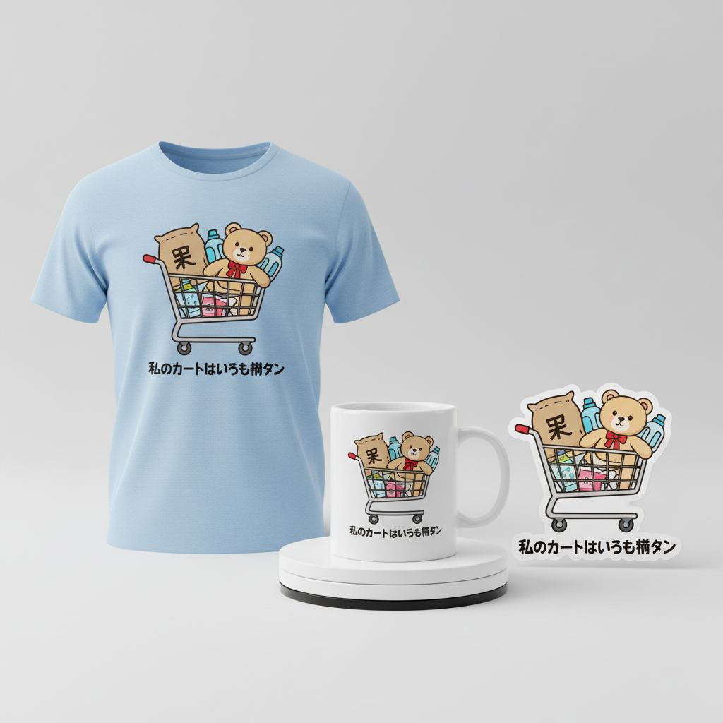
Translating this vibrant cultural moment into merchandise offers a fantastic opportunity. One compelling design concept could focus on the universal, humorous struggle and satisfaction of filling a shopping cart to its absolute limit, without directly referencing any specific brand. This approach provides a broad appeal and ensures longevity.
- 🎨 Visual Concept: Imagine a delightfully ‘kawaii’ style cartoon illustration. Picture a simple, cheerfully colored shopping cart, overflowing with generic yet iconic bulk items – perhaps a large sack of rice peeking out, a ridiculously oversized teddy bear, and a stack of giant-sized bottles. The artwork would employ clean lines and a friendly aesthetic, evoking a sense of innocent fun and the playful exaggeration inherent in bulk shopping. The charm lies in its relatability and gentle humor.
- ✍️ Typography Ideas: To complement the ‘kawaii’ visuals, a rounded, friendly Japanese font would be an ideal choice for the accompanying text. The phrase “私のカートはいつも満タン” (My cart is always full) perfectly encapsulates the shared experience of leaving a wholesale club. This simple, relatable statement resonates with shoppers, offering a knowing wink to those who understand the joyous challenge of their latest big haul.
- 👕 Product Canvas: Given the cheerful design and lighthearted theme, this concept could translate exceptionally well onto light-colored apparel. Think white, pastel, or heather gray t-shirts, hoodies, or even tote bags. The bright, clean illustration would pop against these lighter backgrounds, enhancing the design’s friendly and approachable vibe, making it a comfortable and stylish statement piece for everyday wear.
Strategic Market Insight
Targeting Japanese shoppers, especially families who frequent wholesale clubs, with this particular design concept is a shrewd move. The core of its appeal lies in its deep relatability and cultural resonance. The phrase “私のカートはいつも満タン” isn’t just text; it’s a shared sentiment, a funny and accurate description of a beloved activity. Purchasing such an item isn’t just buying clothes; it’s buying into a subculture, a quiet acknowledgment of a shared experience. It’s a way for individuals to express their enthusiasm for bulk-buying in a humorous and understated fashion. Furthermore, by focusing on the ‘broad trope’ of the shopping experience rather than specific branding, the design remains evergreen and legally compliant, ensuring its appeal continues well beyond any passing trend or seasonal sale.
⚖️ Estimated Copyright Risk: LOW
Copyright Evaluation: The design avoids all trademarked names, logos, and branding. It uses a generic shopping cart and a common Japanese phrase to describe the universal experience of bulk shopping. This falls under parody/commentary and does not violate any intellectual property rights.
Always verify intellectual property rights before listing.
Check Japan Trademark Search for “コストコ” ➔
AI Image Generation Prompts
The following prompts are optimized for leading generators to produce production-ready assets:
👕 Apparel / T-Shirt Prompt
A cute, 'kawaii' style cartoon illustration optimized for a t-shirt print, isolated on a solid Light background. The central subject is an adorable, chibified shopping cart filled to overflowing with oversized, generic bulk items. The art style is a clean vector illustration with crisp, well-defined lines and minimal yet effective shading, emphasizing a smooth, digital aesthetic. The shopping cart has a slightly rounded, friendly appearance, perhaps with subtle, non-distracting anthropomorphic elements like soft, simple eye-like shapes. It gleams softly as if made of polished chrome or a smooth pastel metallic material. Inside, the bulk items are comically exaggerated in size and rendered with a squishy, cute aesthetic: a gigantic, plain white sack of rice with a simple, rounded 'rice' kanji design, a plush, fluffy giant teddy bear with a sweet, simplistic face, and several oversized, generic plastic bottles (e.g., milk, detergent, soda) with plain or no labels, all designed with soft, rounded edges. Additional items might include large, perfectly stacked toilet paper rolls or a giant cereal box, all maintaining the kawaii proportions and simplified forms. The color palette is cheerful and inviting, dominated by soft pastels (light blues, delicate pinks, buttery yellows, mint greens) with strategic pops of slightly brighter, complementary colors to ensure vibrancy without being garish. Rendering is smooth and high-definition, like a professionally created graphic for screen printing, with perfectly anti-aliased edges and no pixelation. Lighting is even, soft studio lighting, creating no harsh shadows, designed to make the illustration pop against the light background. The overall mood is joyful, playful, and utterly adorable. The typography '私のカートはいつも満タン' is presented in a rounded, friendly, Japanese-style font, positioned cleanly below or subtly integrated into the illustration, in a contrasting yet harmonious color like soft charcoal or a rich pastel. The entire graphic should feel self-contained and perfectly ready for direct application onto fabric. The ONLY text allowed in the image is exactly '私のカートはいつも満タン'. Absolutely NO other names, words, or random letters. --ar 3:4 --v 6.0
🔍 Search this niche on:
☕ Drinkware / Mug Prompt
A cute, 'kawaii' style cartoon illustration designed as a panoramic coffee mug wrap. The image features a duplicated side-by-side layout, showing two instances of the exact same graphic on the left and right, designed perfectly for a panoramic mug wrap. Each graphic depicts an adorable, chibified shopping cart overflowing with exaggerated, generic bulk items. The art style is a clean, graphic vector illustration with strong, smooth outlines and a flat, vibrant color application. The shopping cart has a whimsical, rounded form, appearing almost squishy, with a polished, slightly reflective surface in a soft metallic or pastel tone. The items spilling out are comically oversized and rendered with a charming, simple aesthetic: a massive, plain sack of rice, a friendly, giant teddy bear with a minimalist expression, and several enormous, generic plastic bottles (like milk, detergent, or juice) with no specific branding, all featuring soft, rounded contours. Further bulk items such as stacked toilet paper rolls or a giant box of cereal should also be included, maintaining the exaggerated, kawaii proportions. The color palette is cheerful, high-contrast, and vibrant, using a mix of soft pastels and slightly bolder, eye-catching hues (e.g., sky blue, bubblegum pink, lemon yellow, mint green, soft lavender) that stand out on a ceramic mug. Rendering is sharp, high-resolution 2D digital art, ensuring clean lines and smooth color fills ideal for sublimation printing. Lighting is bright, even, and omnidirectional, emphasizing the illustration's graphic clarity and cheerful colors without complex shadows. The mood is happy, charming, and endearing. The text '私のカートはいつも満タン' is incorporated in a rounded, friendly, Japanese-style font, clearly legible and positioned harmoniously with each shopping cart graphic. The background of the graphic itself is a clean, very light pastel or white, providing optimal contrast for the design. The ONLY text allowed in the image is exactly '私のカートはいつも満タン'. Absolutely NO other names, words, or random letters. --ar 3:1 --v 6.0
🔍 Search this niche on:
✨ Die-Cut Sticker Prompt
A cute, 'kawaii' style cartoon illustration optimized for a die-cut sticker, rendered in a 2D flat pop-art style with a thick white outline border around the entire design. The central image is a bold, eye-catching depiction of an adorable, chibified shopping cart overflowing with exaggerated, generic bulk items. The art style features heavy, consistent black outlines that define every element, filled with vibrant, solid blocks of color, reminiscent of classic pop art and contemporary graphic design. The shopping cart has a simplified, almost iconic shape, colored in a bright, cheerful metallic or primary color. The items are rendered with maximum graphic impact: a giant sack of rice represented by a flat white shape with a bold, simple 'rice' symbol, an oversized teddy bear with minimalist button-like eyes and a single block color, and huge, generic plastic bottles with stark, clean shapes and no labels. Additional items like toilet paper rolls or a cereal box are depicted with similar graphic simplicity and bold coloration. The color palette is highly saturated and contrasting, utilizing bright primary and secondary colors (e.g., electric blue, hot pink, sunny yellow, lime green) to create a striking visual impact. Rendering is impeccably clean, vector-quality digital art, designed for crisp print results with no gradients or subtle shading – purely flat color fills. Lighting is completely flat and even, emphasizing the graphic shapes and bold color choices, making the sticker pop visually. The mood is playful, energetic, and fun. The typography '私のカートはいつも満タン' is integrated seamlessly into the design using a rounded, friendly, Japanese-style font, possibly with its own bold outline, rendered in a high-contrast color. Crucially, a thick, clean, uniform white outline border encircles the entire completed illustration (including the shopping cart, all items, and the text), serving as the clear die-cut edge for the sticker. The ONLY text allowed in the image is exactly '私のカートはいつも満タン'. Absolutely NO other names, words, or random letters. --ar 1:1 --v 6.0
🔍 Search this niche on:
Frequently Asked Questions
How does this design concept avoid trademark infringement while clearly referencing a popular shopping experience?
The cleverness lies in its focus on the universal *experience* and *trope* of bulk-buying rather than using any specific brand names, logos, or copyrighted imagery. The visuals depict generic, oversized items and an overflowing cart, which is a common scenario in many wholesale environments. The text, “私のカートはいつも満タン,” describes a feeling, not a trademarked entity. This approach ensures the design is legally safe and broadly relatable, appealing to anyone who enjoys such a shopping style.
Why is a ‘kawaii’ art style particularly effective for this specific trend in Japan?
The ‘kawaii’ aesthetic is deeply ingrained in Japanese culture, making everything from functional objects to complex ideas more approachable and endearing. For a topic like bulk-buying, which can sometimes be seen as mundane or even a “struggle,” the ‘kawaii’ style injects humor, warmth, and cuteness. It transforms the potential chaos of an overflowing cart into something delightful and charming, broadening its appeal across all age groups, especially families, and enhancing its fun, lighthearted message.
Beyond apparel, what other print-on-demand products might perfectly showcase this “My Cart Is Always Full” design?
This design has fantastic potential across a range of print-on-demand items. Tote bags are a natural fit, as they directly relate to shopping and carrying large hauls. Mugs and tumblers could offer a fun way to start the day, reminiscing about past shopping adventures. Phone cases, stickers, and even small home decor items like throw pillows or posters could also carry this cheerful design, allowing fans of the bulk-buying culture to subtly express their passion in various aspects of their daily lives.
Final Thoughts
The enthusiastic embrace of wholesale clubs in Japan presents a fertile ground for print-on-demand designers. By carefully observing cultural nuances and transforming shared experiences into charming, legally compliant designs, there’s significant potential for engagement and sales. This ‘kawaii’ take on the overflowing shopping cart, paired with a universally understood phrase, is a prime example of how cultural insight and creative execution can carve out a successful niche in the e-commerce landscape. Ultimately, the most impactful designs are those that resonate deeply with an audience, making them smile and feel understood, one full cart at a time.
💬 What’s Your Take?
Art is subjective, and this is just one angle! How would you spin this “コストコ (Costco)” trend? Did we miss the mark, or is there a better inside joke to use here? Drop your design ideas and let’s brainstorm in the comments below!