
HODIO EL ODIO – I HATE THE HATE
A new conversation is bubbling across Spain, sparked by an initiative from Prime Minister Pedro Sánchez that has quickly captured the public imagination. The talk of the town, or rather, the digital sphere, is ‘HODIO’ – a cleverly named government tool designed to tackle the growing issues of hate speech and online polarization. This isn’t just a political announcement; it’s a cultural moment, ripe with irony and ripe for commentary.
The Cultural Significance
The choice of the name ‘HODIO’ is nothing short of provocative, playing directly on ‘odio’, the Spanish word for hate. This linguistic twist immediately resonated with a populace increasingly weary of online toxicity and the divisive rhetoric that permeates social media. In a landscape where digital conversations often devolve into heated arguments, the very notion of a tool named ‘HODIO’ to combat ‘odio’ creates a powerful, almost self-referential irony. It’s a mirror reflecting society’s own struggle with defining and addressing hate, prompting conversations about the fine line between free speech and harmful content. For many in Spain, this initiative encapsulates the ongoing debate about digital ethics and the search for common ground in a polarized world.
Design Brainstorm: Capturing the Aesthetic
Translating such a nuanced, ironic trend into a compelling design requires a thoughtful approach. The goal is to create something that resonates instantly with those who understand the cultural context, offering a subtle nod to the ongoing discourse.
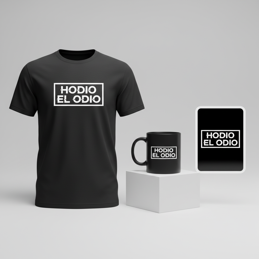
- 🎨 Visual Concept: One compelling direction is a minimalist, high-contrast design that immediately grabs attention. Imagine the text rendered in a bold, slightly glitchy, digital-style sans-serif font, evoking the very digital platforms this tool aims to address. A powerful touch could be enclosing the second word, “EL ODIO”, within a simple, sharp-cornered rectangular box. This visual element functions like a button on a user interface, adding a layer of meta-commentary on the digital nature of the problem and the proposed solution.
- ✍️ Typography Ideas: The core message, “HODIO EL ODIO”, is central to the design’s impact. A robust, slightly distorted sans-serif font would lend itself well to the ‘glitchy’ digital aesthetic, hinting at the imperfections and complexities of online communication. The starkness of the text, combined with the boxed ‘EL ODIO’, makes a clear, unforgettable statement, inviting viewers to ponder the layers of meaning.
- 👕 Product Canvas: For apparel, a dark background would serve as the ideal canvas. This choice enhances the high-contrast effect of the bold text and graphic elements, making the design pop. Furthermore, dark apparel often lends itself to more serious or satirical statement pieces, aligning perfectly with the undertones of the ‘HODIO’ trend.
Strategic Market Insight
Targeting the right demographic for this concept is crucial for its success. This design speaks volumes to social media-savvy, politically aware individuals who possess a sharp appreciation for irony and are genuinely fatigued by online toxicity. The purchase of such a piece isn’t merely about wearing a design; it’s about making a statement, aligning oneself with a specific sub-culture that ‘gets’ the nuanced, satirical commentary. It taps into a collective frustration and provides a visual outlet for that sentiment. The underlying message of combating polarization is, in essence, an evergreen concept, ensuring that while the specific political trigger might fade, the core frustration with online division remains relevant. It’s a simple, memorable concept that cuts through the noise without resorting to overly complex or potentially offensive imagery.
⚖️ Estimated Copyright Risk: LOW
Copyright Evaluation: While HODIO is the name of a government initiative, using it in a satirical phrase like ‘HODIO EL ODIO’ is commentary. The phrase itself is a simple declaration and unlikely to be trademarked. The risk is low because it’s political speech and not targeting a commercial brand. It’s using the broad trope of anti-hate sentiment.
Always verify intellectual property rights before listing.
Check EU Trademark Search for “Hodio” ➔
AI Image Generation Prompts
The following prompts are optimized for leading generators to produce production-ready assets:
👕 Apparel / T-Shirt Prompt
A clean vector illustration of the text 'HODIO EL ODIO', isolated on a solid dark background. The design features high-contrast minimalism, utilizing a stark black and white or deep charcoal and bright white color palette. The typography is a bold, modern, slightly condensed sans-serif font with a subtle digital glitch effect manifested as jagged edges, offset lines, or minor pixelation on select letterforms, giving it an edgy, tech-inspired aesthetic. The word 'EL' is precisely enclosed within a simple, sharp-cornered rectangular box, rendered with crisp, thin lines, resembling a user interface button or a digital command prompt element. The overall composition is perfectly centered and balanced, showcasing strong geometric precision. The vector style emphasizes smooth curves, sharp angles, and immaculate line work, devoid of gradients or complex textures. This is a flat graphic, expertly crafted with clean edges and solid fills, suitable for direct-to-garment printing, screen printing, or vinyl heat transfer. The visual impact is immediate and powerful, focusing purely on the typographic message and its structured presentation. --ar 3:4 --v 6.0 The ONLY text allowed in the image is exactly 'HODIO EL ODIO'. Absolutely NO other names, words, or random letters.
🔍 Search this niche on:
☕ Drinkware / Mug Prompt
A duplicated side-by-side layout showing the exact same graphic on the left and right, designed perfectly for a panoramic mug wrap. The graphic features the text 'HODIO EL ODIO' in a highly detailed, high-contrast, minimalist design. The typography is a powerful, bold, slightly glitchy digital sans-serif font, rendered in bright white against a deep, dark, possibly matte black background. The glitch effect is subtle yet impactful, manifesting as slight horizontal distortions, fragmented letter edges, or minor pixel shifts, evoking a sense of digital disruption. The word 'EL' is distinctively encased within a perfectly proportioned, sharp-cornered rectangular box, akin to a stylized user interface button or a critical command key. This box is rendered with crisp, clean lines, maintaining the high-contrast aesthetic. The overall mood is futuristic, stern, and impactful. The design should be sharp, clear, and perfectly flat, optimized for a seamless wrap-around application on ceramic drinkware. The duplicated graphics are precisely aligned, with ample clear space around each instance for optimal visibility on a cylindrical surface. --ar 3:1 --v 6.0 The ONLY text allowed in the image is exactly 'HODIO EL ODIO'. Absolutely NO other names, words, or random letters.
🔍 Search this niche on:
✨ Die-Cut Sticker Prompt
A vibrant, 2D flat pop-art style illustration of the text 'HODIO EL ODIO', designed as a die-cut sticker. The design features extremely high contrast, predominantly using stark black and luminous white. The text is rendered in a bold, slightly glitchy, digital-style sans-serif font, exhibiting sharp edges and minor, controlled pixelation or horizontal scan-line distortions to convey a modern, broken-signal aesthetic. The word 'EL' is prominently enclosed within a perfectly geometric, sharp-cornered rectangular box, drawn with clean, precise lines, giving it the appearance of a command button from an 8-bit or retro-futuristic interface. The entire graphic, including the text and the rectangular box, is surrounded by a thick, clean white outline border, specifically designed for die-cut applications. The rendering style is flat, graphic, and impactful, with no shadows, gradients, or complex textures, mimicking traditional screen-printed sticker aesthetics. The lines are extremely crisp, and the color fills are solid and opaque, ensuring maximum visibility and pop on any surface. The mood is rebellious, direct, and graphically powerful. --ar 1:1 --v 6.0 The ONLY text allowed in the image is exactly 'HODIO EL ODIO'. Absolutely NO other names, words, or random letters.
🔍 Search this niche on:
Frequently Asked Questions
What’s the deeper message behind ‘HODIO EL ODIO’ as a design concept?
At its heart, “HODIO EL ODIO” is a brilliant play on words that encapsulates the irony of fighting hate with a tool whose name is so phonetically close to “hate” itself. As a design, it serves as a satirical commentary on the complexities of combating online toxicity, reflecting a shared sentiment among those who find the situation both serious and darkly humorous. It’s a statement piece that acknowledges the problem while subtly questioning the solution.
Who would typically wear a design like this, and what are they trying to express?
This design is likely to appeal to individuals who are socially and politically conscious, particularly those active on social media platforms in Spain. They appreciate irony, have a nuanced understanding of current events, and are tired of the pervasive online polarization. Wearing this design is a way to express their perspective, signal their awareness of the cultural conversation around “HODIO,” and identify with a community that shares their frustration and sense of ironic detachment.
Given the specific nature of this trend, how might a design like this maintain relevance over time?
While directly tied to a specific government initiative, the underlying themes of online hate, polarization, and the societal debate around free speech versus harmful content are fundamentally evergreen. The minimalist, digital aesthetic of the design also offers a timeless quality. As such, even if the “HODIO” tool itself evolves or fades from immediate headlines, the commentary on digital toxicity and the ongoing struggle for civil discourse will continue to resonate, giving the design enduring cultural significance beyond its initial political trigger.
Final Thoughts
The ‘HODIO’ trend in Spain presents a unique and compelling opportunity for print-on-demand creators. It’s a moment where pop culture, politics, and language intertwine to create a powerful, resonant message. By tapping into the inherent irony and the public’s collective sentiment, a well-executed design can become more than just apparel—it becomes a talking point, a subtle form of activism, and a badge of shared understanding. Success in this niche, as with any, hinges on thoughtful execution and adding an authentic, creative spin that truly captures the zeitgeist.
💬 What’s Your Take?
Art is subjective, and this is just one angle! How would you spin this “Hodio (hate)” trend? Did we miss the mark, or is there a better inside joke to use here? Drop your design ideas and let’s brainstorm in the comments below!