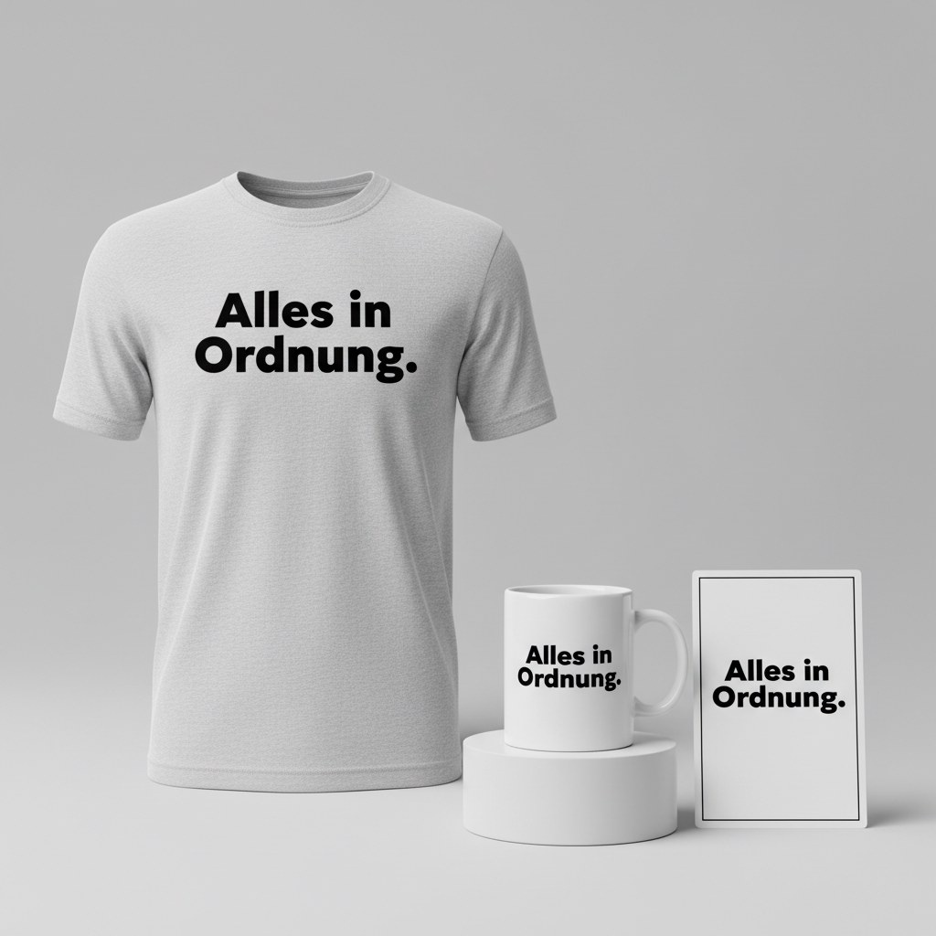
Alles in Ordnung. – Everything in order.
In the vibrant tapestry of European culture, certain phrases hold an almost mystical power, capturing the very essence of a nation’s spirit. For Germany, a country often associated with precision, punctuality, and a deep appreciation for order, one such phrase quietly trended recently, not for its novelty, but for its timeless resonance. It’s a linguistic comfort blanket, a cultural nod, and a perfect canvas for self-aware humor.
The Cultural Significance
The phrase “Alles in Ordnung” — meaning “Everything is in order” or “All is well” — isn’t just a casual expression in Germany; it’s practically a national mantra. It embodies a collective aspiration for organization, reliability, and a calm, collected approach to life. While the world outside may present challenges and complexities, the ability to declare “Alles in Ordnung” speaks volumes about a certain methodical resilience and an underlying confidence in things being, well, in their proper place. This isn’t just about tidiness; it’s about a worldview, a dry wit that finds humor in the stereotype, and a quiet pride in a cultural trait. It’s an inside joke shared among those who understand the unspoken nuances of German efficiency, making it a powerful and relatable statement for anyone who identifies with that cultural outlook.
Design Brainstorm: Capturing the Aesthetic
Translating such a culturally rich phrase into a compelling visual requires a thoughtful approach that respects its inherent meaning and target audience. For “Alles in Ordnung,” the design brief leans heavily into clarity, modernity, and a touch of understated elegance that resonates with German design sensibilities.
- 🎨 Visual Concept: One compelling angle is to embrace extreme minimalism. Imagine a design where the focus is solely on the text, perhaps with subtle, almost imperceptible design elements that hint at order or balance without overpowering the message. The starkness itself can make a powerful statement, reflecting a no-nonsense, straightforward approach. This could translate well to a clean, bold presence on the apparel, allowing the phrase to speak for itself.
- ✍️ Typography Ideas: The recommendation for a large, bold, modern sans-serif font like Helvetica for the main German text is spot on. Helvetica, with its Swiss-German roots, epitomizes clarity and universality, making it an excellent choice for conveying a sense of timeless order. A heavy-weight sans-serif ensures legibility and impact, while the minimalist approach keeps the focus squarely on the phrase. If an accompanying English translation were to be considered, a simple, lighter-weight sans-serif subtly placed below could provide context without competing for attention, ensuring the German phrase remains the hero.
- 👕 Product Canvas: Given the ideal apparel suggestion is “light,” classic t-shirts, lightweight hoodies, or even tote bags come to mind. The minimalist, clean design would truly pop on lighter fabric colors – think crisp white, heather gray, or soft pastels. This pairing emphasizes the freshness and straightforwardness of the design, ensuring it’s both comfortable to wear and visually impactful.
Strategic Market Insight
Targeting Germans with a dry sense of humor and an appreciation for cultural stereotypes is a smart move for this specific design. The phrase “Alles in Ordnung” functions as a form of self-deprecating humor and cultural pride simultaneously. It’s an affirmation of a well-known, often caricatured, national trait, but presented in a way that allows the wearer to acknowledge and even playfully celebrate it. Psychologically, purchasing such an item isn’t just buying a piece of clothing; it’s buying into an identity, a shared understanding, and a subtle declaration of belonging. It taps into a sense of community and inside knowledge, making it a relatable and resonant purchase for those who appreciate the understated wit of German culture.
⚖️ Estimated Copyright Risk: LOW
Our Findings: The design uses a common, everyday German phrase that is not subject to copyright or trademark. It is a cultural expression, and the design relies solely on typography, avoiding any potentially copyrighted imagery. The risk is minimal.
Always verify intellectual property rights before listing.
Check EU Trademark Search for “Ntv News” ➔
AI Image Generation Prompts
The following prompts are optimized for leading generators to produce production-ready assets:
👕 Apparel / T-Shirt Prompt
Clean, minimalist typography design featuring the German phrase 'Alles in Ordnung.' in a large, bold, modern sans-serif font (like Helvetica, Montserrat, Open Sans, or Lato) with perfect kerning and leading. The typography is precise, geometric, and perfectly aligned, rendered in a crisp, solid black color. The overall composition is simple yet impactful, embodying a sleek graphic design aesthetic. The text is presented as a singular, cohesive block. Isolated on a solid Light background, clean vector illustration style. The illustration techniques emphasize flat design principles, sharp edges, and smooth, anti-aliased curves, characteristic of high-quality digital print graphics. There are no gradients or complex textures within the typography itself; it's a pure, unadorned textual design. The rendering is ultra-sharp, akin to a print-ready vector file, with absolute clarity. Lighting is entirely even and non-directional, creating no shadows or highlights, ensuring a perfectly flat, reproducible graphic. The texture is completely smooth and digital, optimized for a direct-to-garment or screen-print application. The mood is reassuring, modern, and uncluttered. This design is optimized for optimal readability and aesthetic appeal on a t-shirt. The ONLY text allowed in the image is exactly 'Alles in Ordnung.'. Absolutely NO other names, words, or random letters. --ar 3:4 --v 6.0
🔍 Search this niche on:
☕ Drinkware / Mug Prompt
A duplicated side-by-side layout showing the exact same graphic on the left and right, designed perfectly for a panoramic mug wrap. The graphic features clean, minimalist typography, specifically the German phrase 'Alles in Ordnung.'. This text is rendered in a large, bold, modern sans-serif font (such as Helvetica Neue, Poppins, or Gotham) with meticulous kerning, appearing as a singular, strong statement. The color of the text is a deep, rich charcoal grey, perfectly contrasting against a smooth, bright white background. The typography is presented with a sleek, flat graphic design aesthetic, suitable for high-resolution print. The rendering is sharp, precise, and entirely two-dimensional, ensuring no distortion or blur when wrapped around a cylindrical object. Lighting is entirely uniform and shadowless, as if directly from a digital file, guaranteeing consistent color and clarity across the wrap. The texture is smooth, akin to a perfectly printed ceramic surface, without any visible grain or artifacting. The mood is calm, contemporary, and optimistic, ideal for a daily coffee ritual. The ONLY text allowed in the image is exactly 'Alles in Ordnung.'. Absolutely NO other names, words, or random letters. --ar 3:1 --v 6.0
🔍 Search this niche on:
✨ Die-Cut Sticker Prompt
A vibrant, eye-catching die-cut sticker design featuring the German phrase 'Alles in Ordnung.'. The text is rendered in a bold, assertive, modern sans-serif typeface (like Impact, Bebas Neue, or Anton) with tight kerning, presented as a solid, single-line phrase. The lettering is filled with a bright, clean, flat teal color (#00BCD4) set against a pure white background. The design is explicitly in a 2D flat pop-art style, characterized by strong, graphic novel-like contours and vibrant, solid color fields with no gradients or subtle shading. A prominent, thick white outline border, approximately 5% of the design's width, encircles the entire textual graphic, providing a distinct die-cut edge. The rendering is incredibly crisp and sharp, mimicking a freshly printed, high-gloss vinyl sticker. Lighting is purely illustrative, emphasizing flat, unshaded areas and bold contrasts. The texture is smooth and glossy, indicative of a durable, waterproof vinyl sticker material. The mood is cheerful, reassuring, and modern, perfect for personalizing items. The ONLY text allowed in the image is exactly 'Alles in Ordnung.'. Absolutely NO other names, words, or random letters. --ar 1:1 --v 6.0
🔍 Search this niche on:
Frequently Asked Questions
Why would a seemingly simple phrase like “Alles in Ordnung” be a strong design choice for German consumers?
Beyond its literal meaning, “Alles in Ordnung” resonates deeply because it taps into widely recognized German cultural values like orderliness, efficiency, and a calm demeanor. For many Germans, it’s a self-aware expression that celebrates these traits with a touch of dry humor, making it a badge of cultural identity rather than just a slogan.
How does a minimalist design enhance the appeal of this particular phrase?
The minimalist approach, featuring bold typography and clean lines, perfectly complements the message of order and clarity inherent in “Alles in Ordnung.” It reflects a core tenet of German design philosophy – functionality and directness – allowing the impactful phrase to be the sole focus without visual clutter. This ensures the message is clear, sophisticated, and aesthetically pleasing.
What apparel styles and colors would best suit this “Alles in Ordnung” design concept?
Given the minimalist design and the recommendation for “light” apparel, classic crew-neck t-shirts, comfortable hoodies, or even light long-sleeve tops would be ideal. For colors, crisp whites, heather grays, natural creams, or even light navy would allow the bold typography to stand out while maintaining a sophisticated, understated aesthetic that aligns with the design’s overall clean feel.
Final Thoughts
Harnessing the power of culturally significant phrases like “Alles in Ordnung” offers a unique avenue in e-commerce, especially within the Print-on-Demand landscape. It demonstrates that deep understanding of a target demographic’s humor, values, and self-perception can transform a simple phrase into a highly desirable product. The key lies in respectful and intelligent execution, allowing the design to serve as a genuine nod to cultural identity rather than a mere translation. With a clean aesthetic and a clear understanding of its audience, this concept has solid potential to resonate and thrive.
💬 What’s Your Take?
Art is subjective, and this is just one angle! How would you spin this “Ntv News (ntv news)” trend? Did we miss the mark, or is there a better inside joke to use here? Drop your design ideas and let’s brainstorm in the comments below!