
テレビありません – I don’t have a TV
📍 Target Market: Japan
🔥 Trend: 立花孝志 破産 (Takashi Tachibana bankruptcy) ↗
Japan is currently experiencing a fascinating surge in public discussion surrounding a notable figure and their recent financial challenges. While the specifics of personal finance can often be a sensitive subject, this particular instance has sparked a much broader, long-simmering conversation among the Japanese populace, touching upon deep-seated sentiments related to public institutions and everyday life. It’s a moment ripe for a clever, culturally attuned design that speaks volumes without saying too much.
The Cultural Significance
At the heart of the trending dialogue lies a figure associated with the enduring debate around Japan’s public broadcaster, NHK, and its mandatory license fees. For years, the quest to avoid these fees has been a quiet, sometimes humorous, struggle for many Japanese households. This current political development, while seemingly personal, has inadvertently reignited public interest in the anti-NHK movement and the various creative ways people express their stance. The phrase ‘テレビありません’ (I don’t have a TV) isn’t just a denial; it’s a widely understood, almost iconic, retort used by countless individuals when faced with fee collectors. It represents a shared cultural experience, a subtle act of defiance, and a testament to the ingenuity of the common person.
Design Brainstorm: Capturing the Aesthetic
Translating such a nuanced cultural moment into a compelling design requires a blend of humor, nostalgia, and understated cleverness. The goal is to create something instantly recognizable to the target audience, evoking a smile and a nod of understanding.
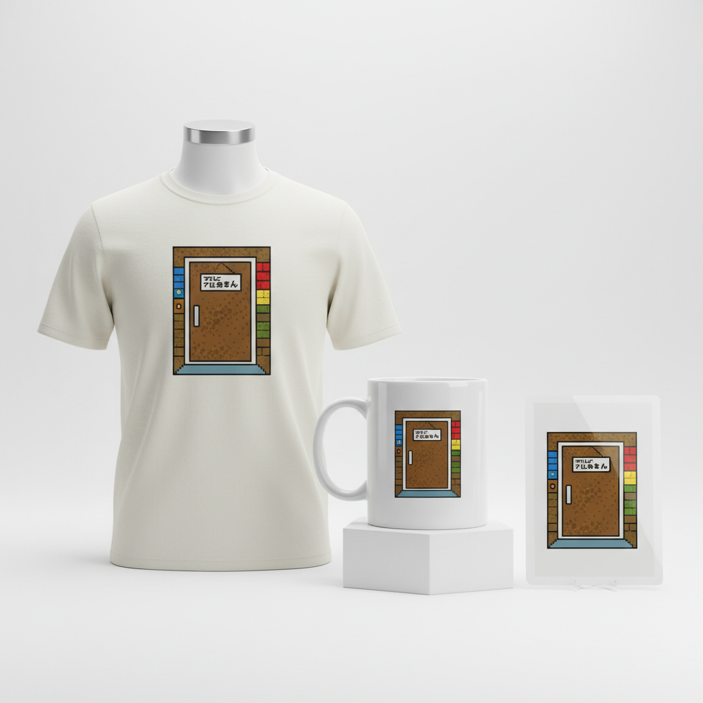
- 🎨 Visual Concept: One angle to consider is a humorous, retro 8-bit video game style graphic. Imagine a pixelated Japanese front door – perhaps with sliding screens or a traditional entryway – rendered in the vibrant, simple color palette reminiscent of classic Famicom games. Next to the door, a small, equally pixelated sign could display the crucial phrase. This evokes a sense of playful nostalgia, making a potentially dry topic feel lighthearted and universally approachable to those who grew up with such aesthetics. The low-resolution charm adds an element of innocence to the subtle rebellion.
- ✍️ Typography Ideas: The chosen text, ‘テレビありません’, is incredibly powerful in its simplicity and widespread recognition. For the 8-bit aesthetic, a blocky, pixelated font would naturally complement the visual style. The text should be clear and prominent on the small sign, perhaps in a contrasting color to the door itself, ensuring it’s the focal point despite its brevity. The humor comes from the directness of the phrase presented in such an unassuming, retro wrapper.
- 👕 Product Canvas: Given the bright and simple color scheme typical of 8-bit art, light-colored apparel such as white, heather grey, or pastel-colored t-shirts, hoodies, or even tote bags would serve as an ideal canvas. These lighter bases would allow the vibrant pixel art to pop, making the design stand out and perfectly capture the playful, retro vibe.
Strategic Market Insight
Targeting Japanese individuals who hold a strong sentiment against the NHK license fee is a strategic move for several reasons. This demographic shares a common, often exasperating, experience, creating an instant connection and sense of camaraderie. The design, by cleverly sidestepping direct political endorsement and focusing on the universally understood phrase ‘テレビありません’, offers a safe, humorous, and evergreen insider joke. Purchasing such a design isn’t just about fashion; it’s about expressing a shared identity, a subtle form of protest, and a nod to fellow “insiders.” The psychological trigger here is belonging and shared humor, allowing individuals to subtly signal their perspective without being overtly confrontational.
⚖️ Estimated Copyright Risk: LOW
Our Findings: The design uses a common, everyday phrase that cannot be trademarked. The pixel art style is a general aesthetic, not a specific copyrighted game. It focuses on a shared cultural experience (avoiding the fee collector) rather than any specific political party or individual, making it a safe parody of a social issue.
Always verify intellectual property rights before listing.
Check Japan Trademark Search for “立花孝志 破産” ➔
AI Image Generation Prompts
The following prompts are optimized for leading generators to produce production-ready assets:
👕 Apparel / T-Shirt Prompt
A humorous, nostalgic, and quirky 8-bit pixel art illustration of a traditional Japanese front door with a small, perfectly pixelated sign next to it. The art style is vividly reminiscent of classic Famicom and NES video games from the late 1980s, featuring a strictly limited color palette (e.g., 16-256 vibrant, high-saturation colors), bold, thick pixel outlines, and a clean, low-resolution aesthetic. The door is a simple yet iconic dark wood, possibly with a small pixelated window or handle. The sign is clearly legible, displaying the Japanese text 'テレビありません' in a distinct, retro 8-bit font, perfectly integrated into the pixel grid. The overall image has a graphic, digital art feel, like a perfectly rendered game sprite. There is absolutely no anti-aliasing; all lines are sharp, pixel-perfect, and jagged, characteristic of true retro pixel art. The shading is flat and blocky, using solid color fills with high contrast to define forms. The mood is playful, engaging, and instantly recognizable as a vintage gaming reference. The entire graphic is isolated cleanly on a solid, light, neutral background, ensuring it stands out as a crisp, scalable, clean vector illustration-style asset, ready for screen printing. No discernible texture, purely digital. The ONLY text allowed in the image is exactly 'テレビありません'. Absolutely NO other names, words, or random letters. --ar 3:4 --v 6.0
🔍 Search this niche on:
☕ Drinkware / Mug Prompt
A perfectly duplicated side-by-side panoramic layout, designed for a coffee mug wrap, featuring the exact same humorous, retro 8-bit pixel art graphic on both the left and right halves. The graphic depicts a charming, low-resolution Japanese front door with a small, distinct pixelated sign. The style is a direct homage to classic Famicom and NES era video games, using a strictly limited, bright, simple, high-saturation color palette (e.g., 16-color to 64-color), prominent dark pixel outlines, and a completely flat, non-textured rendering. The door is authentically pixelated, with visible blocky pixels defining its shape, color, and any minimal details like a handle or frame. The accompanying sign is clear and legible, featuring the Japanese text 'テレビありません' rendered in a classic 8-bit typeface, perfectly aligned with the pixel grid. The background behind the door is a simple, pixelated, solid color or very subtle pixel gradient that allows for seamless, continuous duplication across the mug surface, ensuring a smooth wraparound effect. The lighting is flat and even, characteristic of 2D game sprites, with no complex shadows or highlights. The mood is cheerful, nostalgic, and graphically strong. This duplicated composition ensures a perfect, continuous design for a mug. The ONLY text allowed in the image is exactly 'テレビありません'. Absolutely NO other names, words, or random letters. --ar 3:1 --v 6.0
🔍 Search this niche on:
✨ Die-Cut Sticker Prompt
A bold, vibrant, humorous, and iconic 2D flat pop-art style die-cut sticker design, featuring a retro 8-bit pixel art representation of a Japanese front door with a small, clear sign. The entire design is encased within a thick, clean white outline border, creating a distinct silhouette suitable for die-cutting. The art style is deeply inspired by classic Famicom and NES games, characterized by crisp, blocky pixels, a very limited and high-contrast color palette (e.g., primary, secondary, and tertiary colors with black outlines), and absolutely no anti-aliasing. Every line and shape is defined by hard, sharp pixel edges. The Japanese door is simplified yet recognizable, rendered with solid color blocks and prominent pixel contours. The sign is perfectly integrated into the pixel aesthetic, displaying the text 'テレビありません' in a legible, retro 8-bit font. The overall impression is punchy, graphic, and visually impactful, like a collectible game character or item. Shading is minimal or nonexistent, relying on color contrast and strong outlines to define depth, embodying a flat, graphic, almost screen-printed look. The texture is smooth and glossy, as if printed on vinyl. The sticker design should be centered and fill the square canvas, ready for production. The ONLY text allowed in the image is exactly 'テレビありません'. Absolutely NO other names, words, or random letters. --ar 1:1 --v 6.0
🔍 Search this niche on:
Frequently Asked Questions
Why choose an 8-bit retro style for a contemporary social sentiment?
The 8-bit retro style offers a fantastic blend of nostalgia, approachability, and lightheartedness. It transforms what could be a serious or even contentious topic into something humorous and universally relatable, particularly for those who grew up with Famicom or similar classic video games. This aesthetic makes the design feel like an inside joke among a generation, softening the political edge and making it more about shared cultural reference.
What makes “テレビありません” such an effective phrase for this design?
“テレビありません” (I don’t have a TV) is more than just a phrase; it’s a cultural shorthand in Japan. It’s the most common and widely recognized response used by people to politely, yet firmly, decline paying the NHK license fee. Its power lies in its universality and the shared experience it represents for millions of Japanese households, making it an instant, humorous identifier for the target audience without needing to mention any specific politician or party.
How does this design remain evergreen despite being tied to a trending news event?
While a recent news event sparked renewed discussion, the core sentiment — the desire to avoid the NHK license fee — is a long-standing and ongoing issue in Japan. By focusing on the widely understood, humorous retort ‘テレビありません’ and avoiding specific political names or party slogans, the design transcends the immediate news cycle. It becomes an evergreen symbol of a common, subtle resistance that resonates regardless of specific political developments, offering a continuous appeal to the target demographic.
Final Thoughts
The potential for designs that cleverly tap into shared cultural experiences and insider humor, especially within specific national contexts, is immense. This particular concept, with its thoughtful pivot from a sensitive news item to a universally recognized cultural touchstone, exemplifies how designs can achieve broad appeal while maintaining a sharp, niche focus. Success in this space often hinges on understanding subtle nuances, crafting visually engaging narratives, and offering products that allow individuals to express their identity with a wink and a smile. As always, authentic execution and a unique personal spin will be key to truly shining in the vibrant world of print-on-demand.
💬 What’s Your Take?
Art is subjective, and this is just one angle! How would you spin this “立花孝志 破産 (Takashi Tachibana bankruptcy)” trend? Did we miss the mark, or is there a better inside joke to use here? Drop your design ideas and let’s brainstorm in the comments below!