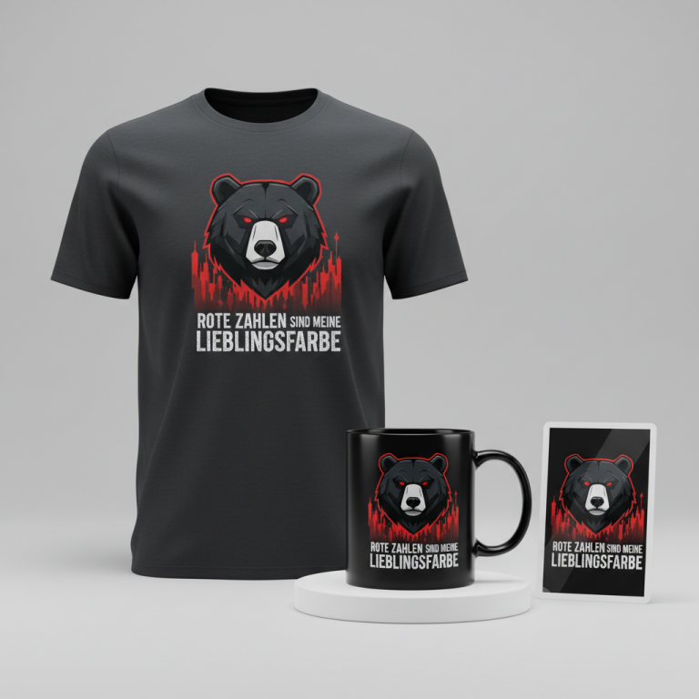
100% Faithful
Across the United Kingdom, a social deduction phenomenon has once again gripped the nation, turning living rooms into strategic war rooms and dinner table conversations into intense debates. With its renewal confirmed for both the original and celebrity versions until at least 2030, the hit BBC show ‘The Traitors’ has cemented its place in British pop culture, creating an ever-growing, passionate fanbase eager to declare their allegiance.
The Cultural Significance
The allure of ‘The Traitors’ lies in its masterful blend of psychology, suspense, and pure, unadulterated drama. It’s more than just a game show; it’s a social experiment that taps into our primal instincts of trust and suspicion. Viewers at home become armchair detectives, scrutinizing every glance, every hesitant word, desperate to uncover the clandestine betrayals unfolding on screen. The format, which sees a group of ‘Faithfuls’ attempting to identify and banish a hidden cohort of ‘Traitors’ before they’re all murdered, creates an immersive experience that transcends typical reality television. This deep engagement fosters a strong sense of community among fans, who relish discussing theories, celebrating triumphs, and commiserating over shocking blindsides. It’s this fervent dedication and the show’s long-term commitment that make it a compelling subject for merchandise that speaks directly to its most invested viewers.
Design Brainstorm: Capturing the Aesthetic
Translating the tense, dramatic atmosphere of ‘The Traitors’ into a wearable design requires a thoughtful approach. One angle to consider is a clean, understated aesthetic that hints at the show’s themes without overt branding.
- 🎨 Visual Concept: This could translate well to a minimalist, text-based design. The core idea features the phrase “100% Faithful” as the central element, arranged in a stacked layout for visual impact. Below this prominent text, a small, stylized icon – perhaps a subtly ominous hooded figure or a single, sharp dagger – could add an intriguing layer of symbolism without being too literal. A simple white or silver-grey color scheme for the design elements offers a stark contrast, mirroring the show’s often monochromatic visual palette and its clear-cut roles of good and evil.
- ✍️ Typography Ideas: For the typography, a modern gothic font would lend itself perfectly to the mood. It evokes a sense of ancient pacts and weighty decisions, aligning with the show’s theatrical premise. The stacked arrangement of “100% Faithful” provides a strong, graphic presence, making the statement feel bold and unwavering. This choice ensures the design is immediately recognizable to fans while maintaining a sophisticated, timeless appeal that avoids fleeting trends.
- 👕 Product Canvas: Given the proposed white or silver-grey design, the ideal apparel would be dark-colored garments. Think deep charcoal, midnight blue, or classic black hoodies, t-shirts, or even long-sleeved tops. The contrast allows the design to truly pop, enhancing its visual impact and aligning with the show’s often shadowy aesthetic. This also provides a versatile canvas for fans to express their allegiance subtly.
Strategic Market Insight
Targeting the passionate fanbase of ‘The Traitors’ with a design like “100% Faithful” is a shrewd move for several reasons. Primarily, it ingeniously sidesteps potential intellectual property risks associated with using the show’s direct name or logo, which are registered trademarks. By referencing a core, universally understood concept from the game – the ‘Faithful’ – the design speaks directly to the vast majority of viewers who root for good to prevail. The phrase ‘100% Faithful’ isn’t just a nod to the show; it’s a positive, evergreen statement that resonates with fans’ desire to identify with the “good guys” and express their unwavering loyalty, whether to the game, their friends, or simply their personal values. This ‘broad trope’ workaround is effective because it taps into the psychology of social deduction games in general, appealing to a wider audience beyond just this specific program, while still feeling intimately connected to its cultural moment. It allows buyers to feel part of the community without directly infringing on copyrighted material, triggering a desire for belonging and recognition.
⚖️ Estimated Copyright Risk: LOW
Risk Assessment: The design avoids the trademarked phrase ‘The Traitors’ and any specific logos or character likenesses. The phrase ‘100% Faithful’ is a common expression and is not trademarked. The design targets the *idea* of the show, which is legally safe and a common POD strategy.
Always verify intellectual property rights before listing.
Check UK Trademark Search for “The Traitors” ➔
AI Image Generation Prompts
The following prompts are optimized for leading generators to produce production-ready assets:
👕 Apparel / T-Shirt Prompt
A minimalist, high-contrast vector illustration designed for a t-shirt print, isolated on a solid deep charcoal black background (#1A1A1A). The central design features the text '100% Faithful' rendered in a sleek, minimalist, modern gothic sans-serif typeface, with sharp, precise edges and slightly condensed letterforms, arranged in a clean, stacked layout. The '100%' is positioned above 'Faithful'. Below the stacked text, there is a small, highly stylized, abstract minimalist icon of a hooded figure, presented as a clean, solid silhouette. The entire design — text and icon — is rendered in pure white (#FFFFFF), creating a striking, graphic impact. The illustration technique emphasizes extreme precision, with perfectly crisp lines, geometrically accurate curves, and solid, uniform color fills; absolutely no gradients, textures, or shading are present in the graphic itself. The rendering is akin to a high-fidelity digital vector art file, ensuring impeccable anti-aliasing and ultra-sharp definition suitable for screen printing. The mood is stoic, modern, and bold, conveying strength through simplicity. The design should appear as a ready-to-print graphic element, perfectly centered and proportioned. High resolution, clear, professional graphic design. The ONLY text allowed in the image is exactly '100% Faithful'. Absolutely NO other names, words, or random letters. --ar 3:4 --v 6.0
☕ Drinkware / Mug Prompt
A duplicated side-by-side layout showing the exact same graphic on the left and right, designed perfectly for a panoramic mug wrap. The graphic itself is a minimalist, text-based design featuring '100% Faithful' in a sleek, minimalist, modern gothic sans-serif typeface, with sharp, precise edges and slightly condensed letterforms, arranged in a clean, stacked layout. '100%' is above 'Faithful'. Below the text, a small, highly stylized, abstract minimalist icon of a hooded figure, presented as a clean, solid silhouette. The entire design, including text and icon, is rendered in pure white (#FFFFFF). This graphic is printed onto a rich, matte black ceramic coffee mug, implying a smooth, durable finish. The illustration style is clean, sharp, and optimized for ceramic printing, with solid color fields and precise linework. The duplicated graphics are perfectly aligned and positioned to create a continuous, seamless wraparound effect, ensuring visual consistency from one side of the mug to the other. The rendering should showcase a high-quality digital print, with flawless registration and vibrant white against the deep black mug. Lighting is even and bright, highlighting the crispness of the design on the mug's surface. The mood is functional, elegant, and consistent with a contemporary devotional aesthetic. The design is displayed against a clean, neutral background, focusing entirely on the mug's design. The ONLY text allowed in the image is exactly '100% Faithful'. Absolutely NO other names, words, or random letters. --ar 3:1 --v 6.0
✨ Die-Cut Sticker Prompt
A vibrant, die-cut sticker design in a bold, 2D flat pop-art style, featuring '100% Faithful' in a sleek, minimalist, modern gothic sans-serif typeface, with sharp, precise edges and slightly condensed letterforms, arranged in a clean, stacked layout. '100%' is above 'Faithful'. Below the text, a small, highly stylized, abstract minimalist icon of a hooded figure, presented as a clean, solid silhouette. The entire primary design (text and icon) is rendered in pure white (#FFFFFF). Critically, the entire white design is encapsulated by a thick, uniform white outline border, which serves as the precise die-cut edge of the sticker. The illustration is characterized by solid, unblemished color fields, stark contrasts, and absolute linearity; there are no gradients, shadows, textures, or volumetric effects. The rendering should convey a flawless, high-gloss vinyl sticker appearance, with perfectly smooth surfaces and laser-cut edges. Lighting is direct and even, emphasizing the flatness and graphic quality of the design. The mood is bold, direct, iconic, and collectible. The sticker itself is depicted floating against a simple, neutral background, highlighting its sharp outline and clean graphic elements. The ONLY text allowed in the image is exactly '100% Faithful'. Absolutely NO other names, words, or random letters. --ar 1:1 --v 6.0
Frequently Asked Questions
How does this design strategy navigate potential intellectual property concerns?
The strategy smartly focuses on a generic yet highly relevant concept: “The Faithful.” By using “100% Faithful” and a subtle, generalized icon (like a hooded figure or dagger), it avoids direct use of the show’s trademarked title or specific logos. This approach leverages the show’s cultural impact and fan understanding without infringing on copyrighted material, making it a safer and more sustainable creative direction.
Will a “Faithful” design resonate if the show’s popularity wanes?
While directly tied to the current show, the phrase “100% Faithful” also has a broader, positive meaning. Its evergreen nature allows it to transcend the immediate pop culture moment. Fans will continue to appreciate the nod to their beloved show, but the message itself has longevity, potentially appealing to enthusiasts of social deduction games or even just those who value loyalty, making it a more enduring design.
Beyond apparel, what other product types could this design concept suit?
The minimalist, text-based nature of this design lends itself exceptionally well to a variety of products. Consider dark-colored mugs where the white/silver-grey text truly pops, giving fans a daily reminder of their allegiance. Phone cases, tote bags, posters for a gaming room, or even subtle enamel pins could also be excellent canvases, offering diverse ways for fans to display their “100% Faithful” status.
Final Thoughts
The enduring popularity of ‘The Traitors’ in the UK presents a compelling opportunity for designers to connect with a highly engaged audience. By focusing on smart, copyright-conscious design that taps into the show’s core themes and fan sentiment, there’s significant e-commerce potential. The “100% Faithful” concept, with its minimalist aesthetic and strategic IP avoidance, is a prime example of how to capture a trend thoughtfully. Ultimately, success in this niche, as with any, will hinge on quality execution, a keen eye for detail, and adding a personal touch that truly resonates with the dedicated fans.
💬 What’s Your Take?
Art is subjective, and this is just one angle! How would you spin this “The Traitors” trend? Drop your design ideas and let’s brainstorm in the comments below!