医療従事者に感謝 – Thank you to the healthcare workers
In Tokyo’s upscale Ginza district, news of a medical clinic’s suspension following a patient death linked to cell therapy treatment has captured widespread attention across Japan. This incident has sparked significant public discussion about medical oversight and patient safety. Such somber events present a unique design challenge: how to respond with sensitivity and a positive, unifying message?
The Cultural Significance
The Ginza Clinic situation deeply resonated in Japanese society. Discussions extend beyond incident specifics to broader reflections on medical standards and public trust. In a culture valuing respect, this often surfaces an underlying appreciation for medical professionals, seeking an expression outlet amidst difficult news.
Design Brainstorm: Capturing the Aesthetic
Navigating a grave topic requires thoughtful design. Instead of directly referencing the incident, a compelling approach pivots towards universal gratitude, honoring the broader medical community.
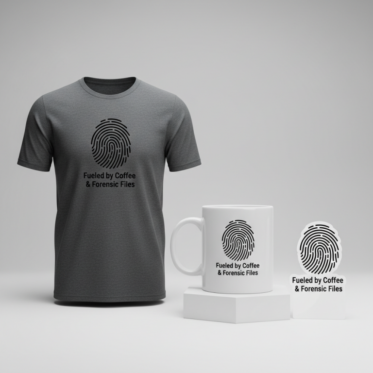
- 🎨 Visual Concept: This design features “医療従事者に感謝” (Appreciation for Medical Professionals). A small, stylized red heart below adds universal compassion. The aesthetic is respectful minimalism, ensuring a clean message avoiding trivialization.
- ✍️ Typography Ideas: A clean, elegant, modern Japanese Mincho (serif) font lends professionalism. Mincho fonts offer excellent readability and a refined appearance Japanese consumers appreciate, elevating the message’s sincerity.
- 👕 Product Canvas: For this minimalist design, light-colored apparel—crisp white t-shirts, pastels, or light grey hoodies—serves as an ideal canvas. Lighter tones allow bold Japanese characters and the subtle red heart to stand out, reinforcing the clean, elegant, uplifting aesthetic.
Strategic Market Insight
The brilliance of this design concept lies in its ‘Diplomatic Pivot.’ Shifting focus from a tragic event to appreciating medical professionals accesses a wider, safer audience, allowing individuals to acknowledge healthcare discussions without controversy. The psychological trigger is twofold: for consumers, it’s expressing gratitude; for healthcare workers, a subtle affirmation of their dedication. This niche taps into a human need for positive recognition.
⚖️ Estimated Copyright Risk: LOW
Copyright Evaluation: The phrase is a common and respectful expression of gratitude in Japanese and is not trademarked. The design avoids any mention of the specific tragic event, clinic, or individuals involved. The use of a generic heart symbol carries no IP risk.
Always verify intellectual property rights before listing.
Check Japan Trademark Search for “銀座クリニック” ➔
AI Image Generation Prompts
The following prompts are optimized for leading generators to produce production-ready assets:
👕 Apparel / T-Shirt Prompt
A clean vector illustration style graphic design, optimized for a t-shirt print, isolated on a solid light background. The design features the Japanese text "医療従事者に感謝" rendered in a pristine, elegant, and modern Japanese Mincho serif font. The typography is flawlessly executed with sharp, precise edges, consistent character spacing, and a balanced weight, conveying a sense of timeless respect and minimalist sophistication. Below the Japanese text, centered perfectly, is a small, simple, and stylized red heart, rendered with clean, smooth, uniform lines, creating a subtle yet poignant symbol of gratitude. The overall composition is harmonious and uncluttered, emphasizing whitespace and negative space for a breathable, high-end graphic design aesthetic. The illustration technique showcases a flat, two-dimensional appearance with no gradients, complex textures, or shadows, focusing instead on pure, vibrant colors (a deep, solid black for the text, and a classic, vibrant red for the heart) and defined, crisp shapes. The rendering is exceptionally sharp and clear, mimicking a high-quality screen print or direct-to-garment application, ensuring perfect legibility and a professional, print-ready finish. The mood is one of profound appreciation, quiet elegance, and modern simplicity. The final image should possess impeccable line work, smooth bezier curves, and a professionally polished quality suitable for apparel. The ONLY text allowed in the image is exactly '医療従事者に感謝'. Absolutely NO other names, words, or random letters. --ar 3:4 --v 6.0
☕ Drinkware / Mug Prompt
A duplicated side-by-side layout showing the exact same graphic on the left and right, designed perfectly for a panoramic coffee mug wrap. The graphic features the Japanese text "医療従事者に感謝" presented in a clean, elegant, and modern Japanese Mincho serif font. The typography is meticulously rendered with exceptional clarity and precision, ensuring high legibility and aesthetic appeal even when wrapped around a cylindrical surface. Directly below the text, a small, simple, and perfectly stylized red heart is centered, providing a delicate yet impactful accent of gratitude. The entire design maintains a strict minimalist aesthetic, with ample clear space around the elements to ensure a clean, uncluttered visual that translates well to a panoramic format. The art style is a flat, two-dimensional vector illustration, completely devoid of shadows, gradients, or complex textures, allowing for crisp, precise printing on ceramic. The text is rendered in a solid, deep black, and the heart is a vibrant, uniform red. The background for the graphic elements should be a clean, uniform white or a very light neutral tone, making the design pop against the mug surface. The rendering is extremely sharp, high-resolution, and print-optimized, suitable for seamless repetition and wrap-around application on drinkware. The overall mood is respectful, appreciative, and aesthetically clean with a strong modern Japanese influence. The ONLY text allowed in the image is exactly '医療従事者に感謝'. Absolutely NO other names, words, or random letters. --ar 3:1 --v 6.0
✨ Die-Cut Sticker Prompt
A vibrant, 2D flat pop-art style die-cut sticker design featuring the Japanese text "医療従事者に感謝" in a pristine, elegant, and modern Japanese Mincho serif font. The typography is rendered with bold, clean, and graphic lines, giving it an impactful and highly visible presence, characteristic of a high-quality sticker. Centered directly beneath the text is a small, simple, and perfectly stylized red heart, rendered with a uniform, solid fill color, contributing to the graphic, flat pop-art aesthetic. The entire combined graphic (text and heart) is encapsulated by a distinct, prominent, and thick white outline border, creating a clean, professional die-cut edge suitable for physical production. The color palette is restricted to a deep, solid black for the text and a bright, vibrant red for the heart, contrasting sharply against the crisp white border and the implied background. The art style emphasizes flat colors, sharp, well-defined edges, and a complete absence of gradients, shadows, or intricate details, embodying a minimalist yet striking visual. The rendering should be exceptionally crisp, mimicking a print-ready vector graphic with smooth, precise curves and lines, designed to pop on any surface. The sticker has a clear, defined shape thanks to the prominent border, making it instantly recognizable and appealing. The overall mood is respectful, visually appealing, and distinctly modern graphic design. The ONLY text allowed in the image is exactly '医療従事者に感謝'. Absolutely NO other names, words, or random letters. --ar 1:1 --v 6.0
Frequently Asked Questions
How can designers ethically approach sensitive trending topics?
When a trend arises from a sensitive situation, an ethical design strategy often employs a ‘Diplomatic Pivot.’ Instead of referencing the specific incident, identify a broader, positive theme. Shifting from a clinic incident to general appreciation for medical professionals allows respectful engagement, finding positive sentiment without exploitation.
Why choose a minimalist design with a simple heart for such a serious discussion?
Minimalism is powerful for sensitive topics. A clean design ensures the message—”Appreciation for Medical Professionals”—takes center stage. The simple, stylized red heart is a universal symbol of care. Its subtlety prevents the design from feeling overly dramatic, conveying sincerity and elegance. This approach respects the gravity while offering a hopeful, positive message for a broad audience.
Who is the primary target audience for gratitude-focused medical professional merchandise in Japan?
This design appeals to two key demographics. Firstly, the general public wishing to show respect and support for healthcare staff, especially when the medical system faces scrutiny. Secondly, it’s highly relevant for medical professionals themselves, serving as a quiet badge of honor acknowledging their hard work and fostering community.
Final Thoughts
The e-commerce potential for designs skillfully navigating public sentiment is immense, especially with a ‘Diplomatic Pivot.’ This concept demonstrates how a respectful, positive message can emerge from challenging news cycles. By focusing on universal values like gratitude, designers can create merchandise resonating deeply with consumers. Success hinges on thoughtful execution, understanding cultural nuances, and genuine intent, fostering connection through positive sentiment.
💬 What’s Your Take?
Art is subjective, and this is just one angle! How would you spin this “銀座クリニック (Ginza Clinic)” trend? Drop your design ideas and let’s brainstorm in the comments below!