WISCO
The air crackles with anticipation across the United States, especially for fans tuned into the high-stakes world of college basketball. When titans clash, like the University of Wisconsin Badgers and the University of Illinois Illini in a crucial Big Ten tournament quarterfinal, it’s more than just a game—it’s a cultural moment. These rivalries ignite passionate discussions, friendly banter, and a surge of pride that extends far beyond the court. For entrepreneurs and creatives in the print-on-demand space, understanding these fleeting yet intense cultural surges is key to tapping into immediate market demand and transforming it into lasting appeal.
The Cultural Significance
In regions like the Midwest, college sports are deeply woven into the fabric of daily life. The Big Ten conference, in particular, commands an almost religious devotion from its adherents. A matchup between Wisconsin and Illinois isn’t just a quarterly event; it’s a chapter in a long-standing narrative of athletic rivalry, academic excellence, and regional identity. For students, alumni, and multi-generational fan bases, these games represent an opportunity to display their unwavering allegiance. This collective effervescence translates into a powerful desire for merchandise that celebrates not just the team, but the very essence of being a fan – the camaraderie, the history, and the deep-seated pride in one’s state and alma mater. It’s a sentiment that transcends temporary game results, embedding itself as a cornerstone of personal and communal identity.
Design Brainstorm: Capturing the Aesthetic
When approaching a trend rooted in nostalgia and strong regional pride, the aesthetic choices become paramount. The goal isn’t just to sell a product, but to offer a piece of wearable identity. One compelling angle to consider is blending retro charm with modern appeal, creating something timeless yet perfectly on-trend.
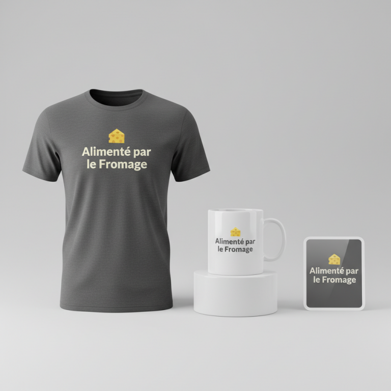
- 🎨 Visual Concept: Imagine a design that immediately transports you back to a simpler, groovier time. This could translate well to a retro 1970s style, characterized by playful curves and an organic feel. Behind the main text, a subtle, distressed silhouette of the state of Wisconsin could anchor the design, providing geographical context without being overtly literal. The color palette could lean into a vintage cardinal red paired with a soft off-white, evoking classic sports aesthetics but with a faded, well-loved quality.
- ✍️ Typography Ideas: For the primary text, “WISCO,” a bubbly, groovy serif font with a heavy drop shadow would perfectly capture that retro ’70s vibe. The use of “WISCO” itself is a clever move; it’s an affectionate, widely recognized nickname for Wisconsin, instantly resonating with locals and fans. This phrasing avoids direct university or team names, offering creative flexibility and circumventing potential trademark complications while still clearly signaling state pride.
- 👕 Product Canvas: This type of design, with its bold yet vintage colors, would truly pop on a dark apparel canvas. Think charcoal grays, deep blues, or classic black t-shirts and hoodies. The dark background allows the cardinal red and off-white to stand out vibrantly, enhancing the distressed retro effect and ensuring high visibility.
Strategic Market Insight
The beauty of this particular design concept lies in its strategic pivot from a temporary sports event to an evergreen expression of regional identity. While the immediate trigger is a major college basketball game, the “WISCO” design is crafted to appeal to a broader and more enduring audience: passionate students, alumni, and lifelong fans of the University of Wisconsin. By using the popular nickname ‘WISCO’ instead of official university names, logos, or mascots, the design ingeniously navigates potential trademark issues that often bottleneck designers in the college sports merchandise space. Furthermore, it cleverly avoids the “Location + Sport” bot trap, which can flag automated content as too generic or spammy. Instead, it offers a sophisticated, culturally relevant item that taps into nostalgia, state pride, and a sense of belonging, driving purchases based on deep emotional connections rather than just transient game-day hype.
⚖️ Estimated Copyright Risk: LOW
Copyright Evaluation: The design uses a common, non-trademarked nickname for the state (‘WISCO’) and a generic state silhouette. It avoids all specific university IP, team names, and league branding. While the University of Wisconsin lists ‘Wisco’ as a protected indica, it is widely used to refer to the state in general and is not actively enforced for generic apparel in the same way as official logos.
Always verify intellectual property rights before listing.
Check US Trademark Database (Justia) for “Wisconsin Vs Illinois” ➔
AI Image Generation Prompts
The following prompts are optimized for leading generators to produce production-ready assets:
👕 Apparel / T-Shirt Prompt
A retro 1970s style vector illustration design optimized for a t-shirt print, isolated on a solid Dark background, with a clean, crisp, and scalable vector illustration style. The main text, 'WISCO', is rendered in a highly stylized, bubbly, groovy, flowing serif font with exaggerated curves and a prominent, heavy, multidirectional drop shadow. The primary text color is a rich, vintage cardinal red (#C41E3A), with the substantial drop shadow meticulously rendered in a slightly darker tone of the same red or a complementary muted sepia, creating a depth illusion. Behind the 'WISCO' text, a subtle, distressed, monochromatic silhouette of the state of Wisconsin appears. This silhouette is in a creamy off-white (#F5F5DC), with fine, delicate texture overlays mimicking age, wear, and subtle print imperfections like a faded screen-print or subtle halftone dots, but still maintaining a clean vector edge. The overall aesthetic is one of authentic 70s nostalgia, with a warm, inviting, and slightly faded color palette that feels genuinely vintage. All elements are perfectly aligned, balanced, and sharp, suitable for high-resolution printing on fabric. The rendering should be smooth, with no pixelation, crisp lines, and perfectly curved shapes, simulating professional graphic design software output. The solid Dark background ensures maximum contrast and allows the vintage colors to pop vividly. Lighting is even and studio-like, emphasizing the flat graphic nature of the design. The mood is cheerful, nostalgic, and subtly cool. The ONLY text allowed in the image is exactly 'WISCO'. Absolutely NO other names, words, or random letters. --ar 3:4 --v 6.0
☕ Drinkware / Mug Prompt
A retro 1970s style graphic design, designed perfectly for a panoramic coffee mug wrap. A duplicated side-by-side layout showing the exact same graphic on the left and right, seamlessly repeating for continuous design flow around a cylindrical surface. The central focus is the text 'WISCO', presented in a bubbly, groovy, expressive serif font with thick, rounded letterforms and a deep, defined drop shadow. The text color is a vibrant, authentic vintage cardinal red (#C41E3A), while the heavy drop shadow exhibits a darker, muted red or a warm sepia tone, adding dimensionality without breaking the flat graphic feel. Behind the text, a subtle, highly distressed silhouette of the state of Wisconsin is depicted in a creamy off-white (#F5F5DC). This background silhouette features delicate, aged textures, such as faint ink bleeds, subtle grunge specks, or a worn, faded print effect, giving it an authentic vintage paper or screen-print quality, while its edges remain clean for crisp printing. The overall color scheme is restricted to cardinal red and off-white, exuding a warm, nostalgic 70s vibe. The rendering style is flat, graphic, and print-ready, emphasizing clarity and color accuracy suitable for ceramic sublimation. Lighting is even and bright, highlighting the graphic elements without shadows or reflections from physical objects. The composition is balanced and centered for optimal mug display. The mood is playfully retro and inviting. The ONLY text allowed in the image is exactly 'WISCO'. Absolutely NO other names, words, or random letters. --ar 3:1 --v 6.0
✨ Die-Cut Sticker Prompt
A retro 1970s style graphic design, optimized for a die-cut sticker, featuring a prominent, thick white outline border around the entire design. The central element is the text 'WISCO', rendered in a bold, bubbly, groovy serif font with an exaggerated, heavy, multi-directional drop shadow that gives it a distinct 3D pop. The main text is colored in a rich, vintage cardinal red (#C41E3A), while the substantial drop shadow is in a darker, complementary red or a warm, muted brown, enhancing the retro aesthetic. Behind the 'WISCO' text, a subtle, highly distressed silhouette of the state of Wisconsin is depicted. This silhouette is in a creamy off-white (#F5F5DC) and includes fine, delicate vintage textures such as subtle halftones, speckled grunge, or a worn-out print effect, giving it an authentic, aged appearance, yet maintaining crisp edges for a clean cut. The art style is a flat, two-dimensional pop-art graphic, with clean, defined lines and vibrant, opaque colors that evoke classic 70s print advertisements and counter-culture art. The thick white outline border encapsulates the entire design, providing a stark contrast that makes the sticker pop on any surface. The overall color palette is limited to cardinal red and off-white, with a strong, high-contrast visual impact. The rendering is sharp, glossy, and perfectly cut, simulating a high-quality vinyl sticker. The lighting is uniform and bright, emphasizing the graphic flatness and the clean die-cut edge. The mood is energetic, playful, and distinctly retro. The ONLY text allowed in the image is exactly 'WISCO'. Absolutely NO other names, words, or random letters. --ar 1:1 --v 6.0
Frequently Asked Questions
How does this design differentiate itself from typical sports merchandise?
Unlike conventional sports merchandise that often features official logos, mascots, or direct team references, this design strategy opts for an evergreen, nostalgic approach. By using the universally recognized nickname “WISCO” and embracing a retro 1970s aesthetic, it cultivates a broader appeal that transcends specific game-day hype. It’s more about state pride and cultural identity than just team affiliation, offering a unique, fashionable alternative.
What kind of audience is most likely to resonate with this specific aesthetic?
This aesthetic is particularly appealing to those who appreciate vintage style, have a strong sense of local or state pride, and are fans of the University of Wisconsin. It speaks to alumni seeking a nostalgic nod to their college days, current students looking for unique ways to express their spirit, and anyone who enjoys retro fashion with a personal, regional twist. The target is broad enough to be impactful but specific enough to feel authentic.
Are there any considerations for expanding this concept beyond apparel?
Absolutely! The “WISCO” retro design is highly versatile. It could translate beautifully onto a range of non-apparel items such as coffee mugs, tote bags, phone cases, wall art, and even home decor like throw pillows. The evergreen nature of the state nickname and the timeless retro aesthetic ensure that the design remains relevant and appealing across various product categories, offering multiple avenues for market expansion and deeper audience engagement.
Final Thoughts
Tapping into cultural moments, especially those fueled by passionate fan bases and deep-seated regional pride, presents a fertile ground for print-on-demand creativity. The “WISCO” concept demonstrates a smart approach: identifying a trending event, distilling its core emotional appeal, and translating it into a design that is not only visually striking but also strategically positioned for longevity and marketability. By pivoting from game-specific to evergreen state pride and carefully navigating potential pitfalls like trademark issues, designers can craft compelling merchandise that truly resonates. Ultimately, success in this dynamic e-commerce landscape hinges on innovative design, keen market insight, and the courage to put a unique spin on popular culture.
💬 What’s Your Take?
Art is subjective, and this is just one angle! How would you spin this “Wisconsin Vs Illinois” trend? Drop your design ideas and let’s brainstorm in the comments below!