待ってるよ、ずっと – I’ll be waiting, forever
A ripple of appreciation is spreading across Japan’s fervent anime community, centered around a performance that has captured hearts and eased concerns. The celebrated voice actress Akemi Okamura has recently stepped into the iconic shoes of Ran Mouri in the beloved ‘Detective Conan’ series, a character deeply etched into the fabric of Japanese pop culture. Fans are not just acknowledging her work; they are actively praising her seamless portrayal, an impressive feat given the high expectations and profound attachment to such a long-standing character.
The Cultural Significance
In Japan, the voice actor, or seiyuu, is often as famous and revered as the on-screen talent. Their voices become intrinsically linked to the characters they embody, shaping generations of fans’ experiences. The temporary hiatus of a long-standing voice actress for a character as pivotal as Ran Mouri naturally brings a moment of trepidation within the fanbase. Ran, known for her strong spirit, martial arts prowess, and, crucially, her unwavering loyalty and enduring wait for Shinichi Kudo’s return, is a cornerstone of the ‘Detective Conan’ narrative. Akemi Okamura’s ability to maintain the character’s essence and emotional depth has not only been a relief but a triumph, solidifying her place and proving the incredible talent within the industry. This moment highlights the profound connection between fans, characters, and the voices that bring them to life, underscoring the delicate balance of continuity and performance in beloved franchises.
Design Brainstorm: Capturing the Aesthetic
Venturing into merchandise for a deeply loved series requires a nuanced approach, especially when navigating intellectual property. One compelling angle focuses on universal themes deeply associated with a character, rather than direct imagery. This could translate well to an understated yet powerful design concept.
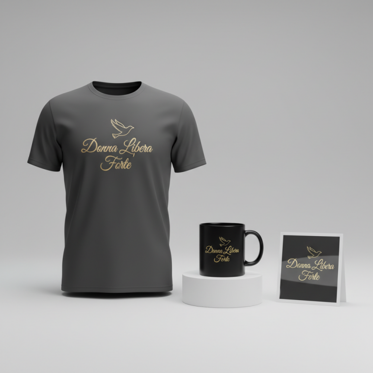
- 🎨 Visual Concept: Imagine a minimalist, text-based design that harks back to the clean, crisp aesthetics of 90s anime title cards and ending credits. The focal point is the typography, but above it, a very small, stylized silhouette of a single white rose could be subtly placed. This rose, in certain fan communities, symbolizes unwavering loyalty, enduring love, and hope – themes that resonate deeply with Ran Mouri’s character arc. Its delicate presence would add a layer of sophistication and insider recognition without being overtly referential.
- ✍️ Typography Ideas: The core of this design could feature the poignant Japanese phrase “待ってるよ、ずっと” (Matte’ru yo, zutto), which translates to “I’ll be waiting, forever.” This sentiment perfectly encapsulates Ran’s steadfast nature. The chosen font would ideally be a clean, sans-serif Japanese typeface, reflecting the timeless simplicity and elegance often found in 90s animation. The clarity of the font would allow the emotional weight of the words to stand out, creating an immediate connection with those who understand its profound context.
- 👕 Product Canvas: For this particular aesthetic, dark apparel – think deep navy, charcoal grey, or classic black – would serve as the ideal backdrop. The dark canvas would allow the white rose silhouette and the clean Japanese text to truly pop, creating a stark, impactful contrast that feels both modern and nostalgically familiar. This choice not only enhances readability but also lends an air of maturity and sophistication to the merchandise.
Strategic Market Insight
The strategic brilliance behind this type of design lies in its ability to target a hyper-specific, dedicated fanbase without infringing on intellectual property. By focusing on a “broad trope workaround,” like “patient and eternal waiting for love,” which is universally understood but deeply associated with Ran Mouri, one taps into a powerful psychological trigger. Fans don’t just buy merchandise; they buy into a feeling, a shared understanding, a sense of belonging. The phrase “待ってるよ、ずっと” acts as a secret handshake for the initiated – those who recognize its profound connection to Ran’s unwavering spirit. This fosters a sense of ‘if you know, you know,’ making the purchase feel more personal and significant than typical licensed merch. It’s about celebrating the *essence* of the character and her journey, appealing to the emotional core of why fans love her, rather than simply reproducing her image. This connection drives desire and creates a strong, loyal customer base.
⚖️ Estimated Copyright Risk: MEDIUM
Our Findings: This is a ‘broad trope’ workaround. The design intentionally avoids the character’s name, the series’ name (‘Detective Conan’), and any direct visual likeness. The text is a sentimental phrase that captures the character’s essence but is not a direct, unique, trademarked catchphrase. The risk is ‘Medium’ because anime IP holders can be very protective, and a bot or manual reviewer familiar with the series *could* still make the connection. However, it is designed to be defensible as it relies on a common emotional trope.
Always verify intellectual property rights before listing.
Check Japan Trademark Search for “岡村明美” ➔
AI Image Generation Prompts
The following prompts are optimized for leading generators to produce production-ready assets:
👕 Apparel / T-Shirt Prompt
A minimalist, impactful t-shirt print design. The core graphic features the Japanese text '待ってるよ、ずっと' rendered in a very clean, crisp, sans-serif Japanese typeface. Positioned directly above and centrally aligned with the text is a very small, elegantly stylized silhouette of a single white rose. The rose is depicted with graceful, minimalist lines, emphasizing its iconic form. The overall aesthetic is a refined 90s anime vector illustration style, characterized by extremely sharp, precise linework, solid flat color fills (no gradients), and perfectly clean edges, reminiscent of high-quality screen printing. The typography is bold yet understated, perfectly legible. The entire design is isolated on a solid, deep charcoal black background, ensuring maximum contrast and visual pop. The rendering is ultra-smooth, with zero anti-aliasing artifacts or pixelation, embodying a pristine, production-ready graphic. The mood is one of subtle nostalgia, loyalty, and poignant simplicity, conveyed purely through the clean graphic forms and text. There is an implicit sense of depth from the crisp white rose and text against the dark background, but the design itself remains strictly 2D. The ONLY text allowed in the image is exactly '待ってるよ、ずっと'. Absolutely NO other names, words, or random letters. --ar 3:4 --v 6.0
☕ Drinkware / Mug Prompt
A sophisticated coffee mug wrap design, presented as a duplicated side-by-side layout showing the exact same graphic on the left and right, designed perfectly for a panoramic mug wrap. The central design element is the Japanese text '待ってるよ、ずっと' displayed in a clean, contemporary sans-serif Japanese font. Above this text, centrally aligned, is a very small, finely detailed silhouette of a single white rose, maintaining an elegant and stylized form. The aesthetic is a refined 90s anime-inspired graphic, clean and focused, with a subtle underlying mood of reflection and enduring commitment. The rendering is a high-resolution 2D graphic, optimized for printing on ceramic, featuring crisp lines and solid, untextured color fills. There are no gradients within the design elements. The colors are vibrant and clear against an implied white or light ceramic background, ensuring excellent legibility from all angles. The overall impression is one of modern graphic design infused with nostalgic anime undertones, perfect for daily use. The duplicated layout ensures seamless wrapping around a cylindrical object. The ONLY text allowed in the image is exactly '待ってるよ、ずっと'. Absolutely NO other names, words, or random letters. --ar 3:1 --v 6.0
✨ Die-Cut Sticker Prompt
A striking die-cut sticker design, presented head-on. The central feature is the Japanese text '待ってるよ、ずっと' rendered in a bold, impactful, sans-serif Japanese font. Directly above the text, centrally aligned, is a small, highly stylized silhouette of a single white rose, depicted with strong, clean outlines and solid white fill. The entire design, encompassing both the rose and the text, is enveloped by a thick, consistent, pure white outline border, creating the iconic die-cut sticker effect. The style is a vibrant 90s anime-influenced pop-art aesthetic, characterized by ultra-flat 2D rendering, sharp vector-like edges, and an absence of any internal shading, gradients, or complex textures within the design elements themselves. The colors (white rose, black text) are intensely saturated, standing out with graphic precision against the white border and an implied neutral background, ready to be cut. The mood is bold, assertive, and visually impactful, conveying the message with a playful yet meaningful collectible quality. The clean white border emphasizes the distinct shape of the sticker. The ONLY text allowed in the image is exactly '待ってるよ、ずっと'. Absolutely NO other names, words, or random letters. --ar 1:1 --v 6.0
Frequently Asked Questions
How does this design appeal to fans without using any official intellectual property?
The design cleverly sidesteps IP infringement by focusing on a universal emotional theme deeply intertwined with the character of Ran Mouri – her patient and eternal waiting for Shinichi. The phrase “待ってるよ、ずっと” (I’ll be waiting, forever) is an indirect sentiment, not a direct quote, and the white rose is a general symbol of loyalty and love. For true fans, these elements act as subtle, powerful cues that evoke the character’s core identity without needing her image or logo, creating an “if you know, you know” connection that feels more exclusive and personal.
Why choose a minimalist, text-based design over more elaborate character art for this trend?
A minimalist, text-based design with a 90s anime aesthetic offers several advantages. Firstly, it elegantly avoids intellectual property issues. Secondly, it appeals to a mature fanbase that often prefers subtle, sophisticated nods to their passions rather than overt character imagery. The simplicity allows the powerful emotional message of the text and the symbolic weight of the white rose to take center stage, creating a timeless piece that doesn’t feel overtly “fandom” but rather a stylish homage.
What’s the significance of the “待ってるよ、ずっと” phrase for the target audience?
For fans of ‘Detective Conan’, the phrase “待ってるよ、ずっと” (I’ll be waiting, forever) directly references Ran Mouri’s defining characteristic: her steadfast devotion and endless patience as she awaits Shinichi Kudo’s return. It encapsulates her entire emotional journey and resilience. This sentiment resonates deeply, touching upon themes of loyalty, enduring love, and hope, which are central to her character’s appeal and are instantly recognizable to anyone familiar with her story, triggering a strong emotional response.
Final Thoughts
The ongoing buzz around Akemi Okamura’s masterful portrayal of Ran Mouri in ‘Detective Conan’ serves as a vibrant reminder of the deep emotional connections fans forge with their beloved characters and the artists who bring them to life. For print-on-demand entrepreneurs, this scenario beautifully illustrates the immense potential in understanding niche cultural moments and translating their underlying sentiments into thoughtful, IP-conscious designs. By focusing on core emotional themes and subtle artistic cues, creators can tap into powerful fan loyalty, offering merchandise that feels both exclusive and deeply personal. Success in this space often hinges on a keen eye for cultural resonance and the creativity to express it in ways that truly speak to the heart of a dedicated community.
💬 What’s Your Take?
Art is subjective, and this is just one angle! How would you spin this “岡村明美 (Akemi Okamura)” trend? Drop your design ideas and let’s brainstorm in the comments below!