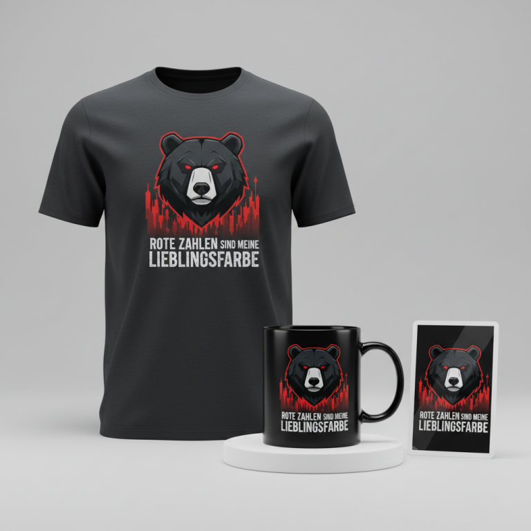
THE G.O.A.T.
The screens across the United States have been lighting up not just with local sports action, but with an unexpected global phenomenon: the Saudi Pro League match featuring Al-Khaleej and Al-Nassr. What might seem like an unlikely topic to dominate American sports discussions has a clear, superstar-sized gravitational pull, drawing in viewers and igniting conversations around one of the biggest names in athletic history.
The Cultural Significance
At the heart of this transatlantic fascination lies Cristiano Ronaldo. His move to Al-Nassr transcended mere club transfers; it became a global spectacle, injecting unprecedented visibility and excitement into the Saudi Pro League. Fans in the U.S., long accustomed to following European football giants, are now tuning into matches from a completely different hemisphere, all to witness the continued brilliance of a living legend. This isn’t just about a soccer game; it’s a testament to the immense personal brand power of an athlete who continually redefines his own legacy, captivating an audience far beyond traditional team loyalties or geographical boundaries.
Design Brainstorm: Capturing the Aesthetic
Translating this individual magnetism into compelling merchandise requires a creative touch that speaks directly to the legend without infringing on specific team or league branding. One angle to consider is a design that celebrates the enduring icon status, a concept instantly recognizable to his legion of fans.
- 🎨 Visual Concept: Imagine a stylized, weathered graphic of a goat’s silhouette. This isn’t just any goat; it’s presented in a confident, three-quarter view, perhaps with a subtle, simple crown adorning its head – a nod to its regal status in the sport. The number ‘7’, so intrinsically linked to the player, could be boldly yet tastefully incorporated onto the side of the goat, perhaps as if it’s branded onto its hide. The overall aesthetic could lean into a distressed, vintage 90s bootleg style, giving it an authentic, lived-in feel. Faded colors like an off-white for the goat and a striking red for the number or subtle accents could evoke a nostalgic, streetwise vibe.
- ✍️ Typography Ideas: The text “THE G.O.A.T.” would be a powerful, unequivocal statement. Utilizing a bold, athletic-style font for this phrase could complement the number ‘7’ and the overall vintage sports aesthetic, ensuring it stands out while maintaining a cohesive look. The choice of font could subtly reference classic sports iconography without directly imitating any specific team’s branding.
- 👕 Product Canvas: This design concept could translate exceptionally well onto dark apparel. Think deep blacks, charcoal greys, or even rich navy blues. The distressed off-white and red elements would pop beautifully against a darker background, enhancing the vintage appeal and giving the merchandise a timeless, versatile look suitable for various casual wear occasions.
Strategic Market Insight
The strategic brilliance of this design approach lies in its ability to pivot from a transient match-day event to an evergreen identity. By focusing on “THE G.O.A.T.” and using universal symbolism like the number 7, designers can tap into a fervent global fanbase. This merchandise isn’t just for Al-Nassr supporters; it’s for anyone who recognizes and celebrates Cristiano Ronaldo’s unparalleled impact on soccer. This strategy skillfully sidesteps direct intellectual property infringement (player names, team logos, league branding) and avoids the “Location + Sport” bot trap that often flags more direct designs. The psychological trigger for purchase here is emotional attachment and admiration for an icon, rather than fleeting team loyalty, making it a powerful, enduring market opportunity.
⚖️ Estimated Copyright Risk: MEDIUM
Our Findings: While ‘G.O.A.T.’ itself is a common acronym and not exclusively owned for all apparel, and the design avoids direct likeness, the *intent* to represent a specific, highly-branded athlete can carry risk. The combination of the number 7, a crown, and the term ‘G.O.A.T.’ is strongly suggestive. Several entities hold trademarks for ‘GOAT’ in the apparel class, creating a complex landscape. This design uses a broad trope to minimize direct infringement.
Always verify intellectual property rights before listing.
Check US Trademark Database (Justia) for “Al-khaleej Vs Al-nassr” ➔
AI Image Generation Prompts
The following prompts are optimized for leading generators to produce production-ready assets:
👕 Apparel / T-Shirt Prompt
A highly detailed vector illustration for a t-shirt print, depicting a stylized, powerful goat's silhouette in a dynamic three-quarter view, facing slightly to the right. The goat possesses an athletic, almost aggressive stance, with defined yet abstract musculature, suggesting strength and determination. Perched elegantly on its head is a small, simple, angular crown with sharp, minimalist points, conveying subtle royalty without overt embellishment. The number '7' is prominently and boldly displayed on the goat's side, integrated seamlessly into its form, rendered in a heavy, athletic-style block font reminiscent of vintage varsity or sports jersey typography. Below the goat, the text "THE G.O.A.T." is emblazoned in a complementary bold, distressed block lettering, slightly warped to enhance the bootleg aesthetic. The entire graphic exhibits a distinct distressed, vintage 90s bootleg aesthetic, characterized by rough, imperfect edges, simulated faded screen print texture, subtle halftone dot patterns, and a general worn-out, lo-fi, streetwear grunge feel. The primary color for the goat silhouette, the number '7', and "THE G.O.A.T." text is a desaturated, creamy off-white or antique beige, giving it a sun-faded, worn appearance. Accenting elements, such as subtle outlines or distressed details within the graphic, are rendered in a slightly faded, muted brick red or a desaturated crimson. The composition is isolated cleanly on a solid, deep charcoal background, allowing the graphic to pop with high contrast. The illustration style is a clean, sharp vector art, but with integrated digital aging effects like subtle speckles, intentional ink bleeds, and a cracked ink overlay for a genuine retro graphic novel feel. High resolution, crisp lines despite the distressed texture. The ONLY text allowed in the image is exactly 'THE G.O.A.T.'. Absolutely NO other names, words, or random letters. --ar 3:4 --v 6.0
☕ Drinkware / Mug Prompt
A panoramic mug wrap layout featuring a duplicated side-by-side display of the exact same graphic, designed perfectly for a coffee mug. The graphic is a stylized, powerful goat's silhouette in a dynamic three-quarter view, facing slightly to the right, embodying an athletic and determined posture with abstract, strong lines. A small, minimalist, angular crown sits atop its head, subtly signifying its regal status. The number '7' is prominently and boldly integrated onto the goat's side, rendered in a heavy, athletic-style block font, evoking vintage sports apparel. Below the goat, the text "THE G.O.A.T." is displayed in a complementary bold, distressed block lettering, perfectly aligned. The entire design captures a distinct distressed, vintage 90s bootleg aesthetic, featuring rough, imperfect edges, a simulated faded screen print texture, subtle halftone dot patterns, and a general worn-out, lo-fi, streetwear grunge vibe. The primary color for the goat, the number '7', and "THE G.O.A.T." text is a desaturated, creamy off-white or antique beige, conveying a sun-faded appearance. Accent colors, such as subtle outlines or internal distressed elements, are a slightly faded, muted brick red or a desaturated crimson. Both instances of the graphic are centered and perfectly scaled for a mug, creating a seamless, repeatable pattern for a wrap. The background for the graphic is a muted, desaturated dark grey or deep charcoal, providing a strong contrast to the faded design. The rendering is sharp, 2D graphic art with an intentional distressed overlay, appearing like an aged, screen-printed design. High resolution, print-ready quality. The ONLY text allowed in the image is exactly 'THE G.O.A.T.'. Absolutely NO other names, words, or random letters. --ar 3:1 --v 6.0
✨ Die-Cut Sticker Prompt
A vibrant, die-cut sticker design featuring a stylized, powerful goat's silhouette in a dynamic three-quarter view, facing slightly to the right. The goat showcases an athletic, abstract form with bold, clean lines characteristic of 2D flat pop-art style. A small, simple, angular crown is perched on its head, adding a touch of understated royalty. The number '7' is prominently and boldly integrated into the goat's side, rendered in a heavy, athletic-style block font, reminiscent of vintage sports designs. Below the goat, the text "THE G.O.A.T." is emblazoned in a complementary bold, distressed block lettering, adding to the graphic punch. The entire graphic maintains a distinct distressed, vintage 90s bootleg aesthetic, applied with a flat color overlay and simulated textures: rough, imperfect edges, subtle screen print texture, and a general worn-out, underground grunge feel, but rendered with the sharpness of a modern sticker. The primary color for the goat, the number '7', and the text is a desaturated, creamy off-white or antique beige, giving it a faded, retro appearance. Accent details, such as subtle outlines or internal distressed patterns, are a slightly faded, muted brick red or a desaturated crimson. Crucially, the entire design is encircled by a thick, clean white outline border, creating a perfect die-cut shape. The sticker is presented as if isolated on a pure white or very light grey background, emphasizing its cut-out form. The rendering is a highly polished 2D flat graphic, vibrant and crisp despite the distressed elements, mimicking high-quality vinyl sticker production. High resolution. The ONLY text allowed in the image is exactly 'THE G.O.A.T.'. Absolutely NO other names, words, or random letters. --ar 1:1 --v 6.0
Frequently Asked Questions
Why focus on “THE G.O.A.T.” concept instead of direct team or player names?
Focusing on the “G.O.A.T.” (Greatest Of All Time) concept is a strategic move to create evergreen merchandise that transcends specific team affiliations or player contracts. It leverages universal recognition of an athlete’s legendary status, allowing fans to celebrate their hero without infringing on official intellectual property like team names, player likenesses, or league logos. This also protects sellers from potential “Location + Sport” bot flags, ensuring a broader and safer market reach.
What makes the distressed, vintage 90s bootleg style particularly effective for this design?
The distressed, vintage 90s bootleg style evokes a sense of nostalgia and authenticity that resonates deeply with sports fans. It suggests a classic, timeless appreciation for the athlete, giving the merchandise an edgy, street-style appeal that stands out from more official, polished gear. This aesthetic adds character and a “cool factor,” making the apparel desirable for both long-time fans and those who appreciate retro sports culture, while also being highly adaptable for various print-on-demand applications.
How does this design resonate with a global audience beyond traditional soccer fans?
The “G.O.A.T.” concept, combined with the iconic number 7, transcends the niche of traditional soccer fandom to appeal to a wider pop-culture audience. Cristiano Ronaldo’s influence stretches far beyond the pitch, making him a recognized figure in general sports, fashion, and even celebrity culture. The design’s clever use of widely understood symbolism allows individuals who admire his achievements, work ethic, or even just his global superstar status to connect with the merchandise, expanding the potential market significantly.
Final Thoughts
The intersection of global sports, celebrity culture, and clever design offers fertile ground for e-commerce entrepreneurs. By understanding the underlying cultural currents—like the phenomenon surrounding a superstar in a trending league—and translating them into unique, IP-conscious designs, there’s a real opportunity to capture passionate audiences. This “G.O.A.T.” concept for the Cristiano Ronaldo fanbase is a prime example of how strategic thinking, combined with creative execution, can unlock significant potential in the print-on-demand space. Success, as always, will hinge on the quality of the final product and how effectively it resonates with the deep-seated admiration fans hold for their chosen heroes.
💬 What’s Your Take?
Art is subjective, and this is just one angle! How would you spin this “Al-khaleej Vs Al-nassr” trend? Drop your design ideas and let’s brainstorm in the comments below!