I Keep Calm and Skip The Line
As discussions around potential travel disruptions ramp up across the United States, one particular topic is soaring in relevance: navigating the often-stressful experience of airport security. The looming possibility of longer lines and increased wait times has put a spotlight on services designed to streamline the journey, making the conversation about bypassing the queues more resonant than ever before. Travelers are seeking solutions and, perhaps, a touch of humor to cope with the modern airport grind.
The Cultural Significance
The cultural obsession with efficiency and time-saving is deeply ingrained in the American psyche, especially for those constantly on the move. Airport security, with its inherent delays and unpredictable nature, often stands as a major point of frustration. The concept of effortlessly gliding past a chaotic, snaking line isn’t just about convenience; it taps into a universal desire for control in an often-uncontrollable environment. It represents a savvy traveler’s triumph over tedious bureaucracy, a subtle nod to being in the know. This sentiment, particularly amplified during periods of anticipated travel strain, creates a rich ground for expressions of shared experience and lighthearted solidarity among the flying public.
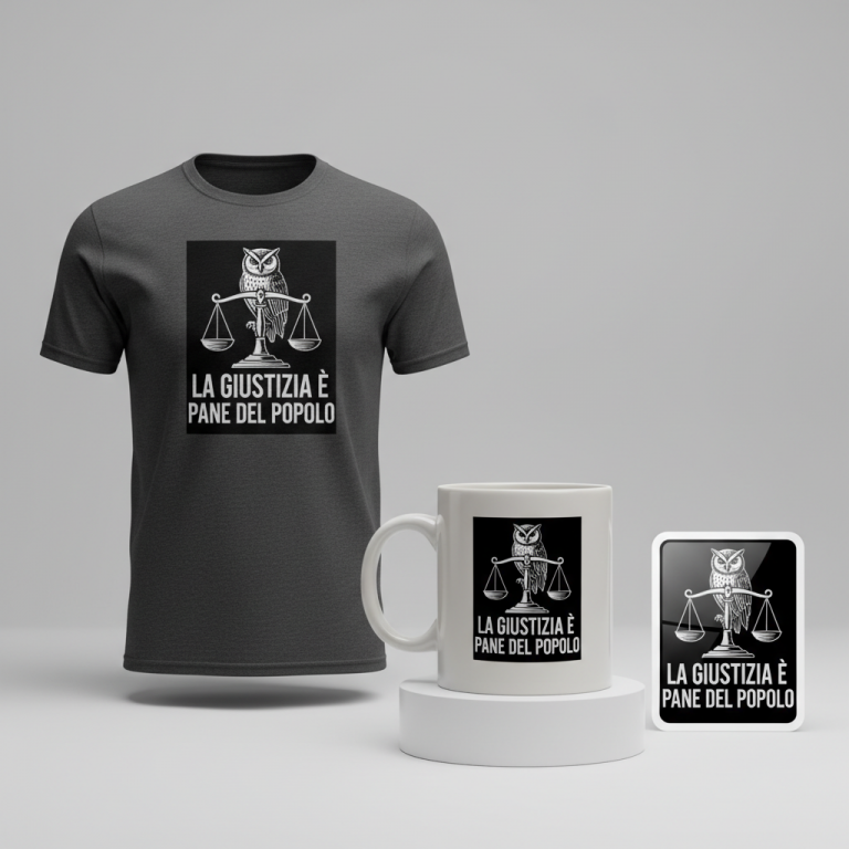
Design Brainstorm: Capturing the Aesthetic
Translating this cultural moment into a compelling merchandise design involves a blend of minimalism, wit, and a clear message. The goal is to create something instantly recognizable and subtly humorous that resonates with the target demographic’s experiences.
- 🎨 Visual Concept: One compelling visual angle could involve a striking, minimalist graphic. Imagine a simple, clean icon of a single person depicted casually strolling forward, perhaps with a slight spring in their step. In stark contrast, behind them, a long, winding, and somewhat chaotic queue of smaller, more frantic-looking people icons stretches into the background. This contrast immediately conveys the message of ease versus struggle, rendered in a straightforward vector art style using just two complementary colors for maximum impact and readability.
- ✍️ Typography Ideas: The accompanying text could be presented in a clean, professional sans-serif font, something akin to Helvetica or Arial, ensuring readability and a modern aesthetic. The phrase “I Keep Calm and Skip The Line” directly reinforces the visual narrative, offering a clever, slightly cheeky affirmation that speaks to the wearer’s efficient approach to travel. The directness of the phrase, paired with the serene visual, amplifies the humor.
- 👕 Product Canvas: Given the recommended base color target, this design would translate exceptionally well onto dark-colored apparel. Think sophisticated black, deep navy, or charcoal gray t-shirts, hoodies, or even premium polo shirts. The simple, two-color graphic would pop vibrantly against these darker backdrops, making the statement even more pronounced and visually appealing to a discerning traveler.
Strategic Market Insight
Targeting frequent flyers and business travelers with this concept taps into a highly engaged and discerning demographic. These individuals prioritize efficiency above all else and possess a keen sense of humor about the universal frustrations of air travel. A purchase here isn’t just about owning a piece of clothing; it’s a statement, a subtle badge of honor indicating one’s mastery of the airport ecosystem. The psychological trigger is the validation of their travel savvy and the shared understanding of the ‘travel hack’ culture. Furthermore, the inherent joy of ‘skipping the line’ is an evergreen perk that transcends specific events, making this design concept timeless. By focusing on the universal experience rather than specific political events or government entities, this approach skillfully navigates potential compliance issues, ensuring broad appeal and longevity.
⚖️ Estimated Copyright Risk: LOW
Our Findings: The quote uses the ‘Keep Calm and…’ meme format which is in the public domain. The visual elements are generic icons, avoiding any specific airport, airline, or government agency branding.
Always verify intellectual property rights before listing.
Check US Trademark Database (Justia) for “Tsa Precheck” ➔
AI Image Generation Prompts
The following prompts are optimized for leading generators to produce production-ready assets:
👕 Apparel / T-Shirt Prompt
A clean vector illustration of a minimalist, humorous design, optimized for a t-shirt print, isolated on a solid Dark background. The primary graphic features a simple, stylized icon of a person confidently strolling past an extremely long, winding, and chaotic queue composed of numerous identical, exasperated-looking people icons. The 'skipping' person icon is sleek, unbothered, and dynamic, while the 'queued' people icons are slightly jostled, overlapping, and convey subtle, humorous distress through their simplified body language (e.g., slumped shoulders, frustrated postures, small sweat drops – all depicted in pure iconographic style). The design uses only two distinct, high-contrast colors: a crisp, bright white for all primary figures and the text, and a slightly darker, muted slate grey for the elements of the chaotic queue, creating depth purely through color contrast against the deep, solid charcoal grey background. The art style is pure flat design, 2D, with sharp, precise lines, geometric simplicity, and absolutely no gradients, textures, or shadows, embodying sophisticated modern iconographic design. Above the graphic, the text 'I Keep Calm and Skip The Line' is laid out in a clean, bold, sans-serif font, reminiscent of Helvetica Neue or Gotham, perfectly centered and proportioned to the graphic. The typography is precise, with perfect kerning and leading, also in bright white, maintaining the strict two-color palette. The overall mood is witty, confident, and understatedly rebellious. --ar 3:4 --v 6.0 The ONLY text allowed in the image is exactly 'I Keep Calm and Skip The Line'. Absolutely NO other names, words, or random letters.
☕ Drinkware / Mug Prompt
A clean, seamless vector art design optimized for a panoramic coffee mug wrap, featuring a duplicated side-by-side layout showing the exact same graphic on the left and right. The central design is a humorous, minimalist illustration of a single, calm person icon effortlessly walking past an extremely long, winding, and comically chaotic queue of numerous other identical, slightly frustrated-looking people icons. The art style is pure 2D flat vector, characterized by sharp, deliberate lines, geometric precision, and an absolute absence of gradients, shadows, or textures, achieving a modern, iconic graphic aesthetic. The design employs only two highly contrasting colors: a rich, deep navy blue for all the figures and the text, set against a pristine, solid light grey background that provides a clean, sophisticated canvas. The individual 'queued' figures are subtly varied in their simple poses to convey a sense of congestion and mild disgruntlement, while the 'skipping' figure maintains a serene, confident posture. Above the graphic, the text 'I Keep Calm and Skip The Line' is rendered in a sleek, bold, sans-serif typography, similar to Montserrat or Open Sans, perfectly legible and integrated into the overall two-color palette. The entire graphic, including the text, is contained within a rectangular panel designed to wrap cleanly around a mug, with the duplication creating a continuous, seamless pattern. The mood is witty, confident, and subtly rebellious, perfect for a daily dose of humor. --ar 3:1 --v 6.0 The ONLY text allowed in the image is exactly 'I Keep Calm and Skip The Line'. Absolutely NO other names, words, or random letters.
✨ Die-Cut Sticker Prompt
A vibrant, eye-catching die-cut sticker design in a bold 2D flat pop-art style, featuring a thick white outline border around the entire graphic. The design showcases a humorous, minimalist illustration where a single, serene person icon is depicted casually and confidently walking past an incredibly long, intricately formed, and comically disorganized queue of numerous identical, frustrated people icons. The art style is purely vector-based, characterized by stark, clean lines, hard edges, and absolute flatness, with no shading, gradients, or textures, maximizing visual punch and clarity. It utilizes only two high-impact, contrasting colors: a vibrant, energetic teal for the confident 'skipping' person icon and the bold text, contrasted with a deep, rich charcoal grey for the multitude of 'queued' figures, ensuring maximum readability and graphic appeal. The composition is dynamic yet balanced, with the text 'I Keep Calm and Skip The Line' presented in a clean, robust sans-serif font like Impact or Anton, perfectly aligned above the graphic. The thick white outline border (approximately 10% of the design's overall width) serves to further accentuate the design, making it 'pop' against any background it's applied to. The overall mood is cheeky, confident, and graphically striking. --ar 1:1 --v 6.0 The ONLY text allowed in the image is exactly 'I Keep Calm and Skip The Line'. Absolutely NO other names, words, or random letters.
Frequently Asked Questions
What makes this design concept ‘evergreen’ beyond current events?
While current events might amplify the relevance of skipping airport lines, the underlying desire for efficiency and the frustration with delays are timeless aspects of travel. The humor in “I Keep Calm and Skip The Line” speaks to a universal, shared experience among travelers, ensuring its appeal remains strong long after specific headlines fade. It celebrates a small victory that every frequent flyer understands and appreciates, making it perpetually relatable.
How does this design avoid political pitfalls or policy issues?
The strength of this concept lies in its focus on the universal experience of queuing versus bypassing. It doesn’t mention specific government entities, current political events, or controversial policies. Instead, it highlights a personal benefit and a common traveler sentiment. By keeping the message light, humorous, and universally applicable to any situation involving long lines, it sidesteps any potential political sensitivities or accusations of profiting from negative news cycles.
Besides apparel, what other products might this design resonate with for the target audience?
For frequent flyers and business travelers who value practicality and subtle statements, this design could extend beautifully to several other products. Consider high-quality travel mugs or insulated water bottles, laptop sleeves, passport holders, or even premium luggage tags. These items are functional accessories that fit seamlessly into a traveler’s routine, offering another canvas for the minimalist, humorous design and reinforcing their “savvy traveler” identity.
Final Thoughts
Tapping into cultural moments, particularly those tied to shared experiences and frustrations like airport travel, offers fertile ground for creative e-commerce endeavors. This “skip the line” concept demonstrates how a thoughtful blend of minimalist design, clever text, and a deep understanding of the target audience’s values can lead to a highly compelling product. The ultimate success, as always, lies in the execution and the unique spin a creator brings to these foundational ideas, transforming a trending topic into a beloved piece of merchandise.
💬 What’s Your Take?
Art is subjective, and this is just one angle! How would you spin this “Tsa Precheck” trend? Drop your design ideas and let’s brainstorm in the comments below!