Torri e Calcio – Towers and Football
In the vibrant heart of Italy, a familiar energy stirs whenever the Serie A calendar brings regional rivals together. The air crackles with anticipation, not just for the 90 minutes of play, but for the deeper narrative of local pride and identity that these matches ignite. This isn’t merely about football; it’s a cultural touchstone, particularly when an Emilian derby takes center stage, captivating fans and sparking widespread digital buzz across the peninsula.
The Cultural Significance
The beautiful game holds an unparalleled position in Italian society, acting as a binding force for communities and a fierce expression of regional belonging. A clash like the one between Sassuolo and Bologna is more than just a league fixture; it’s a testament to the enduring passion of Italian football. These matches often become talking points that dominate conversations in piazzas and cafes, driving immense search interest for everything from match details to live updates. The intense rivalries, steeped in local history and tradition, transform mere sporting events into significant cultural moments, where city pride is worn on sleeves, both literally and figuratively.
Design Brainstorm: Capturing the Aesthetic
Translating the electric atmosphere of an Emilian derby into a timeless design requires a thoughtful approach, one that respects the passion while navigating the nuances of intellectual property. One compelling angle is to lean into the spirit of the city itself, offering a sophisticated nod to its essence rather than a direct team endorsement.
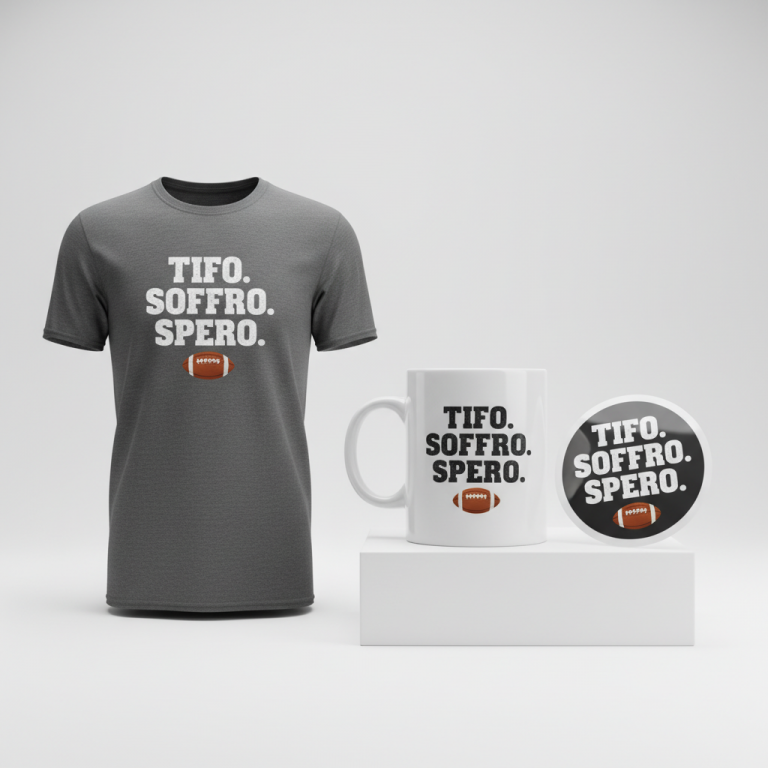
- 🎨 Visual Concept: Imagine a clean, line-art illustration of Bologna’s iconic Two Towers—the Asinelli and Garisenda—rendered with minimalist precision. This architectural focus grounds the design in the city’s identity. Below this striking silhouette, a small, classic football graphic could subtly connect the urban landmark to the sport. The overall visual would be uncluttered, perhaps utilizing a simple two-color palette, such as red and dark blue on a light background. This could offer a clever, understated homage to a club’s colors without explicitly using official branding, maintaining a broad appeal.
- ✍️ Typography Ideas: For the textual element, a stylish, modern sans-serif font could lend a contemporary feel. The phrase “Torri e Calcio” (Towers and Football) is a brilliant choice, elegantly marrying Bologna’s most famous symbols with its sporting passion. The clean arrangement beneath the graphic ensures readability and a refined aesthetic, further solidifying the design’s evergreen potential.
- 👕 Product Canvas: This type of elegant, two-tone design would truly shine on light-colored apparel. Think crisp white, soft grey, or natural-toned t-shirts and hoodies. The stark contrast would allow the minimalist lines and carefully chosen colors to pop, creating a piece that feels both premium and effortlessly stylish.
Strategic Market Insight
The strategic brilliance behind this design concept lies in its ability to pivot from the high-risk domain of specific team names and logos to a universally cherished symbol of civic pride. By focusing on Bologna’s Two Towers and the inclusive phrase “Torri e Calcio,” the merchandise transcends typical fan gear. The target audience broadens significantly beyond just ardent Bologna F.C. 1909 supporters to include any resident of Bologna or admirer of the city who also loves football. This makes the design inherently evergreen and wearable for years, far beyond a single match or season. The psychological trigger here is deeply rooted in local identity and affection for one’s home city, fostering a sense of belonging and pride that is both powerful and enduring. Crucially, this approach ingeniously bypasses any potential intellectual property issues or “bot traps” associated with official club branding, creating a safe yet highly desirable product.
⚖️ Estimated Copyright Risk: LOW
Risk Assessment: The design references a public architectural landmark, not a copyrighted logo. The phrase ‘Torri e Calcio’ is a generic combination of two Italian words and is not a registered trademark or an official slogan of Bologna F.C. 1909.
Always verify intellectual property rights before listing.
Check EU Trademark Search for “Sassuolo – Bologna” ➔
AI Image Generation Prompts
The following prompts are optimized for leading generators to produce production-ready assets:
👕 Apparel / T-Shirt Prompt
A sophisticated, minimalist architectural line-art illustration featuring Bologna's iconic Asinelli and Garisenda towers, rendered with absolute precision and crisp edges, isolated on a solid light off-white background (#F5F5F5), in a clean vector illustration style. The towers are depicted as elegant, geometric silhouettes, utilizing only essential lines and simplified shapes, with a strong sense of verticality and balance. Below the towers, a small, classic, 2D line-art football graphic is positioned centrally, maintaining the minimalist aesthetic with simplified pentagonal and hexagonal patterns. The entire graphic is composed using a restricted two-color palette of a deep crimson red (#CE0026) and a rich, dark navy blue (#003366), applied as perfectly flat, unshaded fills, creating high contrast and visual impact. The typography "Torri e Calcio" is rendered in a modern, bold, and clean sans-serif font (e.g., Gotham, Montserrat, Avenir), meticulously aligned beneath the graphic, in one of the primary design colors. The overall aesthetic is graphic, iconic, and reminiscent of Swiss style poster art or mid-century modern design, emphasizing form and function. There are no gradients, no textures, and no shadows within the illustration itself; only pure, flat color fields and precise black or colored lines. The composition is centered, balanced, and optimized for immediate recognition on apparel, conveying a sophisticated, sporty, and timeless mood. The ONLY text allowed in the image is exactly 'Torri e Calcio'. Absolutely NO other names, words, or random letters. --ar 3:4 --v 6.0
☕ Drinkware / Mug Prompt
A duplicated side-by-side layout showing the exact same graphic on the left and right, designed perfectly for a panoramic mug wrap. The core graphic is a highly stylized, minimalist architectural line-art illustration of Bologna's Asinelli and Garisenda towers. Each tower is represented by clean, geometric lines and simplified forms, capturing their iconic silhouettes with precision. Below the towers, a small, classic, two-dimensional football graphic is depicted with strong, clean lines and simple geometric shapes, devoid of realistic shading or texture. The typography "Torri e Calcio" is presented in a modern, bold, and legible sans-serif font, meticulously arranged beneath the graphic. The entire design employs a striking two-color scheme: a vibrant, classic red (#CE0026) and a deep, athletic dark navy blue (#003366), applied as flat, unshaded fills against a pristine white background. The rendering style is sharp, vector-like, with crisp edges and a focus on graphic impact, suitable for durable ceramic printing. The lighting on the conceptual mug surface is even and diffused, ensuring the colors appear consistent and vivid across the wrap, without reflections or glare. The illustration has a modern, iconic, and clean aesthetic, perfect for a high-quality print. The left and right instances of the design are perfectly identical, ensuring seamless repetition for a wrap-around effect, conveying a fresh and appealing mood. The ONLY text allowed in the image is exactly 'Torri e Calcio'. Absolutely NO other names, words, or random letters. --ar 3:1 --v 6.0
✨ Die-Cut Sticker Prompt
A bold, 2D flat pop-art style illustration featuring Bologna's Asinelli and Garisenda towers, rendered with thick, clean outlines and vibrant, flat color fills. The towers are simplified into iconic, block-like shapes with a strong sense of graphic design, reminiscent of classic travel posters or comic book iconography, emphasizing strong vertical lines and geometric forms. Below the towers, a classic football graphic is illustrated in a simple, highly stylized, flat 2D manner, with bold lines defining its circular shape and traditional pentagon/hexagon patterns. The typography "Torri e Calcio" is set in a modern, robust sans-serif font, cleanly positioned beneath the graphic, forming a cohesive unit. The entire design uses a stark two-color palette of a vivid, classic red (#CE0026) and a deep, impactful dark navy blue (#003366), applied as solid, unshaded blocks of color against a clean white background. Crucially, the entire combined graphic (towers, football, text) is encapsulated within a thick, uniform white outline border, clearly defining its die-cut shape and creating a distinct visual pop and separation from any surface it's applied to. The rendering is crisp, with no gradients, shadows, or textures, focusing solely on strong graphic shapes and high contrast. The mood is energetic, playful, and collectible, perfect for a striking, durable sticker. The ONLY text allowed in the image is exactly 'Torri e Calcio'. Absolutely NO other names, words, or random letters. --ar 1:1 --v 6.0
Frequently Asked Questions
Why opt for city landmarks instead of team logos for football-themed merchandise?
Focusing on iconic city landmarks like Bologna’s Two Towers allows for broader appeal and greater longevity. It taps into general civic pride and love for the city, extending the audience beyond just specific team fans. Crucially, it also sidesteps complex intellectual property rights associated with official club logos and names, offering a safe and evergreen design strategy for creators.
How does the phrase “Torri e Calcio” enhance the design’s appeal and marketability?
“Torri e Calcio” (Towers and Football) is a clever and elegant textual element. It subtly yet powerfully connects Bologna’s most recognizable architectural symbols with the city’s passion for the sport. This phrase is universally understood by locals, evokes a sense of shared identity, and is completely free of any team-specific IP, making the design both safe and highly resonant with a wide local demographic.
What makes a minimalist, architectural design effective for a passionate sports topic?
A minimalist, architectural design offers a sophisticated and timeless aesthetic, setting it apart from busy, overtly branded sports merchandise. Its clean lines and subtle references create a piece that is wearable in many contexts beyond game day, appealing to a demographic that appreciates understated style. This approach elevates the concept from simple fan gear to a more refined expression of city pride and sporting allegiance.
Final Thoughts
The potential for e-commerce success within niches like this Emilian derby, when approached with a smart, culturally-aware strategy, is truly exciting. By understanding the heart of what makes a trend resonate – be it regional pride, historical significance, or simply a shared passion – designers can craft merchandise that tells a story and fosters connection. This specific concept, with its clever sidestepping of IP and deep dive into city identity, is a fantastic example of thoughtful design. Ultimately, the quality of execution and the unique spin each designer brings will be key to capturing the hearts, and wallets, of a passionate audience.
💬 What’s Your Take?
Art is subjective, and this is just one angle! How would you spin this “Sassuolo – Bologna” trend? Drop your design ideas and let’s brainstorm in the comments below!