Eat Sleep Football Repeat
The roar of the crowd, the tension of a penalty shootout, the sheer drama of elite European football – it’s all palpable across the United Kingdom right now. As two titans, Manchester City and Real Madrid, clash in a high-stakes Champions League knockout stage, the nation’s passion for the beautiful game has reached fever pitch. Pubs are packed, social feeds are buzzing, and conversations everywhere are dominated by tactical breakdowns and hopeful predictions. This isn’t just a match; it’s a cultural event that captures the collective imagination of millions.
The Cultural Significance
The Champions League represents the pinnacle of club football, and a showdown between giants like Manchester City and Real Madrid is always an electrifying affair. In the UK, football isn’t just a sport; it’s ingrained in the national identity, a shared experience that transcends generations and backgrounds. This particular fixture, with its rich history, star-studded lineups, and the immense pressure of a knockout round, amplifies that devotion. Fans aren’t just watching a game; they’re investing emotionally in their team’s journey, celebrating victories, and commiserating losses. This intense period of widespread engagement creates a fertile ground for expressions of fandom, both online and through merchandise.
Design Brainstorm: Capturing the Aesthetic
When tapping into such a potent cultural moment, a design concept that speaks to the universal passion for football, rather than a fleeting match, can have lasting appeal. One angle to consider is a timeless, vintage-inspired approach that connects with the enduring spirit of the game.
- 🎨 Visual Concept: Imagine a design that evokes a classic sporting era. This could translate well to a distressed, almost faded aesthetic, giving the impression of a cherished, well-worn favourite. Subtle graphic elements, perhaps a pair of vintage-style stars flanking the main text, could add a touch of character and visual balance without clutter. The color scheme of faded cream and red lends itself perfectly to this nostalgic, retro feel, suggesting authenticity and a deep-rooted love for the sport.
- ✍️ Typography Ideas: For text, a bold, sans-serif font rendered with a distressed effect would complement the retro vibe beautifully. Stacking the words vertically, with ‘Football’ as the largest and most prominent element, immediately draws the eye and emphasizes the core passion. The phrase “Eat Sleep Football Repeat” is instantly recognizable and resonates with the daily routine of a dedicated fan, making the message clear and impactful.
- 👕 Product Canvas: Given the proposed faded cream and red color palette, this design would likely shine brightest on a dark apparel base. Dark navy, charcoal grey, or even classic black t-shirts or hoodies would allow the lighter, vintage-inspired colors to pop, creating a striking contrast that enhances the retro feel and ensures visibility.
Strategic Market Insight
The beauty of this design concept lies in its strategic market insight. While directly referencing the specific Champions League match or teams would lead into intellectual property challenges, the “Eat Sleep Football Repeat” concept cleverly sidesteps these pitfalls. This approach targets the massive, passionate audience of general football fans – a truly evergreen demographic. The phrase itself is a well-established, low-risk, generic Print-on-Demand trope that instantly communicates a universal sentiment. By focusing on the routine and identity of a die-hard supporter, the design triggers a powerful psychological connection. It’s not about *who* is playing, but the inherent love *for* the game itself, making the merchandise appealing to a vast segment of the population, regardless of team allegiance or current trending matches. This offers significant potential for long-term sales beyond the immediate hype of a single tournament.
⚖️ Estimated Copyright Risk: LOW
Risk Assessment: The phrase is a generic and widely used trope across countless niches and is not exclusively owned by any single entity for apparel. The risk comes from competition, not copyright, as long as the graphic execution is original.
Always verify intellectual property rights before listing.
Check UK Trademark Search for “Eat Sleep Football Repeat” ➔
AI Image Generation Prompts
The following prompts are optimized for leading generators to produce production-ready assets:
👕 Apparel / T-Shirt Prompt
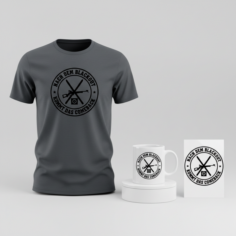
A clean, crisp vector illustration optimized for t-shirt printing. The design is retro-inspired, featuring the text "Eat Sleep Football Repeat" stacked vertically. "Football" is the largest, most prominent word, centered within the design. "Eat Sleep" sits above "Football", and "Repeat" is positioned below. All text uses a distressed, bold sans-serif typeface, with intentional, subtle breaks and imperfections in the letterforms, mimicking a genuine vintage screen-print effect rather than a digital filter. Subtle, five-pointed vintage-style stars with a slightly imperfect, hand-drawn feel flank the "Football" text horizontally, adding character without overwhelming the typography. The primary color for the text and stars is a faded, creamy off-white, reminiscent of aged parchment. This is complemented by a muted, desaturated crimson red used for subtle outlines or a secondary distressed layer within the cream text, providing depth and a nostalgic, worn aesthetic. The illustration style is defined by precise, scalable vector shapes, sharp edges, and flat color fills. There is no gradient or complex shading; depth comes from the layered colors and integrated distressing. The entire graphic is isolated on a solid, deep charcoal grey background, ensuring maximum contrast and versatility for dark apparel. The composition is perfectly centered and balanced, ready for high-quality screen printing. The ONLY text allowed in the image is exactly 'Eat Sleep Football Repeat'. Absolutely NO other names, words, or random letters. --ar 3:4 --v 6.0
☕ Drinkware / Mug Prompt
A duplicated side-by-side layout showing the exact same graphic on the left and right, designed perfectly for a panoramic mug wrap. The core graphic is a highly detailed, retro-inspired design. The central text "Eat Sleep Football Repeat" is arranged vertically. The word "Football" dominates the design, rendered in a large, impactful, distressed sans-serif typeface. "Eat Sleep" is stacked directly above "Football", and "Repeat" is stacked below, all maintaining the same distressed sans-serif style with subtle, authentic-looking imperfections and breaks in the letter outlines and fills, evoking a genuine vintage print. Flanking the "Football" text are subtle, classic five-pointed stars, designed with a slightly worn, nostalgic feel. The color palette consists of a faded, creamy off-white (like vintage ivory) for the main text and stars, expertly contrasted with a muted, desaturated burgundy red used for accenting outlines or a secondary distressed layer. This creates a deeply nostalgic, warm, and comforting aesthetic suitable for a ceramic mug. The overall design has a hand-crafted, slightly imperfect, yet charming appeal. The duplication ensures seamless wrapping around a standard coffee mug, with both identical graphics facing forward when held. The ONLY text allowed in the image is exactly 'Eat Sleep Football Repeat'. Absolutely NO other names, words, or random letters. --ar 3:1 --v 6.0
✨ Die-Cut Sticker Prompt
A vibrant, 2D flat pop-art style die-cut sticker design. The central graphic features the words "Eat Sleep Football Repeat" stacked vertically, with "Football" being significantly larger and more prominent than "Eat Sleep" above it and "Repeat" below. All text is rendered in a bold, clean sans-serif typeface, heavily stylized with a distinct distressed effect that manifests as sharp, intentional breaks and voids in the solid color, reminiscent of classic comic book lettering or aged propaganda posters. Subtle, sharp-edged vintage-style stars flank the "Football" text, adding a graphic flourish. The color scheme is a stark, clean faded cream (an aged, yellowish off-white) and a bold, desaturated crimson red, applied in solid, flat blocks of color with zero gradients or subtle shading. The overall aesthetic is punchy, high-contrast, and eye-catching, perfectly suited for a collectible sticker. The entire design, including text and stars, is encapsulated within a uniformly thick, pristine white outline border, providing a crisp, clean edge for a die-cut finish. The sticker presents as a single, perfectly rendered, flat graphic ready for print, with a playful yet assertive mood. The ONLY text allowed in the image is exactly 'Eat Sleep Football Repeat'. Absolutely NO other names, words, or random letters. --ar 1:1 --v 6.0
Frequently Asked Questions
Why opt for a generic phrase like “Eat Sleep Football Repeat” instead of mentioning the Champions League or specific teams?
Choosing a generic phrase like “Eat Sleep Football Repeat” is a crucial strategic move. It allows creators to tap into the immense passion surrounding events like the Champions League without infringing on valuable intellectual property (IP) like team names, league logos, or specific tournament branding. This broadens the appeal to all football fans, ensures the design remains evergreen, and significantly reduces legal risk, making it a safer and more sustainable choice for Print-on-Demand ventures.
How does a “retro-inspired” design resonate with a modern football audience, especially around a contemporary event?
Retro designs often resonate deeply because they evoke nostalgia and a sense of timeless passion. Modern football culture often appreciates the heritage of the game, and a vintage aesthetic can speak to the enduring spirit of football beyond current trends. It offers a classic, authentic feel that contrasts with fast-fashion, appealing to fans who appreciate a more enduring expression of their love for the sport, even amidst contemporary events.
What other design text variations could work within this IP-safe, evergreen football fan concept?
Beyond “Eat Sleep Football Repeat,” there are many variations that maintain an IP-safe, evergreen appeal. Consider phrases that express dedication, passion, or the universal appeal of the game, such as “Football Is Life,” “My Happy Place Is The Pitch,” “Weekend Forecast: 100% Chance of Football,” or even simpler declarations like “Pure Football Fan.” The key is to convey a universal love for the sport without referencing specific teams, players, or events.
Final Thoughts
The energy surrounding major football events like the Champions League offers a fantastic springboard for creative merchandise. By understanding the cultural pulse and applying smart, IP-conscious design strategies, creators can develop products that not only capture the moment but also possess evergreen appeal. The “Eat Sleep Football Repeat” concept, with its retro flair and universal message, serves as a compelling example of how to connect with passionate audiences effectively. Ultimately, success in this space hinges on thoughtful execution and the unique spin each designer brings to these explored concepts.
💬 What’s Your Take?
Art is subjective, and this is just one angle! How would you spin this “Champions League” trend? Drop your design ideas and let’s brainstorm in the comments below!