Genova nel Cuore – Genoa in my Heart
The air in Italy is electric with the roar of the crowd, as the football season ignites fierce local passions across the peninsula. From the historic streets of Carrara to the bustling port city of Genoa, the Carrarese versus Sampdoria match isn’t just another fixture; it’s a rallying cry, stirring deep-seated pride and intense discussion among fans and citizens alike. This local clash serves as a potent reminder of how deeply football is woven into the fabric of Italian identity, providing a unique lens through which to explore powerful civic loyalties.
The Cultural Significance
Italian football, especially in Serie B, is less about global brands and more about the heart of a community. Clubs like Sampdoria aren’t just sports teams; they are symbols of their cities, embodying generations of local history, triumphs, and shared experiences. When teams from neighboring towns or with significant historical ties face off, it ignites a passionate discourse that extends far beyond the stadium walls. Friends, families, and colleagues will dissect every play, every call, for days. This particular match, Carrarese versus Sampdoria, taps directly into that vibrant local pride, creating a buzz that designers can cleverly interpret. It’s a moment when city identity is at its peak, offering a fertile ground for expressions of belonging and affection for one’s hometown.
Design Brainstorm: Capturing the Aesthetic
For designers looking to tap into this cultural moment, the goal is to create merchandise that resonates deeply without falling into common pitfalls. One angle to consider focuses on evergreen city pride, translating fleeting match enthusiasm into lasting sentiment.
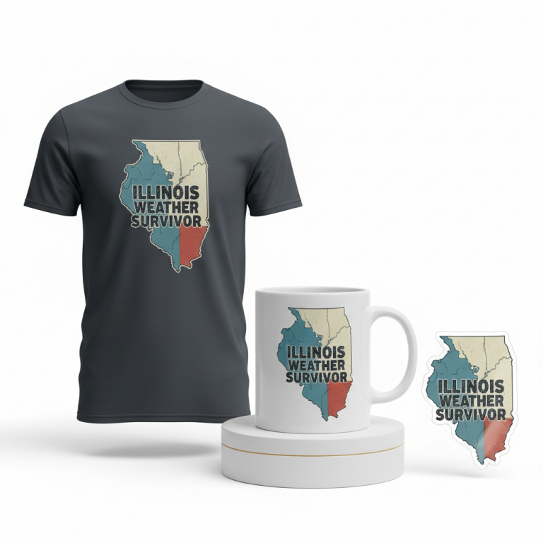
- 🎨 Visual Concept: Imagine a vintage, distressed shield crest, evoking a sense of heritage and enduring loyalty. Within its bounds, a simple yet powerful stylized graphic of the Lanterna lighthouse stands prominently. This isn’t just any lighthouse; it’s the iconic symbol of Genoa, instantly recognizable and a profound source of civic identity. The distressed finish adds an authentic, worn-in feel, suggesting a history of passionate support.
- ✍️ Typography Ideas: The text, “Genova nel Cuore” (Genoa in the Heart), is positioned on a classic ribbon banner that gracefully wraps around the bottom of the crest. The choice of a classic, weathered serif font enhances the vintage appeal, lending an air of tradition and permanence. This phrase is a powerful emotional anchor, universal to anyone who holds Genoa dear, regardless of specific club affiliation.
- 👕 Product Canvas: This design could translate well to dark apparel. The rich, deep tones of black, navy, or charcoal provide a striking backdrop for the lighter, distressed elements of the crest and text, allowing them to truly pop. A dark canvas often lends a sophisticated, timeless feel that perfectly complements the vintage aesthetic.
Strategic Market Insight
The brilliance of this design approach lies in its strategic pivot. Instead of directly engaging with Sampdoria’s specific intellectual property – which can be complex and restrictive – it leans into a broader, more universal sentiment: city pride. By centering the design around “Genova nel Cuore” and the Lanterna, it creates merchandise that fans will strongly identify with, yet it avoids any potential IP infringement issues. This also sidesteps the “Location + Sport” bot trap, which often results in generic, uninspired designs. The target audience broadens significantly beyond just Sampdoria’s most ardent supporters to any citizen proud of Genoa. It taps into the psychological trigger of belonging, offering a wearable symbol of identity that is both authentic and evergreen, making it a much safer and more enduring e-commerce play.
⚖️ Estimated Copyright Risk: LOW
Our Findings: The design avoids all club-specific IP. The phrase ‘Genova nel Cuore’ is a generic statement of local pride, and the lighthouse is a public landmark. There is no direct mention of sports or the team.
Always verify intellectual property rights before listing.
Check EU Trademark Search for “Genova nel Cuore” ➔
AI Image Generation Prompts
The following prompts are optimized for leading generators to produce production-ready assets:
👕 Apparel / T-Shirt Prompt
A sophisticated vintage-inspired vector illustration for a t-shirt print. The design features a classic, heraldic shield crest with a subtly distressed, weathered texture, giving it an authentic antique feel without losing vector clarity. The edges of the shield are clean but show very fine, simulated wear and tear, like a slightly chipped enamel. Inside the crest, the iconic 'Lanterna' lighthouse of Genoa is rendered in a simple, elegant, stylized graphic. The lighthouse uses clean, bold lines with minimal detail, almost an abstract silhouette, but instantly recognizable. It has a slightly aged, faded appearance, possibly with a subtle two-tone or monochromatic color scheme to enhance the vintage feel, like an old faded print. Below the crest, a flowing, subtly curved ribbon banner wraps gracefully around the bottom, appearing to be an integral part of the shield's structure. The banner itself has a distressed, almost fabric-like texture, with slight creasing and folded edges, but still vector-sharp. The text "Genova nel Cuore" is precisely centered on this banner, rendered in a classic, weathered serif font. The typography has a slightly eroded, stamped quality, where the edges of the letters show minor imperfections, suggesting age and repeated use. The overall color palette is muted and vintage-appropriate, perhaps deep blues, faded reds, cream, and charcoal, or a monochromatic scheme with dark grey and off-white, all perfectly isolated on a solid Dark background. This is a clean vector illustration style, with sharp, scalable lines and shapes, but meticulously detailed with simulated grunge, subtle halftones, or fine grain textures within the vector artwork to convey age and wear. The illustration should have a premium, hand-drawn vector aesthetic, ready for high-quality screen printing. The final image should present the graphic clearly and symmetrically, perfectly centered for apparel. The ONLY text allowed in the image is exactly 'Genova nel Cuore'. Absolutely NO other names, words, or random letters. --ar 3:4 --v 6.0
☕ Drinkware / Mug Prompt
A high-resolution digital art render of a custom design optimized for a panoramic coffee mug wrap layout. The central design element is a vintage-inspired shield crest with a distinct distressed texture, evoking the feel of aged metal or stone. The shield's surface exhibits fine cracks, subtle abrasions, and faded areas, indicative of historical wear. Inside this prominent crest, the famous 'Lanterna' lighthouse of Genoa is depicted as a simple, highly stylized graphic. The lighthouse illustration is clean and iconic, using strong, deliberate lines, almost like a simplified woodcut or linocut, with minimal internal detail to ensure clarity and impact. Its form is immediately recognizable, rendered in a solid, slightly muted color that contrasts subtly with the background inside the crest. A gracefully curved ribbon banner is integrated into the bottom of the shield crest, appearing to flow organically from its structure. This banner also shares the distressed, aged aesthetic, with subtle folds and a texture that mimics old parchment or worn fabric. Centered precisely on this banner is the text "Genova nel Cuore," rendered in a classic, weathered serif font. The letters possess a slight irregularity and softness around the edges, as if worn by time or imperfectly printed, adding to the vintage charm. The entire graphic maintains a balanced and cohesive color palette, suitable for print, perhaps utilizing sepia tones, muted blues, and creamy whites, with excellent contrast for readability. A duplicated side-by-side layout showing the exact same graphic on the left and right, designed perfectly for a panoramic mug wrap. The graphics should be identical, ensuring seamless repetition around the mug, with adequate spacing for a full wrap effect without overlapping. The ONLY text allowed in the image is exactly 'Genova nel Cuore'. Absolutely NO other names, words, or random letters. --ar 3:1 --v 6.0
✨ Die-Cut Sticker Prompt
A vivid, bold 2D flat pop-art style illustration of a die-cut sticker design. The central element is a vintage, distressed shield crest, rendered with clean, thick outlines and solid, flat colors, reminiscent of classic comic book art or screen printing. Despite the flat style, subtle texture overlays (like fine halftone dots or a slight grunge pattern) are meticulously applied within the solid color areas of the shield to convey its distressed, weathered quality without introducing gradients or complex shading. The edges of the shield are sharp but intentionally show minor, graphic "chips" or "scratches" to reinforce the vintage feel. Inside the crest, the iconic 'Lanterna' lighthouse is presented as a minimalist, highly stylized graphic. This lighthouse is depicted using strong, defined shapes and a limited, punchy color palette, making it instantly recognizable even in a simplified form. It is rendered with a flat, block-color approach, ensuring it stands out against the crest's interior. A dynamic, curved ribbon banner wraps around the bottom of the shield, also rendered in a flat, solid color with bold outlines. The banner has a clean, graphic appearance but with hints of "worn" edges or slight color variation to simulate age. The text "Genova nel Cuore" is prominently displayed on this banner, using a classic, weathered serif font. The typography is bold and legible, with the "weathered" effect achieved through deliberate, graphic imperfections on the letterforms, not through shading or gradients. The entire design, including the shield, lighthouse, banner, and text, is encapsulated within a very distinct, clean, thick white outline border, perfectly suited for a die-cut sticker. The white border is consistent in thickness and smoothly follows the contours of the crest and banner, ensuring it pops against any background. The color scheme is vibrant yet vintage-inspired, with high contrast for visual impact. The final image is a top-down view, perfectly centered, showcasing the sticker's outline clearly. The ONLY text allowed in the image is exactly 'Genova nel Cuore'. Absolutely NO other names, words, or random letters. --ar 1:1 --v 6.0
Frequently Asked Questions
Why opt for “Genova nel Cuore” instead of direct Sampdoria club branding?
Choosing “Genova nel Cuore” strategically broadens the appeal beyond just avid Sampdoria fans to anyone who feels a strong connection to the city of Genoa. This approach circumvents potential intellectual property (IP) infringement concerns associated with using official club logos or names, while still capturing the essence of local pride that fuels football fandom. It’s an evergreen sentiment that resonates with a wider demographic, making the merchandise more universally wearable and sustainable.
What makes the Lanterna lighthouse such a potent visual symbol for this design?
The Lanterna lighthouse is not just a landmark; it’s the iconic, historical symbol of Genoa, instantly recognizable to locals and those familiar with the city. Incorporating it into the design provides a strong, authentic visual anchor that connects directly to the city’s identity and heritage. It evokes a sense of home, history, and resilience, giving the design a deeper, more emotional resonance than a generic symbol might.
How does the vintage, distressed style enhance the overall message and appeal?
The vintage, distressed aesthetic contributes significantly to the design’s authenticity and timelessness. It suggests a storied history and enduring loyalty, making the item feel like a cherished piece of heritage rather than just new merchandise. This worn-in look adds character and depth, appealing to a sense of nostalgia and making the “Genoa in the Heart” message feel deeply rooted and personal, connecting generations of civic pride.
Final Thoughts
Tapping into the profound wellspring of civic pride, especially during moments of heightened local interest like a significant football match, offers compelling e-commerce potential. By focusing on smart, evocative design that transcends specific club affiliations and embraces the broader identity of a city, creators can forge products that resonate deeply and endure long after the final whistle blows. Remember, the true magic lies in the execution and the unique spin an individual designer brings to these culturally rich concepts.
💬 What’s Your Take?
Art is subjective, and this is just one angle! How would you spin this “Carrarese – Sampdoria” trend? Drop your design ideas and let’s brainstorm in the comments below!