七転び八起き – Fall down seven times, get up eight
Japan is currently gripped by a compelling financial narrative, with discussions surrounding a major scandal involving a former Sony Life Insurance employee making headlines across the nation. This story, rooted in an unsettling incident of unreturned funds, has not only sparked widespread concern but also ignited a broader conversation about trust and accountability in the financial sector. Yet, for observant designers and market strategists, even sensitive national discussions can reveal deeper cultural undercurrents, offering unique pathways for creative, respectful engagement.
The Cultural Significance
The immediate buzz around the Sony Life Insurance situation in Japan stems from the sheer scale and nature of the alleged financial misconduct, a topic that understandably dominates news cycles and public discourse. This kind of event, while challenging, also inadvertently highlights profound aspects of Japanese societal values—particularly resilience, integrity, and the enduring spirit of perseverance. While it’s crucial to approach such sensitive topics with the utmost care, a thoughtful design strategy can transcend the immediate negativity, drawing inspiration from these underlying cultural strengths to create something universally uplifting and culturally resonant. It’s about finding the timeless lesson within a fleeting moment of public attention.
Design Brainstorm: Capturing the Aesthetic
When considering merchandise concepts for a trend with a sensitive origin, the art lies in a diplomatic pivot—transforming immediate headlines into timeless, positive affirmations. Our proposed design concept for this trending topic elegantly navigates this by focusing on powerful Japanese cultural motifs and universal messages of hope.
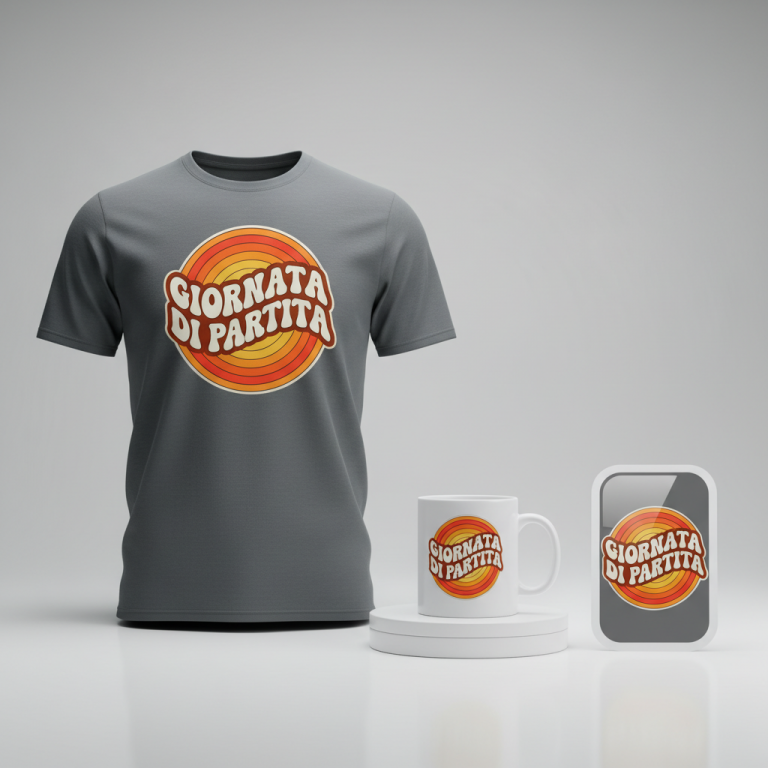
- 🎨 Visual Concept: Imagine a design that speaks volumes through minimalist power. The core visual draws from traditional Japanese calligraphy, known as Shodo. The Japanese text is rendered with the sweeping, dynamic strokes of an ink brush, creating a sense of movement and raw artistic energy. This isn’t rigid text; it flows vertically, evoking the natural grace of authentic Shodo. Complementing this, a small, perfectly circular red stamp, reminiscent of a hanko seal, is positioned subtly near the calligraphy. This seal contains no text, acting purely as an aesthetic accent, grounding the dynamic brushwork with a touch of classic Japanese elegance.
- ✍️ Typography Ideas: The chosen text, “七転び八起き” (Nanakorobi Yaoki), is a cornerstone of this concept. It’s a powerful proverb meaning “fall seven times, stand up eight,” symbolizing resilience and perseverance. The calligraphic style enhances this message, making the words themselves a work of art. The dynamic, hand-brushed appearance of these characters conveys a sense of strength and human effort, perfectly aligning with the proverb’s spirit. The vertical orientation is traditional and adds to the authentic Japanese aesthetic.
- 👕 Product Canvas: This clean, impactful design is ideally suited for light-colored apparel. Think crisp white t-shirts, natural canvas tote bags, or even light grey hoodies. The stark contrast of black ink and a touch of red against a pale background would allow the calligraphy and its profound message to truly pop, creating a sophisticated and eye-catching piece.
Strategic Market Insight
The brilliance of this design approach lies in its “Diplomatic Pivot.” Instead of directly referencing a sensitive financial scandal, the merchandise skillfully recontextualizes the trending moment into an opportunity for universal inspiration. By focusing on “七転び八起き,” the design taps into a widely appreciated Japanese philosophical concept of resilience. This strategy broadens the appeal far beyond those concerned with the initial news story, reaching a diverse audience interested in Japanese culture, motivational messages, and unique aesthetic designs. It transforms a niche, negative news item into an evergreen, positive statement piece that resonates with both Japanese customers and a global audience intrigued by the depth and beauty of Japanese philosophy. The psychological trigger here isn’t curiosity about a scandal, but a desire for personal strength, cultural connection, and timeless wisdom—making it a compelling, emotionally positive purchase.
⚖️ Estimated Copyright Risk: LOW
Risk Assessment: The design is based on a traditional, well-known Japanese proverb, which is in the public domain and not subject to copyright or trademark. It has no connection to the original negative news trend.
Always verify intellectual property rights before listing.
Check Japan Trademark Search for “七転び八起き” ➔
AI Image Generation Prompts
The following prompts are optimized for leading generators to produce production-ready assets:
👕 Apparel / T-Shirt Prompt
A highly detailed, clean vector illustration of traditional Japanese Shodo calligraphy, featuring the vertically brushed text '七転び八起き'. The calligraphy is rendered in a dynamic, artistic style, appearing as if painted with sumi ink, showcasing varying ink saturation, authentic gestural brush strokes, and subtle dry brush texture effects. Accompanying the calligraphy is a small, minimalist, perfectly circular red stamp, resembling a traditional hanko seal, rendered in a solid, deep vermilion red without any internal text, positioned thoughtfully for aesthetic balance near the main text. The overall aesthetic is powerfully clean, embodying respectful Japanese design principles with a modern minimalist edge. The graphic is isolated on a solid light background (off-white or light grey), ensuring maximum contrast and clarity. The illustration style emphasizes crisp lines, smooth curves, and high-resolution graphic fidelity, perfect for print, devoid of any photographic elements or complex shading, focusing purely on graphic impact. The mood is serene, resilient, and inspiring, with a timeless elegance. The ONLY text allowed in the image is exactly '七転び八起き'. Absolutely NO other names, words, or random letters. --ar 3:4 --v 6.0
☕ Drinkware / Mug Prompt
A duplicated side-by-side layout showing the exact same graphic on the left and right, designed perfectly for a panoramic mug wrap. The graphic features powerful Japanese Shodo calligraphy with the text '七転び八起き' brushed vertically in an expressive, dynamic ink-painting style. The strokes demonstrate deep black sumi ink, displaying a rich texture with variations in opacity, pressure, and realistic dry brush effects, conveying authentic calligraphic energy and flow. Adjacent to the calligraphy, on a clean, implied white surface, is a striking, small, minimalist red circle stamp in a vibrant vermilion (shu) hue, perfectly round and devoid of any text, mirroring the look of a traditional hanko seal. The design is clean, balanced, and deeply respectful of Japanese aesthetics, exuding strength and resilience. The duplication ensures a seamless, high-resolution graphic wrap, with precise alignment and consistent quality across both instances. The rendering style is sharp and clear, optimized for print on ceramic, with no 3D elements or photographic depth, presenting a flat, impactful design. The mood is inspiring and culturally rich. The ONLY text allowed in the image is exactly '七転び八起き'. Absolutely NO other names, words, or random letters. --ar 3:1 --v 6.0
✨ Die-Cut Sticker Prompt
A bold, 2D flat graphic design in a contemporary pop-art style, depicting Japanese Shodo calligraphy with the vertically oriented text '七転び八起き'. The calligraphy is rendered in solid, stark black ink with clean, sharp edges that mimic dynamic brush strokes but within a flat graphic context, ensuring maximum visual impact. Accompanying the text is a small, perfectly circular red element in a vibrant, solid vermilion color, serving as a minimalist hanko-style stamp without any text. The entire design, encompassing both the calligraphy and the red circle, is encircled by a distinct, thick white outline border, creating a clean die-cut effect. The aesthetic is modern, striking, and respectful of traditional Japanese art, yet presented with a simplified, graphic clarity ideal for a sticker. There is no shading, gradients, or complex textures; just pure, saturated colors and crisp lines on an implied glossy finish. The composition is centered and balanced, radiating energy and a resilient message. The ONLY text allowed in the image is exactly '七転び八起き'. Absolutely NO other names, words, or random letters. --ar 1:1 --v 6.0
Frequently Asked Questions
Why choose a positive proverb when the initial trend is a negative financial scandal?
The strategy here is a “Diplomatic Pivot.” While the initial news about Sony Life Insurance might be negative, direct merchandise engagement with sensitive events can be risky and often poorly received. By choosing “七転び八起き” (Nanakorobi Yaoki), the design cleverly reinterprets the moment to focus on universal themes of resilience and overcoming adversity, which are deeply embedded in Japanese culture. This transforms a potentially controversial topic into an evergreen, positive message with broad appeal, making the design commercially viable and culturally respectful.
What is the deeper cultural meaning of “七転び八起き” (Nanakorobi Yaoki)?
“Nanakorobi Yaoki” translates to “fall seven times, stand up eight.” It’s a cherished Japanese proverb that embodies the spirit of perseverance, resilience, and the belief that no matter how many setbacks one faces, the important thing is to always rise again. It’s a powerful reminder to never give up, reflecting a core aspect of Japanese philosophy and an inspiring message for anyone facing challenges.
How does this design appeal to a global audience interested in Japanese culture?
This design resonates with a global audience on multiple levels. Firstly, its aesthetic is authentic Japanese, utilizing traditional Shodo calligraphy and the iconic hanko-like red seal, which are globally recognized symbols of Japanese art. Secondly, the message of resilience and perseverance is universal, transcending cultural barriers. Many individuals worldwide are drawn to Japanese philosophy for its depth and practical wisdom. The clean, powerful visual combined with a profound, positive message makes it highly attractive to anyone appreciating Japanese aesthetics and motivational concepts, regardless of their direct connection to the country.
Final Thoughts
Navigating dynamic cultural landscapes for merchandise design requires both sensitivity and strategic foresight. This approach, rooted in the trending discussions in Japan but pivoting to a timeless message of resilience, showcases the power of thoughtful design. By marrying authentic Japanese aesthetics with a universally inspiring proverb, “七転び八起き,” the concept forgoes immediate controversy for enduring appeal. The e-commerce potential here is significant for those looking to offer meaningful, culturally rich products. Remember, success in print-on-demand is often about the story you tell and the emotional connection your designs forge—and a powerful, positive spin can make all the difference.
💬 What’s Your Take?
Art is subjective, and this is just one angle! How would you spin this “ソニー生命保険 (Sony Life Insurance)” trend? Drop your design ideas and let’s brainstorm in the comments below!