Anti Navidad Social Club – Anti Christmas Social Club
📍 Target Market: Spain
🔥 Trend: Amarga Navidad Pedro Almodóvar (bitter christmas pedro almodóvar) ↗
The cultural conversation in Spain is buzzing, and it’s all thanks to the maestro himself, Pedro Almodóvar. With the theatrical release of his latest cinematic offering, ‘Amarga Navidad’ (‘Bitter Christmas’), the acclaimed filmmaker is once again setting the stage for contemplation and discussion, especially as the festive season approaches. This new work promises to infuse the traditional holiday narrative with Almodóvar’s signature blend of emotion, drama, and perhaps, a touch of his unique perspective on what “bitter” truly means during the most wonderful time of the year. This cultural moment creates a fascinating backdrop for creative expression, particularly in the realm of merchandise that speaks to a specific kind of holiday spirit.
The Cultural Significance
Pedro Almodóvar is more than just a director; he’s a Spanish institution, a global icon whose films consistently challenge norms and provoke thought. The anticipation surrounding ‘Amarga Navidad’ is therefore immense, and its title alone has sparked curiosity. ‘Bitter Christmas’ immediately signals a departure from conventional holiday cheer, resonating with a segment of the population that views the festive period with a healthy dose of sarcasm, humor, or even a touch of melancholy. This sentiment isn’t new, but Almodóvar’s endorsement of such a theme through his art gives it a powerful, timely voice, particularly within Spanish-speaking cultures where his influence is deeply felt. This cultural ripple effect offers a unique entry point for designs that tap into this alternative holiday perspective.
Design Brainstorm: Capturing the Aesthetic
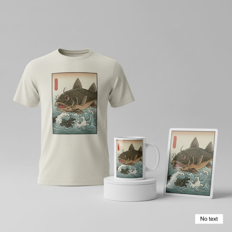
When thinking about merchandise that aligns with this nuanced cultural moment, the goal is to capture the essence of an “anti-Christmas” sentiment without directly referencing the film’s protected intellectual property. One compelling design concept emerges that marries vintage charm with a playful rebellion.
- 🎨 Visual Concept: The vision here is a design mimicking the timeless appeal of a vintage social club emblem or crest. Imagine a clean, distinct circular or shield shape as the primary container, giving it an air of exclusivity and tradition. Within this structure, the elements should feel cohesive and established, as if this “club” has been around for decades. This classic aesthetic provides a cool, member’s-only vibe, subtly inviting those who share its unique perspective to join.
- ✍️ Typography Ideas: The text is key to conveying the message. A fun way to spin this might involve a mix of fonts. For “Anti Navidad,” a slightly distressed script font could add character and a handcrafted, almost rebellious touch, suggesting a gentle defiance. This could then be beautifully contrasted with a bold, sans-serif block font for “Social Club,” which lends gravitas and a sense of officialdom to the playful concept. This typographic interplay creates visual interest and reinforces the idea of a legitimate, albeit unconventional, community.
- 👕 Product Canvas: For this particular design style and message, dark apparel would translate exceptionally well. Think deep charcoals, rich blacks, or forest greens. The vintage emblem with its distressed elements would pop against a darker background, enhancing the cool, understated, and slightly mysterious appeal of a “member’s-only” item. Darker fabrics naturally complement the “bitter” or “anti” theme, giving the merchandise an edgy sophistication.
Strategic Market Insight
The target audience for this concept is clear: individuals who embrace a humorous, sarcastic, or simply alternative view of the Christmas holiday. This niche is surprisingly passionate and remarkably well-established in print-on-demand marketplaces globally. The genius of this approach lies in its pivot from the specific, IP-protected film title ‘Amarga Navidad’ to the broader, evergreen concept of ‘anti-Christmas’ humor, which has universal appeal beyond any single film’s release. The ‘social club’ format is a powerful psychological trigger; it fosters a sense of community, belonging, and shared identity among buyers. People aren’t just buying a T-shirt; they’re buying into a lifestyle, a mindset, and an exclusive club for those who prefer their eggnog with a dash of wry wit. This sense of shared experience is incredibly potent for driving engagement and purchases.
⚖️ Estimated Copyright Risk: LOW
Copyright Evaluation: The design does not use the film’s title, the director’s name, or any imagery from the movie. The phrase ‘Anti Navidad Social Club’ is a generic concept, not a registered trademark, making it a safe pivot.
Always verify intellectual property rights before listing.
Check EU Trademark Search for “Anti Navidad Social Club” ➔
AI Image Generation Prompts
The following prompts are optimized for leading generators to produce production-ready assets:
👕 Apparel / T-Shirt Prompt
A sophisticated, clean vector illustration of a vintage social club emblem. The design is enclosed within a classic, slightly distressed shield shape, evoking a cool, exclusive, member's-only feel. The typography for 'Anti Navidad' is a stylized, slightly weathered script font, with subtle ink-bleed texture, while 'Social Club' is rendered in a bold, assertive sans-serif block font with sharp, clean edges. The overall aesthetic is a blend of retro collegiate and classic heraldic design. Elements include subtle, stylized representations of winter or anti-winter motifs (e.g., a minimalistic snowflake symbol with a 'not' sign, or a subtly stylized sun breaking through winter clouds), all integrated seamlessly into the crest. The color palette is limited to 3-4 muted, deep tones – think deep forest green, antique gold, charcoal gray, and a touch of aged cream – creating a high-contrast, yet harmonious look. The illustration style is clean and crisp, with precise vector lines, smooth curves, and uniform stroke weights, perfect for a silkscreen print. There's a subtle, almost imperceptible distressed overlay effect, giving it an authentic vintage, worn-once feel without compromising print clarity. The rendering is flat and graphic, with no complex gradients or shadows, focusing on strong shapes and clear readability. The mood is timeless, prestigious, and slightly rebellious. Isolated on a solid Dark background, clean vector illustration style. The ONLY text allowed in the image is exactly 'Anti Navidad Social Club'. Absolutely NO other names, words, or random letters. --ar 3:4 --v 6.0
☕ Drinkware / Mug Prompt
A duplicated side-by-side layout showing the exact same graphic on the left and right, designed perfectly for a panoramic mug wrap. The graphic is a vintage social club emblem, crafted with a rich, textured aesthetic that feels hand-drawn yet refined. The design is contained within an elegant, weathered circular badge with an ornate, slightly decorative border, giving it a cool, established, member's-only vibe. 'Anti Navidad' is presented in a flowing, slightly distressed script font, appearing as if etched or debossed, with visible imperfections like subtle ink smudges and rough edges. 'Social Club' is rendered in a strong, retro sans-serif block font, maintaining a robust, grounded presence. The visual elements within the emblem might include stylized, abstract symbols of rebellion against tradition or a winter theme, such as intertwining branches or a stylized, minimalist 'X' over a snowflake, all rendered with a vintage linocut or woodcut texture. The color scheme is warm and inviting, using deep burgundy, burnt orange, a creamy off-white, and dark espresso brown, suggesting a cozy, intellectual atmosphere. Lighting suggests a soft, ambient glow, enhancing the rustic textures. The overall texture mimics an aged ceramic or letterpress print, with slight variations in color saturation and a subtle grainy finish. The mood is sophisticated, nostalgic, and welcoming. The ONLY text allowed in the image is exactly 'Anti Navidad Social Club'. Absolutely NO other names, words, or random letters. --ar 3:1 --v 6.0
✨ Die-Cut Sticker Prompt
A vibrant, eye-catching die-cut sticker design featuring a bold, pop-art style vintage social club emblem. The design is encircled by a thick white outline border, creating a striking contrast and making it pop. The emblem itself is enclosed within a dynamic, angular shield shape with crisp, clean edges, exuding a cool, exclusive, member's-only attitude. 'Anti Navidad' is displayed in a playfully distressed, almost graffiti-style script font with strong, defined outlines. 'Social Club' is rendered in an impactful, chunky sans-serif block font, reminiscent of classic comic book typography, with a slight tilt for added dynamism. The internal elements are simplified to their core forms, utilizing hard shadows and stark color blocking. Imagine abstract, graphic representations like a stylized, smiling sun giving a 'thumbs down' to a snowflake, or bold, geometric patterns within the shield. The color palette is high-energy and saturated: bright crimson red, electric blue, sunny yellow, and jet black, with minimal shading to maintain a flat, 2D aesthetic. The rendering is akin to a screen print or stencil art, with sharp, unambiguous lines and flat areas of color. The texture is smooth and glossy, like high-quality vinyl, with no visible imperfections. The mood is rebellious, energetic, and fun, perfectly suitable for a collectible item. The ONLY text allowed in the image is exactly 'Anti Navidad Social Club'. Absolutely NO other names, words, or random letters. --ar 1:1 --v 6.0
Frequently Asked Questions
How does this “Anti Navidad Social Club” design navigate potential IP concerns related to the film ‘Amarga Navidad’?
The design smartly pivots away from the specific film title by using the broader term “Anti Navidad” and pairing it with a generic “Social Club” concept. This creative interpretation ensures the design is conceptually inspired by the cultural moment the film creates, rather than directly infringing on the film’s intellectual property. It taps into the sentiment without using the protected name.
Why is the “social club” format an effective choice for an “anti-Christmas” theme?
The “social club” format excels at transforming an otherwise individual, perhaps even solitary, sentiment into a shared, collective identity. For those who feel less enthusiastic about traditional Christmas festivities, joining an “Anti Navidad Social Club” provides a sense of belonging, humor, and camaraderie. It creates an exclusive, insider feel, fostering a community around a shared, alternative perspective.
What makes this design appealing to a specific type of buyer?
This design specifically targets buyers who appreciate irony, vintage aesthetics, and a subtle sense of rebellion. They’re likely individuals who enjoy expressing their unique personality, aren’t afraid to stand apart from mainstream holiday cheer, and seek out items that reflect their wry sense of humor and appreciation for alternative cultural statements. It’s for those who find joy in the “bitter” alongside the sweet.
Final Thoughts
The cultural landscape, particularly in countries like Spain, is continually offering fresh waves of inspiration for print-on-demand entrepreneurs. The buzz around Almodóvar’s ‘Amarga Navidad’ presents a fantastic, albeit indirect, opportunity to engage with a passionate audience. By focusing on evergreen themes like “anti-Christmas” humor and channeling it through a clever, community-building design concept like the “Social Club,” designers can tap into significant e-commerce potential. Remember, success in this space often comes down to thoughtful execution, a keen understanding of your audience, and the courage to put your own unique spin on trending cultural conversations.
💬 What’s Your Take?
Art is subjective, and this is just one angle! How would you spin this “Amarga Navidad Pedro Almodóvar (bitter christmas pedro almodóvar)” trend? Drop your design ideas and let’s brainstorm in the comments below!