週末は大工、平日はシェフ – Carpenter on the weekend, Chef on weekdays
A fresh wave of enthusiasm is sweeping across Japan, sparked by the recent television appearance of actor and personality Kudo Asuka. His engaging role in a popular TV special, which delved into the world of home renovation and culinary arts, has truly resonated with audiences, shining a spotlight on the cherished Japanese passion for hands-on hobbies and a well-balanced home life.
The Cultural Significance
The allure of Kudo Asuka’s TV special isn’t just about celebrity; it taps into a deeply ingrained cultural appreciation for craftsmanship, self-sufficiency, and the joy of creating within one’s own home. In Japan, there’s a growing demographic of adults who actively seek balance – dedicating their weekdays to professional pursuits, then transforming into enthusiastic DIYers and passionate home chefs on the weekends. This isn’t merely about practicality; it’s a lifestyle statement, reflecting a desire for personal fulfillment, skill development, and the creation of a warm, inviting living space. The show perfectly captured this spirit, making its themes incredibly relatable and aspirational for many.
Design Brainstorm: Capturing the Aesthetic
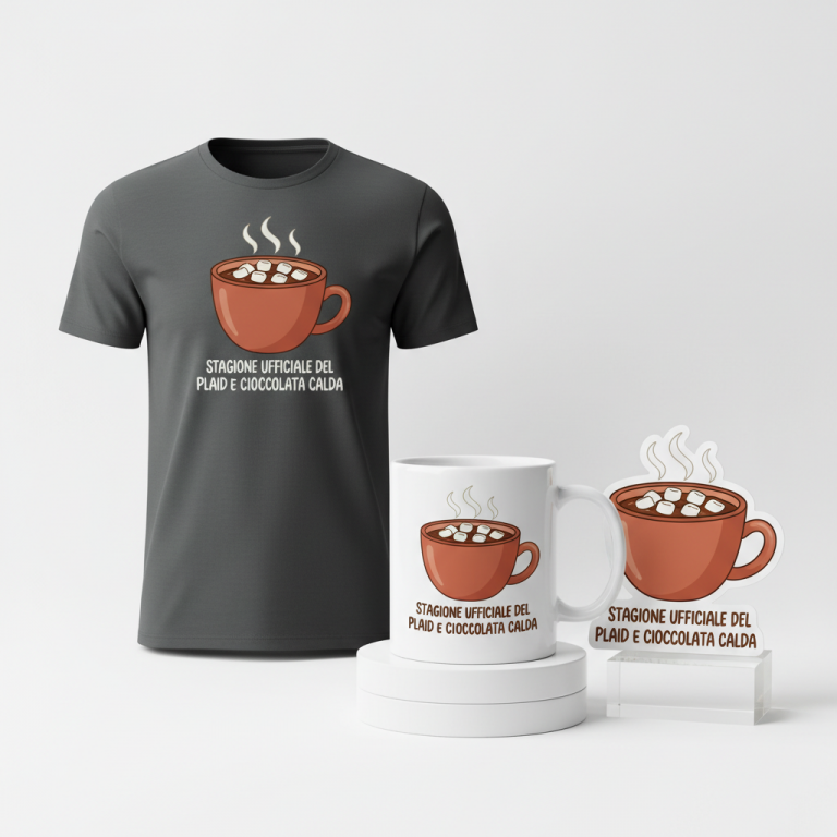
Translating this vibrant cultural trend into merchandise requires a thoughtful approach, focusing on the underlying themes rather than direct celebrity representation. One compelling design concept embraces a clean, balanced Japanese aesthetic, celebrating the hobbies themselves.
- 🎨 Visual Concept: The core graphic could feature simple, iconic line-art symbols: a sturdy hammer and a sharp chef’s knife, elegantly crossed in an ‘X’ shape. This minimalist design choice immediately conveys the two key passions – home improvement and cooking – without being overly literal or cluttered. It speaks to utility, skill, and the hands-on nature of these beloved activities.
- ✍️ Typography Ideas: The Japanese text, “週末は大工、平日はシェフ” (Shūmatsu wa Daiku, Heijitsu wa Shefu – Weekend Carpenter, Weekday Chef), could be rendered vertically on both sides of the central graphic. This traditional layout not only adds to the authentic Japanese feel but also creates a sense of harmony and balance. A clean, slightly brush-stroked font style, perhaps a Kaisho or Gyosho derivative, would lend an air of sophistication and traditional craftsmanship to the typography, making it feel both modern and timeless.
- 👕 Product Canvas: This design concept would translate beautifully onto light-colored apparel. The crispness of the line art and the traditional Japanese script would pop against lighter fabrics, enhancing the clean and balanced aesthetic. Think light grey, natural ecru, or soft white tees and hoodies, offering a versatile and stylish canvas for this thoughtful design.
Strategic Market Insight
Targeting Japanese adults who are passionate about home life, DIY, and cooking is a strategic move for several reasons. Firstly, this demographic is actively engaged in these hobbies, making them predisposed to merchandise that celebrates their interests. Secondly, by pivoting the design away from Kudo Asuka’s likeness and focusing on the evergreen lifestyle themes he highlighted, the concept avoids any potential intellectual property issues while still leveraging the show’s popularity. The phrase “週末は大工、平日はシェフ” perfectly captures the identity of this target demographic, resonating with their dual lives and aspirations. This creates a deeply relatable and aspirational message, suggesting that the wearer embodies a balanced, fulfilling lifestyle – a powerful psychological trigger for purchase in a market that values both tradition and modern pursuits.
⚖️ Estimated Copyright Risk: LOW
Risk Assessment: The risk is low. The design avoids the celebrity’s name and likeness. The Japanese quote is a generic, descriptive phrase about lifestyle and hobbies, not a direct quote from a show or a registered trademark. The graphic elements are universal symbols for carpentry and cooking.
Always verify intellectual property rights before listing.
Check Japan Trademark Search for “週末は大工、平日はシェフ” ➔
AI Image Generation Prompts
The following prompts are optimized for leading generators to produce production-ready assets:
👕 Apparel / T-Shirt Prompt
A professional vector illustration of a clean, balanced Japanese aesthetic design for a t-shirt print. The central graphic features simple, iconic line-art: a carpenter's hammer and a chef's knife, both rendered as precise, crisp black silhouettes, crossed in an 'X' shape with their handles intersecting at the center. The blades point diagonally upwards and outwards. The line weight is consistent and sharp, creating a stark, high-contrast image. The Japanese text "週末は大工" is written vertically on the left side of the central graphic, and "平日はシェフ" is written vertically on the right side. The font is a sophisticated Kaisho-style, characterized by clean strokes with subtle, elegant brush-stroke nuances, ensuring legibility while retaining traditional Japanese calligraphy essence. The overall composition is perfectly symmetrical and harmonious. This is a clean vector illustration style, with solid, flat black lines and shapes, entirely devoid of gradients, shadows, or complex textures within the design itself. The rendering is ultra-sharp, akin to professional graphic design software output. The design is isolated on a solid light off-white background, providing excellent contrast. The mood is minimalist, sophisticated, and culturally authentic. The ONLY text allowed in the image is exactly '週末は大工、平日はシェフ'. Absolutely NO other names, words, or random letters. --ar 3:4 --v 6.0
☕ Drinkware / Mug Prompt
A duplicated side-by-side layout showing the exact same graphic on the left and right, designed perfectly for a panoramic coffee mug wrap. The core graphic is a clean, balanced Japanese aesthetic design featuring simple, iconic line-art: a carpenter's hammer and a chef's knife, both rendered as precise, crisp black line-art silhouettes, crossed in an 'X' shape with their handles intersecting at the center. The blades point diagonally upwards and outwards. The line work is impeccable, thin yet strong, with absolutely no rough edges or imperfections, embodying a polished, contemporary Japanese illustration style reminiscent of minimalist woodblock prints. The Japanese text "週末は大工" is written vertically on the left side of the central graphic, and "平日はシェフ" is written vertically on the right side. The font is a highly refined Gyosho-style, characterized by fluid, elegant brush strokes that are clean and legible, with a slight dynamic flow. The overall composition of each individual graphic is perfectly balanced and harmonious. The design elements are stark black on a pure white background, ensuring maximum clarity and print quality. The aesthetic is clean, sophisticated, and tranquil, with an emphasis on clarity and minimalist elegance suitable for print on drinkware. Each duplicated graphic is distinct but identical, positioned to seamlessly wrap around a cylindrical surface. The rendering is ultra-crisp, high-resolution, and print-ready. The ONLY text allowed in the image is exactly '週末は大工、平日はシェフ'. Absolutely NO other names, words, or random letters. --ar 3:1 --v 6.0
✨ Die-Cut Sticker Prompt
A bold, 2D flat pop-art style illustration of a die-cut sticker design. The central graphic is a vibrant, high-contrast Japanese aesthetic featuring simple, iconic line-art: a carpenter's hammer and a chef's knife, both rendered as chunky, opaque black silhouettes, crossed in an 'X' shape with their handles intersecting at the center. The blades point diagonally upwards and outwards. The shapes are solid and graphic, outlined with a strong, thick black keyline. The Japanese text "週末は大工" is written vertically on the left side of the central graphic, and "平日はシェフ" is written vertically on the right side. The font is a stylized Kaisho-Gyosho hybrid, maintaining calligraphic elegance but with a bolder, more graphic stroke weight suitable for pop-art. The entire design, including the text and crossed tools, is encircled by a thick, clean white outline border, approximately 10% of the design's width, ready for die-cutting. Beyond this white border, the background is completely transparent (implied by a neutral light grey for visualization). The colors are limited to stark black for the line art and text, pure white for the border, and an optional subtle dark grey background for visual separation if transparency isn't possible, emphasizing high contrast and graphic impact. The rendering is perfectly flat, with no shadows, gradients, or depth, showcasing sharp edges and bold shapes. The mood is cool, modern, and impactful. The ONLY text allowed in the image is exactly '週末は大工、平日はシェフ'. Absolutely NO other names, words, or random letters. --ar 1:1 --v 6.0
Frequently Asked Questions
How does this design avoid celebrity likeness issues while still leveraging the trend?
The design cleverly focuses on the core themes and lifestyle concepts introduced by the popular TV special – DIY and cooking – rather than using Kudo Asuka’s image or name. By creating a unique visual representation with the crossed hammer and knife and the aspirational Japanese phrase, it taps into the sentiment and demographic inspired by the show without infringing on any likeness or endorsement rights. This allows for broad market appeal tied to a cultural moment, not just a fleeting celebrity appearance.
What makes the “Weekend Carpenter, Weekday Chef” phrase particularly impactful for the Japanese market?
This phrase directly speaks to a prevalent and highly valued lifestyle in Japan: balancing professional diligence with enriching personal hobbies. It embodies a sense of aspiration and achievement for those who dedicate themselves to both work and the hands-on pleasures of home life. The Japanese language and traditional vertical layout further enhance its authenticity and cultural resonance, making it highly relatable and desirable for the target audience.
Could this concept extend beyond apparel to other product categories?
Absolutely! The core visual elements and message are incredibly versatile. Beyond light apparel, this concept could translate beautifully onto items like aprons (perfect for the “chef” aspect), tote bags for tools or groceries, kitchen towels, mug sets, or even small home decor items. The clean, balanced aesthetic and iconic symbols make it suitable for a wide range of products that appeal to individuals passionate about their home and hobbies.
Final Thoughts
The enthusiasm surrounding Kudo Asuka’s TV special presents a unique opportunity to connect with a thriving demographic in Japan. By thoughtfully crafting designs that encapsulate the spirit of home improvement and culinary passion, while cleverly navigating celebrity rights, creators can tap into a powerful cultural narrative. The success of any such venture will ultimately hinge on innovative execution, a deep understanding of the audience, and the ability to add a personal, creative spin to a universally appreciated set of hobbies.
💬 What’s Your Take?
Art is subjective, and this is just one angle! How would you spin this “工藤阿須加 (Kudo Asuka)” trend? Drop your design ideas and let’s brainstorm in the comments below!