Donna Libera – Free Woman
As the final credits roll on ‘Le libere donne,’ Italy is abuzz with discussions, emotions, and a renewed appreciation for the spirit of female independence. This highly anticipated series finale has captivated audiences nationwide, creating a powerful cultural moment ripe for resonant, thoughtful merchandise.
The Cultural Significance
The conclusion of ‘Le libere donne’ hasn’t just marked the end of a popular television run; it has ignited a broader conversation across Italy about what it means to be a free woman in contemporary society. This beloved show has resonated deeply with its audience, particularly Italian women, by portraying complex female characters who navigate challenges with strength, resilience, and an unwavering commitment to their personal freedoms. The collective experience of following their journeys has forged a strong sense of community and empowerment among viewers, making the show’s conclusion a significant cultural moment rather than just another TV event. It speaks to deeper societal shifts and the ongoing pursuit of personal liberty.
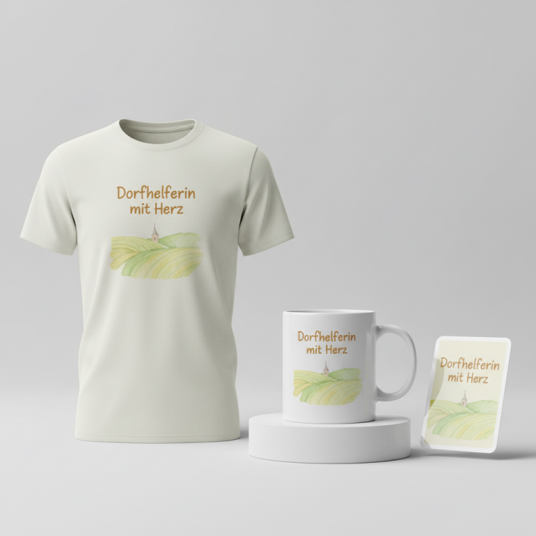
Design Brainstorm: Capturing the Aesthetic
Translating such a rich cultural moment into wearable art requires a thoughtful touch, one that honors the sentiment without directly infringing on intellectual property. One compelling design approach for this trend could focus on elegance, resilience, and a subtle nod to the show’s empowering spirit, ensuring it carries an inspirational, timeless message.
- 🎨 Visual Concept: The core visual could feature a single wildflower, perhaps a delicate poppy or a resilient daisy, subtly breaking through faint pavement cracks. This imagery beautifully symbolizes growth, determination, and the inherent strength found in forging one’s own path, even against odds. The illustration might be rendered in a soft, faded style, giving it a timeless, almost watercolor-like quality that speaks to a refined aesthetic.
- ✍️ Typography Ideas: Complementing this visual, an elegant, flowing script typography could be used for the central text, “Donna Libera.” The choice of script conveys grace and femininity while the phrase itself, meaning “Free Woman,” captures the essence of the show’s theme of independence and empowerment in a legally safe yet deeply resonant way. The singular form allows for a universal statement that transcends the show’s immediate popularity.
- 👕 Product Canvas: This sophisticated design would likely shine brightest on light-colored apparel. Think soft ivory tees, pale gray hoodies, or even a delicate blush pink tank top. The lighter background would allow the subtle wildflower illustration and the elegant script to stand out beautifully, enhancing the classy and inspirational aesthetic while keeping the overall feel light and comfortable.
Strategic Market Insight
Targeting Italian women who are fans of ‘Le libere donne’ is a shrewd move, tapping into a powerful emotional current. These aren’t just casual viewers; they’ve invested time and emotion into characters who embody principles of female empowerment and independence. Purchasing merchandise that proclaims ‘Donna Libera’ isn’t merely buying a t-shirt; it’s an act of self-identification, a public declaration of solidarity with the show’s ideals, and a personal reminder of their own strength. It leverages the post-finale nostalgia, allowing fans to carry a piece of the show’s spirit with them, transforming a temporary pop-culture event into an evergreen statement of personal values. The design’s classy and inspirational tone ensures it appeals to a discerning audience looking for meaningful, stylish apparel that aligns with their identity.
⚖️ Estimated Copyright Risk: LOW
Copyright Evaluation: The design avoids the full, trademarked title of the TV series. The phrase ‘Donna Libera’ is a common Italian phrase and was determined to be a much lower risk than the show’s actual title, as documented in the
Always verify intellectual property rights before listing.
Check EU Trademark Search for “Donna Libera” ➔
AI Image Generation Prompts
The following prompts are optimized for leading generators to produce production-ready assets:
👕 Apparel / T-Shirt Prompt
A premium, elegant t-shirt graphic design featuring the text 'Donna Libera' rendered in exquisite, flowing script typography. The script is highly refined, calligraphic, with graceful, sweeping curves and intentional variations in stroke thickness, embodying a sophisticated hand-lettered, artisanal aesthetic. Behind and slightly interweaving with the text, a delicate and subtle illustration of a single resilient wildflower, perhaps a slender poppy or a determined dandelion, is depicted breaking through stylized pavement cracks. The wildflower illustration uses a clean vector art technique with simplified shapes and extremely low opacity fills, giving it a translucent, faded, almost watermark-like quality. Its colors are highly desaturated – a whisper of muted sage green for the stem and leaves, and an even fainter hint of cream or dusty peach for the bloom. The pavement cracks are represented by minimalistic, abstract vector lines in a very pale, ghosted grey, creating a symbolic yet understated backdrop that seems to emerge from the light background. The entire design adheres strictly to a clean vector illustration style, characterized by perfectly crisp, anti-aliased edges, smooth Bézier curves, and solid, uniform color fills without gradients, shadows, or complex textures, ensuring a refined and minimalist aesthetic. This style is optimized for sharp detail and print clarity in direct-to-garment or screen printing. The graphic is isolated on a solid pure white background, emphasizing its elegant simplicity and making it pop. The overall mood is one of quiet strength, understated elegance, and inspirational freedom. The ONLY text allowed in the image is exactly 'Donna Libera'. Absolutely NO other names, words, or random letters. --ar 3:4 --v 6.0
☕ Drinkware / Mug Prompt
A duplicated side-by-side layout showing the exact same graphic on the left and right, designed perfectly for a panoramic mug wrap. The graphic features the text 'Donna Libera' rendered in an elegant, refined flowing script typography. This calligraphic script possesses graceful, sweeping lines and a polished, contemporary feel, optimized for legibility on a curved surface. Behind the script, a subtle and artistic illustration of a single wildflower, such as a delicate chamomile or a graceful cosmos, is gently breaking through finely detailed pavement cracks. The wildflower is rendered in a soft, ethereal watercolor wash style using muted, desaturated tones – pale olive greens for foliage, and a whisper of lavender or soft ochre for the petals, maintaining a dreamlike, faded quality. The pavement cracks are depicted with thin, artistic line work in a very light grey, subtly integrated into an almost translucent background wash that complements the mug's ceramic. The art style is illustrative and sophisticated, blending delicate line art with soft, diffused watercolor-like fills, giving it a gentle yet inspiring presence. The overall color palette is refined and harmonious, suitable for sublimation printing on a light-colored ceramic mug, creating a cohesive, panoramic design. The mood is serene, reflective, and subtly empowering. The ONLY text allowed in the image is exactly 'Donna Libera'. Absolutely NO other names, words, or random letters. --ar 3:1 --v 6.0
✨ Die-Cut Sticker Prompt
A captivating die-cut sticker design featuring the text 'Donna Libera' in a stylish, flowing script typography. The script is bold, elegant, and highly stylized, rendered with clean, strong lines and a modern graphic sensibility. Behind the script, a striking yet subtle illustration of a single wildflower, such as a resilient daisy or a stylized buttercup, is depicted triumphantly breaking through angular pavement cracks. The wildflower is presented in a 2D flat pop-art style, characterized by simplified, graphic shapes, solid and vibrant (yet sophisticated) color blocks, and minimal, high-contrast detailing. Its colors are clean and direct – a deep, rich forest green for the stem and leaves, and a soft, confident blush pink or mustard yellow for the bloom, with desaturated values to achieve the 'faded' effect through color choice rather than blending. The pavement cracks are bold, geometric lines in a contrasting deep charcoal grey, providing a strong graphic element. The entire design maintains a modern, graphic, and impactful 2D flat pop-art aesthetic, with crisp, vector-like edges and a polished finish. A prominent, perfectly uniform thick white outline border surrounds the entire combined design (text, wildflower, and cracks), defining the precise die-cut shape and ensuring high visibility against any background. The overall mood is uplifting, confident, and distinctly contemporary. The ONLY text allowed in the image is exactly 'Donna Libera'. Absolutely NO other names, words, or random letters. --ar 1:1 --v 6.0
Frequently Asked Questions
How does “Donna Libera” resonate with fans of ‘Le libere donne’ without using the exact show title?
By using “Donna Libera” (Free Woman), the design captures the profound thematic essence of the show – female empowerment and independence – rather than its specific title. Fans connect emotionally with the core message and identity of the series, making this phrase a powerful, universally understood declaration that aligns perfectly with the show’s spirit, allowing them to express their connection in an evergreen, legally safe way.
What is the significance of the wildflower breaking through pavement in this design concept?
The image of a wildflower emerging from cracks in the pavement is a potent metaphor for resilience, growth, and the quiet power of nature to overcome adversity. In the context of “Donna Libera,” it symbolizes the strength and determination of women to thrive, flourish, and assert their independence, even in challenging environments, echoing the journeys of the characters in ‘Le libere donne’.
Why is this design particularly appealing to Italian women, and how does it tap into local sentiment?
This design resonates deeply with Italian women not only because of their connection to the popular show ‘Le libere donne’ but also because it speaks to a broader cultural value placed on strength, identity, and personal freedom. The phrase “Donna Libera” in Italian has an immediate, authentic emotional impact, tapping into a shared sense of empowerment and solidarity that transcends the specific show, making it a stylish and meaningful statement for the target demographic.
Final Thoughts
The enthusiasm surrounding ‘Le libere donne’ in Italy presents a unique window for print-on-demand entrepreneurs. By carefully pivoting from direct IP to a resonant, evergreen phrase like ‘Donna Libera’ and pairing it with a sophisticated visual narrative, there’s a significant opportunity to capture the hearts—and purchasing power—of a passionate audience. The real magic lies in thoughtful execution: ensuring the apparel quality matches the elegance of the design and that the message truly connects with the spirit of the free woman. This niche proves that understanding cultural pulses and offering meaningful, stylish interpretations can transform fleeting trends into enduring e-commerce success stories.
💬 What’s Your Take?
Art is subjective, and this is just one angle! How would you spin this “Le Libere Donne (the free women)” trend? Drop your design ideas and let’s brainstorm in the comments below!