Le crime paie… mes podcasts. – Crime pays… for my podcasts.
In France, a whisper often turns into a roar, especially when the subject touches upon enduring mysteries and the voices that unravel them. Lately, conversations have been buzzing around Jacques Pradel, a name synonymous with French true crime journalism. His insightful commentary on one of the nation’s most perplexing and tragic cases – the disappearance of Xavier Dupont de Ligonnès – has once again captured the public imagination, reigniting a collective fascination with the genre and the dedicated storytellers who delve into its darkest corners.
The Cultural Significance
The Ligonnès case isn’t just a news story in France; it’s a modern myth, a chilling enigma that has haunted the national psyche for years. When a respected figure like Jacques Pradel, whose career has been built on meticulous investigation and compelling narration of real-life crimes, offers new perspectives, the audience listens intently. His voice carries weight, and his dissection of such a high-profile, unsolved mystery taps into a deep human curiosity about justice, morality, and the hidden lives among us. This cultural moment isn’t merely about the crime itself, but about the societal ritual of trying to understand the incomprehensible, guided by seasoned journalists who’ve become trusted interpreters of the macabre.
Design Brainstorm: Capturing the Aesthetic
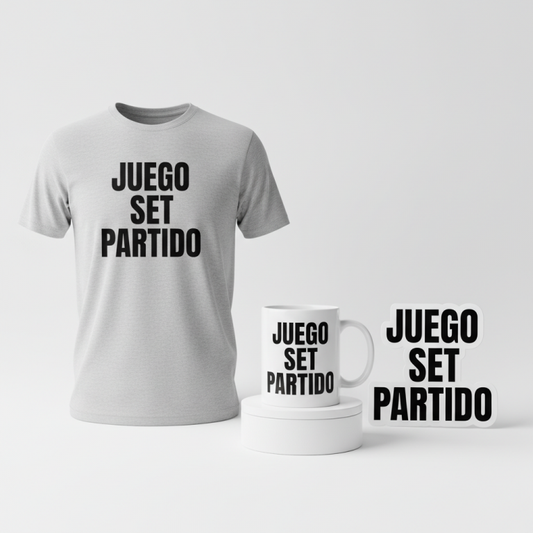
Translating the gravitas of true crime journalism into a marketable design requires a delicate balance of respect for the subject and an understanding of fan culture. One compelling design approach for this trend could focus on a clean, modern aesthetic that subtly nods to the insider world of true crime content creation.
- 🎨 Visual Concept: The central visual element could be a small, simple silhouette of a podcasting microphone. This universal symbol instantly communicates the medium without being overly explicit, offering an understated elegance. It anchors the design in the contemporary context of how many true crime narratives are consumed today.
- ✍️ Typography Ideas: For the main message, “Le crime paie…”, a simple, bold, sans-serif font would convey a sense of authority and journalistic directness. This provides a strong visual anchor. Below it, the secondary text, “mes podcasts”, rendered in a casual, handwritten script font, introduces a personal, almost confessional touch, adding a layer of ironic self-awareness that true crime fans often appreciate. It suggests a direct, personal connection from the creator to the audience.
- 👕 Product Canvas: Given the clean and understated design, a ‘light’ apparel base – think crisp whites, heather grays, or soft pastels – would provide an ideal canvas. These lighter tones allow the typography and the subtle mic graphic to stand out cleanly, enhancing the modern, minimalist appeal.
Strategic Market Insight
While the initial trigger for this trend involves a sensitive true crime case, the merchandising potential wisely pivots to the vast, engaged world of ‘True Crime Fans.’ This demographic, predominantly female, thrives on the unique blend of macabre interest, investigative puzzles, and the community built around their shared passion. The phrase “Le crime paie… mes podcasts.” is a brilliant piece of insider commentary. It’s a dark, humorous, and relatable quip that acknowledges the fascinating (and sometimes lucrative) world of true crime media from a creator’s perspective. It offers an ‘if you know, you know’ moment, a psychological trigger that fosters a sense of belonging and appreciation for the genre’s nuances. This isn’t just a shirt; it’s a badge of honor for those who understand the intricate dance between storytelling and the somber realities of crime.
⚖️ Estimated Copyright Risk: LOW
Risk Assessment: The design is a complete pivot away from the tragic event and public figure. The quote is an original, humorous phrase with no evidence of trademark.
Always verify intellectual property rights before listing.
Check EU Trademark Search for “Le crime paie… mes podcasts.” ➔
AI Image Generation Prompts
The following prompts are optimized for leading generators to produce production-ready assets:
👕 Apparel / T-Shirt Prompt
A clean, modern typographic design for a t-shirt print, rendered in a crisp, isolated vector illustration style on a solid light background. The main text "Le crime paie..." is prominently displayed in a bold, assertive sans-serif font (e.g., Montserrat Black, Poppins ExtraBold), with thick, clean letterforms and sharp angles. Directly beneath, the secondary text "mes podcasts" is elegantly presented in a contrasting, casual, flowing handwritten script font, exuding a personal and approachable feel. A small, simple, and sleek black silhouette of a classic podcasting microphone (like a condenser mic) is positioned subtly alongside or just above the text, acting as a minimalist graphic accent without clutter. The illustration technique is purely vector art, characterized by perfectly smooth curves, razor-sharp edges, and uniform solid color fills. There are absolutely no gradients, blurs, or complex textures within the design itself; everything is presented with graphic precision and stark simplicity. The rendering is exceptionally clean, ensuring maximum legibility and scalability for print. Lighting is completely flat and even across the design, implying no internal shadows or highlights, maintaining a 2D digital aesthetic. The overall mood is sophisticated, witty, and subtly intriguing, designed to be impactful yet understated on apparel. The composition is perfectly centered and balanced, optimized for a front-and-center placement on a garment. The ONLY text allowed in the image is exactly 'Le crime paie... mes podcasts.'. Absolutely NO other names, words, or random letters. --ar 3:4 --v 6.0
☕ Drinkware / Mug Prompt
A duplicated side-by-side layout showing the exact same graphic on the left and right, designed perfectly for a panoramic mug wrap. The core graphic features the main text "Le crime paie..." rendered in a prominent, bold, modern sans-serif typeface (e.g., Gotham Black, Bebas Neue), characterized by its strong presence and clear legibility. Below this, the secondary text "mes podcasts" is depicted in an elegant, flowing, casual handwritten script font, adding a touch of personality and warmth. A small, stylized silhouette of a classic podcasting microphone is strategically placed next to or above the main text, acting as a clear, iconic graphic element. The entire design is executed in a clean, flat 2D graphic style, ensuring maximum clarity and impact when viewed on a curved surface. Colors are solid and vibrant, chosen for excellent contrast and print fidelity on drinkware, with sharp, well-defined edges. The rendering is precise and unblemished, showcasing a digital vector aesthetic with no gradients or textural effects. Lighting is entirely even and non-directional, creating a perfectly flat and shadowless representation of the graphic, as if a print-ready file. The mood is engaging, sophisticated, and slightly intriguing, designed to be a conversation starter. The dual presentation ensures full visibility from any angle on a mug, with each identical design perfectly spaced and oriented for a seamless wrap. The background is a clean, neutral white or light studio grey. The ONLY text allowed in the image is exactly 'Le crime paie... mes podcasts.'. Absolutely NO other names, words, or random letters. --ar 3:1 --v 6.0
✨ Die-Cut Sticker Prompt
A vibrant die-cut sticker design, crafted in a dynamic 2D flat pop-art style. The main text "Le crime paie..." is rendered in a thick, impactful, bold sans-serif font (e.g., Impact, Anton), presented with strong, graphic novel-like precision. Below it, the secondary text "mes podcasts" is depicted in a lively, expressive, casual handwritten script font, reminiscent of a personal signature. A stylized, simplified silhouette of a classic podcasting microphone, with bold, clean lines, is integrated as a central graphic element. The entire combined design, including text and microphone, is surrounded by a prominent, uniformly thick, clean white outline border, creating a distinct "die-cut" effect. The art style embraces solid color blocks, high contrast, and minimal shading, typical of mid-century pop art and comic book aesthetics. Colors are bold, saturated, and eye-catching, designed to stand out. Rendering is exceptionally sharp, with hard edges and crisp definitions, ensuring perfect cut lines. Lighting is completely flat, shadowless, and artificial, enhancing the graphic's two-dimensional quality. The texture implies a smooth, high-gloss vinyl sticker, reflecting minimal light to convey its material. The mood is playful, cool, energetic, and visually arresting, perfect for personalizing items. The design is perfectly centered within a square format, with the white border acting as a clear edge for cutting. The ONLY text allowed in the image is exactly 'Le crime paie... mes podcasts.'. Absolutely NO other names, words, or random letters. --ar 1:1 --v 6.0
Frequently Asked Questions
How does this design navigate the sensitivity inherent in true crime subject matter?
This design wisely sidesteps direct references to any specific tragic case, instead focusing on the broader, evergreen appeal of true crime *podcasting* and the journalistic pursuit. The humor in “Le crime paie… mes podcasts.” is self-aware and directed at the industry of true crime commentary itself, rather than the victims or perpetrators of crimes. It allows fans to express their passion for the genre in a respectful, yet wittily subversive, manner.
What makes the combination of a bold sans-serif and a handwritten script font effective for this message?
The typographic contrast is key to the design’s appeal. The bold sans-serif for “Le crime paie…” projects authority and a classic, almost cynical statement about the nature of crime, echoing a journalist’s objective tone. The handwritten script for “mes podcasts” then adds a personal, informal, and contemporary touch, making it relatable to the modern true crime enthusiast and their consumption habits. This blend perfectly captures the serious subject matter viewed through a contemporary, personal lens.
Why is “light” apparel recommended as the ideal product canvas for this concept?
Light-colored apparel enhances the clean, modern typographic design and ensures the subtle microphone graphic stands out. The minimalist aesthetic is best showcased on lighter backgrounds, preventing the design from feeling heavy or overly serious. It aligns with the contemporary, casual style preferred by many true crime podcast listeners, offering a versatile piece that can be worn in various settings while maintaining its subtle cultural statement.
Final Thoughts
The enduring fascination with true crime, particularly in France where the narrative threads of cold cases are woven deep into the cultural fabric, presents a vibrant opportunity for print-on-demand creators. By tapping into the specific buzz around figures like Jacques Pradel and translating that into clever, culturally resonant designs, designers can connect deeply with a passionate audience. The success of any concept ultimately hinges on impeccable execution, quality products, and an understanding of the subtle nuances that make a design not just eye-catching, but truly meaningful to its target demographic. The market is ripe for designs that speak to the insider humor and shared passion of the true crime community, reminding us that sometimes, the most compelling stories are indeed found in the shadows.
💬 What’s Your Take?
Art is subjective, and this is just one angle! How would you spin this “Jacques Pradel” trend? Drop your design ideas and let’s brainstorm in the comments below!