甘いもの大好き – I love sweet things
A delightful new buzz is sweeping across Japan, as confectionery giant Châteraisé once again captures the nation’s sweet tooth. Known for its accessible pricing and high-quality treats, the chain has ignited excitement with its latest collection of spring-themed sweets. These new offerings are not only delicious but also visually enchanting, embodying the season’s fresh, vibrant spirit, and sparking widespread discussion and delight among consumers.
The Cultural Significance
Châteraisé holds a unique place in the Japanese culinary landscape. It’s a brand synonymous with quality confections that don’t break the bank, making delightful sweets available to everyone. The current surge in popularity is directly tied to their newest seasonal line: spring-themed desserts that are both affordable and incredibly appealing to the eye. In a culture that deeply values seasonal ingredients and aesthetic presentation, Châteraisé’s ability to combine these elements with a friendly price point is a recipe for viral success. This isn’t just about buying a dessert; it’s about participating in a seasonal ritual, indulging in a moment of affordable luxury, and sharing in a collective appreciation for edible art. The joy of discovering a new, cute, and delicious treat is a powerful driver of engagement, especially when it’s so perfectly aligned with Japan’s love for all things charming and fresh.
Design Brainstorm: Capturing the Aesthetic
While the initial trend centers on a specific brand, a smart design strategy can pivot to capture the broader, evergreen appeal of Japanese sweets culture. This could translate well to a design that celebrates the universal joy of traditional and modern Japanese desserts, rendered in a style that resonates with current pop-culture aesthetics. One angle to consider is a playful, endearing interpretation that avoids specific branding, instead focusing on the beloved categories of treats themselves.
- 🎨 Visual Concept: A fun way to spin this might be a super cute, “kawaii”-style illustration. Imagine an assortment of iconic Japanese sweets – perhaps fluffy dango on a stick, a perfectly rounded mochi, and a slice of exquisite strawberry shortcake – each brought to life with tiny, happy faces. The color palette could lean heavily into bright, cheerful pastels: soft pinks reminiscent of cherry blossoms, light greens evoking fresh matcha, and sunny yellows. These vibrant yet gentle hues would instantly communicate joy and deliciousness.
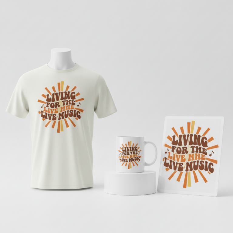
- ✍️ Typography Ideas: Complementing such a charming graphic, the text “甘いもの大好き” (Amai mono daisuki), meaning “I love sweets,” could be rendered in a bubbly, cute, handwritten-style Japanese font. This choice of typography adds to the playful, approachable vibe and makes the design feel personal and heartfelt. It’s a simple, universal sentiment that resonates deeply with anyone who enjoys a delightful dessert.
- 👕 Product Canvas: For apparel, the design would truly pop on light-colored garments. Think crisp white t-shirts, gentle cream hoodies, or pastel-colored tote bags. These light backgrounds allow the bright, pastel hues of the sweet illustrations to stand out beautifully, making the design vibrant and eye-catching without being overwhelming.
Strategic Market Insight
This design concept strategically targets a highly passionate and identifiable demographic: lovers of Japanese sweets and enthusiasts of Japanese culture. By avoiding direct use of the Châteraisé brand name or logo, which would raise trademark concerns, the design taps into an evergreen niche that holds universal appeal. The “foodie” culture is immense, and those with an affinity for specific cuisines, especially one as rich and unique as Japanese confectionery, form a dedicated audience. The kawaii art style further amplifies this appeal, as cuteness is a globally recognized and beloved aesthetic, particularly prevalent in Japanese pop culture. Purchasing such merchandise isn’t just about a shirt; it’s about expressing a personal passion, celebrating cultural appreciation, and finding joy in adorable, relatable imagery. It triggers a sense of belonging for fans and offers a delightful way to carry a piece of their culinary love with them.
⚖️ Estimated Copyright Risk: LOW
Risk Assessment: The design does not use any brand names or logos. The Japanese text ‘甘いもの大好き’ is a very common, generic phrase, and the IP research log confirmed it is not trademarked, making it very low risk.
Always verify intellectual property rights before listing.
Check Japan Trademark Search for “甘いもの大好き” ➔
AI Image Generation Prompts
The following prompts are optimized for leading generators to produce production-ready assets:
👕 Apparel / T-Shirt Prompt
A captivating, ultra-detailed kawaii vector illustration, perfectly isolated on a pure, solid light pastel pink background. The central focus is an adorable, whimsical composition of various anthropomorphic Japanese sweets: plump, round dango skewers with blushing cheeks, soft, squishy mochi squares with sweet, wide smiles, and a perfectly triangular slice of strawberry shortcake featuring a cheerful, frosting-whipped face and bright, sparkling eyes. Each sweet exudes a palpable sense of joy and cuteness, rendered with clean, crisp outlines and smooth, elegant bezier curves. The color palette is exquisitely bright and pastel, dominated by soft rose pinks, delicate mint greens, sunny lemon yellows, and creamy whites, with subtle peach and lavender accents. Shading is flat and cell-shaded, enhanced by soft, unobtrusive gradients that provide a gentle sense of volume without breaking the vector aesthetic. Highlights are depicted as tiny, strategically placed white reflections, giving a glossy, appetizing finish to the wagashi. Below this delightful arrangement, the Japanese text '甘いもの大好き' is meticulously rendered in a charming, bubbly, hand-drawn Japanese font, perfectly aligned and proportionally scaled, maintaining the overall cute and cheerful vibe. This design is optimized for high-quality apparel printing, featuring a minimalist background to ensure print clarity and maximum impact. The artwork is clean, polished, and free from any imperfections, embodying a playful, inviting, and utterly charming mood. The ONLY text allowed in the image is exactly '甘いもの大好き'. Absolutely NO other names, words, or random letters. --ar 3:4 --v 6.0
☕ Drinkware / Mug Prompt
A vibrant, highly detailed, and charming kawaii illustration, explicitly designed as a duplicated side-by-side layout for a panoramic coffee mug wrap. The image features two identical instances of the same delightful graphic, perfectly mirrored and positioned horizontally to create a seamless aesthetic across a cylindrical surface. Each instance showcases an enchanting ensemble of anthropomorphic Japanese sweets: cheerful, jiggly dango on skewers with rosy cheeks, soft, endearing mochi characters with gentle smiles, and a delectable slice of strawberry shortcake with a sweet, cartoon face and glistening berry eyes. The art style is a clean, crisp digital illustration with a distinctive pop-art vibrancy, utilizing thick, uniform outlines and a brilliant, pastel color palette of blush pinks, soft mint greens, sunny yellows, creamy whites, and hints of lavender. Each sweet character radiates warmth and happiness. Shading is simple, flat, and bold, with minimal gradients to maintain a smooth, print-ready finish. The Japanese text '甘いもの大好き' is meticulously integrated below the sweets in each duplicated graphic, rendered in an adorable, bubbly, hand-drawn style, proportionate and perfectly legible. The background for the illustration itself is a clean, solid, light pale yellow, allowing the sweets to truly pop. This entire composition is designed for high-resolution print, ensuring no pixelation or blurriness, creating a joyful and inviting aesthetic perfect for daily use. The ONLY text allowed in the image is exactly '甘いもの大好き'. Absolutely NO other names, words, or random letters. --ar 3:1 --v 6.0
✨ Die-Cut Sticker Prompt
A charming, high-impact kawaii die-cut sticker design featuring an irresistibly cute arrangement of anthropomorphic Japanese sweets. The focal point is a joyful collection of happy-faced dango, smiling mochi, and a cheerful slice of strawberry shortcake, each character boasting wide, expressive eyes and rosy cheeks. The art style is a vibrant, 2D flat pop-art aesthetic, characterized by bold, uniform black outlines, distinct color blocking, and absolutely no complex shading or gradients – pure, unadulterated pastel colors pop vividly. The color palette is intensely bright and inviting: vivid bubblegum pinks, electric mint greens, sunny daffodil yellows, and crisp whites. This entire delightful composition, including the sweet characters and the Japanese text '甘いもの大好き' rendered in a cute, bubbly handwritten style directly below them, is encased by a prominent, uniform, thick white outline border. This border is precisely designed for die-cutting, ensuring clean edges and maximum visibility against any surface. The design is presented as a single, cohesive sticker shape. The overall mood is playful, energetic, and utterly adorable, making it an attention-grabbing, fun accessory. The digital rendering is crisp and sharp, optimized for sticker production. The ONLY text allowed in the image is exactly '甘いもの大好き'. Absolutely NO other names, words, or random letters. --ar 1:1 --v 6.0
Frequently Asked Questions
Why pivot from a specific trending brand to a broader theme for merchandise?
Pivoting from a specific trending brand like Châteraisé to a broader “Japanese sweets” theme is a crucial strategic move for print-on-demand. It entirely bypasses potential trademark and intellectual property infringements, which are significant risks when designing around specific brand names or logos. More importantly, it transforms a fleeting, brand-specific trend into an evergreen niche. While a brand’s specific seasonal promotion might fade, the love for Japanese sweets and culture is constant, ensuring long-term appeal and sales potential for the merchandise.
How does the “kawaii” art style enhance the appeal of this sweet-themed design?
The “kawaii” (cute) art style is incredibly effective for this sweet-themed design because it’s universally appealing and deeply embedded in Japanese culture. It instantly evokes feelings of joy, warmth, and innocence, perfectly aligning with the comforting and delightful experience of eating sweets. For fans of Japanese culture, kawaii is a familiar and beloved aesthetic, making the merchandise feel authentic and relatable. For a broader audience, cuteness is inherently attractive, drawing attention and creating an immediate positive emotional connection, making the design highly marketable.
What emotional connection does a design featuring charming Japanese sweets evoke in potential buyers?
A design featuring charming Japanese sweets can evoke a powerful array of positive emotions in potential buyers. It taps into nostalgia for childhood treats, the simple comfort of indulgence, and the joy of cultural appreciation. For foodies, it’s an expression of their passion and identity. The happy, anthropomorphized sweets can create a sense of whimsical delight and warmth, making the product feel personal and endearing. Essentially, it’s selling not just an item, but a feeling of happiness, cultural connection, and a celebration of life’s sweet moments.
Final Thoughts
Tapping into cultural moments, particularly those surrounding beloved food trends, offers immense potential for creative merchandise. The excitement generated by Châteraisé’s spring sweets in Japan illustrates the power of combining aesthetic appeal with accessible indulgence. By intelligently pivoting this energy towards the broader, universally loved theme of Japanese sweets and deploying a charming kawaii aesthetic, designers can create products that resonate deeply with a passionate audience. Success in this niche hinges on thoughtful design execution and a clear understanding of the cultural nuances that make these trends so captivating.
💬 What’s Your Take?
Art is subjective, and this is just one angle! How would you spin this “シャトレーゼ (Châteraisé)” trend? Drop your design ideas and let’s brainstorm in the comments below!