RUGBY RIVALRY
The United Kingdom is buzzing with the kind of electrifying energy only a truly historic rivalry can ignite. Forget your average sports clash; we’re talking about a renewal of a primal, decade-spanning feud that’s got rugby fans on the edge of their seats. This isn’t just about a game; it’s about deeply ingrained pride, the spirit of competition, and a cultural phenomenon that’s spilling from the pitch into the public consciousness, creating a unique opportunity for evocative, sports-inspired merchandise.
The Cultural Significance
At the heart of this surging trend lies one of the Super League’s most storied confrontations: the Bradford Bulls versus the Leeds Rhinos. This isn’t merely two teams playing; it’s a clash of titans, a local derby steeped in years of fierce battles, memorable moments, and a passionate, almost tribal loyalty from their respective fan bases. When these two clubs meet, it’s more than points on a scoreboard; it’s a revival of bragging rights, an explosion of regional pride, and a testament to the enduring power of community identity through sport. The renewal of this historic fixture isn’t just a sporting event; it’s a cultural happening, drawing attention far beyond the traditional rugby faithful and capturing the imagination of anyone who appreciates a good old-fashioned showdown.
Design Brainstorm: Capturing the Aesthetic
Translating such raw energy into a marketable design requires both creativity and strategic thinking. One compelling approach could lean into the universal symbolism of the rivalry, rather than getting bogged down in specific team iconography.
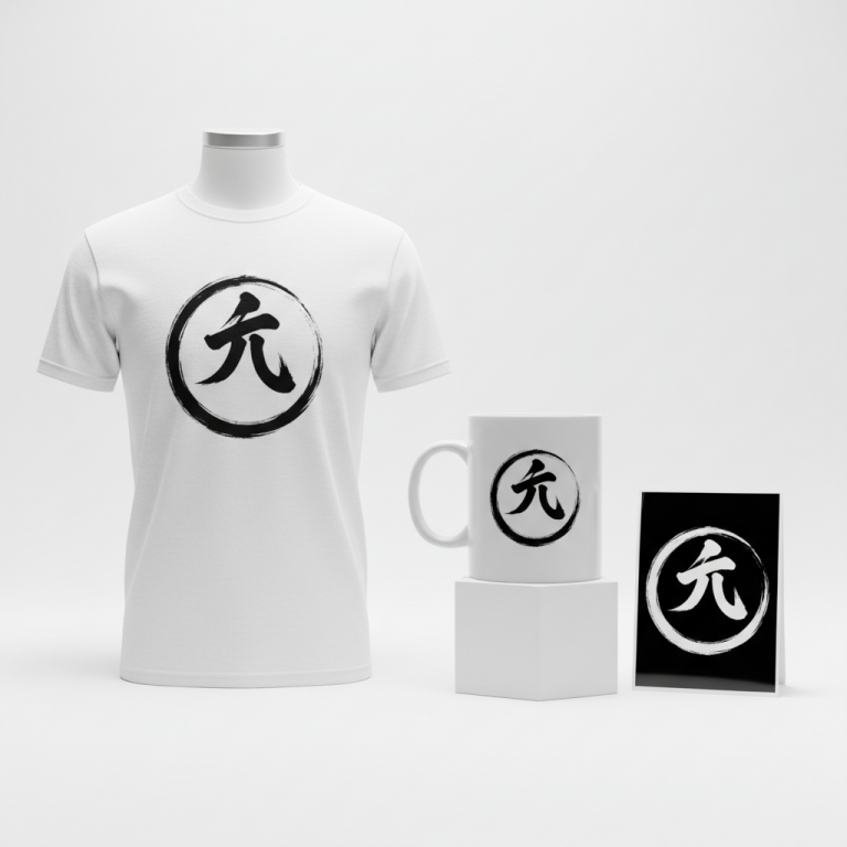
- 🎨 Visual Concept: Imagine a highly stylized, almost primal graphic. The core visual could feature the powerful silhouettes of a charging bull and a charging rhinoceros, poised for an epic collision. To give it a timeless feel, depicting these figures in a distressed, vintage art style could resonate deeply. The bull, perhaps rendered in a solid dark red, facing off against the rhinoceros in a solid dark blue, creates a dynamic contrast without resorting to official team colors. Containing this intense scene within a circular border might suggest unity in conflict, or the endless cycle of rivalry, adding a classic, badge-like quality to the design. This abstraction allows the design to evoke the spirit of the trend while remaining broadly appealing.
- ✍️ Typography Ideas: For text, the straightforward yet powerful phrase “RUGBY RIVALRY” could be used. This phrase acts as an immediate identifier for the theme. Pairing this with a robust, perhaps slightly distressed or vintage-inspired font would complement the visual style. Think bold serifs or strong sans-serifs that feel both classic and energetic, echoing the grit and history of the sport. The beauty of “RUGBY RIVALRY” is its universally understood nature; it’s a common descriptor that speaks to the passion of the game without infringing on any specific team’s intellectual property.
- 👕 Product Canvas: Given the chosen color palette of dark red and dark blue, this design could translate exceptionally well onto light-colored apparel. Crisp white or natural heather grey t-shirts, hoodies, or even polos would provide a perfect backdrop, allowing the stylized animal silhouettes and the bold text to truly pop. The contrast would highlight the vintage distressed effect, enhancing the overall aesthetic and making it an eye-catching piece for fans.
Strategic Market Insight
This design concept strategically targets the passionate UK rugby fan base. By cleverly avoiding specific team names like ‘Bulls’ or ‘Rhinos’ and instead pivoting to the evergreen and entirely safe concept of ‘Rugby Rivalry,’ it achieves broad appeal. The generic animal silhouettes evoke the powerful symbolism of the trend without stepping into intellectual property pitfalls. Fans who understand the intensity of local derbies will instantly grasp the underlying message and appreciate the nod to their beloved sport’s fiercest contests. The psychological trigger here is identity and belonging – fans can proudly wear merchandise that celebrates the spirit of rugby and its iconic clashes, feeling connected to the wider culture of the game, even if it doesn’t bear their specific team’s crest. It’s an homage to the sport itself, making it a powerful and versatile piece for any dedicated supporter.
⚖️ Estimated Copyright Risk: LOW
Risk Assessment: The design uses generic animal shapes and a common, descriptive phrase, ‘Rugby Rivalry’, which is not trademarked. It has no affiliation with any specific team, league, or brand.
Always verify intellectual property rights before listing.
Check UK Trademark Search for “RUGBY RIVALRY” ➔
AI Image Generation Prompts
The following prompts are optimized for leading generators to produce production-ready assets:
👕 Apparel / T-Shirt Prompt
A highly stylized, minimalist graphic for a t-shirt print. The design features the stark, powerful silhouettes of a charging bull (solid matte dark red, hex #8B0000) and a charging rhinoceros (solid matte dark blue, hex #00008B) locked in an impending collision. Both animals are rendered with clean, bold lines and a distressed, vintage art style that suggests a worn screen print or faded linocut, featuring subtle texture within the solid color fills like fine grain, minimal ink bleed, or microscopic fiber impressions. The entire dynamic scene is contained precisely within a prominent circular border that also exhibits a weathered, slightly irregular texture, mimicking aged ink on fabric. The border's color is a distressed dark charcoal grey. The phrase 'RUGBY RIVALRY' is cleanly integrated, perhaps following the bottom curve of the circular border, also in a subtly distressed font matching the overall aesthetic. The illustration is isolated on a solid light background, specifically pure white, in a clean vector illustration style with sharp edges and smooth curves, but infused with the controlled, simulated texture for the vintage effect. The rendering should be high-resolution, optimized for apparel, ensuring crispness despite the distressed elements. The lighting is flat and even, highlighting the graphic's stark contrast and iconic form. The mood is intense, classic, and energetic. The ONLY text allowed in the image is exactly 'RUGBY RIVALRY'. Absolutely NO other names, words, or random letters. --ar 3:4 --v 6.0
☕ Drinkware / Mug Prompt
A high-resolution graphic for a coffee mug wrap layout. The central design features a highly stylized, minimalist representation of a charging bull (solid deep dark red, hex #800000) and a charging rhinoceros (solid rich dark blue, hex #000080) about to collide, depicted as bold silhouettes. The art style is a distressed, vintage linocut or woodcut aesthetic, with visible simulated texture, slight imperfections, and faint ink gaps within the solid red and blue fills, suggesting a hand-printed, aged poster. The entire graphic is contained within a distinct circular border, which itself displays a weathered, slightly faded black or dark grey appearance with subtle breaks and irregularities. The phrase 'RUGBY RIVALRY' is prominently displayed in a bold, slightly retro font, either directly below the circular graphic or subtly integrated within its bottom half, also with a consistent distressed texture. This core design is then presented in a duplicated side-by-side layout, showing the exact same graphic on the left and right, designed perfectly for a panoramic mug wrap. Each instance of the graphic is centered within its half of the layout, ensuring seamless repetition for printing. The background is a clean, flat white. The rendering is 2D, flat graphic design, emphasizing bold shapes and textural detail rather than depth. The lighting is purely illustrative, focusing on the clarity of the design and its simulated vintage print qualities. The mood is robust, classic rivalry, and enduring. The ONLY text allowed in the image is exactly 'RUGBY RIVALRY'. Absolutely NO other names, words, or random letters. --ar 3:1 --v 6.0
✨ Die-Cut Sticker Prompt
A vibrant, 2D flat pop-art style graphic for a die-cut sticker. The design showcases the iconic, minimalist silhouettes of a charging bull (solid bright dark red, hex #CC0000) and a charging rhinoceros (solid vivid dark blue, hex #0000CC) poised for collision. The art style is characterized by crisp outlines but with intentional, subtle distressing and simulated ink wear within the solid color fields, giving it a vintage, screen-printed poster feel without losing its pop-art vibrancy. This dynamic scene is encapsulated within a strong, dark charcoal circular border that also exhibits slight, intentional imperfections. The text 'RUGBY RIVALRY' is presented in a bold, clean, slightly retro font, integrated either directly below the circular graphic or within its lower curve, also with a subtle distressed texture. The entire completed design is bordered by a thick, clean, pure white outline border, precisely defining the die-cut edge of the sticker. The background outside the white border is an isolated, pure white. The rendering is perfectly flat, high-resolution, and sharp, with no gradients, only solid, bold color fields infused with the specified subtle distress. The lighting is flat and even, emphasizing the graphic's clarity, contrast, and pop-art appeal. The mood is bold, iconic, collectible, and energetic. The ONLY text allowed in the image is exactly 'RUGBY RIVALRY'. Absolutely NO other names, words, or random letters. --ar 1:1 --v 6.0
Frequently Asked Questions
Why opt for generic animal silhouettes instead of team mascots or logos?
Choosing generic, stylized animal silhouettes allows the design to tap into the powerful symbolic nature of the rivalry without infringing on copyrighted team intellectual property. It’s a strategic move that broadens market reach, appealing to fans of the sport’s ethos rather than just specific team loyalties, while entirely avoiding legal risks. It celebrates the concept of the “clash” itself.
How does “RUGBY RIVALRY” resonate with fans without mentioning specific teams?
“RUGBY RIVALRY” is a widely understood and emotionally charged phrase within the rugby community. It immediately communicates the intensity and passion of the sport’s most significant matchups, connecting with fans on a deeper level by celebrating the essence of competition that they love. It’s a universal truth about the game, transcending specific club affiliations.
What makes this design suitable for Print-on-Demand (POD) success?
This design’s combination of strong visual appeal, strategic use of generic yet evocative symbols, and IP-safe text makes it an ideal candidate for POD. It addresses a trending topic in the UK market, targets a passionate demographic, and mitigates legal risks, creating a scalable and appealing product line that can be easily adapted to various apparel items.
Final Thoughts
The enduring appeal of a fierce sporting rivalry offers a compelling canvas for creative merchandise. By focusing on the powerful, universal themes of competition and passion, rather than specific team branding, designers can craft items that resonate deeply with fans. This “bulls vs rhinos” trend in the UK rugby scene is a prime example of how cultural moments can be intelligently translated into marketable products. Ultimately, success in this niche will hinge on thoughtful execution, a keen eye for aesthetics, and a personal spin that makes each piece truly unique.
💬 What’s Your Take?
Art is subjective, and this is just one angle! How would you spin this “Bulls Vs Rhinos” trend? Drop your design ideas and let’s brainstorm in the comments below!