Orgullo de Vallecas – Pride of Vallecas
The electric atmosphere of LaLiga football is palpable across Spain, and with clashes like Rayo Vallecano versus Elche C.F. igniting discussions, the passion for the beautiful game is undeniable. But beyond the immediate thrill of the match, a deeper current of local pride and cultural identity often surges, offering fascinating opportunities for unique merchandise concepts. It’s this profound sense of belonging, rather than just the scoreline, that can truly resonate with a dedicated fanbase.
The Cultural Significance
In Spain, football is more than a sport; it’s a vital thread in the fabric of regional and local identity. The rivalry and camaraderie surrounding clubs are intensely personal, often rooted in specific neighborhoods and communities. Vallecas, a working-class district in Madrid, embodies this perfectly. Its residents possess an fierce, almost legendary, pride in their roots and, by extension, their beloved team, Rayo Vallecano. This isn’t merely about cheering for a club; it’s about celebrating a shared history, a collective spirit, and an unwavering sense of home. Tapping into this inherent “Orgullo de Vallecas” – the pride of Vallecas – connects directly with the heart of this passionate community, offering merchandise that speaks to their very identity.
Design Brainstorm: Capturing the Aesthetic
Translating this profound local pride into a visual concept requires an aesthetic that feels authentic and deeply connected to the urban environment of Vallecas. One angle to consider is a design that eschews typical sports iconography for something more raw and resonant.
- 🎨 Visual Concept: Imagine a design that feels like it’s been lifted directly from a street wall in Madrid. A gritty, urban aesthetic where every line tells a story. The texture could be distressed and weathered, almost like an old stencil or graffiti piece that has seen countless seasons. A subtle nod to Rayo Vallecano’s nickname, “Rayo” (lightning bolt), could be integrated: perhaps a stylized bolt, not overtly aggressive, but sharp and dynamic, breaking through or forming part of the typography. This approach grounds the design in the real-world, lived experience of the fans.
- ✍️ Typography Ideas: The chosen phrase, “Orgullo de Vallecas,” is key. This could be rendered in a bold, assertive, perhaps slightly condensed sans-serif font that mirrors the no-nonsense attitude often associated with street art. The letters might feature uneven edges or a halftone pattern to enhance the stencil-like appearance. The lightning bolt could seamlessly intersect with a letter, perhaps the ‘O’ or ‘L’, making it an integral part of the wordmark rather than just an add-on. This ensures the text itself becomes a piece of art.
- 👕 Product Canvas: Given the urban and gritty aesthetic, dark apparel would serve as the ideal backdrop. Think deep charcoals, midnight blacks, or even a very dark navy. These colors provide a strong contrast, allowing the distressed textures and the subtle lightning bolt detail to really pop. Hoodies, t-shirts, and even long-sleeve tees in these dark hues would perfectly encapsulate the desired streetwear vibe, making the design feel current and effortlessly cool.
Strategic Market Insight
The genius of focusing on “Orgullo de Vallecas” lies in its strategic pivot from broad, high-competition sports merchandise. Directly using team names like ‘Rayo Vallecano’ or ‘Elche C.F.’ can often lead to licensing complexities and a crowded market. By instead homing in on the hyper-specific, passionate niche of Vallecas supporters, the design taps into a far deeper well of emotional connection and local identity. The psychological trigger here is belonging; purchasing this merchandise isn’t just buying a shirt, it’s affirming one’s identity, history, and community. This approach creates an evergreen appeal, as neighborhood pride isn’t tied to a single match result or season. It cleverly bypasses common ‘Location + Sport’ bot traps by emphasizing cultural identity over a fleeting sporting event, offering a durable, authentic product that resonates year-round.
⚖️ Estimated Copyright Risk: LOW
Copyright Evaluation: ‘Orgullo de Vallecas’ is a statement of local pride, not an official, trademarked team slogan. The design avoids all official logos, crests, and team colors, making it a compliant expression of local identity.
Always verify intellectual property rights before listing.
Check EU Trademark Search for “Orgullo de Vallecas” ➔
AI Image Generation Prompts
The following prompts are optimized for leading generators to produce production-ready assets:
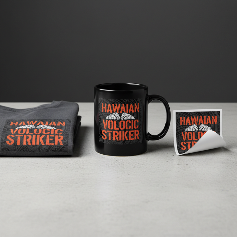
👕 Apparel / T-Shirt Prompt
A bold and impactful typography-focused vector illustration for a t-shirt print, isolated on a solid dark charcoal background. The text 'Orgullo de Vallecas' is rendered in a gritty, urban street art and stencil-inspired style. Letters are thick, blocky sans-serif, with deliberately imperfect, rough-hewn edges and subtle breaks, giving a worn, weathered look. A highly stylized, jagged lightning bolt is seamlessly integrated into the typography, perhaps replacing a stroke in a letter or breaking through the composition, acting as a subtle nod to 'Rayo'. The overall texture is simulated distressed and weathered, achieved through clean vector techniques: digital scratches, subtle stipple patterns, simulated spray paint overspray along edges, and ink bleed effects, all rendered with crisp, scalable lines. The color palette is high-contrast, utilizing a distressed off-white or light grey for the primary text, with the lightning bolt potentially highlighted in a muted, desaturated electric blue or burnt orange, maintaining a raw, authentic, and powerful mood. The illustration should embody a clean vector aesthetic while conveying the raw energy of urban street art, suitable for screen printing. The composition is centered and impactful. The ONLY text allowed in the image is exactly 'Orgullo de Vallecas'. Absolutely NO other names, words, or random letters. --ar 3:4 --v 6.0
☕ Drinkware / Mug Prompt
A high-fidelity, photo-realistic illustration designed for a panoramic coffee mug wrap layout. The image features a duplicated side-by-side layout showing the exact same graphic on the left and right. The central graphic displays 'Orgullo de Vallecas' in a deeply weathered, gritty urban typography style, evoking a stencil painted onto a textured, aged concrete wall. The letters are bold, impactful, and appear hand-painted with visible spray paint overspray, slight drips, and uneven edges, as if applied directly to a rough surface. A dynamic, stylized lightning bolt, subtly integrated into the text, perhaps splitting a letter or emerging from the word, glows faintly with an internal energy. The texture is extremely detailed: deeply distressed, with visible concrete cracks, chipped paint, faint rust stains, and heavy grunge effects, giving a palpable sense of age and wear. Atmospheric volumetric lighting casts subtle shadows and highlights, emphasizing the three-dimensional texture of the paint and concrete. The overall mood is raw, authentic, and powerful, with an industrial, street-level aesthetic. The color scheme features deep, muted tones for the background concrete and a vibrant, yet distressed, color for the typography – possibly a bold red or deep yellow, with the lightning bolt in a contrasting electric blue. The seamless duplication ensures a perfect wrap around the mug. The ONLY text allowed in the image is exactly 'Orgullo de Vallecas'. Absolutely NO other names, words, or random letters. --ar 3:1 --v 6.0
✨ Die-Cut Sticker Prompt
A vibrant, 2D flat graphic design for a die-cut sticker, featuring 'Orgullo de Vallecas' in a bold, pop-art infused street art typography style. The design has a thick, clean white outline border around the entire composition. The letters are chunky, geometric, and have a distinct stencil quality, reminiscent of simplified comic book lettering or vintage screen prints. While fundamentally flat, the design incorporates simulated distressed textures like halftone dots, subtle offset printing errors, and minimal, graphic-style scratches or 'grunge' effects within the solid color blocks, rather than realistic textural depth. A highly stylized, iconic lightning bolt is graphically integrated into the text, rendered with sharp angles and a clean, impactful shape. The color palette is high-contrast and punchy, perhaps using a bold primary color (e.g., bright red, electric blue) for the text, against a dark contrasting background (e.g., black or deep grey) for the design's internal elements, ensuring strong visual pop. The overall aesthetic is graphic, iconic, and immediately recognizable, with a retro-modern urban feel. The flat rendering and sharp edges are optimized for a clean die-cut. The ONLY text allowed in the image is exactly 'Orgullo de Vallecas'. Absolutely NO other names, words, or random letters. --ar 1:1 --v 6.0
Frequently Asked Questions
Why focus on ‘Vallecas’ pride instead of direct team names?
By shifting the focus from specific team names to the inherent ‘Orgullo de Vallecas,’ we’re tapping into a more enduring emotional connection. This strategy not only sidesteps potential licensing hurdles associated with official team branding but also targets a highly passionate, hyper-local demographic whose pride in their neighborhood is constant, regardless of match outcomes. It fosters an evergreen design that transcends a single season or game, appealing to a deeper sense of community and identity.
How can the “gritty, urban” aesthetic be achieved for Print-on-Demand products?
Achieving a genuine gritty, urban look for POD involves specific design techniques. Using textures that mimic worn paint, concrete, or fabric, incorporating halftone patterns, and designing typography with distressed edges can effectively convey that street art feel. Choosing dark base apparel is also crucial, as it enhances the contrast and makes the weathered details more prominent, giving the print a more authentic, integrated appearance rather than just a flat graphic.
What other product types might this design concept work well on?
While apparel is a natural fit, the urban aesthetic of “Orgullo de Vallecas” could extend to various other products. Think about canvas prints or metal signs for home decor, offering a piece of local identity for a supporter’s living space. Mugs, phone cases, and even laptop sleeves could carry the design, allowing fans to display their pride in everyday items. The key is selecting products that align with the street art vibe and appeal to a demographic that values both style and substance.
Final Thoughts
The potential for Print-on-Demand designs that skillfully blend trending cultural moments with deep-seated local identity is immense. The “Orgullo de Vallecas” concept is a prime example of how understanding a specific audience’s passions can lead to highly effective, emotionally resonant merchandise. It reminds us that successful e-commerce isn’t just about what’s popular, but about intelligent targeting and authentic design. By embracing the unique character of communities and translating that into compelling visuals, designers can create products that truly speak to people, fostering loyalty and driving meaningful engagement.
💬 What’s Your Take?
Art is subjective, and this is just one angle! How would you spin this “Rayo Vallecano – Elche C. F.” trend? Drop your design ideas and let’s brainstorm in the comments below!