BIATHLON
A recent strategic decision sent ripples through the dedicated biathlon fanbase across France: the planned rest of prominent French biathlete Quentin Fillon Maillet from a crucial World Cup relay event. This news, while seemingly tactical, underscores the immense focus and passion surrounding the sport in the country, highlighting how deeply fans connect with their athletic heroes and the high stakes of competitive biathlon.
The Cultural Significance
Biathlon, a demanding sport combining the endurance of cross-country skiing with the precision of rifle shooting, holds a special place in the hearts of many, particularly in nations with a strong winter sports tradition like France. When an athlete of Quentin Fillon Maillet’s stature, a figure often seen as a national icon, is strategically rested, it’s not just a footnote; it’s a significant event that sparks discussion and speculation among enthusiasts. This move reflects the intense physical demands of the sport and the meticulous planning required at the elite level. For fans, it’s a window into the strategic chess game of top-tier competition, fostering a deeper connection to the athletes and their journeys, and amplifying the underlying passion for biathlon itself.
Design Brainstorm: Capturing the Aesthetic
Translating this current of passion into compelling merchandise requires a design that speaks to the sport’s essence without being overtly tied to a single moment or personality. The aim is to create an evergreen piece that resonates with all biathlon aficionados.
- 🎨 Visual Concept: One compelling angle is a minimalist design centered around a heart rate (EKG) line. This line could subtly begin, then morph into the dynamic silhouette of a cross-country skier, before smoothly transitioning into the focused form of a person aiming a rifle at a target. The entire graphic would be rendered as a single, continuous stroke, symbolizing the relentless drive and flow of the sport. For color, a stylized interpretation of the French flag’s blue, white, and red could be incorporated, perhaps as subtle gradients or distinct segments within the line, nodding to the trend’s origin without being a literal flag depiction.
- ✍️ Typography Ideas: The design text “BIATHLON” offers a clear, bold statement. The typography could be a clean, strong sans-serif font that conveys athleticism and modernity. Positioning this word beneath or subtly integrated with the EKG line could reinforce the universal appeal, making it about the sport’s inherent thrill rather than any specific event or individual.
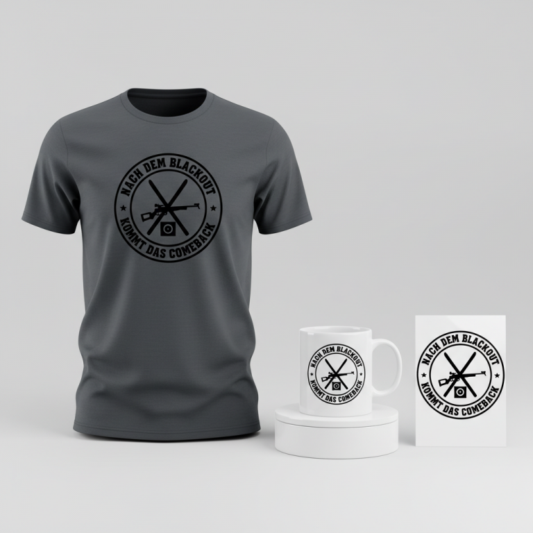
- 👕 Product Canvas: Given the stylized graphic and the intended color palette, dark apparel provides an ideal canvas. A deep navy, charcoal grey, or classic black would allow the blue, white, and red design elements to pop vibrantly, creating a sophisticated and impactful visual contrast.
Strategic Market Insight
The strategic pivot away from an individual athlete’s name and towards the broader sport of biathlon is a savvy move in the world of print-on-demand. While the initial trending event involves a specific athlete (Quentin Fillon Maillet) and country (France), focusing on the sport itself sidesteps potential intellectual property concerns associated with using a famous person’s likeness. More importantly, it dramatically expands the target audience beyond just immediate fans of one athlete or nation. This design concept appeals to anyone with a passion for biathlon, regardless of their nationality or specific favorite competitor. The “heartbeat/evolution” design style is a proven, popular format for niche sports apparel because it evokes emotion, dynamism, and the journey of an athlete, tapping into a universal appreciation for the sport’s physical and mental demands.
⚖️ Estimated Copyright Risk: LOW
Risk Assessment: This design avoids all IP infringement by not using the athlete’s name, likeness, or country name. It uses generic silhouettes that represent the core activities of the sport. The word ‘BIATHLON’ is the name of a sport and is not trademarked for apparel in this context.
Always verify intellectual property rights before listing.
Check EU Trademark Search for “Quentin Fillon Maillet” ➔
AI Image Generation Prompts
The following prompts are optimized for leading generators to produce production-ready assets:
👕 Apparel / T-Shirt Prompt
A highly detailed, clean vector illustration in a modern, minimalist style, specifically designed for a Dark t-shirt print. The central graphic is a single, continuous, unbroken line that elegantly flows and transforms. It begins as a precise, rhythmic electrocardiogram (EKG) waveform, then smoothly morphs into the dynamic, athletic silhouette of a cross-country skier in mid-stride, captured with fluid motion. This line seamlessly continues to transform, becoming the focused, poised silhouette of a biathlete aiming a rifle at a target, showcasing tension and precision. The entire graphic, from EKG to skier to rifle-aimer, maintains its identity as one uninterrupted stroke. Colors are inspired by the French flag (blue, white, and red) but used in a sophisticated, stylized, non-literal manner; the continuous line itself subtly transitions through these distinct hues – a cool, technical white for the EKG segment, a vibrant, energetic blue for the skier's portion, and a powerful, determined red for the rifle-aimer's section – creating a dynamic color flow within the single stroke. The line possesses a smooth, polished enamel-like texture with crisp, razor-sharp edges, rendered with absolute vector precision and no anti-aliasing artifacts. Isolated on a solid, deep matte black background, ensuring maximum contrast and a premium, high-impact feel. The composition is perfectly balanced, clean, and graphically strong, exuding athleticism, focus, and modern design elegance. The text "BIATHLON" is integrated cleanly beneath the graphic in a modern, bold sans-serif typeface, complementing the minimalist aesthetic. --ar 3:4 --v 6.0 The ONLY text allowed in the image is exactly 'BIATHLON'. Absolutely NO other names, words, or random letters.
☕ Drinkware / Mug Prompt
A duplicated side-by-side layout showing the exact same graphic on the left and right, designed perfectly for a panoramic coffee mug wrap. The graphic is a striking, minimalist, and dynamic illustration rendered in a crisp, high-definition vector art style, optimized for print clarity and vibrancy on ceramic. It features a single, continuous, unbroken line that evolves through three distinct forms: a precise, rhythmic EKG heart rate monitor line, which then fluidly transforms into the agile silhouette of a cross-country skier in motion, and finally culminates as the focused, steady silhouette of a biathlete aiming a rifle at a target. This entire transformation is achieved within the integrity of one continuous stroke, maintaining a sleek, modern aesthetic. The color palette is directly inspired by the French flag (blue, white, and red), applied in a stylized, non-literal way; envision the continuous line itself subtly shifting and flowing through segments of deep azure blue, crisp stark white, and powerful crimson red, creating a dynamic visual narrative without harsh breaks. The line possesses a smooth, high-gloss, slightly reflective finish, giving it a vibrant, premium, and durable printed look against a clean, brilliant white or light grey backdrop (representing the mug's surface). The overall rendering is sharp, vibrant, and graphically impactful, conveying athleticism, precision, and endurance with a modern, technical feel. The text "BIATHLON" is seamlessly integrated below the graphic in a strong, contemporary sans-serif font, ensuring excellent legibility on the mug's surface. The duplicated layout ensures a cohesive and balanced design when viewed from any angle on the cylindrical surface. --ar 3:1 --v 6.0 The ONLY text allowed in the image is exactly 'BIATHLON'. Absolutely NO other names, words, or random letters.
✨ Die-Cut Sticker Prompt
A bold, dynamic die-cut sticker design presented in a vibrant 2D flat pop-art style with a distinct, thick white outline border encompassing the entire graphic. The central artwork is a single, continuous, uninterrupted, and highly stylized line. This graphic line commences as a sharp, angular electrocardiogram (EKG) trace, then smoothly morphs into the energetic, silhouette profile of a cross-country skier in motion, finally transitioning into the precise, aiming silhouette of a biathlete with a rifle. The entirety of this transformation is conveyed as one unbroken, flowing stroke, emphasizing continuity and athleticism. The color scheme draws inspiration from the French flag (blue, white, and red) used in a bold, graphic, and non-literal pop-art manner; the continuous line itself is rendered with distinct, alternating segments of vivid primary blue, crisp stark white, and powerful crimson red, each color block distinctly defined within the continuous stroke, creating high contrast and dynamic flow. The background within the sticker boundary, but behind the primary line, is a flat, solid, complementary neutral light grey or off-white color, to make the primary colors pop. The aesthetic is characterized by flat, highly saturated colors, strong graphic lines, and zero gradients, shadows, or subtle textures, emulating classic screen-printed pop art. The rendering is extremely crisp, with clean, defined edges and a flat, matte finish suitable for a durable vinyl sticker. The composition is tightly focused and impactful, radiating energy and modern graphic appeal. The text "BIATHLON" is prominently displayed in a bold, condensed sans-serif font, complementing the pop-art aesthetic, also featuring the same thick white outline border. --ar 1:1 --v 6.0 The ONLY text allowed in the image is exactly 'BIATHLON'. Absolutely NO other names, words, or random letters.
Frequently Asked Questions
Why opt for a generic “BIATHLON” design when a specific athlete is trending?
The decision to focus on the evergreen sport rather than a trending athlete like Quentin Fillon Maillet is a strategic one that offers several benefits. Primarily, it avoids potential intellectual property issues associated with using a celebrity’s name or likeness. Secondly, it broadens the market appeal significantly. While the specific news might generate initial buzz, a design celebrating the sport itself resonates with all biathlon fans, not just those following one particular athlete or event, ensuring a longer-lasting product demand.
What makes the “heartbeat/evolution” design style effective for sports merchandise?
This design style effectively captures the essence of athletic passion and progression. The EKG line symbolizes life, intensity, and the rhythmic exertion of an athlete’s body. Its evolution into sport-specific silhouettes (skier, shooter) visually tells a story of transformation, skill, and dedication. It’s dynamic, relatable, and communicates the core spirit of the sport in a minimalist, universally appealing way, resonating deeply with enthusiasts who understand the physical and mental demands.
How do the French flag colors tie into the design without being overtly nationalistic?
The inspiration from the French flag’s blue, white, and red is intended to be stylized and non-literal. Instead of a direct flag image, these colors could be used as subtle accents, gradients, or a specific chosen palette within the continuous EKG line. This approach allows the design to acknowledge the trend’s origin in France and its vibrant biathlon culture without alienating international fans or making the apparel solely about one country. It’s a nod to the event’s context, maintaining broad appeal for all lovers of the sport.
Final Thoughts
The potential for impactful, evergreen sports merchandise is clear, even when sparked by transient news. By leveraging a trending topic as a gateway to a broader, passionate niche, and by applying clever, legally sound design principles, creators can tap into a dedicated audience. The key is to distill the essence of the sport, create a design that speaks to its universal appeal, and present it on the right canvas. Ultimately, success lies in understanding the underlying passion of the target market and delivering a product that truly resonates with their love for the game.
💬 What’s Your Take?
Art is subjective, and this is just one angle! How would you spin this “Quentin Fillon Maillet” trend? Drop your design ideas and let’s brainstorm in the comments below!